After buying a townhome in Chicago’s Lincoln Park neighborhood, these parents of two young children hired Habitar Design for a full remodel. In the 165-square-foot kitchen, dark cabinetry and limited storage made the narrow room feel even more cramped. Designer Renata Malafaia reimagined the kitchen, adding full-height storage, extending the upper cabinets and backsplash to the ceiling and installing more efficient cabinetry. To brighten the space, she chose a lighter palette, infusing it with warmth through small details with character.
Wall paint: Snowbound, Sherwin-Williams
Find a kitchen designer on Houzz
10 Clever Ways to Finish a Kitchen Cabinet Run
Before: Along the back wall, the fridge protruded past the countertop, and the space between the upper and lower cabinets was underutilized.
“The homeowners are very into transitional style, and they like clean lines,” the designer says. “They wanted their kitchen to feel brighter and not so heavy. We modernized it while adding character and charm.” The beaded Shaker-style cabinetry, painted in a soft, calming blue (Sherwin-Williams Stardew), balances traditional style with clean, modern lines. “It took a while to find just the right blue,” Malafaia says. “This one is dusky with misty undertones.”
While her clients assumed silver finishes like polished nickel would best complement the cool blue, the designer steered them toward warm brass tones. “Otherwise the room would have felt way too cold,” she says.
See why you should hire a professional who uses Houzz Pro software
Before: The existing garden window was an asset, but the granite and backsplash paired with dark blue cabinetry made the room feel gloomy and a bit dingy.
This area includes a two-drawer panel-front dishwasher and a trash pullout to the left of the sink. On the right side, an appliance garage conceals the microwave and toaster.
The one-hole faucet has a clean, modern silhouette, while knurled accents create visual interest.
Dishwasher: Fisher-Paykel; cabinet pulls: Charlotte in Honey Bronze, Top Knobs; faucet, soap dispenser and disposal button: Brizo; counters: Calacatta Lincoln Evoke quartz, TM Supply
Originally the designer specified quartzite countertops, but the homeowners decided on quartz instead. “This one has minimal veining that mimics natural stone,” Malafaia says.
5 Must-Have Features for a Small Kitchen
Handmade square zellige backsplash tiles cover the room’s open wall space, introducing subtle texture and depth. Extending the backsplash to the ceiling eliminates a horizontal line and visually heightens the space.
Ceiling light: Pottery Barn
Backsplash tile: 4 by 4 inches in Pure White, Zia Tile; pot filler: Brizo
Find a kitchen remodeler on Houzz
The tall cabinets around the niche are outfitted with rollout drawers. Full-height cabinetry pushes the highest shelves out of reach, so the homeowners store less-used items above and use a small stepladder when needed.
Before: The microwave was above the range, and the floor-to-ceiling cabinet on the left gave the kitchen a dark, tunnel-like feel.
This article was originally published by a www.houzz.com . Read the Original article here. .


Kitchen at a Glance
Who lives here: A young family of four
Location: Chicago
Size: 165 square feet (15 square meters)
Designer: Renata Malafaia of Habitar Design
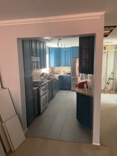
Before: A header that contained a plumbing stack partially blocked the view from the dining room into the kitchen. Malafaia removed it to open up the space — a fortunate decision as demolition revealed a hidden leak inside that could have caused damage.