Tag

Dark

Browsing


In a relatively small space, compromises have to be made, but in the right hands that needn’t result in a lesser design. With this eat-in kitchen in London there wasn’t room for everything initially requested, such as a breakfast bar on the island, but the resulting space feels open, elegant and highly functional.

After extending the original tiny kitchen, the owners asked Nick Street of Sylvarna Kitchen Design to create Shaker-style cabinetry. He used several tricks to make the space feel bigger, including raising the island on legs, opening up the area above the range cooker, and installing white countertops to reflect the light. “We came out of it with something that was actually better than what they were originally looking for,” Street says.


This article was originally published by a www.houzz.com . Read the Original article here. .


After buying a townhome in Chicago’s Lincoln Park neighborhood, these parents of two young children hired Habitar Design for a full remodel. In the 165-square-foot kitchen, dark cabinetry and limited storage made the narrow room feel even more cramped. Designer Renata Malafaia reimagined the kitchen, adding full-height storage, extending the upper cabinets and backsplash to the ceiling and installing more efficient cabinetry. To brighten the space, she chose a lighter palette, infusing it with warmth through small details with character.

“After” photos by Tony Fiorito and Gina Fiorito

Kitchen at a Glance
Who lives here: A young family of four
Location: Chicago
Size: 165 square feet (15 square meters)
Designer: Renata Malafaia of Habitar Design

Before: A header that contained a plumbing stack partially blocked the view from the dining room into the kitchen. Malafaia removed it to open up the space — a fortunate decision as demolition revealed a hidden leak inside that could have caused damage.

After: Creating a bright, open space was a priority, and Malafaia leveraged a range of design strategies to achieve this. “Taking the cabinets up to the ceiling and removing the header made the kitchen look so much taller,” she says. Now there’s a clear view of the kitchen from floor to ceiling.

Wall paint: Snowbound, Sherwin-Williams

Find a kitchen designer on Houzz

Another visual trick was leaving space between the right-side cabinetry and the end of the kitchen wall. “I always try to leave a little breathing room past the end of a cabinet run,” Malafaia says. As a bonus, the space beyond the cabinets created an ideal spot for pet bowls.

10 Clever Ways to Finish a Kitchen Cabinet Run

Before: Along the back wall, the fridge protruded past the countertop, and the space between the upper and lower cabinets was underutilized.

After: Malafaia filled the back wall around the refrigerator with cabinetry. For a seamless look and efficiency, she recommended a panel-front counter-depth fridge and a hardworking pullout pantry cabinet.

“The homeowners are very into transitional style, and they like clean lines,” the designer says. “They wanted their kitchen to feel brighter and not so heavy. We modernized it while adding character and charm.” The beaded Shaker-style cabinetry, painted in a soft, calming blue (Sherwin-Williams Stardew), balances traditional style with clean, modern lines. “It took a while to find just the right blue,” Malafaia says. “This one is dusky with misty undertones.”

While her clients assumed silver finishes like polished nickel would best complement the cool blue, the designer steered them toward warm brass tones. “Otherwise the room would have felt way too cold,” she says.

See why you should hire a professional who uses Houzz Pro software

Before: The existing garden window was an asset, but the granite and backsplash paired with dark blue cabinetry made the room feel gloomy and a bit dingy.

After: The new window trim matches the rest of the moldings, and a linen Roman shade filters natural light when needed.

This area includes a two-drawer panel-front dishwasher and a trash pullout to the left of the sink. On the right side, an appliance garage conceals the microwave and toaster.

The one-hole faucet has a clean, modern silhouette, while knurled accents create visual interest.

Dishwasher: Fisher-Paykel; cabinet pulls: Charlotte in Honey Bronze, Top Knobs; faucet, soap dispenser and disposal button: Brizo; counters: Calacatta Lincoln Evoke quartz, TM Supply

Special hinges on the garage door make it easy to open. “These hinges are a fantastic product,” Malafaia says. “You can lift the door to any height and it stays there. It doesn’t fly up to the top position or slam down to the bottom.”

Originally the designer specified quartzite countertops, but the homeowners decided on quartz instead. “This one has minimal veining that mimics natural stone,” Malafaia says.

5 Must-Have Features for a Small Kitchen

This view from the hallway reveals the 12-by-24-inch porcelain floor tiles and a new ceiling light over the sink. “There had not been a light there before,” Malafaia says. “It’s a functional touch that adds so much character.” Undercabinet LED strip lights illuminate the countertops.

Handmade square zellige backsplash tiles cover the room’s open wall space, introducing subtle texture and depth. Extending the backsplash to the ceiling eliminates a horizontal line and visually heightens the space.

Ceiling light: Pottery Barn

The oven’s placement maximizes prep space, while a pot filler saves trips from sink to range — especially helpful with toddlers and pets underfoot.

Backsplash tile: 4 by 4 inches in Pure White, Zia Tile; pot filler: Brizo

Find a kitchen remodeler on Houzz

Across from the range, a niche keeps the kitchen from feeling overcrowded with cabinetry. Ribbed glass on the upper cabinet fronts enhances the open look and adds texture. The symmetry of the composition is visually pleasing, and the countertop space creates a handy spot for laying out ingredients, particularly when baking.

The tall cabinets around the niche are outfitted with rollout drawers. Full-height cabinetry pushes the highest shelves out of reach, so the homeowners store less-used items above and use a small stepladder when needed.

Before: The microwave was above the range, and the floor-to-ceiling cabinet on the left gave the kitchen a dark, tunnel-like feel.


This article was originally published by a www.houzz.com . Read the Original article here. .


Soul Interiors Design, LLCSave Photo
After: The kitchen went from cramped and dark to open, light and bright with improved lighting and the removal of the dropped soffits and the wall separating the space from the dining area. Jamentz also had her team remove the space-hogging peninsula and replace it with a multifunctional 10-foot island. New cream-colored quartz countertops and custom white oak cabinets with ribbed panels also lighten the look and add textural interest.

The counter stools in synthetic rattan bring in some texture and the dark legs echo the cabinet hardware color. Jamentz reupholstered the counter stools in a faux leather to work with the room palette.

Her team wove in new engineered hardwood flooring for an exact match with the existing floor. “It took the flooring subcontractor quite a while to find the exact match, but luckily he did, and it is nearly impossible to detect where the old floor meets the new,” Jamentz says.

“Aesthetically engineered hardwood flooring is a wonderful choice for kitchen floors, as there is a wide variety of wood species and stain colors to choose from, and it is much softer to stand on when cooking or doing the dishes than a hard surface such as porcelain tile,” she says. “That said, if you have a very active household with pets and kids, preengineered floors might not be the best choice because it can scratch easily.”

Jamentz focused on wellness by helping improve air quality and refrigeration and adding healthy steam cooking. “In this project, our solution was to create a wellness-centric kitchen that provides the opportunity to cook nutritious meals, feel more energetic due to increased daylight, enjoy filtered water on demand, breathe cleaner indoor air, entertain with ease, recycle and compost effortlessly and feel organized through personalized storage solutions,” she says.

Shop for kitchen furniture


This article was originally published by a
www.houzz.com . Read the Original article here. .


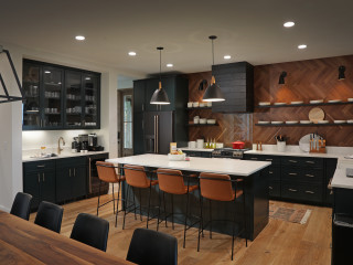
4. Dark Green, Black and Greige

Designer: Giana Shorthouse of Studio Giana
Location: Atlanta

Homeowners’ request. “The original kitchen was small, cramped and lacked storage and space to gather with friends and family,” designer Giana Shorthouse says. “It was remodeled to an expansive and multifunctional kitchen that includes a range of more function, spanning from the island and range wall to the custom-designed pantry, wall-to-wall china storage, a separate bar and a reworked butler’s pantry. We also built it out to include an adjacent covered outdoor space that carries the space from inside to outside.”

Shorthouse uses Houzz Pro business software to manage projects. “I use it for proposals, invoicing, purchase orders, and time and expenses,” she says.

Dark and moody features. Dark warm-green island base (Andiron, Sherwin-Williams). Black-framed stools. Black pendant lights. “We went dark to give the space a richer and more dynamic feeling,” Shorthouse says. “The homeowners had lived in the home for over a decade with old, nonfunctioning windows and years of white paint, so when it came to colors we decided to go dark to give the space dimension and a richness it was missing before. Coming from prior years of loft living, the homeowners’ personal style reflects a more modern and industrial perspective, so when it came to finishes, we chose black to honor their personal style. Mixing dark green, black and aged brass details allowed us to blend their more modern outlook in a home that was fit for a more traditional style. I designed the island base with more classic detailing and color in mind but paired it with a more modern waterfall countertop to add contrast to the style.”

Other special features. Warm greige perimeter cabinets (Skipping Stone, Benjamin Moore). Pacific White marble countertops and backsplash.

Designer tip. “Balance through contrast,” Shorthouse says. “When you look at the material selections, you’ll notice that there is an inherent balance between materials because I chose to place darker materials next to lighter materials to create a lot of contrast.”

“Uh-oh” moment. “We had a construction mishap with the installation of the flooring,” Shorthouse says. “We chose to go with a limestone floor, and due to the settling in the home between the original foundation and the new foundation underneath the new addition, we started seeing cracks in the floor shortly after install, which had to be repaired and wasn’t ideal for such a beautiful flooring selection.”

Stools: Asher, Jamie Young; faucet: Lombardia, Rohl; wall, ceiling and trim paint: Alabaster, Sherwin-Williams

New to home remodeling? Learn the basics


This article was originally published by a www.houzz.com . Read the Original article here. .


This Seattle-area family enjoyed daily casual meals and cooking together. But as the family grew to six, the kitchen seemed to be bursting at the seams. So the homeowners hired interior designer Harmony Weihs to figure out how to enlarge their kitchen, update other spaces and improve the flow throughout their home. Weihs proposed an addition that would double the size of the kitchen and extend the dining room a few feet to accommodate more family members when they gather.

Beyond the space planning, she helped the owners balance the light-filled kitchen they craved with the cozy cottage feel they love. Within the mostly white palette, she added copper accents, a large blue range, a limestone plaster vent hood, wood beams and honed countertops to create a more casual, European-inspired vibe in the room.


This article was originally published by a www.houzz.com . Read the Original article here. .

Pin It