
As holiday hosting ramps up, so does the value of a dedicated dining room. Beyond providing seating for a meal, a dining room sets the tone, gives hosts room to spread out and draws people together. For inspiration, explore these five refreshed spaces featuring bold wallpaper, layered textures and stylish architectural updates.
Designer: Jeanne Barber of Camden Grace
Location: Berwyn, Pennsylvania
Size: About 200 square feet (19 square meters)
Homeowners’ request. “The dining room opens to the home’s foyer and living room, all with tall ceilings and substantial millwork, making it feel slightly formal,” says designer Jeanne Barber, who uses Houzz Pro software. “We connected the dining room to the living room and entry color palettes by going a little lighter and brighter. The surrounding neighborhood is diverse, with historical stone homes of modest size built by farmers when they cleared land and grander Victorians built by robber barons.”
Special features. “The chair shape was an ode to the farmhouse style, but we wanted it to look more elevated so we found chairs with a pop of blue and faux leather for the seats,” Barber says. “A standout wallpaper was a must, beautifully tying all the hues and textures together. A long dining table was essential because our client’s extended family surrounds her on neighboring streets and they often host family gatherings.” The rug is hand-woven jute in a harlequin pattern.
Designer tip. “Get wallpaper,” Barber says. “It always makes a huge impact in a space and beautifully ties everything together.”
Wallpaper: Coppice in Navy/Lagoon/Gold, Harlequin; dining table: Spencer, Woodbridge Furniture; chairs: Nantucket in Blueberry and Tusk, Redford House; rug: Harwich hand-woven jute, Annie Selke
Find an interior designer on Houzz
Designer: Ashley Frush of Gramophone Design Build
Location: Hunt Valley, Maryland
Size: About 290 square feet (27 square meters); 14 feet, 11 inches by 19 feet, 5 inches
Homeowners’ request. “The clients wanted their dining space to feel connected to the rest of the remodel without exceeding the budget,” says designer Ashley Frush.
Special features. “We chose to highlight the existing octagon tray ceiling — once a design element the homeowners didn’t love — by adding LED tape lighting to modernize and emphasize its geometry,” Frush says. “Below the chair rail, we continued this updated aesthetic by replacing traditional picture frame molding with fluted paneling, achieving texture and interest while avoiding drywall repairs. To tie in the home’s architectural details, we echoed the arch top windows by reshaping the butler’s pantry entries into archways. Finally, we split the existing ceiling rough-ins to accommodate two oversized woven black rattan pendants, adding drama and warmth to the dining area without making the space feel overly formal.”
Designer tip. “Bring balance to a space,” Frush says. “To do that here, we used oversized pendants that visually connect the painted upper walls with the textured fluted paneling below. The archways establish a rhythm of soft repeating forms, while the LED-lit tray ceiling captures attention, turning an awkward shape into an intentional, eye-catching feature.”
Console, table and chairs: Four Hands; rug: Amber Lewis x Loloi; paint color: Pure White, Sherwin-Williams
10 Easy Ways to Refresh Your Guest Room
Designer: Devon Tobin of Duet Design Group
Location: Denver
Size: 215 square feet (20 square meters); 14 feet, 1 inch by 15 feet, 3 inches
Homeowners’ request. “The homeowners wanted a dining room that felt both elegant and approachable — a place for hosting family dinners that didn’t feel overly formal,” says designer Devon Tobin. “The space was dated and lacked warmth. We refreshed the palette, added architectural texture and layered in natural materials to create a setting that felt timeless but livable.”
Special features. “The white plaster fireplace surround brings architectural balance and light to the room, while the exposed beams add warmth and structure,” Tobin says. “The vintage-inspired rug grounds the space with a pattern and a sense of age, complementing the dark-stained chairs and brass chandelier. The wall color is Sherwin-Williams Cotton, a soft neutral that changes beautifully with light throughout the day.”
Designer tip. “When working with traditional architecture, contrast is a key element,” Tobin says. “Pair crisp, pale walls with dark, silhouetted furniture and soft organic textures. It keeps a classic room from feeling predictable.”
“Uh-oh” moment. “The original ceiling height and window placement limited lighting and furniture options,” Tobin says. “Introducing the beams provided a strong horizontal line, giving the chandelier proper scale and transforming a flat ceiling into a design feature.”
Dining table and chairs: Hooker Furniture; chandelier: Visual Comfort
New to home remodeling? Learn the basics
Designer: Lori Withey of Bellisa Design
Location: Dallas
Size: 165 square feet (15 square meters); 11 by 15 feet
Homeowners’ request. “The existing light gray walls and unremarkable window shades called for bold intervention,” says designer Lori Withey. “But what began as a colors and furniture update morphed into a full-on construction project and the selection of standout design features.”
Special features. “A cerused oak dining table with a distinct textured grain is complemented by dark chocolate velvet dining chairs, which have a luxurious sheen and dense soft pile, reflecting light in all directions,” Withey says. “A wallcovering with gold marigolds over a blue-green background offers an enchanting design that injects a vibrant energy into the space. A luminous 12-light chandelier finished in gold leaf features an explosion of quartz crystals that cast shadow patterns across the dark painted ceiling and the patterned wallpaper, creating an additional feature to be enjoyed.”
Designer tip. “Painting or papering a ceiling in a darker color similar to the wall color or wallpaper is a highly effective way to establish a dramatic, moody atmosphere in any space,” Withey says. “Darker ceilings visually envelop a room, amplifying the feeling of intimacy and coziness. This design move blurs the edges between walls and ceiling, making the space feel cohesive.”
Cabinet: West cane cabinet in charcoal brown, Crate and Barrel; chandelier: John-Richard
More on Houzz
Read more stories
Browse photos for ideas
Find home professionals
This article was originally published by a www.houzz.com . Read the Original article here. .


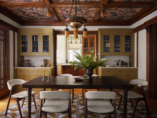
Designer: Sarah Montgomery Interiors
Location: Chicago
Size: 255 square feet (24 square meters)
Homeowners’ request. “Set on a historic street in Logan Square, this brick Foursquare home had been carefully restored — lots of woodwork, stained glass and even its century-old dining room light fixture,” says designer Sarah Montgomery. “Our clients wanted to bring that same richness into their furnishings, creating a design-forward family space that incorporated some modern elements and could also stand up against two young boys and a pooch.”
Special features. Wallpapered ceiling in botanical paper. Built-ins painted in Olivetone by Benjamin Moore. Upper cabinets backed in geometric wallpaper. Vintage dining chairs reupholstered in family-friendly fabric. The light fixtures are antique and original to the home. The millwork is also original.
Designer tip. “Always consider the ceiling as a design element and don’t be afraid of painting built-ins a fun color,” Montgomery says.
“Uh-oh” moment. “There were several design schemes for the dining room that we presented, and to better help the client visualize them, we created 3D renderings,” Montgomery says. “We don’t always do this, but in order to help them select the perfect main feature — the wallpaper — it was necessary. The dining room had so many original features that we were working with that the new elements had to complement those in just the right way.”
Montgomery says she uses Houzz Pro software for project management. “We use the Selections boards to upload our items and send them to our client for an easy approval process and so they have access to all the necessary details,” she says. “We use Houzz Pro for sending proposals. We share their client dashboard so they have easy reference for their boards and documents at all times. We also log out time through Houzz so that our client gets clear invoices breaking down the time spent month-over-month.”
Ceiling wallpaper: Pierre Frey; built-in cabinet wallpaper: Fayce; rug: Oscar Isberian; wall paint: Swiss Coffee, Benjamin Moore; project photography: Dustin Halleck; styling: Sami Wiley
See why you should hire a professional who uses Houzz Pro software