![]()
This article was originally published by a www.houzz.com . Read the Original article here. .
![]()
This article was originally published by a www.houzz.com . Read the Original article here. .
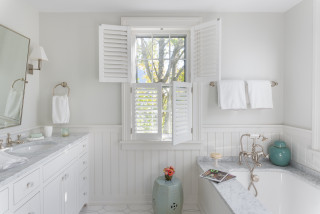
These modern tubs combine elegance with everyday comfort — perfect for a spa-style bathroom or one designed for aging in place. The deck provides support when getting in and out of the tub and offers a built-in surface for bath products and accessories. Custom designs can also showcase beautiful materials such as natural stone, wood and tile. And unlike the massive whirlpool tubs of the past, these streamlined versions don’t take up excessive space or force awkward room layouts.
Browse these 10 tubs with stylishly slim decks and surrounds and gather ideas for your next bathroom project.
This article was originally published by a www.houzz.com . Read the Original article here. .
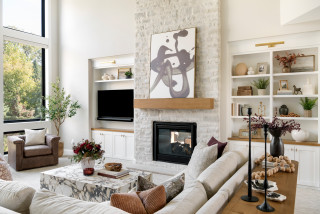
Homeowners’ request. “This was a special request from the clients — they wanted this room to evoke a subtle ‘Mad Men’ vibe,” says designer Janiece Lonvelin. “Not in a literal sense but in a way that felt a bit nostalgic, dramatic, fun and intentional. This room serves as a hangout space for the family, designed primarily for adults, especially with the bar located across the room.”
Special features. “We immediately fell in love with the walnut wall paneling and made it a priority to preserve and thoughtfully incorporate it into the new design,” Lonvelin says. “The existing beams were also kept to maintain character. To ground the space, we selected large-scale floor tile and layered in furnishings that play off one another, ultimately creating a room that feels moody, sexy and full of personality.
“We selected a striking art piece that felt contemporary yet carried a subtle retro influence. The olive sofa was an intentional choice, bringing in color, creating depth and standing out beautifully against the dark wood panelling. We layered in a rich mix of textures through the rug, bouclé chair and leather accent chairs to set the tone for the space. Thoughtful pops of color, along with glass and varied wood tones in the decor, helped tie everything together.”
Designer tip. “When working with dark walls, add contrast and texture in the pieces you bring in to prevent the space from feeling flat,” Lonvelin says. “Mix in different shapes like curved furniture or decor, especially if your room has a lot of squared-off corners. This creates balance, depth and visual interest throughout the space.”
“Uh-oh” moment. “The initial challenge was during the design process and getting the clients on board with the amount of color and texture in the space,” Lonvelin says. “While it wasn’t a lot overall, when you’re working primarily with neutrals, a large olive sofa becomes a significant pop of color. To help, we used 3D renders to showcase the completed look, showing how all colors worked together. This gave them a full sense of the space and helped ease their concerns.”
Wall paint: Swiss Coffee, Benjamin Moore
This article was originally published by a www.houzz.com . Read the Original article here. .
![]()
Designer: Erica Peale Design
Location: Arlington, Virginia
Size: 108 square feet (10 square meters); 9 by 12 feet
Homeowner’s request. “The homeowner wanted a more functional, well-organized space with dedicated storage for laundry and cleaning supplies,” says designer Erica Peale. “Previously, the room lacked proper laundry hampers, causing baskets to pile up on the floor, and there was no storage for linens or cleaning supplies, leaving the space cluttered. Painted a jarring orange, the room felt anything but inviting.”
Peale uses Houzz Pro software to help run her business. “We use Houzz for website hosting, 3D floor planning, project library and client reviews,” she says. “Houzz is an invaluable tool to help with our projects.”
Storage strategies. “Thoughtful design transformed this laundry room into a highly functional and organized space,” Peale says. “Open cubbies were created to house rolling laundry hampers, keeping them accessible yet neatly tucked away. Pullout drying racks add convenience for air-drying garments, while custom cabinetry provides ample storage for cleaning supplies, detergents and household linens. Additional features such as adjustable shelving, a built-in ironing board, concealed waste bins and dedicated folding surfaces ensure everything has a place, making daily laundry tasks more efficient and enjoyable.”
Other special features. “The custom cabinetry was painted in a soft, soothing spa-like blue, (Sherwin-Williams’ Stardew), bringing a calm and refined feel to the space,” Peale says. “Large-format 12-by-18-inch travertine floor tiles ground the room with warmth and texture, while a polished marble 1-inch hexagon backsplash adds a timeless, elevated touch. Floating shelves with brass ceiling-mounted brackets introduce both style and function, complemented by brass cabinet hardware that adds warmth and subtle contrast. A full-size utility sink enhances everyday usability, while Steele Canvas laundry baskets provide an efficient system for separating whites, darks and dry cleaning.”
Designer tip. “A key design approach we recommend is choosing a softer, more restful color palette and prioritizing closed storage to minimize visual clutter,” Peale says. “Layering a mix of textures and varying sheens not only reflects light throughout the space but also creates depth and visual interest, transforming a functional room into one that feels calm, polished and intentional.”
General contractor: Connor Bentley; wall paint: White Dove, Benjamin Moore
25 Home Design Trends Defining How We’ll Live in 2026
This article was originally published by a www.houzz.com . Read the Original article here. .

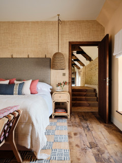
Natural textures are key to this look. Wood, stone, jute, linen and wool will all provide a link to nature and work together to create a fuss-free scheme.
Go for clean-lined furniture shapes for a contemporary take. Choosing unpainted wood that allows the grain to show through and undyed fabrics in natural tones will help to create a tactile and earthy scheme that provides a link to the outdoors all year round.
Smaller elements, such as jute or seagrass baskets, can also help to introduce pleasing texture in a simple way.
This article was originally published by a www.houzz.com . Read the Original article here. .

![]()
Homeowners’ request. “This bathroom is shared by three teenage girls,” says interior designer Victoria Johnson. “The parents reached out wanting to maximize storage and give the space a more elevated, timeless look.”
Shower-tub combo. “The homeowners chose to keep the shower-tub combo primarily for resale value, as families with young children often prefer having a tub,” Johnson says. “Plus, their teenage daughters still enjoy using it. To make the setup more functional, we designed a wall-to-wall niche large enough to hold all their hair products, soaps and razors neatly. We also added a hand shower, which serves both as a spa-like feature and a practical one — it’s perfect for washing their beloved dog.”
Other special features. “Everything in this bathroom was designed around the idea of three — one for each daughter,” Johnson says. “We installed a triple medicine cabinet, which we purchased on Houzz, so each girl has her own section. We also designed a custom recessed cabinet between the studs, again divided into three compartments for individual storage. The custom vanity features a single sink to maximize counter space, a decision that has proven incredibly functional for busy mornings.” The countertop is Taj Mahal quartzite.
Designer tip. “There are three features I absolutely love here,” Johnson says. “First, the wall-to-wall niche. It’s such a simple upgrade that dramatically improves usability, and I’ll likely do this in every project moving forward. Second, medicine cabinets. There are so many beautifully designed options now and the hidden storage they provide is invaluable. Third, when space is tight, adding recessed cabinets between studs is a clever way to gain storage without sacrificing floor space.”
Wall color: Pearly White, Sherwin-Williams
This article was originally published by a www.houzz.com . Read the Original article here. .
Kitchen at a Glance
Who lives here: A couple with a blended family that includes six young adult kids
Location: Shakopee, Minnesota
Size: 238 square feet (22 square meters)
Designers-builders: Steve McDonald and Angela Barnhart of White Birch Design
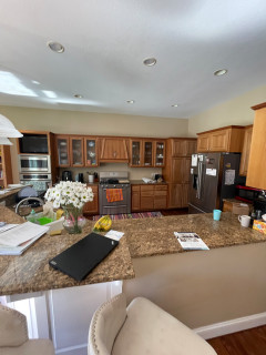
Before: The kitchen’s short cherry cabinets, beige walls and brown granite countertops made the space feel drab and dated. “They just wanted to add cabinets that go to the ceiling and add an island and paint everything, but that wasn’t solving problems for the kitchen itself,” Barnhart says.
The awkward angled peninsula with the sink cut the kitchen off from the family room. “You had to go all the way around the peninsula to get in and out of the kitchen,” Barnhart says. “When you entertain and have a bunch of people there, it becomes very difficult.”
A large stainless steel refrigerator jutted past the cabinetry, and a pair of wall ovens with a TV above them crowded the space even further. The homeowners liked the maple floor but not its dark stain, and they wanted to keep the charm of glass-front cabinets above the range wall in the updated design.
This article was originally published by a www.houzz.com . Read the Original article here. .

As holiday hosting ramps up, so does the value of a dedicated dining room. Beyond providing seating for a meal, a dining room sets the tone, gives hosts room to spread out and draws people together. For inspiration, explore these five refreshed spaces featuring bold wallpaper, layered textures and stylish architectural updates.
Designer: Sarah Montgomery Interiors
Location: Chicago
Size: 255 square feet (24 square meters)
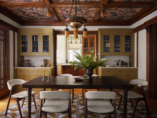
Homeowners’ request. “Set on a historic street in Logan Square, this brick Foursquare home had been carefully restored — lots of woodwork, stained glass and even its century-old dining room light fixture,” says designer Sarah Montgomery. “Our clients wanted to bring that same richness into their furnishings, creating a design-forward family space that incorporated some modern elements and could also stand up against two young boys and a pooch.”
Special features. Wallpapered ceiling in botanical paper. Built-ins painted in Olivetone by Benjamin Moore. Upper cabinets backed in geometric wallpaper. Vintage dining chairs reupholstered in family-friendly fabric. The light fixtures are antique and original to the home. The millwork is also original.
Designer tip. “Always consider the ceiling as a design element and don’t be afraid of painting built-ins a fun color,” Montgomery says.
“Uh-oh” moment. “There were several design schemes for the dining room that we presented, and to better help the client visualize them, we created 3D renderings,” Montgomery says. “We don’t always do this, but in order to help them select the perfect main feature — the wallpaper — it was necessary. The dining room had so many original features that we were working with that the new elements had to complement those in just the right way.”
Montgomery says she uses Houzz Pro software for project management. “We use the Selections boards to upload our items and send them to our client for an easy approval process and so they have access to all the necessary details,” she says. “We use Houzz Pro for sending proposals. We share their client dashboard so they have easy reference for their boards and documents at all times. We also log out time through Houzz so that our client gets clear invoices breaking down the time spent month-over-month.”
Ceiling wallpaper: Pierre Frey; built-in cabinet wallpaper: Fayce; rug: Oscar Isberian; wall paint: Swiss Coffee, Benjamin Moore; project photography: Dustin Halleck; styling: Sami Wiley
See why you should hire a professional who uses Houzz Pro software
Designer: Jeanne Barber of Camden Grace
Location: Berwyn, Pennsylvania
Size: About 200 square feet (19 square meters)
Homeowners’ request. “The dining room opens to the home’s foyer and living room, all with tall ceilings and substantial millwork, making it feel slightly formal,” says designer Jeanne Barber, who uses Houzz Pro software. “We connected the dining room to the living room and entry color palettes by going a little lighter and brighter. The surrounding neighborhood is diverse, with historical stone homes of modest size built by farmers when they cleared land and grander Victorians built by robber barons.”
Special features. “The chair shape was an ode to the farmhouse style, but we wanted it to look more elevated so we found chairs with a pop of blue and faux leather for the seats,” Barber says. “A standout wallpaper was a must, beautifully tying all the hues and textures together. A long dining table was essential because our client’s extended family surrounds her on neighboring streets and they often host family gatherings.” The rug is hand-woven jute in a harlequin pattern.
Designer tip. “Get wallpaper,” Barber says. “It always makes a huge impact in a space and beautifully ties everything together.”
Wallpaper: Coppice in Navy/Lagoon/Gold, Harlequin; dining table: Spencer, Woodbridge Furniture; chairs: Nantucket in Blueberry and Tusk, Redford House; rug: Harwich hand-woven jute, Annie Selke
Find an interior designer on Houzz
Designer: Ashley Frush of Gramophone Design Build
Location: Hunt Valley, Maryland
Size: About 290 square feet (27 square meters); 14 feet, 11 inches by 19 feet, 5 inches
Homeowners’ request. “The clients wanted their dining space to feel connected to the rest of the remodel without exceeding the budget,” says designer Ashley Frush.
Special features. “We chose to highlight the existing octagon tray ceiling — once a design element the homeowners didn’t love — by adding LED tape lighting to modernize and emphasize its geometry,” Frush says. “Below the chair rail, we continued this updated aesthetic by replacing traditional picture frame molding with fluted paneling, achieving texture and interest while avoiding drywall repairs. To tie in the home’s architectural details, we echoed the arch top windows by reshaping the butler’s pantry entries into archways. Finally, we split the existing ceiling rough-ins to accommodate two oversized woven black rattan pendants, adding drama and warmth to the dining area without making the space feel overly formal.”
Designer tip. “Bring balance to a space,” Frush says. “To do that here, we used oversized pendants that visually connect the painted upper walls with the textured fluted paneling below. The archways establish a rhythm of soft repeating forms, while the LED-lit tray ceiling captures attention, turning an awkward shape into an intentional, eye-catching feature.”
Console, table and chairs: Four Hands; rug: Amber Lewis x Loloi; paint color: Pure White, Sherwin-Williams
10 Easy Ways to Refresh Your Guest Room
Designer: Devon Tobin of Duet Design Group
Location: Denver
Size: 215 square feet (20 square meters); 14 feet, 1 inch by 15 feet, 3 inches
Homeowners’ request. “The homeowners wanted a dining room that felt both elegant and approachable — a place for hosting family dinners that didn’t feel overly formal,” says designer Devon Tobin. “The space was dated and lacked warmth. We refreshed the palette, added architectural texture and layered in natural materials to create a setting that felt timeless but livable.”
Special features. “The white plaster fireplace surround brings architectural balance and light to the room, while the exposed beams add warmth and structure,” Tobin says. “The vintage-inspired rug grounds the space with a pattern and a sense of age, complementing the dark-stained chairs and brass chandelier. The wall color is Sherwin-Williams Cotton, a soft neutral that changes beautifully with light throughout the day.”
Designer tip. “When working with traditional architecture, contrast is a key element,” Tobin says. “Pair crisp, pale walls with dark, silhouetted furniture and soft organic textures. It keeps a classic room from feeling predictable.”
“Uh-oh” moment. “The original ceiling height and window placement limited lighting and furniture options,” Tobin says. “Introducing the beams provided a strong horizontal line, giving the chandelier proper scale and transforming a flat ceiling into a design feature.”
Dining table and chairs: Hooker Furniture; chandelier: Visual Comfort
New to home remodeling? Learn the basics
Designer: Lori Withey of Bellisa Design
Location: Dallas
Size: 165 square feet (15 square meters); 11 by 15 feet
Homeowners’ request. “The existing light gray walls and unremarkable window shades called for bold intervention,” says designer Lori Withey. “But what began as a colors and furniture update morphed into a full-on construction project and the selection of standout design features.”
Special features. “A cerused oak dining table with a distinct textured grain is complemented by dark chocolate velvet dining chairs, which have a luxurious sheen and dense soft pile, reflecting light in all directions,” Withey says. “A wallcovering with gold marigolds over a blue-green background offers an enchanting design that injects a vibrant energy into the space. A luminous 12-light chandelier finished in gold leaf features an explosion of quartz crystals that cast shadow patterns across the dark painted ceiling and the patterned wallpaper, creating an additional feature to be enjoyed.”
Designer tip. “Painting or papering a ceiling in a darker color similar to the wall color or wallpaper is a highly effective way to establish a dramatic, moody atmosphere in any space,” Withey says. “Darker ceilings visually envelop a room, amplifying the feeling of intimacy and coziness. This design move blurs the edges between walls and ceiling, making the space feel cohesive.”
Cabinet: West cane cabinet in charcoal brown, Crate and Barrel; chandelier: John-Richard
More on Houzz
Read more stories
Browse photos for ideas
Find home professionals
This article was originally published by a www.houzz.com . Read the Original article here. .
With three kids and busy careers, this young Bedford, Massachusetts, couple needed a space to unwind. Their dated primary bathroom — cramped with a single vanity and an old shower-tub combo — wasn’t cutting it.
Enter design-build pro Jamaal Siddiqui, who uses Houzz Pro software. By borrowing 20 square feet from the bedroom, he carved out space for a spacious double vanity with a dark driftwood finish and a relaxing low-curb shower. Layers of honed marble tile in varying patterns bring subtle elegance, while a soothing neutral palette transforms the room into a calm retreat where the couple can finally exhale.
Before Photo
Bathroom at a Glance
Who lives here: A young couple with three kids
Location: Bedford, Massachusetts
Size: 78 square feet (7.3 square meters)
Design-build pro: Jamaal Siddiqui of Yusra Design + Build
Before: Here’s a peek into the original 58-square-foot primary bathroom from the bedroom. A single-sink vanity hugged the wall behind the bedroom’s desk and makeup station. (See before-and-after floor plans below.) “This wasn’t just a primary bathroom renovation, this was a reconfiguration of the primary suite,” Siddiqui says. “The bathroom was a dark and small space, and one of the solutions was expanding into the bedroom to utilize underused square footage.”
Before Photo
Across from the vanity, a shower-tub combo with a fabric curtain filled the space, while a toilet was tucked into a niche by the bathroom’s only window. “By keeping the toilet in the same location, we were not only able to save costs but keep the privacy for the toilet as you walk into the bathroom,” Siddiqui says.
Siddiqui uses Houzz Pro software to keep projects on track, from selections to scheduling. “We also create ideabooks for all our projects,” he says. “This allows our clients to upload their likes and dislikes. It’s a starting point.”
See why you should hire a professional who uses Houzz Pro software
A neutral palette sets a soothing tone with greige walls (Accessible Beige by Sherwin-Williams), a crisp white ceiling and white trim with a satin finish. Marble mosaic tiles in a fan pattern, honed and with soft white grout, cover the floor. “The homeowner was inspired by a friend’s bathroom we had done in the past,” Siddiqui says. “Marble can sometimes come off as cold. Introducing softer geometry with the fan pattern helped to balance the feel of the space.” The floor is framed in 12-by-24-inch marble tiles, cut to size, for a polished finish.
The existing window keeps the space bright and airy, while a new low-profile, energy-efficient exhaust fan improves ventilation. Four-inch LED recessed lights in the ceiling provide clean, even illumination throughout.
Floor tile: Dolomite Iceberg Blended Fan marble mosaic, Maravilla, Floor & Decor
Find a home professional on Houzz
Before Photo
Before: A blank wall once sat to the right of the bathroom door. “The reconfiguration of the bathroom was really determined by the rest of the suite as well,” Siddiqui says. “We wanted to have the bathroom door and closet door in the bedroom opposite each other. Relocating the sink from that wall allowed us to move the bathroom door.”
Above, a pair of 18-by-30-inch mirrors have handcrafted beveled frames with champagne-colored beading, adding visual interest and depth. A towel ring between the mirrors keeps hand towels off the counter. Two ceiling-mounted dome pendant lights with opal etched glass and a brushed nickel finish illuminate the vanity. “One of the things we really gave a lot of thought about was how much space would be on the wall itself,” Siddiqui says. “The size of the mirrors didn’t allow us for a lot of wall space. By changing it up and installing ceiling-mounted pendant lights, it made it unique and also gave the homeowners the artificial light they need at the vanity.”
Pendant lights: Maybery in brushed nickel and opal etched glass, Birch Lane
Before and After: 4 Brilliant Bathrooms Under 60 Square Feet
The shower itself is designed for luxury, with a 12-inch ceiling-mounted shower head, wall-mounted shower head, three body sprays and a pressure-balanced valve, all in brushed nickel.
New to home remodeling? Learn the basics
Originally, a single-sink vanity hugged the wall by the bathroom door, with a shower-tub combo across from it, next to the toilet.
In the updated plan, the bathroom footprint was pushed into the primary bedroom, making room for a low-curb shower and a spacious double vanity relocated to a new wall. “By reconfiguring the space, we were able to optimize storage,” Siddiqui says. “It doesn’t always have to be an addition or something extreme. Rethinking the space can allow you to come up with a solution.”
More on Houzz
Read more stories
Browse photos for ideas
Find a home professional
This article was originally published by a www.houzz.com . Read the Original article here. .

Llogarajah, using Houzz Pro, addressed the look of the space and tweaked the layout to create a more family-friendly environment. And thanks to some thoughtful and sustainably minded choices, it was all done on a tight budget. Check out the before-and-after photos below.
This article was originally published by a www.houzz.com . Read the Original article here. .

Designers: Jeanie Engelbach and Ryan Romanowski of apartmentjeanie
Location: New York City
Size: 168 square feet (16 square meters); 12 by 14 feet
Homeowners’ request. “When the homeowners purchased this apartment, it was a complete white box, devoid of color, warmth and vibrancy,” says designer Jeanie Engelbach. “The dining area, and the rest of the open floor plan, did not accurately reflect our clients’ edgy, energetic and gothic yet glam aesthetic. As self-identified homebodies who love to entertain, they wanted a space that felt like them and was inviting to their guests. Having worked with them previously, we knew they trusted our instincts and ability to integrate their style and passions into the overall design concept and weren’t at all shocked when we suggested we use our client’s bright magenta-colored hair and black wardrobe as the inspiration.”
Special features. “To bring this vision to life, we fully committed to color drenching the entire open-floor living and dining room in a rich aubergine — Benjamin Moore Plum Royale — that transformed the space from generic white box to something far more regal and cinematic,” Engelbach says. “We carried the graphic metallic Art Deco-inspired wallpaper from the living room as a frieze to add contrast and structure, while the warm walnut custom-built bar and matching record stand introduces depth and acts as visual divider from living to dining area.
“The bar’s mirrored backsplash reflects light and creates an illusion of multiple windows. We inherited the polished live-edge dining table with lucite base from the apartment’s previous owner, then softened the room with curved velvet chairs that play off the plum tones. The chairs’ matte black steel tube frame anchors the hand-knotted wool rug in black with streaks of white . The dramatic Italian cascading crystal beaded chandelier brings movement and glamour.”
Designer tip. “When working with an open-floor-plan living space, it’s important to delineate designated areas within the larger floor plan,” Engelbach says. “However, implementing one consistent decorative element throughout — in this case, the paint and wallpaper — creates a sense of cohesion and continuity.”
Wallpaper: Art Deco Glamour, Spoonflower; chairs: Inesse in Iced Blue velvet, CB2
More on Houzz
Read more stories
Browse photos for ideas
Find home professionals