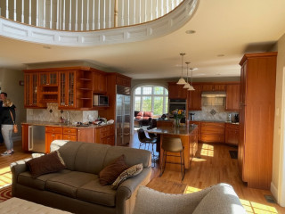
Before Photo
This article was originally published by a www.houzz.com . Read the Original article here. .

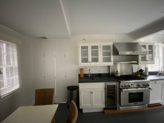
Before Photo
This article was originally published by a www.houzz.com . Read the Original article here. .

Before Photo
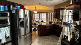
Kitchen at a Glance
Who lives here: A retired couple
Location: Alameda, California
Size: 285 square feet (26 square meters)
Designer: William Adams Design
Before: The former 165-square-foot kitchen felt dated and inefficient with aging gray cabinets, mismatched white and black appliances, wood-look vinyl flooring and no island. A corner sink beneath two front-yard-facing windows anchored the layout. “I just felt like that corner sink was dated,” Adams says. “It also took up so much space by the way it was positioned.”
Without an island, storage and prep space were limited and the center of the room felt like wasted territory. An eating area with a large fireplace sat just off the kitchen. “Having that giant fireplace inside the kitchen made no sense at all,” Adams says.
White ceramic tile with dark grout wrapped the countertops and backsplash, creating a dingy look and maintenance the couple didn’t want. Lighting was also a problem: A single ceiling fixture plus a couple of fluorescent task lights left the space poorly illuminated. “The lack of light was not conducive for working in the kitchen or doing everyday tasks,” Adams says. “They enjoy cooking and entertaining and there wasn’t enough space in that footprint to contain what they needed. The cleanliness with those countertops was also an issue.”
This article was originally published by a www.houzz.com . Read the Original article here. .

They hired contractor Arent Wortel and designer Joel Fraley for the project. Wortel focused on making the room structurally sound, while Fraley worked closely with the homeowners to create a bold, memorable look. “These clients are very outgoing and love bold style,” Fraley says.
This article was originally published by a www.houzz.com . Read the Original article here. .
![]()
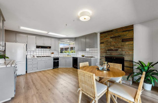
Kitchen at a Glance
Who lives here: A couple
Location: South Minneapolis, Minnesota
Size: 225 square feet (21 square meters)
Design-build firm: Bluestem Remodeling
The kitchen features custom Shaker-style cabinets in a mix of black and wood units. Polished gold-tone knobs and pulls add refined accents. “The clients were really interested in not having a monolithic look with their cabinetry,” says Mark Ferraro-Hauck, director of design at Bluestem Remodeling. “I love the repeated black throughout the room, but it’s not a black kitchen.”
Wide-plank white oak flooring has a special sealer that preserves its natural, unfinished appearance. “It integrates really well with the rest of the house, giving it a consistent flow,” Ferraro-Hauck says. “We didn’t want the kitchen to feel completely separate from the rest of the house.”
A large sliding glass door opens the kitchen to the patio and backyard. “Their backyard is their summer living room,” Ferraro-Hauck says. A double-hung window on the same wall adds another source of daylight and fresh air.
Custom cabinetry: Sean’s Cabinetry
Find kitchen remodelers on Houzz
This article was originally published by a www.houzz.com . Read the Original article here. .

After: Reesey removed the fridge wall and flipped the locations of the kitchen and dining area, adding a 5-foot bump-out along the way. (For orientation, check out the white door in both photos; it leads to an outdoor walkway and stayed in the same place.) These moves more than doubled the size of the kitchen, to 313 square feet, and allowed for expansive storage, better flow and a pleasing openness.
Three kinds of wood bring warmth without feeling one-note: milled pine on the ceiling beams, maple on the island base and oak for the flooring. The dining furniture and a band on the range hood complement the other wood elements, while green cabinets (painted in Dried Thyme by Sherwin-Williams) and white walls, countertops and backsplash tile balance the color palette. Texture and movement come from the wood graining and the backsplash tiles’ scallop shapes.
Paint colors: Dried Thyme, Sherwin-Williams (cabinets); Wind’s Breath, Benjamin Moore (walls); Super White, Benjamin Moore (trim)
Read more about this project
This article was originally published by a www.houzz.com . Read the Original article here. .

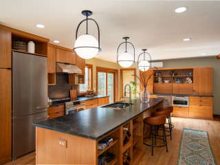
Kitchen at a Glance
Who lives here: A couple
Location: Duanesburg, New York
Size: 275 square feet (26 square meters)
Design-build pro: Marianne A. Clifford of Marianne Ashley Designs
Clifford removed the old appliances, cabinets, counters and floor, along with the two-level island, making way for a more than 12-foot-wide, one-level island with seating and storage. “It offers a lot more options on how the island can be used,” she says. The new layout improves sightlines and makes the kitchen feel open and inviting.
The island base and perimeter cabinets are semicustom cherry flat-panels with a natural finish and matte black ledge pulls. “A lot of the woodwork in their home was already cherry, so we wanted to create a unified look,” Clifford says.
The upgraded stainless steel refrigerator stayed in place, while an added open upper cabinet and tall pantry on the side expand storage. “There are hooks inside that pantry cabinet for hanging a step stool and broom,” Clifford says.
Modern counter stools with cognac leather upholstery and curved low backs sit at the island, while contemporary pendant lights with etched opal glass shades and matte black frames hang overhead. The ceiling has new LED recessed lights on dimmers. “This gives them full control,” Clifford says.
Pendant lights: Somerset, Hinkley Lighting; stools: Zion, Ballard Designs
Find kitchen remodelers near you
This article was originally published by a www.houzz.com . Read the Original article here. .

After: The design team stripped the kitchen down to just two keepers: the red oak flooring and the beverage fridge. It replaced everything else with custom perimeter cabinets in a soft blue-gray specially matched to Benjamin Moore’s Boothbay Gray, a nod to the wife’s Maine roots. Depending on the light, the cabinets can read more blue or more gray, giving the space subtle, shifting depth.
A new paneled refrigerator flanked by pantry storage and matching cabinets creates a seamless, symmetrical wall that’s both beautiful and practical. The wet bar got its own spotlight, ideal for entertaining.
This article was originally published by a www.houzz.com . Read the Original article here. .

After: The kitchen retains its original footprint, but custom inset cabinets in a smoky blue-gray (De Nimes by Farrow & Ball), paired with boldly veined marble countertops and backsplash, create a striking design statement. The floor, stained gray, grounds the space with subtle sophistication.
McQuaide wrapped the ceiling beam in reclaimed oak and flanked the matte plaster hood with matching wood shelves, adding warmth and texture. Playful nods to the island’s maritime past infuse character throughout the home, including a charming “porthole” on the galley door — actually a convex antique mirror wrapped in leather.
This article was originally published by a www.houzz.com . Read the Original article here. .

![]()
After: The kitchen retains its original footprint, but custom inset cabinets in a smoky blue-gray (De Nimes by Farrow & Ball), paired with boldly veined marble countertops and backsplash, create a striking design statement. The floor, stained gray, grounds the space with subtle sophistication.
McQuaide wrapped the ceiling beam in reclaimed oak and flanked the matte plaster hood with matching wood shelves, adding warmth and texture. Playful nods to the island’s maritime past infuse character throughout the home, including a charming “porthole” on the galley door — actually a convex antique mirror wrapped in leather.
This article was originally published by a www.houzz.com . Read the Original article here. .

Kitchen at a Glance
Who lives here: A couple with two kids — one in college and one still at home — and a labradoodle
Location: Richardson, Texas
Size: 430 square feet (40 square meters)
Designer: Tara Lenney Design
Before: The dreary, chopped-up, 310-square-foot kitchen had dark oak-stained cabinetry, granite countertops in brown, tan and black, and a beige ceramic tile floor. It also had what Lenney describes as “the world’s weirdest shape.” A black electric cooktop sat on an angled wall to the right, while a stainless steel double-bowl sink was positioned beneath two windows. (Take note of the window near the sink to help orient the view in the following “after” photo.)
A large stainless steel refrigerator protruded past surrounding cabinetry along a wall backed by a centrally located laundry room (see the before-and-after floor plans below) and was squeezed next to a pair of wall ovens. The laundry room further divided the kitchen from the closed-off dining room and sunken living room.
In the background, a short peninsula cut the kitchen off from the breakfast area and a den. “It was very uninviting,” Lenney says. “Everything was spread out in weird locations. It was also like a hallway. You’re trying to get your cooking done and there are literally people walking through your cooking area. If you were in the kitchen, you couldn’t be where anyone else was because of the layout.”
Find a kitchen designer on Houzz