This article was originally published by a www.houzz.com . Read the Original article here. .

Designer: Danielle Barzilay Dahan of RnD Builders
Location: Woodland Hills, California
Size: 560 square feet (52 square meters); 20 by 28 feet
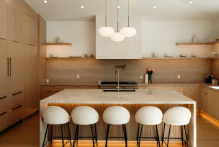
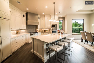
Homeowners’ request. “The homeowners envisioned a clean, modern and highly functional kitchen that would feel warm, bright and timeless,” designer Danielle Barzilay Dahan says. “Their previous kitchen felt cramped and dark, with insufficient storage and no clear flow. To solve these issues, we focused on seamless built-in cabinetry, maximizing storage, and a neutral, calming palette that blends effortlessly with the home’s open-plan layout. The goal was to create a space that’s both beautiful for entertaining and practical for everyday family life.”
Wood cabinets and details. “We chose to use natural white oak cabinetry throughout the kitchen to achieve a soft, modern warmth,” Dahan says. “The wood adds texture and depth without overwhelming the space. This material was used for the tall pantry wall, lower cabinetry, integrated fridge panels and even open shelving.
“Rather than painted cabinetry, natural wood gives a timeless and organic feel that aligns with the overall minimalist vision. Integrated handles keep the lines clean and uninterrupted. Matching white oak floors add continuity and warmth. White oak floating shelves above the countertop display minimal, neutral-toned ceramics.”
Dahan says she uses Houzz Pro software to “manage projects, communicate with clients and create visual ideation boards. For this kitchen, the Mood Boards and 3D visual tools helped the homeowners visualize the final outcome. Houzz Pro also streamlined budgeting, timeline tracking and updates, keeping the clients informed and engaged at every step.”
Other special features. “To complement the wood, we used a light-toned quartz countertop and backsplash, soft white walls and matte black and brass accents that ground the space and add sophistication,” Dahan says. “Undercabinet and toe kick lighting adds a soft glow and enhances the clean lines of the cabinetry.”
Designer tip. “Use integrated LED lighting under cabinets and toe kicks to elevate the space,” Dahan says. This simple touch adds depth and luxury while improving functionality, especially in the evenings.”
“Uh-oh” moment. “During the planning phase, we realized the original placement of the island didn’t allow for comfortable circulation,” Dahan says. “Moving the island required relocating plumbing lines — something that wasn’t planned for. It created delays and unexpected costs, but by staying flexible and working closely with the contractor we adjusted the layout and maintained the clean design intent without compromise.”
See why you should hire a professional who uses Houzz Pro software
This article was originally published by a www.houzz.com . Read the Original article here. .
In the kitchen, the designer focused on how the homeowners like to work and live. She created an efficient layout with a large island, a dedicated baking station and ample display space for personal collections. “My clients wanted to make the kitchen more functional for their family, create an open feel and bring in lots of natural light,” Mancera says.
This article was originally published by a www.houzz.com . Read the Original article here. .

With three energetic boys, these Georgia homeowners wanted a more open, functional layout to replace their aging kitchen and closed-off dining room. The husband, a skilled general contractor, was comfortable doing the construction work; the wife had plenty of creative ideas. But the couple needed help turning their vision into a workable plan, designing the right layout to fit their busy lifestyle and choosing stylish finishes.
They brought in designer Rosa Moreno and, after several revisions, the team removed a dividing wall and pushed the kitchen into the former breakfast area, adding 72 square feet. The new layout made space for a larger island with seating and storage. A muted green for the island contrasts nicely with soft white perimeter cabinets. White oak floors and warm wood accents add inviting texture, while marble-look quartz counters and a herringbone porcelain tile backsplash polish the earthy, transitional design.
Before Photo
Kitchen at a Glance
Who lives here: A family of five
Location: Norcross, Georgia
Size: 242 square feet (22 square meters)
Designer: Rosa Moreno Kitchens
Builder: Atlanta Renovations and Construction
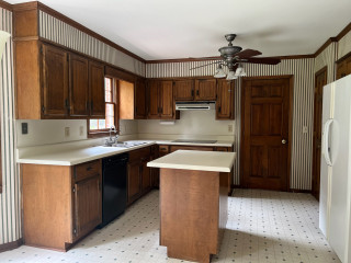
Before: This photo of the former kitchen was taken from the breakfast area. The dated 170-square-foot space had striped wallpaper, a soffit, mismatched standard appliances, dark brown cabinets, laminate counters, a ceiling fan and vinyl flooring. “There was a lot of wood and it was so heavy,” Moreno says. “The white fridge sticking out was a problem too. I knew we definitely could do a lot better.”
On the left, a drop-in double-bowl sink sat beneath a window that the homeowners were open to removing to improve the layout and storage. The fridge wall separated the kitchen from the dining room, making the kitchen and its small island feel cramped. “But by removing that wall, we were getting rid of storage,” Moreno says. “So that was the big question on how things would work.”
The door seen at the back opened to a hallway leading to the living room. In that hallway was a powder room and door to the basement. A door to a closet is just out of view on the fridge wall. “There were so many doors that we had to deal with,” Moreno says.
She also took down the wall between the kitchen and dining room, expanding the kitchen into the former breakfast nook, adding 72 square feet and dramatically improving flow. The extra space allowed for a larger custom island, which is painted a muted, organic green with soft gray undertones. “It’s a really pretty neutral green that’s warm at the same time,” Moreno says. “I like to ground a space so everything isn’t so white. Plus, her favorite color is green. It took time to find the right green, and we went with this neutral one because it’s transitional but also modern.” Soft white custom inset cabinetry along the perimeter brightens the room and contrasts gently with the island. Satin bronze hardware adds a rich, polished touch to both.
Moreno placed the new farmhouse-style sink in the island and placed the new range where the sink used to be. She moved the refrigerator to the cooktop’s former spot, resulting in a smarter, safer layout. “I’m not a big fan of putting the range in the island, especially when you have little kids,” Moreno says. “Removing that sink window allowed us to put the range there with the hood as a focal point. She was afraid of losing the light from that window, but now we’re getting light from the front of the house by removing that wall.”
Paint colors: Alabaster (perimeter cabinets), Drift of Mist (walls), Pure White (ceiling and trim), Shade-Grown (island), Sherwin-Williams
Find kitchen remodelers near you
Above the island, a pair of 16-inch brushed brass bell-shaped pendant lights with clear glass shades add a stylish detail. LED ceiling lights provide general illumination, while undercabinet lighting brightens key task areas.
Pendant lights: Newton Bell in brushed brass, Innovations Lighting
Shop for your kitchen
A custom paint-grade wood hood with a white oak accent band is painted to match the perimeter cabinetry. A powerful hood insert helps prevent smoke and odors from drifting into nearby spaces. The backsplash consists of 2-by-6-inch white porcelain tiles laid in a herringbone pattern; the tiles have subtle tone variations, a glossy finish and frost white grout. “Everything is very neutral here, so bringing that texture there on the backsplash was important,” Moreno says. “It doesn’t stick out but brings another element into the space. Something I also like about that tile is the glossy finish that reflects the light.”
Range: 36-inch smart commercial-style, gas with six burners, KitchenAid
Pros Share the 8 Biggest Kitchen Remodeling Mistakes
Refrigerator: KitchenAid
25 Genius Kitchen Storage Ideas
Before Photo
Before: Here’s a closer look at the wall that divided the kitchen and dining room (visible through the doorway at right). The white refrigerator seen in the earlier “before” photo sat in the empty cabinet frame. To the left of a pair of aging white wall ovens stood a door leading to the previously mentioned closet. “It was a load-bearing wall,” Moreno says, “so we had to put in a beam.”
The interior side of the island features a streamlined setup with the pullout trash and recycling center on the left, a classic white farmhouse sink with a dedicated base cabinet in the center and a quiet, top-control stainless steel dishwasher completing the lineup.
Dishwasher: KitchenAid
9 Ways to Save Money on Kitchen Cabinets
Sink: Whitehaven, Kohler; faucet: Odin in Brilliance Luxe Gold, Brizo
New to home remodeling? Learn the basics
At the back right of the photo is the home’s updated staircase to the second floor. “We removed another piece of wall there to make the staircase area more open,” Moreno says.
10 Common Kitchen Layout Mistakes and How to Avoid Them
“I’m most proud that they trusted me and listened to my advice,” Moreno says. “Before, the kitchen was so dark you couldn’t wait to get out. Now they can entertain family and friends and be all together.”
More on Houzz
Read more kitchen stories
Browse kitchen photos
Hire a kitchen remodeler
Shop for kitchen products
This article was originally published by a www.houzz.com . Read the Original article here. .
Tile: Watercolors picket in O’Keefe by Lunada Bay; chandelier: Royyo
Read more about this project
This article was originally published by a www.houzz.com . Read the Original article here. .
Roos took over a mudroom to expand the kitchen, adding 45 square feet and freeing up room for an island with seating. A nifty rolling baking cart can tuck away into the island. The walnut island coordinates with a focal point range hood and red oak flooring to add warmth to the light gray perimeter cabinets and white tile. A colorful handmade backsplash design over the range punches up the space with playful personality.
This article was originally published by a www.houzz.com . Read the Original article here. .

The cushions and artwork, in shades of blue, green and orange, bring dynamic color to the space, adding personality.
Sustainability is always a key consideration in Llogarajah’s projects. “Several existing elements were carefully integrated into the new design,” she says. Along with all the kitchen appliances and the sink, her design also incorporated the owner’s existing dining table and chairs to minimize waste.
“The design is tailored to seamlessly incorporate [all] these pieces, meaning the reused items feel intentional, as though they were always part of the overall scheme,” she says.
This article was originally published by a www.houzz.com . Read the Original article here. .
![]()
Designer: Carlos Nyce of TriVistaUSA Design + Build
Location: Arlington, Virginia
Size: 168 square feet (16 square meters); 11 feet, 8 inches by 14 feet, 5 inches
Homeowners’ request. “The client came to us seeking to improve their home layout, with one of the main goals being to enhance the flow for better entertainment space,” designer Carlos Nyce says. “They desired an open, functional kitchen layout, but the existing space didn’t allow for that. As part of our architectural design proposal, we suggested relocating the kitchen to the opposite side of the house, where more space was available. This change allowed us to reconfigure the kitchen, adding a highly functional island and additional storage. The client’s aesthetic preferences leaned toward clean lines, bright, warm wood tones, with touches of industrial style and a bit of glam.”
Wood cabinets. Natural maple wood cabinets in a matte finish. “They wanted their kitchen to feel bright, warm and cozy, while also introducing some industrial elements for contrast,” Nyce says. “We worked with the concept of using a lighter tone around the perimeter, paired with darker accents on the island, hardware and other details. The house facade featured black-painted brick, and [the homeowners] were keen on incorporating this dark color into the interior details. By integrating natural maple matte wood cabinets along the perimeter with a white brick-look tile backsplash, we achieved the perfect balance of cozy and industrial. The island, painted in Sherwin-Williams Tricorn Black, stands out against the lighter backdrop and provides just the right amount of darkness they were looking for.”
Other special features. Marble-look quartz countertops.
Designer tip. “Balance is key,” Nyce says. “To achieve the perfect look, you first need a clear reference for where you want your design to go. If you’re blending multiple styles, the key is always balance — incorporating textures, colors, materials and elements in the right proportions so the space feels harmonious.”
Find kitchen remodelers near you
This article was originally published by a www.houzz.com . Read the Original article here. .

Parents of three now-grown sons, the couple were finally ready to make serious changes. They hired designer Jodi Swartz to help improve both function and style. While the overall layout stayed mostly the same, two-tone custom cabinets in a classic white for the perimeter and a robin’s-egg blue for the expansive island give the kitchen a fresh look. A dual-fuel range in a soft shade of blue and blue backsplash tiles complement the island. Touches of black add dramatic contrast. Elegant marble countertops, warm oak flooring and a cozy seating area near a fireplace elevate the kitchen with timeless appeal.
This article was originally published by a www.houzz.com . Read the Original article here. .
A blue glass pendant light that previously hung in the breakfast area inspired the new look and balances all the clean lines with its vintage silhouette. Artwork and backsplash tiles in shades of blue and green complement the pendant and play nicely with cherry cabinets. The cabinets are a flat-panel style with horizontal pulls, conveying a midcentury vibe.
This photo was taken from where the fridge is in the next photo.
Backsplash tile: Natural Hues collection in Rain, Ireland and Starlight, Daltile; cabinets: Seaside in natural cherry, Tedd Wood
This article was originally published by a www.houzz.com . Read the Original article here. .

The designers also switched up the layout, including moving the fridge to the other side of the kitchen to make room for a pantry cabinet. And of course, the new sink faucet is perfectly centered under the window.
Backsplash and island top: Lilac marble, Integrated Resources Group; stools: Henry, Hedge House Furniture; seat fabric: Dot, Dot, Dot… in Vintage Blue, Perennials Fabrics; faucet: Odin in matte black, Brizo
Read more about this project