After: The large skylight brings a better quality of light into the room. Doing away with the slanted glazing has also freed up more wall space for a bigger cabinet.
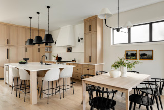
While Clarke-Bishop has reduced the amount of black in the room, she’s also banished most of the white to make the kitchen feel warmer and more inviting.
“At first we were trying to do a pink kitchen, but we couldn’t find a shade that would work in this light — everything either looked too sugary or too dirty,” she says. They settled on a very pale but warm gray.
The walls, meanwhile, are a subtle pinkish-white. “It brings warmth into the room without being an overt color,” Clarke-Bishop says.
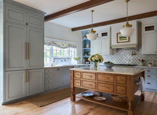
The client loves black, so Clarke-Bishop has retained some, designing a black island that echoes the existing range. The island is on legs. “It not being solid allows more light to come through and gives it a bit more airiness,” she says.
The island isn’t huge — 64½ inches long by 35½ inches wide by 32 inches deep — but it’s perfect for the homeowners. “They really didn’t want any appliances in the island. They wanted it to be a standalone” countertop, Clarke-Bishop says. “It’s become a real focal point of the kitchen — everyone stands around it chatting.”
The legs are a modern take on a Victorian turned leg. “I researched lots of Victorian table legs to find a good combination of the detail they needed to add a bit of something to the space without it being overly ornate, because everything’s quite simple and calm in the room,” Clarke-Bishop says.
The countertop is Arabescato marble, which has a hint of pink in it. The remaining countertops are a simple, lightly marbled quartz, “just to allow the island to have a shining moment.”
The refrigerator sits behind the far-left door, with a pantry in the right-hand tall cabinet.
Cabinet paint: Strong White; island paint: Pitch Black, both Farrow & Ball; wall paint: Rose Tinted White, Edward Bulmer


Kitchen at a Glance
Who lives here: A couple and their child
Location: Calgary, Alberta
Size: 192 square feet (18 square meters); 12 by 16 feet
Designer: Megan Stimpson of Alykhan Velji Designs
Builder: Sukhman Mahal of Bright Custom Homes
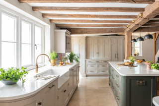
The design came together in a somewhat unconventional way. Sukhman Mahal, co-owner of Bright Custom Homes, began the build as a spec house. The design process with Stimpson was well underway before the family bought the home. “From the beginning, we wanted transitional style that would be timeless and have wide appeal,” Stimpson says. “The layout of the space is long and quite narrow. We used the same wood tones and wall paint within the open floor plan to keep things simple, bright, neutral and cohesive.”
Because construction was still in progress when the house sold, the new owners had the opportunity to tweak the finishes to suit their personalities. The room already had white oak cabinetry, off-white quartz countertops and antique oak engineered flooring. However, they were able to change the backsplash, lighting, faucet and cabinet hardware selections.
Wall color: White Dove, Benjamin Moore; flooring: 7½ -inch Wildwood Antique Oak planks in Istanbul, Magna Hardwood Floors
Find a builder on Houzz