![]()
This article was originally published by a www.houzz.com . Read the Original article here. .
![]()
This article was originally published by a www.houzz.com . Read the Original article here. .
![]()
Designer: Heather Safferstone of Safferstone Interiors
Location: Merion Station, Pennsylvania
Size: 252 square feet (23 square meters); 10½ by 24 feet
Homeowners’ request. “The client purchased a historic home with beautiful architectural bones, but the existing kitchen was tucked into an oddly angled room at the side of the house,” says designer Heather Safferstone. “It felt disconnected from the way the family actually lived, cooked, gathered and hosted. As part of a large-scale, two-story renovation, the homeowners added a generous new kitchen adjacent to a large family room, along with a breakfast room, full bath, home office and a new primary suite above. The goal was to create a kitchen that felt deeply connected to the home’s traditional character while supporting the rhythm of modern family life.”
Green cabinets. Pewter Green by Sherwin-Williams. “The client and I loved the idea of a green kitchen from the beginning, but her husband was initially a bit hesitant,” Safferstone says. “Like many homeowners, they had that familiar ‘What is best for resale?’ moment, so we originally considered a more classic off-white kitchen. The turning point came from the adjacent family room. We selected a dark green velvet for two sofas, and once they were delivered, the clients saw how beautifully that depth of color grounded the space. It gave them the confidence to carry green into the kitchen in a much more committed way. Rather than limiting the color to the island, we used Pewter Green on the perimeter cabinetry and introduced a walnut island at the center of the room. The walnut adds warmth and keeps the kitchen feeling collected rather than overly matched.”
Other special features. Mont Blanc quartzite perimeter countertops and backsplash. Soapstone island countertop. Warm brass details. “Because the clients keep a kosher kitchen and frequently host large Shabbat dinners and holiday celebrations for family and community, function was essential,” Safferstone says. “They needed ample prep space, thoughtful storage, durable materials and a layout that could support serious cooking and entertaining with ease. A large island became one of the key solutions, providing generous prep space, additional storage, two dishwashers and two trash pullouts flanking the sink for convenience during cooking and cleanup.”
Designer tip. “Worry less about resale and be willing to design for yourself,” Safferstone says. “Find your design muse within the project and run with it. Maybe it’s an architectural element within the home you want to tie into or, in this case, the color of the sofa in the next room.”
Stools: Poly & Bark; pendant lights: Hendricks small, Ralph Lauren, Visual Comfort; project photography: Rebecca McAlpin; styling: Gabrielle Langdon
Find an interior designer on Houzz
This article was originally published by a www.houzz.com . Read the Original article here. .
![]()
After extending the original tiny kitchen, the owners asked Nick Street of Sylvarna Kitchen Design to create Shaker-style cabinetry. He used several tricks to make the space feel bigger, including raising the island on legs, opening up the area above the range cooker, and installing white countertops to reflect the light. “We came out of it with something that was actually better than what they were originally looking for,” Street says.
This article was originally published by a www.houzz.com . Read the Original article here. .
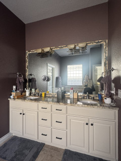
Bathroom at a Glance
Who lives here: A couple
Location: Denver
Size: 200 square feet (19 square meters)
Designer: Rachel Ogburn of Rowe Interior Design
Before: The existing double vanity was in good shape, but the homeowners wanted to replace the oval sinks and brown granite countertop. “We repainted the cabinetry when we did the rest of the home in 2024,” Ogburn says. “It used to be yellow oak cabinets and we did it in Accessible Beige (by Sherwin-Williams). We also updated the hardware then.”
A large framed mirror made the rectangular vanity feel boxy. “It also didn’t utilize the very tall ceilings they had in there,” Ogburn says. “The mirror made it feel squatty.” Deep aubergine walls paired with dated finishes added visual weight, while oversize beige floor tiles meant to mimic stone fell flat. “They almost permanently looked muddy,” Ogburn says. “Also, the installation was just square-on-square.”
The walk-in shower to the right of the vanity continued the beige-on-beige look with more tile and outdated fixtures.
This article was originally published by a www.houzz.com . Read the Original article here. .

They hired contractor Arent Wortel and designer Joel Fraley for the project. Wortel focused on making the room structurally sound, while Fraley worked closely with the homeowners to create a bold, memorable look. “These clients are very outgoing and love bold style,” Fraley says.
This article was originally published by a www.houzz.com . Read the Original article here. .

After: Reesey removed the fridge wall and flipped the locations of the kitchen and dining area, adding a 5-foot bump-out along the way. (For orientation, check out the white door in both photos; it leads to an outdoor walkway and stayed in the same place.) These moves more than doubled the size of the kitchen, to 313 square feet, and allowed for expansive storage, better flow and a pleasing openness.
Three kinds of wood bring warmth without feeling one-note: milled pine on the ceiling beams, maple on the island base and oak for the flooring. The dining furniture and a band on the range hood complement the other wood elements, while green cabinets (painted in Dried Thyme by Sherwin-Williams) and white walls, countertops and backsplash tile balance the color palette. Texture and movement come from the wood graining and the backsplash tiles’ scallop shapes.
Paint colors: Dried Thyme, Sherwin-Williams (cabinets); Wind’s Breath, Benjamin Moore (walls); Super White, Benjamin Moore (trim)
Read more about this project
This article was originally published by a www.houzz.com . Read the Original article here. .
“They thought they’d be able to work with their existing deck, but we couldn’t in good conscience tell them that it was worth fixing up,” he says. “In order to give them a well-designed deck and some usable lounge space they desired beneath it, we let them know that replacing that deck would be best.” By the time the project was done, they’d also added a fire table area and a putting green for family fun.
This article was originally published by a www.houzz.com . Read the Original article here. .
“The client really liked that this tile looked lived-in from the start, because they didn’t want to be concerned about it not looking pristine all of the time,” she says. They also chose unlacquered brass for the perimeter cabinet hardware and lighting “to lean into that patinaed look,” she says.
The previous layout of the major appliances worked well, so Flake was able to save on costs by keeping them in the same locations. Above the new JennAir gas range is a custom hood wrapped in red oak with a gray granite trim, both of which match the new island, which is in the foreground of the photo. The perimeter cabinetry now stretches to meet the 10-foot ceiling, emphasizing its height and updating its look.
Paint colors: Green Earth (perimeter cabinets), Alabaster (walls), Accessible Beige (trim), Sherwin-Williams
Perimeter countertops: Calacatta Lavasa quartz, MSI; island countertop: Silver Gray leathered granite
This article was originally published by a www.houzz.com . Read the Original article here. .
![]()
Before Photo
Kitchen at a Glance
Who lives here: A family of five
Location: Wakefield, Massachusetts
Size: 159 square feet (15 square meters), plus a mudroom and bar area of 231 square feet (21 square meters)
Designer: Amanda Colosi Johnson of McGuire + Co. Kitchen & Bath
Before: The U-shaped layout worked for the family, but the dated finishes needed an update. The dark brown and cottage green cabinetry, along with vinyl tile flooring and standard appliances, had run their course. “This couple is a lot of fun and not afraid of color, pattern and texture,” Colosi Johnson says. “That’s why the homeowners painted those cabinets themselves that cottage green.”
A large refrigerator on the right jutted out from the cabinetry. A peninsula with two backless stools and hard-to-reach drawers separated the kitchen from the bar and mudroom area. The door on the near left leads to a sun porch, while the back doorway opens to a hall with a powder room. “We pursued looking into options on how we could change up the layout, but it didn’t make sense to do that,” Colosi Johnson says. “We wanted to problem-solve.”
This article was originally published by a www.houzz.com . Read the Original article here. .

With three energetic boys, these Georgia homeowners wanted a more open, functional layout to replace their aging kitchen and closed-off dining room. The husband, a skilled general contractor, was comfortable doing the construction work; the wife had plenty of creative ideas. But the couple needed help turning their vision into a workable plan, designing the right layout to fit their busy lifestyle and choosing stylish finishes.
They brought in designer Rosa Moreno and, after several revisions, the team removed a dividing wall and pushed the kitchen into the former breakfast area, adding 72 square feet. The new layout made space for a larger island with seating and storage. A muted green for the island contrasts nicely with soft white perimeter cabinets. White oak floors and warm wood accents add inviting texture, while marble-look quartz counters and a herringbone porcelain tile backsplash polish the earthy, transitional design.
Before Photo
Kitchen at a Glance
Who lives here: A family of five
Location: Norcross, Georgia
Size: 242 square feet (22 square meters)
Designer: Rosa Moreno Kitchens
Builder: Atlanta Renovations and Construction
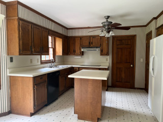
Before: This photo of the former kitchen was taken from the breakfast area. The dated 170-square-foot space had striped wallpaper, a soffit, mismatched standard appliances, dark brown cabinets, laminate counters, a ceiling fan and vinyl flooring. “There was a lot of wood and it was so heavy,” Moreno says. “The white fridge sticking out was a problem too. I knew we definitely could do a lot better.”
On the left, a drop-in double-bowl sink sat beneath a window that the homeowners were open to removing to improve the layout and storage. The fridge wall separated the kitchen from the dining room, making the kitchen and its small island feel cramped. “But by removing that wall, we were getting rid of storage,” Moreno says. “So that was the big question on how things would work.”
The door seen at the back opened to a hallway leading to the living room. In that hallway was a powder room and door to the basement. A door to a closet is just out of view on the fridge wall. “There were so many doors that we had to deal with,” Moreno says.
She also took down the wall between the kitchen and dining room, expanding the kitchen into the former breakfast nook, adding 72 square feet and dramatically improving flow. The extra space allowed for a larger custom island, which is painted a muted, organic green with soft gray undertones. “It’s a really pretty neutral green that’s warm at the same time,” Moreno says. “I like to ground a space so everything isn’t so white. Plus, her favorite color is green. It took time to find the right green, and we went with this neutral one because it’s transitional but also modern.” Soft white custom inset cabinetry along the perimeter brightens the room and contrasts gently with the island. Satin bronze hardware adds a rich, polished touch to both.
Moreno placed the new farmhouse-style sink in the island and placed the new range where the sink used to be. She moved the refrigerator to the cooktop’s former spot, resulting in a smarter, safer layout. “I’m not a big fan of putting the range in the island, especially when you have little kids,” Moreno says. “Removing that sink window allowed us to put the range there with the hood as a focal point. She was afraid of losing the light from that window, but now we’re getting light from the front of the house by removing that wall.”
Paint colors: Alabaster (perimeter cabinets), Drift of Mist (walls), Pure White (ceiling and trim), Shade-Grown (island), Sherwin-Williams
Find kitchen remodelers near you
Above the island, a pair of 16-inch brushed brass bell-shaped pendant lights with clear glass shades add a stylish detail. LED ceiling lights provide general illumination, while undercabinet lighting brightens key task areas.
Pendant lights: Newton Bell in brushed brass, Innovations Lighting
Shop for your kitchen
A custom paint-grade wood hood with a white oak accent band is painted to match the perimeter cabinetry. A powerful hood insert helps prevent smoke and odors from drifting into nearby spaces. The backsplash consists of 2-by-6-inch white porcelain tiles laid in a herringbone pattern; the tiles have subtle tone variations, a glossy finish and frost white grout. “Everything is very neutral here, so bringing that texture there on the backsplash was important,” Moreno says. “It doesn’t stick out but brings another element into the space. Something I also like about that tile is the glossy finish that reflects the light.”
Range: 36-inch smart commercial-style, gas with six burners, KitchenAid
Pros Share the 8 Biggest Kitchen Remodeling Mistakes
Refrigerator: KitchenAid
25 Genius Kitchen Storage Ideas
Before Photo
Before: Here’s a closer look at the wall that divided the kitchen and dining room (visible through the doorway at right). The white refrigerator seen in the earlier “before” photo sat in the empty cabinet frame. To the left of a pair of aging white wall ovens stood a door leading to the previously mentioned closet. “It was a load-bearing wall,” Moreno says, “so we had to put in a beam.”
The interior side of the island features a streamlined setup with the pullout trash and recycling center on the left, a classic white farmhouse sink with a dedicated base cabinet in the center and a quiet, top-control stainless steel dishwasher completing the lineup.
Dishwasher: KitchenAid
9 Ways to Save Money on Kitchen Cabinets
Sink: Whitehaven, Kohler; faucet: Odin in Brilliance Luxe Gold, Brizo
New to home remodeling? Learn the basics
At the back right of the photo is the home’s updated staircase to the second floor. “We removed another piece of wall there to make the staircase area more open,” Moreno says.
10 Common Kitchen Layout Mistakes and How to Avoid Them
“I’m most proud that they trusted me and listened to my advice,” Moreno says. “Before, the kitchen was so dark you couldn’t wait to get out. Now they can entertain family and friends and be all together.”
More on Houzz
Read more kitchen stories
Browse kitchen photos
Hire a kitchen remodeler
Shop for kitchen products
This article was originally published by a www.houzz.com . Read the Original article here. .

A simple oak shelf above the sink keeps the area open and offers display space. The cabinet to the left of the sink contains a corner shelving system to make use of a potentially dead area, and the cabinet to the right is a dishwasher. The doorway leads into the mudroom.
The couple were set on having Carrara marble countertops. They knew the pitfalls of the porous stone but wanted a natural product. “Marble has a depth you just don’t get with quartz,” Higham says. The countertop company coated it with a dry protection, “so, provided it isn’t abused, it should last well,” he says.
“We chose a honed matte finish rather than polished. We find that with a polished finish, sometimes the polish starts rubbing off. A matte finish tends to last better,” Higham says. “As long as the owners aren’t chopping highly acidic or alkaline things on it and they clear up spills, it should work really well.”
Cabinet paint: Color-matched to Vert de Terre, Farrow & Ball; handles and knobs: Kilburn antique brass, Corston; sink: Farmhouse 800 Belfast, Villeroy & Boch; instant hot water faucet: 3-in-1 Fusion in patinated brass, Quooker; pull-out spray, Bidbury & Co.