
In a 142-square-foot kitchen, every inch counts. So a peninsula slicing the space nearly in two wasn’t doing this young family any favors. Living in a 1925 Craftsman in Philadelphia’s Mount Airy neighborhood with two small kids, the owners wanted a layout that felt more open, functional and welcoming for everyday life and casual entertaining. Dark, aging cabinets, beige tile countertops and a clunky appliance arrangement only added to the challenges.
Designer Sean Lewis reworked the kitchen within the existing footprint, removing the peninsula and relocating appliances to create better flow. Ceiling-height cherry cabinetry packed with smart storage solutions maximizes every square foot, while a floating quartz counter with playful pink stools adds prep space and a kid-friendly homework area. Finished with lively floral wallpaper and classic checkerboard porcelain tile flooring, the refreshed kitchen now feels like a bright jewel-box hub for the whole family.
Small shifts made a big difference. Nudging the new range a few inches to the right created generous landing space on both sides. The new apron-front sink now sits beneath an upgraded window, while the existing refrigerator was relocated across the room from the sink wall, resulting in a layout that’s far more intuitive to use.
Custom stained cherry cabinetry with a durable satin-sheen finish now runs to the ceiling, squeezing maximum storage out of the compact footprint. “We used custom cabinets with organizers and tall uppers to maximize storage,” Lewis says. “The custom cabinetry in this kitchen ensures each inch is utilized to save space and give a timeless look.” Unlacquered brass knobs and 6-inch pulls will develop a natural patina over time.
To give the room a sense of place, Lewis introduced lush floral wallpaper in pink and green tones. “To reflect the age of the home, we chose a wallpaper to give character from the Arts and Crafts era,” he says. “When working in historic homes in Mount Airy, we want to ensure kitchens feel functional, comfortable and fit the style of the home.”
Wallpaper: Golden Lily, Morris & Co.; ceiling paint: Ceiling Bright White, Sherwin-Williams; trim paint: Buttercream, Benjamin Moore
Find a kitchen designer on Houzz
Task lighting over the sink comes from a single swing-arm sconce with a cased white dome shade. The kitchen also features a vintage-style flush-mount ceiling light (not shown), undercabinet strips and 4-inch LED recessed lights. “They just had one ceiling light before,” Lewis says. “They wanted different options for work and mood lighting for when they were entertaining.”
A stainless steel microwave rests in an open shelf to the left of the sink. “We built that upper shelf to maximize the open workspace on the counter,” Lewis says. “A lot of people do a microwave drawer now, but this kitchen doesn’t include a lot of space down low for a microwave.”
The backsplash is handcrafted, bone-colored ceramic tile with a matte finish and taupe grout. Tiles from the same line in a green hue form a border along the top. “This is a well-known handmade tile out of Michigan,” Lewis says. “Each tile has a nice organic, handmade feel that goes well with this Craftsman home.”
Backsplash: Motawi Tileworks; sconce: Ford’s Mill fitter swing-arm with cased white glass dome shade, Rejuvenation; sink: Shaws: faucet: Rook in polished gold, Brizo
15 Kitchen Storage Ideas From Best of Houzz 2026 Award Winners
Lewis updated the windows for energy efficiency. “The deep windowsill doubles our counter space and the window shelf is perfect for plants,” he says. On the floor, 12-by-12-inch matte porcelain tiles in medium gray and warm white create a checkerboard pattern with a soft cement look and custom winter-gray grout, adding a bold yet classic touch. “The clients saw another kitchen we did that had that and loved it,” Lewis says. A door with glass panels connects the kitchen to an enclosed back porch.
Floor tile: Volume 1.0 in Electric Moss and Sonic White, Daltile; countertops: Dreamy Carrara, Caesarstone; stools: Nerd in Tan Rose, Design Within Reach; windows: Elevate, Marvin
See why you should hire a professional who uses Houzz Pro software
Storage around the range is highly functional: A lower corner cabinet to the left features a pullout organizer for small appliances and essentials, a large two-door upper cabinet above holds dishes and glassware, and a trash pullout sits to the lower right.
Range: Thermador
Where Designers Would Spend and Save in a Kitchen
Before: A closer look at the problematic peninsula shows how it sliced through the center of the room. “Which made it hard to fit many people in there and certainly made the entry feel crowded,” Lewis says. The doorway connects the kitchen to a butler’s pantry and the main entry to the rest of the home.
New to home remodeling? Learn the basics
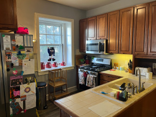
Before Photo
Before: The peninsula with sink and dishwasher (center) was the proverbial elephant in the room. Other challenges included the refrigerator’s location (top left), making better use of unused wall space (left) and improving workspace around the range (right).
More on Houzz
Read more stories
Browse photos for ideas
Find home professionals
This article was originally published by a www.houzz.com . Read the Original article here. .


Kitchen at a Glance
Who lives here: A couple with two young kids
Location: Mount Airy neighborhood of Philadelphia
Size: 142 square feet (13 square meters)
Designer: Sean Lewis of Airy Kitchens
Before: The dated kitchen had blue walls, low-hanging wood cabinets, wood-look vinyl flooring and beige tile countertops that were tough to keep clean. A peninsula housing a double-bowl sink and dishwasher cut the room in two, creating an awkward, pinched entry on the right. “As soon as I saw the peninsula I knew it was not a good idea,” Lewis says. “They wanted to get rid of that.”
Elsewhere, a slide-in range was squeezed against a short run of counter space and topped with a microwave that had little in the way of ventilation. Two existing windows, including the one seen here, were also due for an update.