Tag

Storage

Browsing


The owners of this home in Surrey, England, describe their new kitchen as not only visually stunning but highly practical too. This blend of beauty and functionality is the work of kitchen designer Darren Taylor of Searle & Taylor, who has expertly balanced color, proportion and layout.

By zoning the cabinetry, he’s made the kitchen intuitive and enjoyable to use. “We’re all about organizing and zoning,” Taylor says. Storage is divided into dedicated areas for cooking, cleaning up, food storage, dishware storage and entertaining, so everything is where it’s needed and within easy reach.


This article was originally published by a www.houzz.com . Read the Original article here. .


Designer: Nikki Romero-Holt of Kimberly Timmons Interiors
Location: Denver
Size: 90 square feet (8.4 square meters); 7½ by 12 feet

Homeowners’ request. “The homeowners wanted their entry built-in to function seamlessly for everyday life while remaining visually cohesive with the kitchen just steps away,” says designer Nikki Romero-Holt. “Because the space is fully visible from the main living area, it needed to feel intentional and refined, not purely utilitarian. They were struggling with how to balance accessibility and aesthetics. Shoes, jackets and daily essentials required open grab-and-go storage, but clutter was not an option in such a prominent location.”

Storage features. “The built-in was designed around three primary storage components: open cubbies below the bench for everyday shoe storage, recessed alcoves with hooks for frequently used jackets and an adjacent closed closet for overflow storage and seasonal items,” Romero-Holt says. “This layered approach allows the homeowners to keep daily essentials accessible while maintaining a clean, organized appearance.

“To ensure continuity with the home’s contemporary, high-contrast aesthetic, we carried the walnut wood seen throughout the house into this space. A two-tone cushion combination, including a green vinyl channel-tufted back and a green-blue patterned seat cushion adds warmth and dimension while complementing the surrounding artwork. The result feels like a distinct moment within the home yet completely aligned with the overall design language.”

Designer tip. “When designing open storage built-ins, take cues from hospitality spaces,” Romero-Holt says. “Many boutique hotels utilize open storage solutions that are both functional and visually appealing. By treating the storage wall as a fully integrated architectural feature rather than a purely practical insert, you can create something that feels custom and intentional.”

“Uh-oh” moment. “One challenge arose when we installed the first iteration of the full-height channel-tufted back panel,” Romero-Holt says. “The channels initially terminated directly into the window jamb, leaving exposed edges that felt abrupt and unfinished. To resolve this we introduced an extended walnut window jamb, creating a clean and intentional stopping point for the upholstery. That subtle architectural adjustment elevated the overall execution and delivered the tailored finish we had envisioned from the start.”

Channel-tufted vinyl fabric: Drifter in Pine, Arc|Com; cushion fabric: Che Fico in Fabiana Notte, Architex


This article was originally published by a www.houzz.com . Read the Original article here. .


Designer: Karina Melo of Sam Kachmar Architects
Location: Cambridge, Massachusetts
Size: 88 square feet (8.2 square meters)

Homeowners’ request. “Like most older homes in the New England area, this gambrel suffered from a lack of storage, particularly for a young family with three children,” says designer Karina Melo. “In this gut renovation, we sought to create extra space and storage throughout the home. In that spirit, an old, ill-functioning three-season room was converted to a spacious mudroom with various storage options for parents and young children.”

Storage features. “Our goal was to introduce multiple storage options at this space that would grow with the family as their needs changed and to maximize efficiency within the space,” Melo says. “We used every corner for storage. At the ceiling we designed cubbies for baskets to store bulk and seasonal items. A bench seat wraps the corner, with half dedicated to two large drawers and the other side with open cubbies for everyday shoe storage. Along one wall we designed full-height cabinets with storage for shoes at the lower levels, coatracks and shelves and open areas for other items. Also, open coat hooks are available on the opposite wall for quick stowing of guests coats and everyday jackets.”

Other special features. “The cabinetry was designed by Metropolitan with a mix of stained walnut and white tones,” Melo says. “The walls, ceiling and trim were all painted Chantilly Lace (by Benjamin Moore) for a clean finish. On the floor we chose a gray porcelain hexagonal tile that would be durable and easy to clean.”

Designer tip. “As families and children grow, their storage needs change,” Melo says. “The blend of cubbies, drawers, cabinetry, coat hooks, etc. will function for this family for a lifetime. To maintain a clean, clutter-free look, open storage was intentionally placed out of direct sightlines, while beautifully finished wood cabinetry was used to create a focal point as you enter the room, resulting in a space that feels both practical and polished.”


This article was originally published by a www.houzz.com . Read the Original article here. .


Before Photo

WINN Design+BuildSave Photo

“After” photos by Sarah Pitterle Maldonado of Nova Soul Imagery

Kitchen at a Glance
Who lives here: A family
Location: Vienna, Virginia
Size: 256 square feet (24 square meters)
Designer-builder: Winn Design + Build

Before: Heavy traditional-style white cabinets stopped short of the ceiling and didn’t provide the storage the family needed. An abundance of stainless steel appliances overwhelmed the room, while a dated, busy tile backsplash created visual clutter. Dark granite countertops along the perimeter and a lighter granite on the island also felt out of step with the homeowners’ goals. They did want to keep the white oak flooring and have it refinished. “It continues into adjacent rooms,” says design-build pro Michael Winn.

The sink on the right and the rangetop on the back wall worked well but the left wall felt disjointed. A cramped grouping of wall ovens, a hulking microwave and a toaster oven sitting on the countertop crowded an awkward run of cabinetry. “They also had a workstation there that ends up for most people being a gathering space for papers,” Winn says. “We did away with that and cleaned things up.”

The large stainless steel refrigerator also made the cooking area feel tight. “To the left of that was the pantry closet,” Winn says. “It was a step-in pantry that simply consisted of deep shelves, so things would get lost in the back.”


This article was originally published by a
www.houzz.com . Read the Original article here. .


In a 142-square-foot kitchen, every inch counts. So a peninsula slicing the space nearly in two wasn’t doing this young family any favors. Living in a 1925 Craftsman in Philadelphia’s Mount Airy neighborhood with two small kids, the owners wanted a layout that felt more open, functional and welcoming for everyday life and casual entertaining. Dark, aging cabinets, beige tile countertops and a clunky appliance arrangement only added to the challenges.

Designer Sean Lewis reworked the kitchen within the existing footprint, removing the peninsula and relocating appliances to create better flow. Ceiling-height cherry cabinetry packed with smart storage solutions maximizes every square foot, while a floating quartz counter with playful pink stools adds prep space and a kid-friendly homework area. Finished with lively floral wallpaper and classic checkerboard porcelain tile flooring, the refreshed kitchen now feels like a bright jewel-box hub for the whole family.

“After” photos by Jake Dunderdale

Kitchen at a Glance
Who lives here: A couple with two young kids
Location: Mount Airy neighborhood of Philadelphia
Size: 142 square feet (13 square meters)
Designer: Sean Lewis of Airy Kitchens

Before: The dated kitchen had blue walls, low-hanging wood cabinets, wood-look vinyl flooring and beige tile countertops that were tough to keep clean. A peninsula housing a double-bowl sink and dishwasher cut the room in two, creating an awkward, pinched entry on the right. “As soon as I saw the peninsula I knew it was not a good idea,” Lewis says. “They wanted to get rid of that.”

Elsewhere, a slide-in range was squeezed against a short run of counter space and topped with a microwave that had little in the way of ventilation. Two existing windows, including the one seen here, were also due for an update.

After: Lewis stripped the kitchen down to its bones, removing the old cabinetry, countertops, flooring, peninsula and all the appliances except the refrigerator.

Small shifts made a big difference. Nudging the new range a few inches to the right created generous landing space on both sides. The new apron-front sink now sits beneath an upgraded window, while the existing refrigerator was relocated across the room from the sink wall, resulting in a layout that’s far more intuitive to use.

Custom stained cherry cabinetry with a durable satin-sheen finish now runs to the ceiling, squeezing maximum storage out of the compact footprint. “We used custom cabinets with organizers and tall uppers to maximize storage,” Lewis says. “The custom cabinetry in this kitchen ensures each inch is utilized to save space and give a timeless look.” Unlacquered brass knobs and 6-inch pulls will develop a natural patina over time.

To give the room a sense of place, Lewis introduced lush floral wallpaper in pink and green tones. “To reflect the age of the home, we chose a wallpaper to give character from the Arts and Crafts era,” he says. “When working in historic homes in Mount Airy, we want to ensure kitchens feel functional, comfortable and fit the style of the home.”

Wallpaper: Golden Lily, Morris & Co.; ceiling paint: Ceiling Bright White, Sherwin-Williams; trim paint: Buttercream, Benjamin Moore

Find a kitchen designer on Houzz

The 33-inch white farmhouse sink with a classic apron front includes a stainless steel basin rack, garbage disposal and a polished gold pull-down faucet with touch technology. A 24-inch pro-style stainless dishwasher sits to the left of the sink.

Task lighting over the sink comes from a single swing-arm sconce with a cased white dome shade. The kitchen also features a vintage-style flush-mount ceiling light (not shown), undercabinet strips and 4-inch LED recessed lights. “They just had one ceiling light before,” Lewis says. “They wanted different options for work and mood lighting for when they were entertaining.”

A stainless steel microwave rests in an open shelf to the left of the sink. “We built that upper shelf to maximize the open workspace on the counter,” Lewis says. “A lot of people do a microwave drawer now, but this kitchen doesn’t include a lot of space down low for a microwave.”

The backsplash is handcrafted, bone-colored ceramic tile with a matte finish and taupe grout. Tiles from the same line in a green hue form a border along the top. “This is a well-known handmade tile out of Michigan,” Lewis says. “Each tile has a nice organic, handmade feel that goes well with this Craftsman home.”

Backsplash: Motawi Tileworks; sconce: Ford’s Mill fitter swing-arm with cased white glass dome shade, Rejuvenation; sink: Shaws: faucet: Rook in polished gold, Brizo

15 Kitchen Storage Ideas From Best of Houzz 2026 Award Winners

A floating, wall-mounted quartz counter, supported by a wood bracket that matches the new cabinetry, provides extra space for prep, coffee, breakfast or homework. Lightweight pink stools echo the pink tones in the wallpaper. “The stools offer an opportunity for friends to hang out,” Lewis says. “Keeping the baseboard radiator saved on budget and keeps feet warm.”

Lewis updated the windows for energy efficiency. “The deep windowsill doubles our counter space and the window shelf is perfect for plants,” he says. On the floor, 12-by-12-inch matte porcelain tiles in medium gray and warm white create a checkerboard pattern with a soft cement look and custom winter-gray grout, adding a bold yet classic touch. “The clients saw another kitchen we did that had that and loved it,” Lewis says. A door with glass panels connects the kitchen to an enclosed back porch.

Floor tile: Volume 1.0 in Electric Moss and Sonic White, Daltile; countertops: Dreamy Carrara, Caesarstone; stools: Nerd in Tan Rose, Design Within Reach; windows: Elevate, Marvin

See why you should hire a professional who uses Houzz Pro software

The 30-inch stainless steel induction range is paired with a 30-inch stainless hood that vents properly to the outdoors. Above the range, a decorative tile design — using tiles from the same line as the main backsplash but in varied shapes, sizes and colors — creates a subtle focal point. “They wanted some kind of focal point for the backsplash,” Lewis says. “As a designer, I try to go for a backsplash that isn’t too over the top in a space like this with the patterned wallpaper and checkerboard floor. This design showcases the Craftsman look of the tile.”

Storage around the range is highly functional: A lower corner cabinet to the left features a pullout organizer for small appliances and essentials, a large two-door upper cabinet above holds dishes and glassware, and a trash pullout sits to the lower right.

Range: Thermador

Where Designers Would Spend and Save in a Kitchen

Before: A closer look at the problematic peninsula shows how it sliced through the center of the room. “Which made it hard to fit many people in there and certainly made the entry feel crowded,” Lewis says. The doorway connects the kitchen to a butler’s pantry and the main entry to the rest of the home.

After: In the back corner, Lewis created a dedicated coffee area with shallow upper cabinets and drawers below to store cups and supplies. The existing 36-inch refrigerator now sits just to the right of this space, out of view.

New to home remodeling? Learn the basics

Before Photo

Airy KitchensSave Photo

Before: The peninsula with sink and dishwasher (center) was the proverbial elephant in the room. Other challenges included the refrigerator’s location (top left), making better use of unused wall space (left) and improving workspace around the range (right).

After: Removing the peninsula, relocating the refrigerator across the room (bottom middle), placing the sink under one of the kitchen’s two windows (top) and slightly shifting the new induction range (right) dramatically improved function and flow. The added counter with pink stools (left) provides extra seating in this family-friendly, classic-meets-modern space. “Now this kitchen is a little jewel box ready to make memories in this historic home,” Lewis says.

More on Houzz
Read more stories
Browse photos for ideas
Find home professionals


This article was originally published by a
www.houzz.com . Read the Original article here. .


Lori K Design StudioSave Photo
11. Warm and Welcoming

A new custom Eastern black walnut double vanity adds a generous dose of warmth in this updated California primary bathroom by designer Lori Wallick. The piece includes inset soft-close doors and drawers in two styles: Shaker for the doors and bottom two sets of drawers and flat-panel for the row of top drawers. The countertop and short backsplash are Taj Mahal quartzite, which complements the rest of the palette in the bathroom. Two earth-tone concrete sinks tie in with the concrete tub opposite the vanity. Sleek gold-finish widespread faucets join brushed pewter cabinet pulls and hand-hammered copper mirrors for a mixed-metals look.

Custom vanity: Oak Ridge Cabinets

Read more about this bathroom makeover

New to home remodeling? Learn the basics


This article was originally published by a
www.houzz.com . Read the Original article here. .


This article was originally published by a
www.houzz.com . Read the Original article here. .


This article was originally published by a
www.houzz.com . Read the Original article here. .


3. Built-In Sorting Systems

Designer: Erica Peale Design
Location: Arlington, Virginia
Size: 108 square feet (10 square meters); 9 by 12 feet

Homeowner’s request. “The homeowner wanted a more functional, well-organized space with dedicated storage for laundry and cleaning supplies,” says designer Erica Peale. “Previously, the room lacked proper laundry hampers, causing baskets to pile up on the floor, and there was no storage for linens or cleaning supplies, leaving the space cluttered. Painted a jarring orange, the room felt anything but inviting.”

Peale uses Houzz Pro software to help run her business. “We use Houzz for website hosting, 3D floor planning, project library and client reviews,” she says. “Houzz is an invaluable tool to help with our projects.”

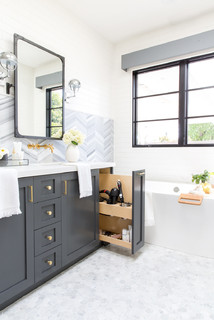
Storage strategies. “Thoughtful design transformed this laundry room into a highly functional and organized space,” Peale says. “Open cubbies were created to house rolling laundry hampers, keeping them accessible yet neatly tucked away. Pullout drying racks add convenience for air-drying garments, while custom cabinetry provides ample storage for cleaning supplies, detergents and household linens. Additional features such as adjustable shelving, a built-in ironing board, concealed waste bins and dedicated folding surfaces ensure everything has a place, making daily laundry tasks more efficient and enjoyable.”

Other special features. “The custom cabinetry was painted in a soft, soothing spa-like blue, (Sherwin-Williams’ Stardew), bringing a calm and refined feel to the space,” Peale says. “Large-format 12-by-18-inch travertine floor tiles ground the room with warmth and texture, while a polished marble 1-inch hexagon backsplash adds a timeless, elevated touch. Floating shelves with brass ceiling-mounted brackets introduce both style and function, complemented by brass cabinet hardware that adds warmth and subtle contrast. A full-size utility sink enhances everyday usability, while Steele Canvas laundry baskets provide an efficient system for separating whites, darks and dry cleaning.”

Designer tip. “A key design approach we recommend is choosing a softer, more restful color palette and prioritizing closed storage to minimize visual clutter,” Peale says. “Layering a mix of textures and varying sheens not only reflects light throughout the space but also creates depth and visual interest, transforming a functional room into one that feels calm, polished and intentional.”

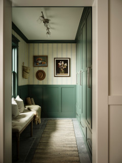
General contractor: Connor Bentley; wall paint: White Dove, Benjamin Moore

25 Home Design Trends Defining How We’ll Live in 2026
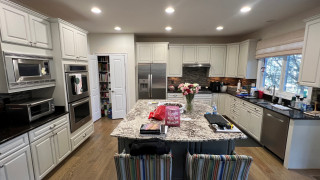


This article was originally published by a www.houzz.com . Read the Original article here. .

Pin It