This article was originally published by a www.houzz.com . Read the Original article here. .
This article was originally published by a www.houzz.com . Read the Original article here. .

They hired designer Sarah West to help them create a timeless look and feel with cleaner lines and an organic modern style. West responded by pairing custom rift-cut white oak cabinets and several greige upper cabinets with creamy white walls for a warm atmosphere that complements the earthy tones in the stone flooring and new zellige backsplash tile. A furniture-style island has seating on three sides for face-to-face conversation. A large plaster range hood offers clean lines, softened by an elegantly arched window.
This article was originally published by a www.houzz.com . Read the Original article here. .

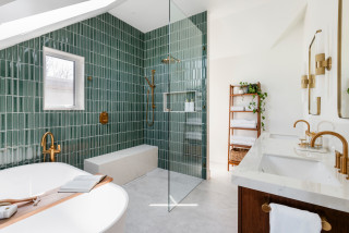
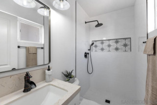
When this Canadian family started to outgrow its home, the last thing it wanted to do was leave behind its beloved neighborhood in Victoria, British Columbia. “This is a fantastic neighborhood that’s walkable to shops, restaurants and the beach,” Robbyn McDonald of MAC Reno Design Build says. “We finished the attic to create space for a primary suite and living room. They’d never had an en suite bathroom before, so they were really excited.” The new, light-filled bathroom is a fresh take on midcentury modern style.
Bathroom at a Glance
Who lives here: A young family
Location: Victoria, British Columbia
Size: 118 square feet (11 square meters)
Designer-builder: MAC Reno Design Build
The new bathroom includes a double vanity, a generous shower stall, a freestanding bathtub and a private toilet alcove behind the plumbing wall in the shower. The shower has a long bench with a handheld shower wand above it. The shower stall is curbless, so the floor slopes imperceptibly to direct water to a linear drain next to the bench.
To increase the attic space, the firm removed the home’s existing hipped pyramid roof. It framed the walls a few feet higher, then added a new cross-gable roof.
Find a local design-build firm on Houzz
Simple mirrors with rounded edges maintain the clean look. The room has a lot of straight lines, so the subtle curves of the mirror frames add softness.
The countertop is a porcelain slab that looks like marble. The designers used the same porcelain on the shower bench. The bench is heated and serves as a toasty seat in the shower.
Browse vanities in the Houzz Shop
The flooring is also porcelain, composed of large-format tiles. The open door offers a glimpse into the primary bedroom. Heated floors keep the bathroom nice and warm.
The shower has a partial enclosure, which keeps the water inside. Tight insulation and energy-efficient glass on the windows and skylight help prevent drafts.
“The vaulted ceiling added height and visual interest, creating a cozy and inviting tub area,” McDonald says. “Positioning the skylight above the tub brought natural light throughout the room, reducing reliance on artificial lighting.”
Shop for a bathtub
Shower tile: Flauti in Sage Gloss, Ceramic Tileworks
“High-quality materials and precise construction techniques ensured the bathroom met industry best practices for sustainability, water conservation and performance,” McDonald says. These include:
Updated plumbing and mechanical systemsWater-conserving shower fixtures Low-E energy-efficient windows that create a tight envelopeHeated flooring that provides even, energy-efficient heatLED lightingPlenty of natural light to reduce use of artificial lighting
This article was originally published by a www.houzz.com . Read the Original article here. .
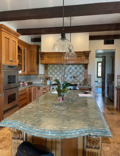
The Ryders expanded the home into what was once a deck to create a new living room. That allowed them to knock down walls and open up the kitchen footprint into the former living room to create an open-plan concept that breezily connects the new kitchen, dining and living spaces. It also freed up room for a large kitchen island that seats six. A mix of soft white and light gray cabinets and marble-look quartz countertops establishes a fresh and clean look. Wood flooring and hand-hewn wood ceiling beams add warmth. And a built-in coffee station ensures that the homeowners are well-caffeinated to manage the lively household.
This article was originally published by a www.houzz.com . Read the Original article here. .
“I like to minimize overhead light in a bathroom,” Clark says. “You get better light from eye level when you’re putting on makeup. But the vanity was so long that it really needed something in the center, so I added the glass pendant light there.”
The mirrors hide medicine cabinets. “Some of my clients are reluctant about medicine cabinets at first because they tend to all look the same. But these arched mirrored medicine cabinets are really pretty,” Clark says. The frames are brass.
This article was originally published by a www.houzz.com . Read the Original article here. .

Before Photo
Kitchen at a Glance
Who lives here: A family of four
Location: Mendham Township, New Jersey
Size: 336 square feet (31 square meters)
Designer: Alison Griffin of Griffin Designs
Before: The house is set perpendicular to a fairly busy road. The home’s front entrance, pictured here to the right of the windows, opens to a side yard.
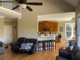
The room — which previously contained only living and dining spaces and now also houses the kitchen — extends from this side of the house to the other in one open space. This photo looks toward the dining and family room areas. The other end of the room, which was not photographed before the remodel, contained a rarely used sitting area with expansive views of a dense forest preserve.
The room’s ceilings were just 7⅓ feet, which made the space dark. “This is such a large, long space, which made the ceilings seem even lower,” Griffin says.
The original kitchen was on the other side of the house, in a back corner. “That kitchen was small and cramped,” Griffin says. The homeowners wanted to move the kitchen to this side of the house.
This dining table, with its wood top and metal legs, was a good fit for the new city loft look and was kept.
Find a local interior designer on Houzz
This article was originally published by a www.houzz.com . Read the Original article here. .

![]()
Once Guiducci was done with the architectural planning for the space, interior designer Terra Kushner took over with the finishes. “Our clients are classic with a modern twist,” Kushner says. “They vibed with a Lower East Side Manhattan hotel, the Ludlow.” The hotel mixes classic materials with hints of the neighborhood’s gritty urban and artistic history. The result for the couple is a light-filled bathroom that feels timeless and handsome.
This article was originally published by a www.houzz.com . Read the Original article here. .
![]()
Meanwhile, LaFreniere tackled the countertop clutter from the inside out.
“When I do kitchens, I focus on what’s inside of the cabinet,” she says. “I go through the homeowners’ small appliances, every pot, every utensil, spices [and] Tupperware and really make sure that there’s a place for everything.”
On one side of the range is a utensil pullout with a knife block and towel storage, and on the other side is a spice pullout. LaFreniere eliminated the lazy Susan. “I don’t do corner cabinets,” she says. “I find them to be completely useless, no matter whether a lazy Susan or the kidney pullouts. I just leave them empty.”
This article was originally published by a www.houzz.com . Read the Original article here. .

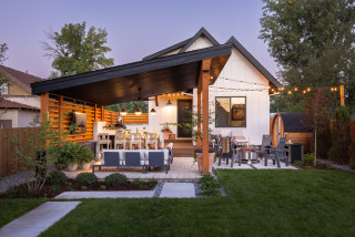
Yard at a Glance
Who lives here: A couple of empty nesters with two dogs
Location: Timnath, Colorado (near Fort Collins)
Size: 3,200 square feet (297 square meters); about 45 feet wide and 60 to 80 feet long
Landscape designer and builder: Lindgren Landscape, with Jamie McCarn as designer
The homeowners wanted a pergola or a covered structure for outdoor entertaining, but that was the extent of their vision. “We talked about enclosing it,” landscape designer Jamie McCarn says of the structure, “but we decided it was too small and we needed to keep everything open.”
They also opted for a substantial roof cover. With a pergola, “you can’t go out in the rain, and you don’t get that solid shade or interior feel. And I know that’s what [the homeowners] were going for,” McCarn says. She angled the roof to open up the look in the tight yard without losing any shelter or protection.
Stained Douglas fir wood beams and posts pop against the black-painted Douglas fir roof, anchoring the structure in the yard and complementing the home’s colors and details. “We never want the landscape to feel scabbed-on. It needs to feel cohesive with the house,” McCarn says.
Find a local landscape designer
This article was originally published by a www.houzz.com . Read the Original article here. .

The landscape design includes smart features. “We used a Sonance sound system with two subwoofers and six speakers within the garden spaces, as well as speakers in the cabana that are controlled by a home automation system,” Stucchi says. “The landscape lights, the bistro lights and the lights in the cabana are all controlled by a Lutron system app on the homeowners’ phones.”
Paperbark maples (Acer griseum, USDA zones 4 to 8; find your zone), which are multistemmed trees with beautiful bark, frame the cabana. “About a million resident wild bunnies severely limited our plant palette with their insatiable appetites for herbaceous perennials. No amount of rabbit deterrent would help us there. We tried everything,” Stucchi says.
He used trees, flowering shrubs, evergreens and grasses for structure, color and texture. These include a mix of hydrangeas, ‘Karl Foerster’ feather reed grass (Calamagrostis x acutiflora ‘Karl Foerster’, zones 4 to 9) and both Blushing Knock Out roses (Rosa ‘Radyod’, zones 5 to 11) and Knock Out roses (Rosa ‘Radrazz’, zones 5 to 11).