
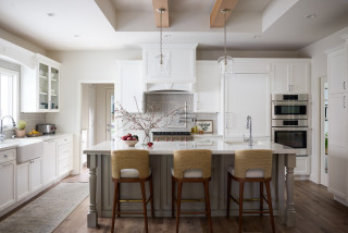
In 2011, design-build pro Jared Lewis and his wife, Katherine, moved into their 1962 traditional-style home in Scotts Valley, California. Over the years, the couple updated the house in phases to create more of a coastal cottage style. In 2017, they built an 8-foot addition for a new open-concept kitchen and dining room.
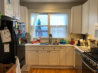
But after living with the kitchen for a number of years, they felt that while many of the elements looked and functioned fine, the bright white cabinets and blue island base dated the space. Seeking more warmth and a current look, they teamed up with designer Kerry Gillette, who used Houzz Pro software, for a refresh.
Now creamy white cabinets and a soft beige paint on the island base create a warm and inviting style. New rustic wood ceiling beams and wood-look flooring add more warmth. The flooring material and stools upholstered in performance fabric introduce durable details that stand up to frequent guests.
This article was originally published by a www.houzz.com . Read the Original article here. .


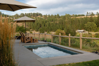


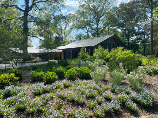

They also had to consider some less desirable critters. “There is a lot of wildlife and deer, so we had to plant things that the deer won’t chew on,” Barton says. Lavender and grasses were the team’s top picks.
Outdoor lighting, including tree lights, step lights and lights nestled among the boulders, highlight key features of the home exterior and landscape. Barton notes that the lights are especially welcome in winter, when the yard is more often enjoyed from inside. “It gets you excited for the holidays,” he says. “It’s nice to look out into the landscape and see that depth, and see that snow light up with the landscape lighting.”