
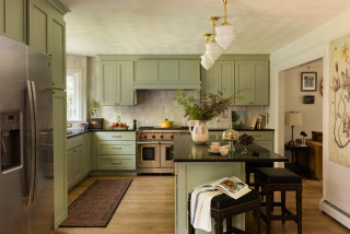
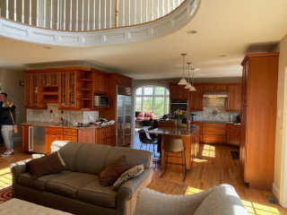
This young couple’s appreciation for historic design and love of cooking didn’t jibe with the finishes in their 1990s Colonial-style home or the small work area in their kitchen. They hired Lynda and Jessica Caccamo, a mother-daughter interior design team, to help them achieve a highly functional kitchen with a historic look.
The designers opened up the kitchen to the dining room, then swapped them, putting the new kitchen in the original dining room space and vice versa. The resulting design has a traditional historic style, featuring soft green kitchen cabinetry, a large island, a dining room wet bar, ample storage and plenty of room for the couple to prepare dinner together.
This article was originally published by a www.houzz.com . Read the Original article here. .

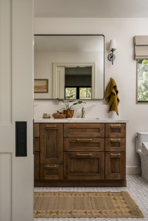


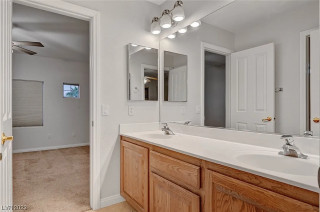

Bathroom at a Glance
Who lives here: A young family of three
Location: Long Beach, California
Size: 97 square feet (9 square meters)
Designer: Heather Knight-Willcock
Contractor: Bryan Luu of BLuu Construction
A large part of the project involved relocating the primary suite. Knight-Willcock found space for the primary bathroom by taking over a small existing hall bath, part of a hallway and space from two small closets. (See before-and-after floor plans below.) This allowed room for a double vanity, a generous shower stall and additional storage.
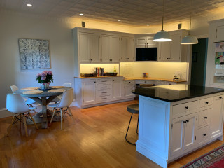
“Heather named this project ‘MCMR,’ which stands for Midcentury Modern Revival,” Luu says. Style-wise, this meant the design honors the home’s midcentury modern vintage while giving it modern conveniences and a warm organic feel.
This view from the bedroom shows a new paneled pocket door partially open on the left. “There is a small hallway to the left of this door. Using a pocket door optimized the space,” Luu says.
Find a local general contractor on Houzz