Tag

Week

Browsing


A cramped layout, dated finishes and awkward closets left this Oregon primary en suite bathroom feeling smaller than its footprint. To create a space that better suited the single homeowner’s needs, designer Amy Pearson reworked the layout and refined the style to deliver a more open, functional and timelessly modern retreat.

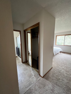
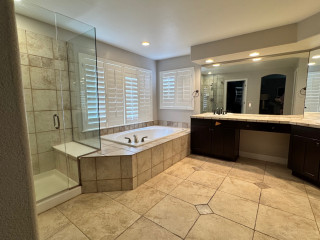
By eliminating two closets — one in the bathroom and one in the bedroom — and shifting the door to the primary suite, Pearson was able to expand the bathroom by 14 square feet and introduce a more efficient floor plan. The new design includes dual floating walnut vanities with storage towers, a spacious low-curb shower that spans the width of the room and improved lighting and ventilation throughout.

A restrained palette of white, black, gray and brown highlights rich materials, including Carrara marble mosaic tile and warm wood cabinetry. Geometric-patterned wall tiles add drama and dimension, while luxe brass accents bring a refined touch. The result is a sophisticated, light-filled bathroom with smart storage and enduring style.


This article was originally published by a www.houzz.com . Read the Original article here. .


Copper Sky Design + RemodelSave Photo
After: This zoomed-in photo showcases the finishes used throughout the expanded kitchen, which include custom inset perimeter cabinets painted an earthy sage green, creamy white 4-by-4-inch backsplash tile set in a running bond pattern and similar-colored quartz countertops. Flake complemented the green with warm terra-cotta floor tiles. The floor tiles are Craftsman-appropriate, she says, as well as a practical pick for an active family of five.

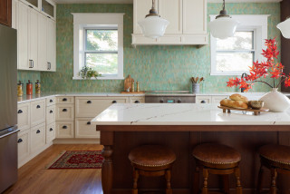
“The client really liked that this tile looked lived-in from the start, because they didn’t want to be concerned about it not looking pristine all of the time,” she says. They also chose unlacquered brass for the perimeter cabinet hardware and lighting “to lean into that patinaed look,” she says.

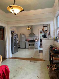
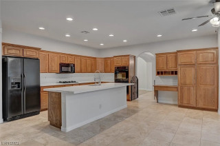
The previous layout of the major appliances worked well, so Flake was able to save on costs by keeping them in the same locations. Above the new JennAir gas range is a custom hood wrapped in red oak with a gray granite trim, both of which match the new island, which is in the foreground of the photo. The perimeter cabinetry now stretches to meet the 10-foot ceiling, emphasizing its height and updating its look.

Paint colors: Green Earth (perimeter cabinets), Alabaster (walls), Accessible Beige (trim), Sherwin-Williams

Perimeter countertops: Calacatta Lavasa quartz, MSI; island countertop: Silver Gray leathered granite


This article was originally published by a
www.houzz.com . Read the Original article here. .


Signature Designs Kitchen | Bath | InteriorsSave Photo
The designer used Calacatta Gold marble tile to wrap the opening of the shower as well as the other shower walls. Then she continued this same tile around the room as wainscoting. Without looking closely, it’s hard to tell that this is tile and not slab. The veining pattern is laid out so well that it looks uninterrupted. “At first even I was a little nervous about how prominent and bold this veining pattern is, but it turned out so great,” Bagley Catlin says.

The designer nodded to an existing arched opening between the bedroom and bathroom by creating an arched opening to the shower. The soft curve of the arch is a pleasant contrast to the straight edges in the room. “I knew a single door would look odd with the arch, so we used French doors here,” she says.

The bench is shaped like a slice of a hexagon, which suits the angled placement of the shower stall in the corner of the room. Bagley Catlin had it covered in quartz slabs, creating a monolithic look.


This article was originally published by a
www.houzz.com . Read the Original article here. .


When this couple sold their business, retired and moved from Texas to Virginia to be closer to family, there was one thing they wished they could have brought with them: their kitchen.

“They absolutely loved their kitchen in Texas,” interior designer Theresa Dorlini says. “They had completed a lot of updates on that kitchen, and they shared photos of it with us. While this kitchen looks nothing like that kitchen, we were able to pick up on a lot of what they loved about it and give it to them here.”

The new kitchen may look different, but it feels right at home in their 1915 house. Architectural details, cabinetry with a furniture-like feel and vintage-style opaque glass pendant lights give the space a timeless character that suits the age of the home. At the same time, modern conveniences — like updated appliances, a coffee bar and well-equipped cabinets — add comfort and functionality.


This article was originally published by a www.houzz.com . Read the Original article here. .


Jessica Koltun HomeSave Photo
Photos by Costa Christ of Strictly Natural Light

Bathroom at a Glance
Who lives here: A young family
Location: Dallas
Size: 201 square feet (19 square meters)
Designer: Jessica Koltun Home

In this new-construction home, the primary bathroom sits between the primary bedroom, seen in the distance, and the primary closet. It measures a little over 17 feet long by 11¾ feet wide. Koltun used double doors at both bathroom entrances. These doors are narrower than standard doors and add Parisian apartment flair.

Koltun composed the room with a drop-in tub underneath a large arched window, serving as a focal point, then bookended it with two vanities. On the opposite side of the room is a generous shower stall, flanked by a makeup table niche and a toilet room.

While the bathroom has classic materials and traditional architectural elements like the double doors and arches, Koltun balanced them with modern touches like the blocky tub surround and minimalist material palette. The result is a transitional style that will stand the test of time.

Wall paint: Pure White, Sherwin-Williams; vanity stain: Birchbark, Sherwin-Williams

Find a designer on Houzz


This article was originally published by a
www.houzz.com . Read the Original article here. .


After purchasing this house in Henderson, Nevada, a couple with four young kids enlisted designer Christy Mancera of Cera Construction to make it better suit their lifestyle. Mancera, who used Houzz Pro software, reworked the entire floor plan to make the home more family-friendly.

In the kitchen, the designer focused on how the homeowners like to work and live. She created an efficient layout with a large island, a dedicated baking station and ample display space for personal collections. “My clients wanted to make the kitchen more functional for their family, create an open feel and bring in lots of natural light,” Mancera says.


This article was originally published by a www.houzz.com . Read the Original article here. .


The layout of the kitchen revolves around an island measuring 8 by 3⅓ feet. “We placed seating on three sides of the island so that during gatherings people could have conversations across the island. Also, our clients like to eat breakfast together here,” Rachaman says. The island contains storage and a microwave drawer. The light fixture overhead adds a modern touch, and its barely-there silhouette preserves views of the garden.

One of the homeowners loves to cook and bake. The other’s interest in the culinary arts lies primarily in enjoying food. “The cook had a lot of specialty tools and gadgets he wanted to use,” Rachaman says. “He cooks Asian food a lot and wanted specific places to put things like the small bowls he likes to serve it in.” The designers planned storage to house items like this, as well as spices, mixing bowls, baking sheets and cutting boards. The homeowner also has a large cookbook collection, and the designers tailored the island to house them.

One quirky part of the renovation involved one of the homeowners’ cold morning swims in Lake Washington. “He hangs his wetsuit to dry in the coat closet,” Emhoff says. “He wanted the fridge to back up to this closet so the heat coming off it would help dry the wetsuit.” There’s a vented wall between the back of the fridge and the coat closet.

Cabinetry: Bellmont Cabinet; cabinet paint: Olympic Range, Sherwin-Williams; wall paint: Pink Ground, Farrow & Ball

Browse kitchen and dining furniture in the Houzz Shop


This article was originally published by a www.houzz.com . Read the Original article here. .


When this Wisconsin couple settled into their 1960s Colonial-style home tucked into a quiet wooded neighborhood, they knew the existing 70-square-foot second-floor primary bathroom wasn’t going to meet their long-term needs. To achieve the spa-like en suite they envisioned, they turned to Cor Improvements and design director Jim Pitzen, who reimagined the layout by converting a bedroom into a spacious 170-square-foot bath.

The transformation includes two vanities, a freestanding claw-foot tub, a walk-in shower and a water closet — all in a welcoming blue-and-white palette with classic details that honor the home’s roots. The update also added a walk-in closet and an adjacent laundry room, creating a highly functional layout tailored for comfort and ease.


This article was originally published by a www.houzz.com . Read the Original article here. .


Before Photo

McGuire + Co. Kitchen & BathSave Photo

“After” photos by Regina Mallory Photography

Kitchen at a Glance
Who lives here: A family of five
Location: Wakefield, Massachusetts
Size: 159 square feet (15 square meters), plus a mudroom and bar area of 231 square feet (21 square meters)
Designer: Amanda Colosi Johnson of McGuire + Co. Kitchen & Bath

Before: The U-shaped layout worked for the family, but the dated finishes needed an update. The dark brown and cottage green cabinetry, along with vinyl tile flooring and standard appliances, had run their course. “This couple is a lot of fun and not afraid of color, pattern and texture,” Colosi Johnson says. “That’s why the homeowners painted those cabinets themselves that cottage green.”

A large refrigerator on the right jutted out from the cabinetry. A peninsula with two backless stools and hard-to-reach drawers separated the kitchen from the bar and mudroom area. The door on the near left leads to a sun porch, while the back doorway opens to a hall with a powder room. “We pursued looking into options on how we could change up the layout, but it didn’t make sense to do that,” Colosi Johnson says. “We wanted to problem-solve.”


This article was originally published by a
www.houzz.com . Read the Original article here. .


Nsight Designs NolaSave Photo
A new 33-inch-wide pocket door is on the right. Often pocket door hardware is not easy for someone with limited dexterity to grab and close, so Lewis was mindful of finding some that was. Although a 36-inch door opening is needed for wheelchair access, 33 inches was the widest possibility here, and it allows comfortable passage with a walker.

Lewis chose some stylish but affordable items, including the floor tile and a ready-made vanity, to keep costs down. “A lot of the budget was spent behind the walls because we needed new plumbing and new electrical,” she says.

“This vanity is great because it has the texture of wicker on the doors,” Lewis says. The champagne bronze Brizo faucets have levers that are easy to operate. “When designing for aging in place, you have to be mindful of dexterity with faucet handles and drawer pulls,” Lewis says.

Instead of a medicine cabinet, the homeowner chose a simple wall mirror. “While this house is about 100 years old and Craftsman, I like to mix styles to make it look like it changed over time,” Lewis says. “The mirror and the light fixture add midcentury modern style, and the vanity adds some natural character and textures that are in keeping with Craftsman style.”


This article was originally published by a
www.houzz.com . Read the Original article here. .

Pin It