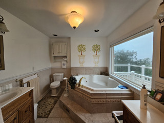
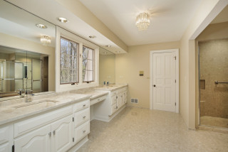
This article was originally published by a www.houzz.com . Read the Original article here. .
The transformation includes two vanities, a freestanding claw-foot tub, a walk-in shower and a water closet — all in a welcoming blue-and-white palette with classic details that honor the home’s roots. The update also added a walk-in closet and an adjacent laundry room, creating a highly functional layout tailored for comfort and ease.
This article was originally published by a www.houzz.com . Read the Original article here. .
Before Photo
Kitchen at a Glance
Who lives here: A family of five
Location: Wakefield, Massachusetts
Size: 159 square feet (15 square meters), plus a mudroom and bar area of 231 square feet (21 square meters)
Designer: Amanda Colosi Johnson of McGuire + Co. Kitchen & Bath
Before: The U-shaped layout worked for the family, but the dated finishes needed an update. The dark brown and cottage green cabinetry, along with vinyl tile flooring and standard appliances, had run their course. “This couple is a lot of fun and not afraid of color, pattern and texture,” Colosi Johnson says. “That’s why the homeowners painted those cabinets themselves that cottage green.”
A large refrigerator on the right jutted out from the cabinetry. A peninsula with two backless stools and hard-to-reach drawers separated the kitchen from the bar and mudroom area. The door on the near left leads to a sun porch, while the back doorway opens to a hall with a powder room. “We pursued looking into options on how we could change up the layout, but it didn’t make sense to do that,” Colosi Johnson says. “We wanted to problem-solve.”
This article was originally published by a www.houzz.com . Read the Original article here. .
Lewis chose some stylish but affordable items, including the floor tile and a ready-made vanity, to keep costs down. “A lot of the budget was spent behind the walls because we needed new plumbing and new electrical,” she says.
“This vanity is great because it has the texture of wicker on the doors,” Lewis says. The champagne bronze Brizo faucets have levers that are easy to operate. “When designing for aging in place, you have to be mindful of dexterity with faucet handles and drawer pulls,” Lewis says.
Instead of a medicine cabinet, the homeowner chose a simple wall mirror. “While this house is about 100 years old and Craftsman, I like to mix styles to make it look like it changed over time,” Lewis says. “The mirror and the light fixture add midcentury modern style, and the vanity adds some natural character and textures that are in keeping with Craftsman style.”
This article was originally published by a www.houzz.com . Read the Original article here. .
“Because the style of the room is traditional, we wanted a bridge faucet,” Mehrl says. “We were able to find one with the modern convenience of a pull-down sprayer.” The island also contains a trash pullout, a cutting board pullout and extra storage on the work side.
When choosing the counter stools, Mehrl kept the new open plan in mind. “In order to keep a comfortable amount of space between the sectional sofa in the living room and the island, we needed stools that would tuck under the counter,” she says. These stools have simple, traditional style, and their padded leather seats provide comfort.
Faucet: Weymouth bridge pull-down, Moen
Shop for kitchen fixtures
This article was originally published by a www.houzz.com . Read the Original article here. .
The small black-and-white en suite bathroom in this 1934 Colonial just outside Boston had vintage charm, but it fell short of the sophisticated retreat the new homeowners envisioned. The single pedestal sink offered no storage or counter space, and the aging shower-tub combo didn’t meet the couple’s needs. The nearby walk-in closet in the bedroom also lacked functional storage.
Looking to create a more spacious and practical layout, the couple hired design-build pros Jason and Megan Hoffman. Jason suggested pushing a wall shared by the bathroom and closet into the bedroom to gain valuable square footage. The reimagined bath now features a warm wood double vanity, a roomy low-curb shower with a built-in bench and a linen cabinet for added storage. A thoughtful mix of white, black and wood finishes with clean-lined midcentury touches brings modern style to this refreshed and highly functional space.
Before Photo
Bathroom at a Glance
Who lives here: A young couple
Location: Newton, Massachusetts
Size: 43 square feet (4 square meters)
Designers-builders: Jason and Megan Hoffman of J.P. Hoffman Design Build
Before: The 40-square-foot bathroom had charm thanks to its pedestal sink and classic black-and-white tile, but it lacked the storage and counter space the young couple needed in their primary suite. The aging shower-tub combo added to the challenges. “They have a tub in another bathroom, so that satisfied the home’s need for a tub,” Jason says. “Having no tub here opened up the opportunity to maximize the layout.”
Two existing windows — one beside the toilet and another at the end of the shower-tub — were in good shape, so the homeowners opted to keep them.
Find a bathroom designer
A pony wall on the left adds a touch of privacy for the new two-piece white toilet. A decorative walnut shelf above the toilet offers a warm accent. “We moved the new toilet 6 inches so everything on that wall now fits,” Jason says.
Creamy white paint (White Dove by Benjamin Moore) covers the walls, ceiling and trim, creating a clean, warm backdrop. Matte black details throughout add striking contrast.
10 Aging-in-Place Features Pros Swear By
Bronze and brass two-light fixtures with clear glass globes add a touch of midcentury style that complements the vanity. The bathroom also has recessed LED ceiling lights and a new exhaust fan, both of which were digitally removed from these photos to better highlight the room’s key design features.
Double vanity: Serenity door style in natural walnut, Candlelight Cabinetry; towel ring: Purist in matte black, Kohler; vanity pulls: Morris, Top Knobs; vanity lights: Young House Love Clear Glass Bubble, Shades of Light
Shop for bathroom vanities on Houzz
Creamy white glossy ceramic tiles, measuring 2 by 6½ inches, cover the wall above the vanity in a vertical stack pattern; the grout is frosty white. The tile’s subtle surface movement adds depth and texture. “We used that tile on the shower walls too,” Jason says. “By bringing the tile all the way across that wall, you’re creating less transitions and making the room seem bigger.”
Faucets: Jason Wu collection, matte black, Brizo; wall tiles: Wellfleet in Coconut, 2 by 6½ inches, Best Tile
10 Smart Bathroom Storage Solutions
On the bathroom floor, 4-by-12-inch matte black porcelain tiles are laid in a herringbone pattern and paired with midnight black grout, adding depth and visual interest.
Floor tile: Topography porcelain in black, 4 by 12 inches, Best Tile
See why you should hire a professional who uses Houzz Pro software
On the shower floor, hexagonal tumbled Carrara marble mosaic tiles bring natural variation in veining and tone, set with frosty white grout for soft contrast. “The homeowners liked the way everything looked when all the details were put together,” Jason says.
Shower floor tile: Antique Carrara hexagon tumbled, 2 by 2 inches, Best Tile
A hardwired black towel warmer with a programmable timer, mounted to the side of the linen cabinet, adds both function and luxury to the space. “We were able to redesign and update this bathroom without changing the location of windows,” Jason says. “The creativity and the ability to see the solution was key here.” For added privacy, the windows were fitted with a translucent film.
New to home remodeling? Learn the basics
Before: A swing door on the left once connected the bedroom and bathroom. An imposing dark armoire stood against the wall space between the door to the bathroom and the primary closet to its right. The door on the far right leads to the second-floor landing and staircase to the main level. The exposed metal ductwork visible at the back left is from a prior HVAC upgrade.
A new pocket door now connects the bedroom and bathroom. “It was related to the size of the bathroom and the location of switches to optimize space,” Jason says. The previously exposed ductwork is also gone. “We were able to enclose the necessary ductwork behind a wall in the new bathroom and added the valuable linen cabinet,” Megan says.
More on Houzz
Read more bathroom stories
Browse bathroom photos
Find a bathroom remodeler
Shop for your bathroom
This article was originally published by a www.houzz.com . Read the Original article here. .
“These pleated screens are a really cool product,” Trakas says. “They are on a track, and they fold up into themselves like an accordion.” The screens are opened and closed manually, and when the homeowners aren’t using them, they tuck right up next to the columns.
Retractable screens: ZigZag2, Genius
Shop for outdoor products
This article was originally published by a www.houzz.com . Read the Original article here. .
With three energetic boys, these Georgia homeowners wanted a more open, functional layout to replace their aging kitchen and closed-off dining room. The husband, a skilled general contractor, was comfortable doing the construction work; the wife had plenty of creative ideas. But the couple needed help turning their vision into a workable plan, designing the right layout to fit their busy lifestyle and choosing stylish finishes.
They brought in designer Rosa Moreno and, after several revisions, the team removed a dividing wall and pushed the kitchen into the former breakfast area, adding 72 square feet. The new layout made space for a larger island with seating and storage. A muted green for the island contrasts nicely with soft white perimeter cabinets. White oak floors and warm wood accents add inviting texture, while marble-look quartz counters and a herringbone porcelain tile backsplash polish the earthy, transitional design.
Before Photo
Kitchen at a Glance
Who lives here: A family of five
Location: Norcross, Georgia
Size: 242 square feet (22 square meters)
Designer: Rosa Moreno Kitchens
Builder: Atlanta Renovations and Construction
Before: This photo of the former kitchen was taken from the breakfast area. The dated 170-square-foot space had striped wallpaper, a soffit, mismatched standard appliances, dark brown cabinets, laminate counters, a ceiling fan and vinyl flooring. “There was a lot of wood and it was so heavy,” Moreno says. “The white fridge sticking out was a problem too. I knew we definitely could do a lot better.”
On the left, a drop-in double-bowl sink sat beneath a window that the homeowners were open to removing to improve the layout and storage. The fridge wall separated the kitchen from the dining room, making the kitchen and its small island feel cramped. “But by removing that wall, we were getting rid of storage,” Moreno says. “So that was the big question on how things would work.”
The door seen at the back opened to a hallway leading to the living room. In that hallway was a powder room and door to the basement. A door to a closet is just out of view on the fridge wall. “There were so many doors that we had to deal with,” Moreno says.
She also took down the wall between the kitchen and dining room, expanding the kitchen into the former breakfast nook, adding 72 square feet and dramatically improving flow. The extra space allowed for a larger custom island, which is painted a muted, organic green with soft gray undertones. “It’s a really pretty neutral green that’s warm at the same time,” Moreno says. “I like to ground a space so everything isn’t so white. Plus, her favorite color is green. It took time to find the right green, and we went with this neutral one because it’s transitional but also modern.” Soft white custom inset cabinetry along the perimeter brightens the room and contrasts gently with the island. Satin bronze hardware adds a rich, polished touch to both.
Moreno placed the new farmhouse-style sink in the island and placed the new range where the sink used to be. She moved the refrigerator to the cooktop’s former spot, resulting in a smarter, safer layout. “I’m not a big fan of putting the range in the island, especially when you have little kids,” Moreno says. “Removing that sink window allowed us to put the range there with the hood as a focal point. She was afraid of losing the light from that window, but now we’re getting light from the front of the house by removing that wall.”
Paint colors: Alabaster (perimeter cabinets), Drift of Mist (walls), Pure White (ceiling and trim), Shade-Grown (island), Sherwin-Williams
Find kitchen remodelers near you
Above the island, a pair of 16-inch brushed brass bell-shaped pendant lights with clear glass shades add a stylish detail. LED ceiling lights provide general illumination, while undercabinet lighting brightens key task areas.
Pendant lights: Newton Bell in brushed brass, Innovations Lighting
Shop for your kitchen
A custom paint-grade wood hood with a white oak accent band is painted to match the perimeter cabinetry. A powerful hood insert helps prevent smoke and odors from drifting into nearby spaces. The backsplash consists of 2-by-6-inch white porcelain tiles laid in a herringbone pattern; the tiles have subtle tone variations, a glossy finish and frost white grout. “Everything is very neutral here, so bringing that texture there on the backsplash was important,” Moreno says. “It doesn’t stick out but brings another element into the space. Something I also like about that tile is the glossy finish that reflects the light.”
Range: 36-inch smart commercial-style, gas with six burners, KitchenAid
Pros Share the 8 Biggest Kitchen Remodeling Mistakes
Refrigerator: KitchenAid
25 Genius Kitchen Storage Ideas
Before Photo
Before: Here’s a closer look at the wall that divided the kitchen and dining room (visible through the doorway at right). The white refrigerator seen in the earlier “before” photo sat in the empty cabinet frame. To the left of a pair of aging white wall ovens stood a door leading to the previously mentioned closet. “It was a load-bearing wall,” Moreno says, “so we had to put in a beam.”
The interior side of the island features a streamlined setup with the pullout trash and recycling center on the left, a classic white farmhouse sink with a dedicated base cabinet in the center and a quiet, top-control stainless steel dishwasher completing the lineup.
Dishwasher: KitchenAid
9 Ways to Save Money on Kitchen Cabinets
Sink: Whitehaven, Kohler; faucet: Odin in Brilliance Luxe Gold, Brizo
New to home remodeling? Learn the basics
At the back right of the photo is the home’s updated staircase to the second floor. “We removed another piece of wall there to make the staircase area more open,” Moreno says.
10 Common Kitchen Layout Mistakes and How to Avoid Them
“I’m most proud that they trusted me and listened to my advice,” Moreno says. “Before, the kitchen was so dark you couldn’t wait to get out. Now they can entertain family and friends and be all together.”
More on Houzz
Read more kitchen stories
Browse kitchen photos
Hire a kitchen remodeler
Shop for kitchen products
This article was originally published by a www.houzz.com . Read the Original article here. .
One of the homeowners loves to cook and bake. The other’s interest in the culinary arts lies primarily in enjoying food. “The cook had a lot of specialty tools and gadgets he wanted to use,” Rachaman says. “He cooks Asian food a lot and wanted specific places to put things like the small bowls he likes to serve it in.” The designers planned storage to house items like this, as well as spices, mixing bowls, baking sheets and cutting boards. The homeowner also has a large cookbook collection, and the designers tailored the island to house them.
One quirky part of the renovation involved one of the homeowners’ cold morning swims in Lake Washington. “He hangs his wetsuit to dry in the coat closet,” Emhoff says. “He wanted the fridge to back up to this closet so the heat coming off it would help dry the wetsuit.” There’s a vented wall between the back of the fridge and the coat closet.
Cabinetry: Bellmont Cabinet; cabinet paint: Olympic Range, Sherwin-Williams; wall paint: Pink Ground, Farrow & Ball
Browse kitchen and dining furniture in the Houzz Shop