
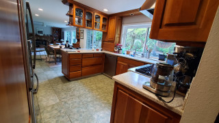
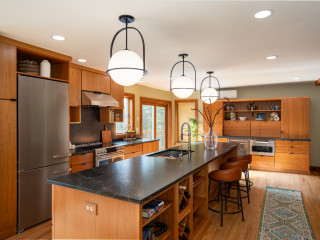
This couple purchased a pied-à-terre in Chicago’s Holden Block building, an Italianate-style landmark dating back to the rebuilding period following the Great Chicago Fire in 1871. Designed by architect Stephen Vaughn Shipman and built in 1872, the building is a standout, as many other Chicago commercial loft buildings were demolished to make way for skyscrapers. Its ornately carved Buena Vista sandstone facade earned it landmark status. The building’s conversion to residential condos in the 1990s was thoughtful, but the original kitchen in this unit did not celebrate the building’s history or architecture.
The owners brought in trusted designer Laura O’Brien of O’Brien Harris, who had designed two other kitchens for them in the past. The first kitchen she designed for them was classic white, while the second featured dramatic black. “This time they were ready for something entirely different — a moody, colorful space that embraces color in a way that feels timeless and unexpected,” O’Brien says. The new kitchen nods to the building’s industrial history and its elegant facade.
This article was originally published by a www.houzz.com . Read the Original article here. .

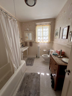


Bathroom at a Glance
Who lives here: A retired couple
Location: Keller, Texas
Size: 200 square feet (19 square meters)
Design-build pro: Chris Chumbley of USI Design & Remodeling
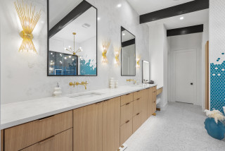
Before: The bathroom, with its tall cove ceiling, skylight, taupe walls and abundant light brown tile, felt dated and divided. Two separate single vanities with oval sinks — including the husband’s smaller one seen here — occupied opposite walls, while a corner shower beside the vanity felt squeezed in. “They wanted a walk-in shower with a wider entry,” Chumbley says. “They also didn’t want any glass in the shower, so we had to create a much larger footprint.”
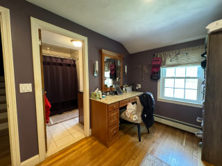
An arched doorway by the shower led to the wife’s dressing room, home office and laundry area. Across from the shower, a tiled deck surrounded an oval tub, part of which is visible at right. The homeowners wanted to incorporate the water closet in the new design.