Tag

Week

Browsing


The real estate market is a beast to navigate. From constantly shifting interest rates to flip-flopping from a buyer’s to a seller’s market, it’s rare for the industry to be predictable. However, there’s one fine detail that seems to occur in the same few months each year: the best time to sell a house. Each spring, real estate companies like Zillow and Realtor.com estimate the exact week that will yield the best results for sellers if they list their home right then.

Owners who listed their house during this year’s peak week could expect it to get 22.8 percent more views compared with those listed during an average week, to sell 17 percent faster, and to have listing prices $34,000 higher than at the beginning of January, according to Realtor.com data.

Of course, people rarely have the flexibility to prepare their house to go on the market during an exact month or week. Inspections, repairs, cleaning, photography, and appraisals take time—keep reading to find out exactly how long, on average—but we’ve noticed a pattern in the predictions, and we’re sharing it along with real estate experts’ insights so you can be ready to pounce and get the best deal possible next year.

Related Stories:Best Time to Sell a House

The best time of year to sell a house always falls in the late spring and early summer. That’s partly due to pent-up demand. Potential buyers who’ve been waiting out the slower winter market are likely to have their paperwork in order and be ready to go when they see a great listing.

Soumi Sarkar

Data source: Realtor.com

Best Week to Sell a House

This year, the best week for a quick and profitable sale was in mid-April (the week of April 14, 2024 to be exact). “The third week of April brings the best combination of housing market factors for sellers,” Hannah Jones, Realtor.com senior economic research analyst, says. “The best week offers higher buyer demand, lower competition, and fewer price reductions than the typical week of the year.”

That’s earlier than in years past: In 2023, the best weeks to sell a house were the first two weeks of June.

The Best Month to Sell a House

It may have been April this year, but historically May has been the best month to list a house. Homes listed before Memorial Day and during the best week sell an average of 17 percent faster than those listed during average weeks. That’s nine days faster than usual! “Inventory levels and price reductions climb later in the year,” Jones explains. “But buyers eager to buy soon may find success earlier in the spring as the market starts to pick up.”

Why Is It Best to Move in the Early Summer? May Marks the End of a School Year

May is a month historically associated with the beginning of summer and the end of the school year. That timing makes it more convenient for families with children to move without interrupting education requirements or adjusting to a new school midyear.

Renovations Are Easier to Complete

Renovations are best completed in the summer and fall months, after the heavy rains of spring but before the frost and snow of winter. Summer renovations ensure the weather is pleasant enough for outdoor work. While interior renovations can be done year-round, landscaping, exterior painting, and structural changes should happen during the summer. That way, homeowners who sell or buy during the best month have ample time to complete work before winter hits.

Can I Sell My Home During the Off-Season?

Yes! We understand that due to a myriad of life factors (job loss, family obligations, extenuating circumstances) it may not be possible to wait until the exact spring week when selling a home is best. Besides, listing your house during this week is just a suggestion, not a must. Selling in the winter is typically the slowest for selling your home due to holidays and weather, but it’s still possible. We recommend consulting a trusted real estate agent and preparing for a slightly longer listing period.

How Long Does It Take to List a Home?

According to both Zillow and Realtor.com data, it takes two months to hire a real estate agent, complete any minor repairs needed, clean, and appraise your home prior to listing, on average. This means that in order to sell during the peak month, you’ll want to start planning no later than the end of February. After the listing goes live, it usually takes another two months before the closing is complete and the keys are passed over.

Follow House Beautiful on Instagram and TikTok.


This article was originally published by a www.housebeautiful.com . Read the Original article here. .

Dana Langreck, CKDSave Photo
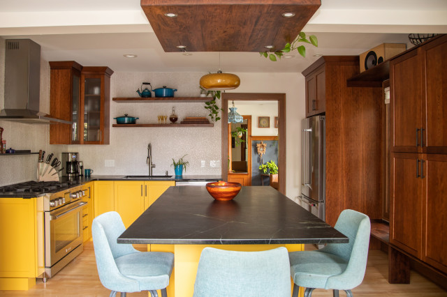
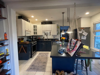
After: Langreck removed the former materials and components but kept the refrigerator. The updated space follows the previous layout. “The only wall change we attempted was to trim around the opening between the kitchen and mudroom,” Langreck says. “We just tried to make the opening as wide as possible and drywall-wrapped it.”

Frameless cherry cabinets in a low-sheen stain and other wood details add a generous dose of warmth. The lower cabinets and new island are painted a warm yellow (Brittlebush by Sherwin-Williams). Langreck incorporated the existing refrigerator but built out tons of storage surrounding it and the nearby window. “By adding a pantry cabinet over by the window we were able to gain storage over there,” she says. “We now have the microwave inside that cabinet as well, since they don’t use it very frequently.”

The island includes additional storage and seating on three sides. “Wrapping the seating around made it more comfortable for conversation and freed up the end of the island toward the sink to act as prep space without a chair in the way,” Langreck says.

She designed the wood structure over the island that was built by the husband and stained to match the cherry cabinets. It features integrated LED lights. “The ceiling heights are different with that header running across, so it was a way to connect the two spaces together and illuminate the seating area,” Langreck says. A handmade yellow pendant light complements the cabinets. The ceiling also has new LED recessed lights.

Natural maple flooring was sanded and finished in place. “They originally tried to salvage the wood floor underneath the ceramic tile, but it had too many holes and needed to be replaced,” Langreck says. “We evened out the floor in the kitchen and mudroom so it’s all one level.”

Cabinetry: Hudson panel door style, cherry in Mission low-sheen stain, Dura Supreme Cabinetry; wall paint: Creamy, Sherwin-Williams

Find kitchen remodelers near you


This article was originally published by a
www.houzz.com . Read the Original article here. .


Kirk Riley DesignSave Photo
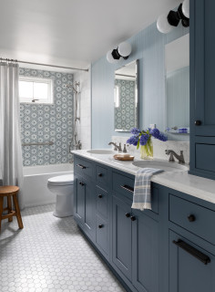
The shower accent wall consists of Carraro Blanco and Thassos marble mosaic tiles with touches of blue. “They were the inspiration for the bathroom,” Kirk says. “We played off that hexagon shape for other parts of the room. A subtle repeat of shapes and colors throughout the room makes the bathroom feel comforting.”

A 24-inch stainless steel grab bar on the back wall offers support for those entering and exiting the tub. The shower-tub combo also includes a pressure-balanced valve system, hand shower, integrated diverter tub spout and a white acrylic tub. A custom operable window brings in fresh air. Surrounding the window is 2-by-12-inch ogee molding in Apollonia marble in a honed finish. “We knew we wanted to add this hall bathroom, but then realized it would be lovely to add that window,” Kirk says. “It really brightens the space.”

The bathroom walls are covered in a blue nonwoven wallpaper with a cloth-like pattern that pairs wavy horizontal lines with straight vertical ones. “It gives you the look and appearance of linen, but it’s more durable and appropriate for a bathroom,” Kirk says.

An ADA-compliant chair-height toilet has an elongated bowl for extra comfort. “I love that this toilet is one piece and skirted for easy cleaning,” Kirk says. A teak bench offers a spot for resting towels or a book while soaking in the tub.

Accent wall tile: Aliso hexagon in blue on Carrara Blanco, StoneImpressions; grab bar: 24-inch in Brilliance Stainless, Delta; teak bench: Sage Interiors; toilet: St. George, DXV; tub: Archer, Kohler; wallpaper: Linen Strie in blue, York Wallcoverings

8 Golden Rules of Bathroom Design


This article was originally published by a
www.houzz.com . Read the Original article here. .


building Lab, inc.Save Photo
After: “To achieve the space and the kind of openness they wanted, we used steel for the new deck structure,” Shoup says. The deck required only two posts, which were welded to the beams for an elegant and simple design. “This structure is a movement-resistant frame, because this is earthquake country,” Shoup says. The new deck measures 26½ by 14 feet, and the covered patio measures 20 by 16 feet.

Look closely at the left side of this photo, where the original siding meets the new fiber cement siding, to see a thoughtful detail. The new siding juts out from the rest of the facade. “This added a thickness and clearly defined the entry and the area underneath the deck,” Shoup says.

This is an “upside-down” house, meaning the bedrooms are on the ground floor, and the living room opens onto the deck. The deck also can be viewed from the kitchen, as the floor plan is open. It’s easy for the homeowners to pour themselves a cup of coffee in the morning and then enjoy it outside among the tree canopies.


This article was originally published by a
www.houzz.com . Read the Original article here. .



This 1920s Spanish Colonial home in Kensington, California, has quite a history, including being the residence of J. Robert Oppenheimer during his time at the University of California, Berkeley. However, the home’s funky kitchen didn’t share that history; it was added on to the back of the home in the 1970s. The homeowner, who loves to cook and to host her grandchildren, looked to Houzz to find a designer when she was ready to remodel. She found interior designer Anne Norton, who came up with a design that would lighten the space and tie it in with the rest of the historic architecture.

AND Interior Design StudioSave Photo
Photos by Peter Lyons Photography

Kitchen at a Glance
Who lives here: A woman and her dog, Teddy
Location: Kensington, California
Size: 252 square feet (23 square meters)
Designer: Anne Norton of AND Interior Design Studio

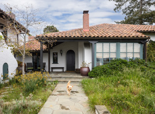
Before we step inside, take a look at this photo, which shows the home’s classic 1920s Spanish Colonial architecture. It also introduces us to the homeowner’s dog, Teddy.

The homeowner wanted her kitchen to flow with the rest of the home’s historic architecture. “She’s a big cook, she even likes to make her own yogurt and kombucha,” Norton says. She also loves to gather around the kitchen table with friends and family, especially her grandchildren.

Find a local interior designer on Houzz

AND Interior Design StudioSave Photo
Here’s a peek at the kitchen in the background, beyond the dining room. The arched opening in the foreground is an architectural element that’s repeated throughout the home. The existing opening to the kitchen had been squared off. Norton redesigned the opening, giving it a graceful arch that mimics the others in the house.

The dining room and the other original rooms had high ceilings. But the kitchen addition had a low, flat ceiling covered in dark wood.

Shop for a chandelier

Before: “The kitchen had a much different look than the rest of the house,” Norton says. “It had been strongly influenced by the School of Environmental Design at UC Berkeley in the ’70s. It was very dark, it had post-and-beam architecture, and it had a flat, low, wood-covered ceiling.” You can glimpse the squared-off opening to the dining room at left.

The cabinets were dark-stained Douglas fir, the wood on the ceiling had a dark stain, and the floors were dark. “The layout was good but there wasn’t enough storage,” Norton says. “We also wanted to upgrade the cabinetry with doors and drawers that were easy to open. The goal was to modernize the kitchen while making it feel like it was part of the original architecture.”

AND Interior Design StudioSave Photo
After: While Norton kept the addition’s original footprint and its windows and skylights intact, she looked to the ceiling to help her tie the space to the rest of the home. First she turned to a structural engineer to help remove the post-and-beam structure. Two new large steel beams were installed to hold up the roof. This allowed the designer to raise the ceiling to 9½ feet at the highest point and add a curve to it that was inspired by the arches in the rest of the home. “Raising and curving the ceiling was the most important thing we did,” Norton says. She centered the range and vent hood on the curve. The refrigerator is located at the end of the cabinet run on the right.

With the other elements in the kitchen lightened up, Norton kept the dark floors. “I am a big believer in ‘If it ain’t broke, don’t fix it,’” she says. A Middle Eastern rug adds lightness. “I like the way the soft pale oranges in the rug juxtapose with the green cabinets,” Norton says. “It brings a lot of dynamism to the space.”

Browse dining tables in the Houzz Shop

AND Interior Design StudioSave Photo
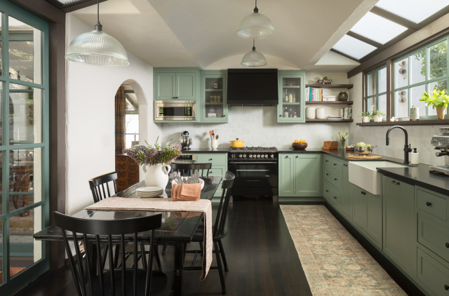
Another important element that ties the kitchen to the rest of the home is the hand-plastered finish on the walls. “We kept the materials in the kitchen simple and honest to let the architecture of the curved ceiling bring the drama,” Norton says. This includes the soft sage green on the cabinets, leathered Absolute Black granite counters and marble subway tiles.

The cabinet profiles are flush inset with simple lines and hardware. And they’re also modern, with lots of inserts and features like spice pullouts, a panel-front dishwasher and trash-recycling pullouts. They have full-extension door and drawer slides, meaning they extend out from the cabinet the full length of the slide when opened, not the typical 75%.

Norton chose Benjamin Moore’s Carolina Gull paint for the cabinets, bringing in a soft, nature-inspired color. The hardware is oil-rubbed bronze. “It will patina over time,” Norton says. This will lend a sense of age that matches other details in the home.

Find a local cabinet pro

AND Interior Design StudioSave Photo
The Douglas fir windows were a part of the 1970s addition, so Norton added Douglas fir shelves to tie in with them. She notes that being thoughtful about small details was important. “We didn’t float the shelves,” she says. “The little supports that hold up the shelves are an old-world technique. I think it’s these small details that make the kitchen feel authentic.”

The cabinets on either side of the vent hood have decorative metal mesh inserts that give them a lighter feel. Also, Norton had the marble backsplash tiles hand-cut into 4-by-8-inch rectangles. This gives them a stronger presence than if standard 3-by-6-inch tiles had been used.

AND Interior Design StudioSave Photo
This homeowner is a staunch kitchen table person, and the existing expanse of windows provided the perfect spot for one. The table is a Scandinavian piece from the 1800s. The built-in china cabinets to the left are original to the addition and worked well with the renovated kitchen’s architecture.

Norton wanted to create just the right spot for the homeowner’s Keith Haring subway art. “That wall where the art hangs was a wood grid of 12-by-12-inch cubbies that made no sense, so we took them out,” she says. She replaced them with a plastered wall that lightened the room and gave the owner a spot to hang the beloved artwork.

The large windows overlooking the back garden were a great feature of the 1970s addition. “There is a view of wisteria hanging from a trellis, and her chickens come up and look through the windows. I always leave this house loaded up with a dozen eggs,” Norton says with a laugh.

AND Interior Design StudioSave Photo


This article was originally published by a
www.houzz.com . Read the Original article here. .


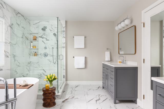
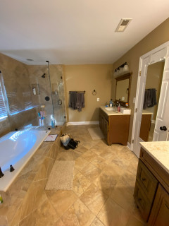
An overabundance of tan and brown finishes and a large built-in tub made for a drab and heavy look in Michael and Yoshie Davison’s primary bathroom. Yearning for a light and airy feel with a fresh style, they turned to designer Shelley Vilov and project manager David Jordan, both of whom had helped the couple update another bathroom in their home.

The remodeling team replaced the built-in tub with a freestanding model that helped loosen up the layout and allow for a bigger shower. White marble-look porcelain tiles cover the floor and the walls wrapping the shower and tub area, creating a brighter look. Pale gray walls also brighten the space, while midtone gray vanities and chrome fixtures and details add touches of fresh, modern style.


This article was originally published by a www.houzz.com . Read the Original article here. .
Pin It