This article was originally published by a www.houzz.com . Read the Original article here. .

This article was originally published by a www.houzz.com . Read the Original article here. .

To integrate the addition, the remodeling team took the existing kitchen down to the studs for a full overhaul. Interior designer Nicole Martel worked closely with the couple to develop a layout tailored to how they wanted to use the space and choose finishes that felt appropriate for the home’s period architecture. The new kitchen features an island large enough to seat the whole family, a second oven for holiday cooking and a walk-in pantry concealed behind false cabinet doors.
This article was originally published by a www.houzz.com . Read the Original article here. .
![]()
For this busy Minnesota couple with three teenage daughters, the original primary bathroom was cramped, dated and uninspiring. Designer Victoria Johnson transformed the space into a serene retreat with a freestanding soaking tub, a furniture-style white oak double vanity and a spa-worthy shower with integrated LED lighting. Soothing neutral tones, thoughtful storage and luxe finishes turned this once-boring bathroom into a peaceful, elevated haven perfect for recharging after a hectic day.
Before Photo
Bathroom at a Glance
Who lives here: A couple — a CPA and an art teacher — with three teenage daughters
Location: Maple Grove, Minnesota
Size: 170 square feet (16 square meters)
Designer: M. Victoria Johnson Interiors
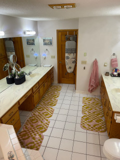
Before: The former bathroom, with powder blue walls and a basic beige tile floor, had an aging wood double vanity that offered little storage. “Storage was an issue for sure,” Johnson says. “Everything was just in need of an update and upgrade.”
A solid-surface countertop and row of Hollywood-style vanity lights dated the space. Nearby, a corner tub with deck ate up valuable square footage. The door at right leads to the primary bedroom; the other door reflected in the mirror opens to the couple’s closet.
A tower cabinet with adjustable shelves provides storage for linens and essentials. Its metal-framed door with reeded glass lightens the vanity wall while hiding clutter. The large bottom drawer includes a built-in outlet and custom partition for hair tools.
The counter and backsplash are Fusion quartzite, a durable natural stone with dramatic patterning and swirling colors. “It’s stunning and definitely the wow factor of this bathroom,” Johnson says. Mitered edges give the countertop a substantial feel. Walls, ceiling and trim are painted a light greige (Gossamer Veil by Sherwin-Williams) with a limewash finish. “Limewash is good for spaces with moisture, and I also wanted to have texture but not do tile everywhere,” Johnson says. “I figured if we went with a finish that was good for a space with moisture we could solve that. It also adds texture to the space.”
The floor was upgraded to 12-by-24-inch large-format light gray matte porcelain tiles laid in a herringbone patter with matching grout for a clean, contemporary look.
Find a bathroom designer on Houzz
A bold, extra-large black LED zigzag sconce mounted vertically between the mirrors adds modern flair. “I don’t like sconces above mirrors,” Johnson says. “I think when you have them next to the mirror you get better lighting. In this space I didn’t have the room to add them on each side, so I put one in the middle. This one in particular is more like a decorative piece or statement.” New recessed LED ceiling lights on dimmers provide overall illumination. (They were digitally removed by the photographer to showcase other design details.)
Sconce: Zig Zag, Visual Comfort; medicine cabinets: Infinity in black, CB2
Before and After: 4 Elevated Bathrooms in 170 to 180 Square Feet
Faucet: Castia in brushed nickel, Kohler
See why you should hire a professional who uses Houzz Pro software
Before Photo
10 Bathroom Vanity Features Pros Always Recommend
A floor-mounted tub filler with hand shower head and diverter in vibrant brushed nickel matches the vanity faucets. Durable fabric drapes soften the existing windows and add warmth. Johnson mounted the drapery rod a few inches higher to visually lift the walls. She also removed the window trim and added a sheetrock detail for a cleaner, more modern look.
10 Ways to Control the Cost of Your Bathroom Remodel
Before Photo
The door next to the shower leads to the water closet, which the homeowners wanted to keep. “We changed the toilet, continued the tile into that space and painted the water closet,” Johnson says.
New to home remodeling? Learn the basics
The new setup includes a fixed shower head, an 8-inch contemporary rain can, a hand shower and a pressure-balanced valve with diverter, all in vibrant brushed nickel. A long niche keeps products organized and off the floor, while an integrated LED lighting strip adds a modern glow. “I love the overall look and feel,” Johnson says. “It’s definitely not a basic bathroom anymore. The improved storage we gave them is great too.”
More on Houzz
Read more stories
Browse photos for ideas
Find home professionals
This article was originally published by a www.houzz.com . Read the Original article here. .


While Clarke-Bishop has reduced the amount of black in the room, she’s also banished most of the white to make the kitchen feel warmer and more inviting.
“At first we were trying to do a pink kitchen, but we couldn’t find a shade that would work in this light — everything either looked too sugary or too dirty,” she says. They settled on a very pale but warm gray.
The walls, meanwhile, are a subtle pinkish-white. “It brings warmth into the room without being an overt color,” Clarke-Bishop says.
The client loves black, so Clarke-Bishop has retained some, designing a black island that echoes the existing range. The island is on legs. “It not being solid allows more light to come through and gives it a bit more airiness,” she says.
The island isn’t huge — 64½ inches long by 35½ inches wide by 32 inches deep — but it’s perfect for the homeowners. “They really didn’t want any appliances in the island. They wanted it to be a standalone” countertop, Clarke-Bishop says. “It’s become a real focal point of the kitchen — everyone stands around it chatting.”
The legs are a modern take on a Victorian turned leg. “I researched lots of Victorian table legs to find a good combination of the detail they needed to add a bit of something to the space without it being overly ornate, because everything’s quite simple and calm in the room,” Clarke-Bishop says.
The countertop is Arabescato marble, which has a hint of pink in it. The remaining countertops are a simple, lightly marbled quartz, “just to allow the island to have a shining moment.”
The refrigerator sits behind the far-left door, with a pantry in the right-hand tall cabinet.
Cabinet paint: Strong White; island paint: Pitch Black, both Farrow & Ball; wall paint: Rose Tinted White, Edward Bulmer
This article was originally published by a www.houzz.com . Read the Original article here. .


An 11-by-3½-foot island serves as the center of the kitchen and its English-kitchen-inspired green paint, marble countertop with an ogee edge and oversize glass pendant lights make it stand out. The seeded glass and knurled brass on the lights add texture and dimension, while their transparency keeps them from overwhelming the space. “I’d always rather have lights be oversized than anything that looks the slightest bit undersized,” Wunder says.
Beyond the island, a range alcove serves as the focal point. The range hood has a subtle curve to it and is flanked by countertop cabinets that provide storage for everyday dishes and glassware.
The homeowners wanted a scullery, or back kitchen, to hold additional prep space, the fridge, a second sink and dishwasher for hiding pots and pans when entertaining, small appliances, a second oven and storage for pantry items, wine, glassware, serving pieces and more. “The main kitchen laid out really nicely because we knew how much the back kitchen would be supporting it,” Wunder says. “It allowed the kitchen to become more of an entertaining kitchen.”
Find an interior designer on Houzz
This article was originally published by a www.houzz.com . Read the Original article here. .

She turned to McDonald Remodeling with a collection of Houzz inspiration photos for a full transformation. A bold botanical print wallpaper sets the eclectic, resort-like tone. A custom rift-sawn white oak floating double vanity and matching makeup station boost storage, while a spacious open shower and freestanding tub give the room an airy, modern feel. Carefully chosen light fixtures, tiles, art and accessories layer in style and color, turning this once-bland bathroom into a joyful, tropical escape from Minnesota winters.
This article was originally published by a www.houzz.com . Read the Original article here. .

The vine growing up the corner of the house and along the entry overhang was another priority within the design. “This is a hop vine [Humulus lupulus, zones 4 to 8] that the homeowner has been growing for many years. He had trained it across the overhang, and it was important to him that we protect it,” Galante says.
Galante reports that the homeowners love their pots and planters. She filled the built-in brick planters around the patio with ‘EverColor Everest’ Japanese sedge (Carex oshimensis EverColor Everest ’Carfit01’, zones 5 to 9), which adds soft color and texture against the fence. The pot on the right has autumn fern (Dryopteris erythrosora, zones 5 to 8) and creeping jenny (Lysimachia nummularia, zones 3 to 9).
This article was originally published by a www.houzz.com . Read the Original article here. .
![]()
Kitchen at a Glance
Who lives here: A couple
Location: South Minneapolis, Minnesota
Size: 225 square feet (21 square meters)
Design-build firm: Bluestem Remodeling
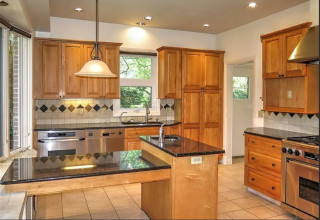
The kitchen features custom Shaker-style cabinets in a mix of black and wood units. Polished gold-tone knobs and pulls add refined accents. “The clients were really interested in not having a monolithic look with their cabinetry,” says Mark Ferraro-Hauck, director of design at Bluestem Remodeling. “I love the repeated black throughout the room, but it’s not a black kitchen.”
Wide-plank white oak flooring has a special sealer that preserves its natural, unfinished appearance. “It integrates really well with the rest of the house, giving it a consistent flow,” Ferraro-Hauck says. “We didn’t want the kitchen to feel completely separate from the rest of the house.”
A large sliding glass door opens the kitchen to the patio and backyard. “Their backyard is their summer living room,” Ferraro-Hauck says. A double-hung window on the same wall adds another source of daylight and fresh air.
Custom cabinetry: Sean’s Cabinetry
Find kitchen remodelers on Houzz
This article was originally published by a www.houzz.com . Read the Original article here. .

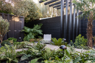
You can also see one of the ways she gave the small space depth, with the eye going from the black patio door frames to the steel pergola to the black wood posts attached to the shed.
Bejanaru also planted four new trees, placing the two tallest nearer to the house and the two shorter ones at the back. “The plants in front draw the eye upward, then the shorter ones — visually below the other two — draw your eye to the back of the [yard], so you have several focal points,” she says.
The new trees consist of two Tasmanian tree ferns (Dicksonia antarctica, USDA zones 9 to 10; find your zone) — one on the front left and the other at the back right; a tall windmill palm (Trachycarpus fortunei, zones 7 to 11) and a pineapple guava (Acca sellowiana, zones 8 to 10) in front of the shed.
The huge olive tree was already there. “We kept it, of course, because it’s beautiful and I also love the color of the bark, which stands out,” Bejanaru says.
9 Design Tips to Enhance Views of Your Garden From Indoors