This article was originally published by a www.houzz.com . Read the Original article here. .
This article was originally published by a www.houzz.com . Read the Original article here. .
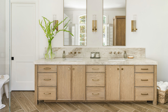
A walnut double vanity helps anchor this updated 56-square-foot Oakland, California, bathroom by William Adams Design. Tall legs create a lighter, more open feel, while the elimination of an old shower stall made room for the 5-foot-long ready-made model with semicustom features. Undermount sinks, gunmetal-finish faucets and marble-look quartz countertops and backsplashes add durability and polish. Combined with abundant natural light and a biophilic mix of materials, the warm wood vanity helps strengthen the room’s connection to nature.
Semicustom double vanity: Room & Board
Read more about this bathroom makeover
This article was originally published by a www.houzz.com . Read the Original article here. .

After: The remodeling team replaced the cramped original addition with a much larger, light-filled living room that includes a modern fire feature and a TV. Wrapped in expansive windows and offering direct access to two new decks, the space finally capitalizes on the home’s scenic setting. “All these spaces connect now,” Jants says. “The kitchen is now centered between two entertaining areas. You can host and have separate conversation areas yet you’re still in the same space.”
At the end of the island, the structural support posts sit atop acrylic globes. “They’re different and an uncommon decorative element,” Jants says. “They’re like salt. They season the design.”
This article was originally published by a www.houzz.com . Read the Original article here. .

Bathroom at a Glance
Who lives here: A couple
Location: Denver
Size: 200 square feet (19 square meters)
Designer: Rachel Ogburn of Rowe Interior Design
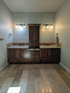
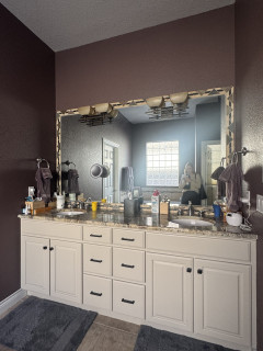
Before: The existing double vanity was in good shape, but the homeowners wanted to replace the oval sinks and brown granite countertop. “We repainted the cabinetry when we did the rest of the home in 2024,” Ogburn says. “It used to be yellow oak cabinets and we did it in Accessible Beige (by Sherwin-Williams). We also updated the hardware then.”
A large framed mirror made the rectangular vanity feel boxy. “It also didn’t utilize the very tall ceilings they had in there,” Ogburn says. “The mirror made it feel squatty.” Deep aubergine walls paired with dated finishes added visual weight, while oversize beige floor tiles meant to mimic stone fell flat. “They almost permanently looked muddy,” Ogburn says. “Also, the installation was just square-on-square.”
The walk-in shower to the right of the vanity continued the beige-on-beige look with more tile and outdated fixtures.
This article was originally published by a www.houzz.com . Read the Original article here. .
Kitchen at a Glance
Who lives here: A couple and their child
Location: Calgary, Alberta
Size: 192 square feet (18 square meters); 12 by 16 feet
Designer: Megan Stimpson of Alykhan Velji Designs
Builder: Sukhman Mahal of Bright Custom Homes
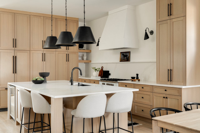
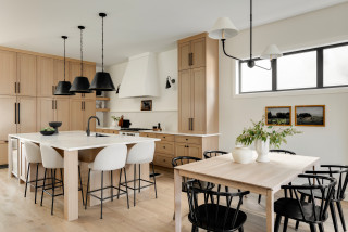
The design came together in a somewhat unconventional way. Sukhman Mahal, co-owner of Bright Custom Homes, began the build as a spec house. The design process with Stimpson was well underway before the family bought the home. “From the beginning, we wanted transitional style that would be timeless and have wide appeal,” Stimpson says. “The layout of the space is long and quite narrow. We used the same wood tones and wall paint within the open floor plan to keep things simple, bright, neutral and cohesive.”
Because construction was still in progress when the house sold, the new owners had the opportunity to tweak the finishes to suit their personalities. The room already had white oak cabinetry, off-white quartz countertops and antique oak engineered flooring. However, they were able to change the backsplash, lighting, faucet and cabinet hardware selections.
Wall color: White Dove, Benjamin Moore; flooring: 7½ -inch Wildwood Antique Oak planks in Istanbul, Magna Hardwood Floors
Find a builder on Houzz
This article was originally published by a www.houzz.com . Read the Original article here. .
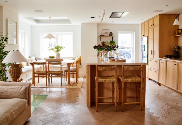
Key to the transformation was moving the kitchen up from the windowless basement to the airy ground floor and turning the lower level into a snug TV room, giving the family plenty of spaces to hang out, entertain and relax. Then Shirin and Natascia brought in natural materials — wood, rattan, linen and stone — for texture and warmth. What elevates the renovation, though, are the many beautiful details they incorporated, from the double bullnose countertop edge to sawn-oak cabinet door trims to custom wardrobes in the bedroom.
This article was originally published by a www.houzz.com . Read the Original article here. .
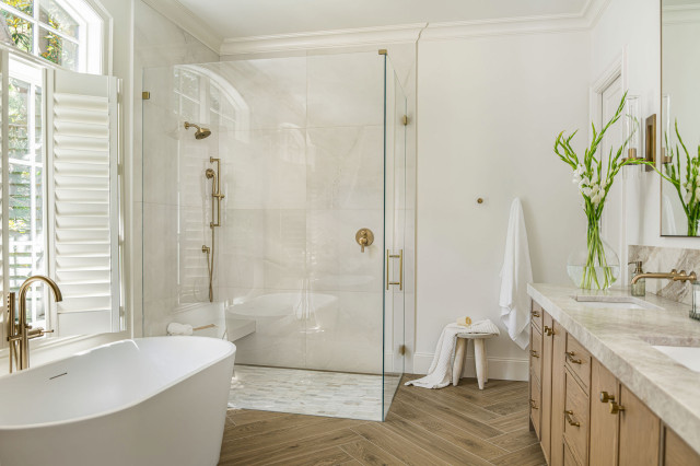
The shower has a marble mosaic floor that provides another traditional touch. On the walls, large-format (30-by-60-inch) porcelain tiles have an onyx look. The floating shower bench is also covered in these tiles for a seamless, minimalist effect.
The shower water flows into a linear drain on the right. “This drain was a challenge,” Rieser says. “My clients really wanted a linear drain, and we wound up having to have this one custom-made and painted.” The drain and the floor that slants toward it contain the water within the shower stall, allowing for a curbless entry.
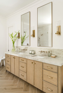
The rest of the bathroom also has tile flooring. “We wanted the classic look of a herringbone wood on the floors,” Rieser says. “To avoid water damage to real wood, we opted for a ceramic tile that has a wood look.”
This article was originally published by a www.houzz.com . Read the Original article here. .
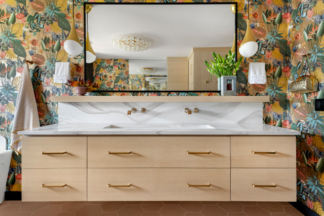
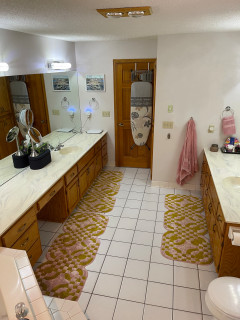
She turned to McDonald Remodeling with a collection of Houzz inspiration photos for a full transformation. A bold botanical print wallpaper sets the eclectic, resort-like tone. A custom rift-sawn white oak floating double vanity and matching makeup station boost storage, while a spacious open shower and freestanding tub give the room an airy, modern feel. Carefully chosen light fixtures, tiles, art and accessories layer in style and color, turning this once-bland bathroom into a joyful, tropical escape from Minnesota winters.
This article was originally published by a www.houzz.com . Read the Original article here. .
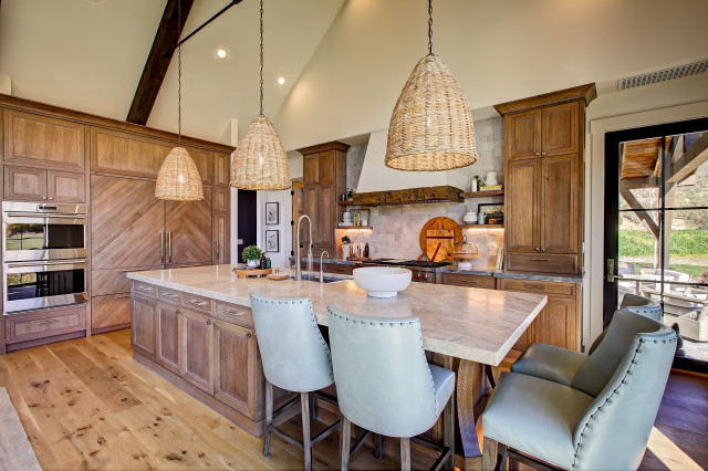
Rustic style brings a relaxed, real-world edge to a kitchen. Rough-hewn wood, natural stone and handcrafted details add texture and toughness — a welcome balance in a space made for hard work and happy messes. Even a few rugged touches can give a kitchen that lived-in, collected-over-time charm. See how these new kitchens mix raw materials and refined design, creating inviting, hardworking spaces full of character.
Designer: Lauri Johnson of Swan Home Design
Builder: B&B Builders
Location: Swan Valley, Idaho
Size: 322 square feet (30 square meters); 13 feet, 10 inches by 23 feet, 3 inches
Homeowners’ request. “The owner wanted their kitchen to be spacious, functional and warm and inviting,” says designer Lauri Johnson. “They love to entertain and wanted to be able to have multiple people in the kitchen at a time, so we gave them plenty of room to maneuver between the island and the stovetop and fridge.”
Rustic details. Reclaimed-timber range hood detail. Rift-sawn white oak cabinets in a custom stain. Stone zellige tile backsplash. Wide-plank knotty wood flooring. Taj Mahal quartzite island countertop. Allure quartzite perimeter countertop. “We chose different quartzite countertops in order to create more interest and texture,” Johnson says.
Other special features. “The seating arrangement still allows for plenty of storage for a busy kitchen and to be able to sit together and enjoy a family-style meal,” Johnson says.
Paint colors: Alabaster (walls) and Shoji White (trim), Sherwin-Williams
Find a home professional on Houzz
Designers: David and Agi Losonczi of Revival Contractors
Location: Newport Beach, California
Size: 280 square feet (26 square meters)
Homeowners’ request. “The homeowners wanted a bright, timeless coastal kitchen that still felt warm and lived-in,” says designer Agi Losonczi. “Their old layout was dark, dated and lacked functional storage. They dreamed of a light, open space that reflected the relaxed elegance of Newport Beach — something classic yet current. We focused on improving natural light flow, creating hidden storage and integrating warm textures so the space would feel both inviting and refined.”
Rustic details. “To bring a soft coastal-rustic charm, we used wide-plank European oak flooring and a handcrafted natural stone tile backsplash in mixed beige and ivory tones,” Losonczi says. “The marble-look quartz countertops add luxury while being easy to maintain. Natural white oak accents on the range hood trim and island bring warmth and texture. These materials were chosen for their organic character — subtle imperfections, matte finishes and soft colors that give the room a sense of authenticity and calm.”
Other special features. Custom Shaker cabinets in White Dove by Benjamin Moore. Brushed brass pulls.
Designer tip. “When we’re designing a bright kitchen, we mix different warm materials like natural wood, soft white paint and unlacquered brass to keep it from feeling sterile,” Losonczi says. “We also use hidden outlets under cabinets and lighting with warm color temperature to maintain a cozy glow day and night.”
Backsplash: Zellige in Natural White, 4 by 4 inches, Cle Tile; stools: Balboa, Serena & Lily; wall paint: Swiss Coffee, Benjamin Moore
See why you should hire a professional who uses Houzz Pro software
Design team: Greg Howe and Pam Lamaster-Millett (designers) and Dana Burgess (project manager) of Searl Lamaster Howe Architects
Location: Harbert, Michigan
Size: 306 square feet (28 square meters); 9 by 34 feet
Homeowners’ request. “For this multigenerational retreat, our client wanted a kitchen with ample space for everyone,” says project designer Dana Burgess. “The final plan design is composed of several prep and cooking zones connected by the large central island. The result is a welcoming setting ideal for hosting large gatherings — casual, comfortable and naturally inspired.”
Rustic details. “We wanted the cabinet design to give a nod to more traditional framed cupboards but without applied hardware,” says designer Pam Lamaster-Millett. “The horizontal band serves as integrated pulls and lets the plain-sawn white ash be the focus. Additionally, keeping the background elements such as the wall and flooring tones neutral allowed for the millwork to be the standout feature within the kitchen.”
Other special features. “The kitchen’s location within the house is strategic,” says designer Greg Howe. “It’s tucked just steps away from the front entry yet screened from view by a partial-height wall. A shallow shelf serves as a perch not just for everyday glasses and tableware but select pieces of art and family mementos. The pine-stained wood ceiling from the dining room and foyer beyond extends into the space, connecting the spaces and enhancing the sense of openness. Open views from the adjacent living room called for a less cluttered aesthetic.”
The countertops and backsplash are quartz. The flooring is porcelain tile. The range and cooking zone are just out of view on the left, directly across from the island end. “It’s set slightly apart for two reasons,” Howe says. “First, it reduces congestion in the kitchen, which is a good thing given it is often used by several people during food prep. Second, it removes the range and exhaust hood from a direct line of sight from the living room the kitchen opens onto.”
Designer tip. “Opting for a shallow shelf instead of upper cabinets in the work zone really opens the area for better light,” Lamaster-Millett says.
“Uh-oh” moment. “The original cabinet stain was envisioned in a soft green — a deliberate contrast from the natural wood tones of the wood framing and pine ceiling above,” Burgess says. “The final deep brown was a safer pivot made during shop drawings.”
How to Design a Kitchen That Brings People Together
General contractor: Ashley Wainscott of Simply Home
Location: Austin, Texas
Size: 250 square feet (23 square meters)
Homeowners’ request. “The homeowners wanted an updated space with a nod to modern design while honoring the rustic roots of their home and location,” says general contractor Ashley Wainscott. “They wanted their countertops and cabinets to be the center of attention and to carry those countertops throughout the downstairs of the home.”
Rustic details. Knotty pine cabinets and beams. Black Galaxy granite perimeter countertop. Light granite island countertop. Large-format stone tile flooring.
Other special features. “Refinished ceilings and updated wall colors brighten the space and enhance its architectural details,” Wainscott says. “Multiple coats of high-quality paint and precise prep work created a polished, durable finish. The standard horizontal brick lay kept the backsplash light and airy, keeping your eyes on other parts of the kitchen.”
More on Houzz
Read more stories
Browse photos for ideas
Find home professionals
This article was originally published by a www.houzz.com . Read the Original article here. .

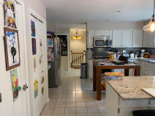
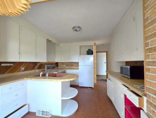
After: Reesey removed the fridge wall and flipped the locations of the kitchen and dining area, adding a 5-foot bump-out along the way. (For orientation, check out the white door in both photos; it leads to an outdoor walkway and stayed in the same place.) These moves more than doubled the size of the kitchen, to 313 square feet, and allowed for expansive storage, better flow and a pleasing openness.
Three kinds of wood bring warmth without feeling one-note: milled pine on the ceiling beams, maple on the island base and oak for the flooring. The dining furniture and a band on the range hood complement the other wood elements, while green cabinets (painted in Dried Thyme by Sherwin-Williams) and white walls, countertops and backsplash tile balance the color palette. Texture and movement come from the wood graining and the backsplash tiles’ scallop shapes.
Paint colors: Dried Thyme, Sherwin-Williams (cabinets); Wind’s Breath, Benjamin Moore (walls); Super White, Benjamin Moore (trim)
Read more about this project
This article was originally published by a www.houzz.com . Read the Original article here. .

The upgraded shower includes a rain shower head, a standard shower head and a handheld wand. Heated floors, controlled by a dedicated thermostat separate from the rest of the bathroom, add comfort underfoot. To permanently resolve the moisture issues, Boyd installed a high-efficiency exhaust fan with integrated sensors that automatically detect humidity and run as needed.
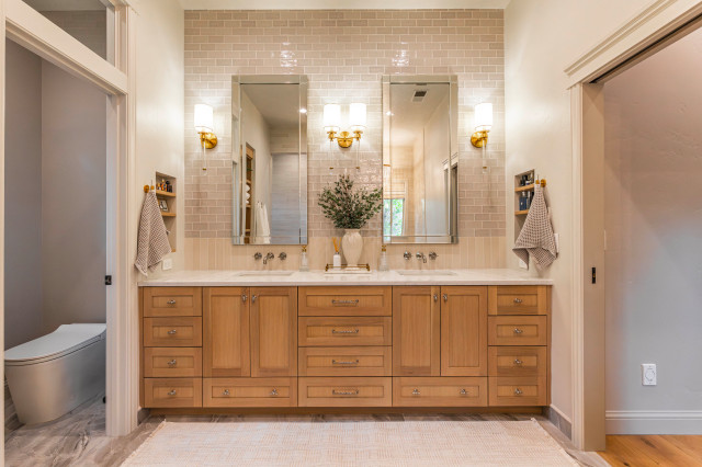
Extending the tile to the ceiling enhanced the room’s boutique hotel feel while protecting the drywall from tub splashes. Lienhard grounded the space with wainscoting made from the same large-format marble-look porcelain tile used on the floor. Above it, she wrapped the walls in the elongated subway tile featured at the vanity, connecting the two tile styles with a delicate pencil liner.
Floor and wainscoting tile: Magnifica Pietra Bianca, Bedrosians; grout color: Warm Gray, Prism