Tag

Update

Browsing


This Canadian couple with two young children found that the kids’ bathroom in their 1919 Tudor-style home in Kitchener, Ontario, was not particularly child-friendly. To add storage, make bath time easier and update the room for modern life, they turned to contractor Tyler Sonnenberg and designer Marissa Warner. Using warm white oak, soft green ceramic tiles, champagne-bronze fixtures and vintage-inspired touches, they created a cheerful space that fits the home’s style and will grow with the kids.

“After” photos by Marissa Warner

Bathroom at a Glance
Who lives here: A couple and their two young children
Location: Kitchener, Ontario, Canada
Size: 60 square feet (5.6 square meters)
Designer: Marissa Warner of The Home Narrative
Contractor: Tyler Sonnenberg of Sonnarc Homes

Before: The bathroom lacked adequate storage and had a shallow bathtub (just outside of this photo’s frame to the left). It also lacked a handheld shower wand, a practical feature for bathing little ones.

Find a general contractor on Houzz

Sonnarc Homes Ltd.Save Photo
After: While much of the room changed, the layout stayed the same. Keeping the existing plumbing rough-ins helped control costs, freeing up room in the budget to have the two water walls tiled from floor to ceiling. The expanse of soft green tiles not only prevents water damage but also adds a compelling visual impact.

“Replacing the toilet was the one thing they’d done to this bathroom before we renovated, so we kept it,” Sonnenberg says. Reusing it was another way to keep the budget in check. The standard-height toilet sits lower than a comfort-height model, making it easier for newly potty-trained toddlers to use.

10 Ways To Control the Cost of Your Bathroom Remodel

Sonnarc Homes Ltd.Save Photo
“Everything in here is in keeping with the style of the home,” Sonnenberg says. He and the homeowners collaborated with Warner to find the right finishes. Square ceramic tiles in earthy green hues offer a subtle nod to the Tudor Revival era. The beaded-wood mirror frame, white-glass light fixture and champagne-brass plumbing fixtures add vintage charm. While the duck prints add a playful touch, the timeless material palette suits all ages and will allow the bathroom to grow with the kids.

A compact white oak vanity with a natural finish maximizes the small footprint. Its top drawer is fully functional, and is U-shaped to accommodate the sink’s P-trap. The other two drawers are deep enough to accommodate bottles and larger items such as extra towels.

See why you should hire a professional who uses Houzz Pro software

Sonnarc Homes Ltd.Save Photo
“I suggested we integrate a built-in step stool so that the kids could feel more independent washing their hands or brushing their teeth,” Sonnenberg says. Thoughtful design by the cabinetmakers at Kitchen Appeal ensured that the step would be both functional and safe.

With heavy-duty hinges, the wood top supports a weight of 75 pounds. Wheels underneath make the drawer easy to slide out, and they retract automatically once it’s fully extended, to prevent rolling. “We also added that little baseboard detail at the bottom to keep the wheels hidden,” Sonnenberg says. The wooden platform is easy to flip up, enabling the drawer to hold items such as towels and extra toilet paper rolls.

Floor tile: Polestar collection, Unicomstarker

For additional storage, Sonnenberg and Warner outfitted an existing alcove with built-in open shelves and a cabinet door. The cabinet’s white oak and door style match the vanity’s, and the door’s pull mirrors the one on the vanity’s top drawer.

The entry door and its hardware are original to the home. A new etched-glass casement window replaced the existing window, letting in more light while providing privacy.

Check out our guide to get started on your home project

Sonnarc Homes Ltd.Save Photo
The versatile new shower head can be mounted or used as a handheld wand, which is especially helpful for rinsing bath suds and cleaning the tub.

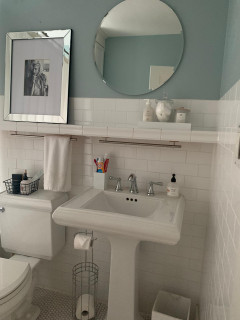
Plumbing fixtures: Trinsic in champagne brass, Delta; wall tile: 5-by-5-inch Renzo Jade ceramic tile, MSI Surfaces

5 Stylish New Bathrooms With a Shower-Tub Combo

Sonnarc Homes Ltd.Save Photo
Because the soaking tub has slim edges that aren’t wide enough to hold bottles, they needed another solution. “The walls were kind of busy, so I suggested using a ledge instead of a niche,” Sonnenberg says. The quartz-topped ledge with an ogee edge runs along the wall above the standard 60-inch soaking tub, tying in with the vanity countertop and echoing the home’s original architectural details.

More on Houzz
Read more bathroom stories
Browse bathroom photos for ideas
Find design and remodeling pros


This article was originally published by a
www.houzz.com . Read the Original article here. .


Twenty years after building their home in the countryside outside Fayette, Ohio, this couple were ready to rethink their primary bathroom. The teal walls, single-sink vanity and corner shower-tub layout felt dated and underwhelming, especially the tub they rarely used and the cramped storage. They had always imagined a more customized retreat that reflected how they actually live, but the options just weren’t there when they built the house.

With a clear vision and a collection of inspiration photos in hand, the homeowners turned to Lange Custom Builders to transform the space. By removing the corner tub and expanding into two closets, the team added 35 square feet, freeing up space for a floating walnut double vanity and a spacious low-curb shower that lend a light and airy feel. Oversize checkerboard porcelain floor tiles and richly toned zellige shower tiles add personality and texture, delivering a classic-meets-modern bathroom that finally feels tailored to the couple’s preferences and lifestyle.

Before Photo

Lange Custom Builders, Inc.Save Photo

Photos by Lindsey Lange of Lange Custom Builders

Bathroom of the Week
Who lives here: A couple with teenagers
Location: Fayette, Ohio
Size: 185 square feet (17 square meters)
Design-build firm: Lange Custom Builders

Before: The former 150-square-foot bathroom had teal walls, an off-white ceramic tile floor and a large corner tub with tiled deck that the homeowners rarely used. “It wasn’t functional and they needed more storage space and an open flow,” says Lindsey Lange, co-owner of Lange Custom Builders. “This couple came to us with a clear vision of what they wanted since they built this home 20 years ago and were ready to make it their dream bathroom with style and function.”

A standard single-sink vanity (partially seen on the right) sat near the tub, while the toilet and small corner shower were positioned across the room. Two small closets further broke up the layout.

Two windows over the tub brought in natural light, but the room still felt dark. “She really wanted to see the window from the door of the bathroom and bedroom,” Lange says. “She wanted as much natural light as possible.”

Lange Custom Builders, Inc.Save Photo
After: Lange removed the tub, flooring, vanity, shower and toilet. “Everything was torn down to the studs, both in the bathroom and bedroom area,” Lange says. She then reworked the layout, creating a new water closet in the former shower area, converting the former toilet zone and one closet into a walk-in closet and transforming the second closet into a spacious low-curb shower.

These changes freed up space for a custom-built floating walnut double vanity. The contemporary piece features white sinks with vertical sides, luxe gold widespread faucets with square spouts and a Calacatta Viola marble-look quartz top with a 6-inch mitered-edge profile. “She had an inspiration picture we went off of for the vanity,” Lange says. “Especially the counter.”

Large-format (24-by-24-inch) matte porcelain floor tiles in white and asphalt with light gray grout add durability and drama. “The material is very practical, and they give the bathroom a bold statement with the checkerboard pattern,” Lange says.

Larger operable double-hung windows on two walls flood the space with natural light and fresh air. “They also made the bathroom feel a lot bigger because they’re more proportional to the wall space,” Lange says.

Floor tile: Sterlina II in white and Asphalt, matte finish, 24 by 24 inches, Emser Tile; sinks: Verticyl, Kohler; faucets: Allaria widespread with square spout in Luxe Gold, Brizo

Find a bathroom remodeler on Houzz

Lange Custom Builders, Inc.Save Photo
The new vanity offers easy-access drawer storage for grooming products and other essentials. The homeowners opted for no visible hardware on the drawer fronts. “The drawers have integrated handles and electrical outlets,” Lange says. “She wanted a clean look to it. Just simple and modern.”

Arched mirrors and white-and-gold pendant lights add a glam touch, while new LED recessed ceiling lights improve overall illumination. A warm off-white paint with soft, creamy undertones (Alabaster by Sherwin-Williams) keeps the space bright without feeling stark. “Alabaster is a color we use often in our projects,” Lange says. “It’s for people who want white but a bit of more warmth to it.”

10 Bathroom Vanity Features Pros Always Recommend

Before Photo

Lange Custom Builders, Inc.Save Photo

Before: The former single-sink vanity lacked style and user-friendly storage. “It was just very outdated and she didn’t have good storage for all of the things she needed,” Lange says. “It also had no personality. It was a standard vanity and she wanted a custom look.” The wall to the right is the exterior of one of the two small closets the room contained.

See why you should hire a professional who uses Houzz Pro software

Lange Custom Builders, Inc.Save Photo
After: Lange absorbed the closet into the bathroom, creating space for a larger, low-curb shower with a custom tempered glass enclosure. The same marble-look quartz used for the vanity top was carried into the shower. “The countertop material was used for the curbs to tie everything together and keep the flow for the bathroom,” Lange says. The doorway to the right of the shower opens to the primary bedroom.

Before and After: 4 Stylish Bathrooms in 150 to 190 Square Feet

Lange Custom Builders, Inc.Save Photo
The shower walls are lined with authentic zellige tiles made from natural unrefined clay in a moody red-brown color. These handcrafted tiles have a variation in tone that adds depth and dimension. “She went back and forth on what she wanted the shower to look like, and the color of these tiles was one of the last things she picked out,” Lange says. “She liked the moody feel of them and liked how the color was similar to the color of the walnut vanity.”

The shower includes a fixed modern shower head and hand shower on a slide bar in a gold finish. A custom double niche and built-in bench feature the same quartz as the vanity counter and shower curbs.

Shower fixtures: Litze in Luxe Gold, Brizo; wall tiles: Burnt Sugar, 4 by 4 inches, Zia Tile

10 Tips for Designing the Perfect Shower

Before Photo

Lange Custom Builders, Inc.Save Photo

Before: The corner shower sat next to an aging white toilet. “The toilet was sort of just out in the open,” Lange says. A small linen closet to the left of the toilet, hidden behind a door, added little function. Lange and the homeowners saw the potential to reimagine and expand the space.

Lange Custom Builders, Inc.Save Photo
After: At the far end of the photo, near the sunlit window, a new water closet on the left replaces the former corner shower. Midway along the wall on the left, an opening now leads to a walk-in closet that Lange created from the former toilet and linen closet. Opposite the closet opening, the vanity is partially visible on the right wall. In the foreground on the left, a new linen closet behind black-framed glass doors features walnut drawers and shelving. It stands across from the shower. “She saw a picture she liked and thought it looked clean and luxurious with the glass doors,” Lange says. “The black frame with the glass doors and the walnut just looked really beautiful.”

New to home remodeling? Learn the basics

Lange Custom Builders, Inc.Save Photo
Here’s a peek inside the new walk-in closet off the upgraded bathroom. “The arched mirror in here and the dark walnut cabinetry and drawers match the vanity in the bathroom,” Lange says. “The bathroom has a more open feel with a lot more natural light and the warmth of the walnut. It’s more modern now than it was before, but also timeless because of the classic elements like the marble-look tiles on the floor and the marble-look quartz.”

More on Houzz
Read more stories
Browse photos for ideas
Find home professionals


This article was originally published by a
www.houzz.com . Read the Original article here. .


When it came time to refresh their dated primary bathroom, this retired Keller, Texas, couple turned to a familiar face. Three years earlier, they’d found design-build pro Chris Chumbley on Houzz and hired him to update the kitchen in their 2006 traditional-style home. Now they called him back to tackle the bathroom’s outdated finishes and cramped layout.

Seeking better function and a high-end look, the couple envisioned a more open, airy layout with ample storage and a spacious shower. Chumbley, who uses Houzz Pro software, delivered with a sleek, curbless shower free of glass or doors, a custom white oak double vanity with all-drawer storage and an elegant freestanding tub that enhances the sense of space. Soft neutral tiles and refined details complete the calm, luxurious retreat.

Before Photo

USI Design & RemodelingSave Photo

“After” photos by Ken Vaughan of Vaughan Creative Media

Bathroom at a Glance
Who lives here: A retired couple
Location: Keller, Texas
Size: 200 square feet (19 square meters)
Design-build pro: Chris Chumbley of USI Design & Remodeling

Before: The bathroom, with its tall cove ceiling, skylight, taupe walls and abundant light brown tile, felt dated and divided. Two separate single vanities with oval sinks — including the husband’s smaller one seen here — occupied opposite walls, while a corner shower beside the vanity felt squeezed in. “They wanted a walk-in shower with a wider entry,” Chumbley says. “They also didn’t want any glass in the shower, so we had to create a much larger footprint.”

An arched doorway by the shower led to the wife’s dressing room, home office and laundry area. Across from the shower, a tiled deck surrounded an oval tub, part of which is visible at right. The homeowners wanted to incorporate the water closet in the new design.

USI Design & RemodelingSave Photo
After: Chumbley removed the two single-sink vanities, floor tile, corner shower and decked tub to start fresh. In their place, he created a larger, curbless shower with no glass or doors — the feature that inspired the bathroom’s new open layout. “It all started with the shower,” Chumbley says. “We wanted to create a universal design. The wider opening is for that, and getting away from the glass was about less maintenance.”

Durable marble-look porcelain tiles wrap the shower walls and enclosure, setting a luxe tone. The shower includes both a fixed head and a hand shower in satin brass. A long niche with matching satin brass Schluter trim keeps hair and body products organized, while a built-in bench offers a relaxing spot. Beige matte porcelain floor tiles slope gently toward a linear drain in front of the bench to keep water contained.

A new white oak double linen cabinet now stands where one of the old vanities sat, coordinating with the updated double vanity (see below). “It’s a 24-inch-deep cabinet that’s nice and spacious,” Chumbley says. “We put organizational racks on the inside of the doors too. It’s very functional in terms of zones for storing what you need.”

Wall tile: Golden Reverie, 12 by 24 inches, Daltile; floor tile: Reside USA in beige, Arizona Tile

See why you should hire a professional who uses Houzz Pro software

USI Design & RemodelingSave Photo
This wider view showcases the bathroom’s open, airy layout. “It’s about style but also performance,” Chumbley says. “It’s a daily indulgence that effortlessly supports routines.” The existing arched doorway to the updated dressing room and home office received new trim. “They have grasscloth on the walls in the home office now, and I needed to terminate it in the doorway, so I had that trim made to create a stopping point,” Chumbley says.

Find a home professional on Houzz

Before Photo

USI Design & RemodelingSave Photo

Before: The wife’s vanity on the opposite wall included a sit-down makeup area. “She told me she didn’t use it,” Chumbley says. “It’s one of the first things we find out in the interviews — what they use or not.”

The white vanities, with white-framed mirrors and dated lights,

had limited storage. A double linen cabinet appears here to the right of the wife’s vanity. “Because the other vanity was going away, we wanted a larger scale for the double vanity on this wall,” Chumbley says. A door partially visible at right leads to the husband’s closet.

USI Design & RemodelingSave Photo
After: Moving the double linen cabinet next to the new open shower made room for a custom 10-foot-wide white oak double vanity with a neutral finish and all-drawer storage “for ease of access,” Chumbley says.

A Cristallo quartzite countertop and backsplash deliver durability and drama. The rare natural stone features a white base with bold gold veining, orange and gray flecks and subtle translucency. A mitered edge enhances the countertop’s hefty look.

Wall, ceiling and trim paint: Modern Gray, Sherwin-Williams

What to Consider When Choosing a Bathroom Vanity

USI Design & RemodelingSave Photo
The double vanity features undermount rectangular porcelain sinks with solid brass widespread faucets with a satin brass finish and ADA-compliant handles. Above, a custom mirror integrates two recessed LED lighted medicine cabinets for a sleek, built-in look. A pair of three-light sconces in a brushed bronze finish, mounted directly on the mirror, provide bright task lighting and maintain symmetry with the sinks below.

Faucets: Skylar in satin brass, Newport Brass; sconces: Lanza in brushed bronze, Hinkley

The 10 Most Popular New Bathrooms Right Now

USI Design & RemodelingSave Photo
The recessed medicine cabinets feature soft-close doors, adjustable glass shelves and built-in electrical outlets. A defogger keeps the mirrors clear after showers. “It was about maximizing storage,” Chumbley says. “I think that’s important when a couple shares a vanity.”

Medicine cabinets: Krugg Reflections

See the Bathroom Features Homeowners Want Most in 2025

USI Design & RemodelingSave Photo
The double vanity’s drawers were customized to fit the homeowners’ storage needs, with built-in organizers and internal drawers. The top drawer shown here keeps hair appliances off the counter but within easy reach, thanks to a built-in outlet.

New to home remodeling? Learn the basics

Before Photo

USI Design & RemodelingSave Photo

Before: The oval jetted tub sat in a tiled deck with sharp corners. “They just didn’t like the deck design and wanted a freestanding tub,” Chumbley says. A shallow arched niche above the tub was painted green.

USI Design & RemodelingSave Photo
After: An elegant 31-by-67-inch white acrylic freestanding tub with soft curves takes up less floor space and enhances the bathroom’s open feel. A floor-mounted tub filler in a satin brass finish coordinates with the vanity faucets and shower fixtures.

Chumbley expanded and squared off the former niche to create an accent wall clad in 13-by-39-inch fluted ceramic tiles featuring a crisp white background with soft taupe and gray veining and touches of gold. “That particular tile is art to us,” Chumbley says. “We made the accent wall taller to separate it from the arched doorway next to it. Also, cutting those fluted tiles on a straight line is easier than a radius. It gives you a more successful and cleaner outcome.”

More on Houzz
Read more stories
Browse photos for ideas
Find a home professional


This article was originally published by a
www.houzz.com . Read the Original article here. .


The owners of this London home were pretty happy with the kitchen when they moved in but felt it didn’t really reflect their style. Unsure how to remedy that, they looked to Houzz, where they came across the profile of interior designer Jo Kaur Llogarajah of Studio JKL. “We instantly connected and they were drawn to what they described as my personable approach and understanding of the home being an intimately personal space, rather than promoting a ‘house style,’” Llogarajah says. “The family are from Senegal and wanted their heritage incorporated into the design.”

Llogarajah, using Houzz Pro, addressed the look of the space and tweaked the layout to create a more family-friendly environment. And thanks to some thoughtful and sustainably minded choices, it was all done on a tight budget. Check out the before-and-after photos below.


This article was originally published by a www.houzz.com . Read the Original article here. .


This retired couple in Washington state were ready to trade the cramped, dated kitchen in their 1990s split-level home for something brighter, smarter and more functional. Basic maple cabinets fell short on storage, and a bulky two-tier island made walkways uncomfortably tight. While skylights and a nearby sliding door offered some natural light, the lack of a window left the space feeling dark.

Designer Molly Erin McCabe guided the couple beyond their initial idea of a light refresh to a full remodel that reconfigured appliances, opened up circulation and brought in a garden view. Warm cherry cabinetry now stretches to the ceiling, maximizing storage and beautifully complementing a soft blue backsplash. A sleek single-level island creates better flow, while a new bar area with a beverage fridge improves entertaining.

Before Photo

McCabe By Design LLCSave Photo

“After” photos by Iklil Gregg Photography

Kitchen at a Glance
Who lives here: A recently retired couple
Location: Kingston, Washington
Size: 280 square feet (26 square meters), including a breakfast area
Designer: Molly Erin McCabe of McCabe by Design

Before: This view from the living room shows the former kitchen in the background. While the size of the open layout was adequate, short basic maple cabinets without knobs or pulls offered little storage or style. Granite tile counters and a black tile backsplash paired with a mix of black and stainless steel appliances felt dated. The bulky two-tier island cramped circulation. “It was probably the first thing out of my mouth,” McCabe says. “They didn’t have sufficient aisleways.” A breakfast area with a wood table and chairs and a sliding glass door to a deck connected the kitchen and living room.

McCabe By Design LLCSave Photo
After: McCabe removed the dated cabinets, counters, backsplash and most of the appliances, along with the bulky two-tier island. In their place, she added a streamlined single-level island that includes storage and a trash and recycling pullout. “Without the bulk of the larger island, the entire kitchen is safer and more spacious, visually and functionally,” McCabe says.

Frameless cherry cabinets with a warm brown stain extend to the ceiling, maximizing storage. “It was configured for how the clients live and how they cook,” McCabe says. “My objective was to create storage that was inside the kitchen, to minimize trips into the pantry. The cherry also has a richer tone.”

The cabinetry pairs with the existing red oak floor, which was patched with new boards where the island was moved and then refinished with a matte urethane coat. “Because we moved the island, we had to weave in new boards,” McCabe says. “We kept the project cost down by only having to refinish the floor in the kitchen.”

Cabinetry: Bria cabinet line in door style Carson in cherry with Toast stain, Dura Supreme Cabinetry; wall paint: Comfort Gray, Sherwin-Williams

Find kitchen remodelers near you

Before Photo

McCabe By Design LLCSave Photo

Before: The blue-and-wood two-tier island with overhang and stools crowded the adjoining breakfast area. The black tile backsplash paired with a black propane cooktop and inefficient downdraft vent made that side of the kitchen feel especially dark. The two fixed skylights were incorporated into the new design.

McCabe By Design LLCSave Photo
After: The new island provides a large, uninterrupted surface for meal prep or serving a buffet. Its polished quartz top, also used on the perimeter counters, resists scratches, stains and chips and features a light marbled background with gray swells and charcoal accents. “The light-colored countertops lighten and brighten the kitchen,” McCabe says. The top drawer has a power strip inside. Ash gray knurled bar pulls add a subtle finishing detail to the cabinetry.

A 30-inch built-in induction cooktop in black glass replaces the former propane unit in roughly the same location. It’s paired with a wall-mounted stainless steel hood that improves air quality and helps keep surfaces clean.

For the backsplash, McCabe used handcrafted glazed ceramic blue picket tiles with tonal variation and light gray grout. “The blue tile in the backsplash ties in the blue hue that flows through the home, and the scale of the tile adds interest without creating visual clutter,” she says. A paneled door on the left leads to an existing walk-in pantry.

Backsplash tile: Watercolors picket in Whitney, Lunada Bay Tile; counters: Swanbridge, Cambria; hardware: Amwell in Ash Gray, Top Knobs

Before and After: 4 Appealing Kitchens in 300 Square Feet

Before Photo

McCabe By Design LLCSave Photo

Before: This view shows the interior side of the former island, which held a white double-bowl sink, sink cabinet and dishwasher. “There was no space to the right of the sink, which created a hazard,” McCabe says.

A black wall oven and a small black microwave sat next to the refrigerator alongside a short run of cabinetry and counter that ended just before the sliding glass door. “There was about 11 inches or so between the casing of the door and the cabinetry,” McCabe says.

McCabe By Design LLCSave Photo
After: McCabe moved the upgraded wall ovens and new refrigerator across the kitchen (see below), which freed up space to relocate the sink and add a vinyl casement window that fills the room with natural light. “This also gives them a direct view of the garden from the sink,” McCabe says.

The new undermount workstation sink in brushed stainless steel features a motion-activated smart pull-down faucet with a spot-resistant finish. “The plumbing from the island was rerouted through the floor joists to that wall,” McCabe says. “There’s a whole floor of the home below. Running the plumbing through the floor joists was instrumental to keep the costs down. The workstation sink effectively creates more counter space and makes food prep a breeze with multiple accessories.”

The couple’s existing top-control stainless steel dishwasher was reinstalled to the right of the sink. A valance above integrates LED pods for task lighting, and the updated plan also includes new ceiling LEDs and glass bulb pendant lights over the breakfast table.

See why you should hire a professional who uses Houzz Pro software

Before Photo

McCabe By Design LLCSave Photo

Before: Across from where the refrigerator and wall ovens were, a short run of cabinetry and counter went largely unused. “The cabinets there were only 21 inches deep instead of 24,” McCabe says. Nearby, a desk area by the dining table often became a dumping ground. “They wanted a beverage center,” McCabe says.

McCabe By Design LLCSave Photo
After: McCabe extended the wall behind the refrigerator by 7 inches to group the refrigerator and ovens together. The counter-depth four-door stainless steel fridge, which has a convertible lower right section that can switch between refrigerator and freezer, occupies the space of the former short cabinetry. A stainless steel combination convection microwave and wall oven is adjacent. “The stainless steel finishes on the appliances reflect light and contribute to the lighter, fresher feel of the space,” McCabe says.

The former desk area became a bar, featuring an undercounter beverage refrigerator and cabinets for storing spirits and entertaining supplies. “The beverage fridge and countertop help keep guests close by when entertaining, without making them feel like they are in the way,” McCabe says.

New to home remodeling? Learn the basics

Before Photo

McCabe By Design LLCSave Photo

Before: The former kitchen felt smaller than its actual size due to the shape and placement of the two-tier island (center), which made walkways tight, especially between the island and dining table (bottom right).

The refrigerator and wall ovens (bottom left) were positioned along the exterior wall, while the desk (top right) and a short run of cabinetry and counter (top left) sat across the room. The cooktop was on the left, opposite the island sink.

McCabe By Design LLCSave Photo
After: Removing the two-tier island and installing a single-level island improved circulation in the kitchen. Relocating the refrigerator and new wall ovens (top left) and adding a bar area with a beverage refrigerator (top right) made the space more functional. “It’s optimized for entertaining, has better work flow and allows two people to work together safely,” McCabe says.

More on Houzz
Read more kitchen stories
Browse kitchen photos
Hire a kitchen remodeler


This article was originally published by a
www.houzz.com . Read the Original article here. .


This empty-nest couple in California turned to designer Lori Ramsay to help reimagine the basic white kitchen in the wife’s Mediterranean-style childhood home, located in a San Diego master-planned community. Their goal was to honor cherished memories while improving function, storage and style in the 125-square-foot space. Ramsay kept the original footprint mostly intact but elevated the design with white-and-wood cabinetry, brass hardware, and countertops and a backsplash in striking white granite with bold veining and forest green crystals. A new peninsula adds storage, seating and a workstation sink, while the former breakfast area now houses a glamorous bar with glass-and-brass shelving.

Before Photo

Lori Ramsay DesignSave Photo

“After” photos by Elizabeth Patton Photography

Kitchen at a Glance
Who lives here: An empty-nest couple
Location: San Diego
Size: 125 square feet (11.6 square meters)
Designer: Lori Ramsay Design

Before: The nearly all-white kitchen included a short peninsula, white appliances, white solid-surface counters and basic cabinetry without hardware. A cove ceiling added to the dated look. “The cove ceiling was something I wanted to remove, but the budget wouldn’t allow it,” Ramsay says.

While the layout created an efficient work triangle between the sink, range and refrigerator, a small microwave above the range lacked proper ventilation, and the bulky refrigerator jutted into the walkway. “The kitchen functioned very well,” Ramsay says. “The primary concern was that the whole thing was dated and didn’t have style. This homeowner has great taste and the dated kitchen didn’t reflect her personality.” The wood-look laminate floor offered a visual break from all the white but was worn and ready for replacement.

Lori Ramsay DesignSave Photo
After: Ramsay mostly retained the original footprint. “Every time you move something like plumbing and gas lines, it adds to the expense,” she says. She also kept the cove ceiling but had the rest of the kitchen completely gutted and rebuilt. The upper cabinets and trim are painted a warm white (Pure White by Sherwin-Williams), which contrasts beautifully with the stained rift-cut white oak lower cabinets. The two-tone combination adds depth and warmth, while rich brass pulls tie the look together. “They didn’t have adequate storage before,” Ramsay says. “We increased storage capacity and accessibility by converting lower cabinets to all drawers.”

A soft white wall and ceiling color with warm khaki undertones (Neutral Ground by Sherwin-Williams) creates a cozy backdrop that helps the cabinetry stand out. Polished Alpine granite, with bold ebony, graphite and gray veining and forest green crystals, forms the countertops and slab backsplash, adding color, movement and drama. “That was the kickoff for the kitchen,” Ramsay says. “She found that slab and fell in love with it, and that informed all the other decisions.”

Cabinetry hardware: Erika pull in warm brass, Atlas Homewares

Find kitchen remodelers near you

Lori Ramsay DesignSave Photo
A white 30-inch, slide-in, dual-fuel smart range with double ovens has a 36-inch custom hood designed to coordinate with the upper cabinetry. The hood liner has LED lighting and a powerful blower that keeps odors and smoke from drifting into surrounding spaces. A white oak band brings the warmth of the lower cabinetry to the hood. “Creating the hood as a focal point elevates the design and increases functionality,” Ramsay says. “And by making the hood at least 6 inches larger, it gives the cook room and gives the hood more presence.”

In addition to the lights inside the hood, the kitchen also includes updated LED ceiling lights and undercabinet lights over task areas.

Range: Café; range hood insert: Monsoon Mini II, Zephyr

Shop for your kitchen

Before Photo

Lori Ramsay DesignSave Photo

Before: Previously, the large side-by-side refrigerator in a corner of the kitchen stuck out past the cabinetry. The bulky appliance sat by a doorway that opens to the family room. “I thought that needed to be cabinet-depth or built-in,” Ramsay says.

A pantry cabinet next to the refrigerator had fixed shelves inside. “It was only 12 inches deep,” Ramsay says. “That’s why you see such a disparity between the full-depth refrigerator and the pantry.”

See why you should hire a professional who uses Houzz Pro software

Lori Ramsay DesignSave Photo
After: Ramsay shifted the location of the refrigerator and swapped in a white counter-depth, two-drawer French door smart fridge with gold hardware. Its location to the left meant she could add a full-height and full-depth pantry cabinet (right) for small appliances, with drawers underneath for breakfast supplies and dry goods. “Moving the refrigerator to the left and making it counter-depth made the entrance to the kitchen more spacious,” Ramsay says.

Before and After: 4 Inviting Kitchens in 120 to 160 Square Feet

Lori Ramsay DesignSave Photo
An appliance garage added in the corner by the fridge helps keep the counters free of clutter. “My concern with shifting the refrigerator was that there would be a deep hole in the corner of the kitchen,” Ramsay says. “So we did two things: We dropped the upper cabinetry to the countertop and added the appliance garage. And for the lower cabinet, we did a magic corner [organizer] on the range side and added a spice pullout by the refrigerator.”

25 Genius Kitchen Storage Ideas

Lori Ramsay DesignSave Photo
A 30-inch fireclay farmhouse-style workstation sink sits across from the refrigerator. It features an extra-deep single bowl and a wood cutting board that slides along a built-in ledge for added function. The faucet, finished in luxe gold, has magnetic docking and a pull-down spray. “We extended the countertop behind the sink and added cabinets on the end to allow for storage and comfortable seating behind the sink,” Ramsay says. “That became the island for them.”

To the left of the sink is a double-drawer white-and-gold dishwasher that complements the fridge. A trash and recycling pullout sits in the peninsula, perpendicular to the sink. “We couldn’t fit the trash to the right of the sink, so that was the most logical place to put it,” Ramsay says. “Because these homeowners are empty nesters, using one small oven or one of the dishwasher drawers just makes sense.” Floating rift-cut white oak shelves at the end of the upper cabinetry provide a perfect spot for plants or decorative items.

Sink: Elkay; faucet: Artesso in luxe gold, Brizo

6 Expert Tips for Banishing Kitchen Clutter

Before Photo

Lori Ramsay DesignSave Photo

Before: A small breakfast area with a table and chairs sat just off the kitchen but wasn’t used regularly. “They didn’t use it often and she wanted a bar,” Ramsay says. A pot rack hung over the sink, adding visual clutter. A structural post in the space needed to remain in place, as removing it would have been too costly.

Lori Ramsay DesignSave Photo
After: Removing the cluttered pots and pans gave Ramsay the opportunity to install elegant brass-and-glass pendant lights, which now illuminate the counter seating area. She replaced the table and chairs with a glamorous bar setup, creating a more functional space for entertaining. A beverage fridge in the peninsula keeps cold drinks nearby and allows guests to grab what they like without entering the kitchen. Medium brown luxury vinyl plank (LVP) flooring extends through the kitchen and bar area, offering the look of warm wood but with improved durability and water resistance.

New to home remodeling? Learn the basics

Lori Ramsay DesignSave Photo
The elegant bar has raised-panel cabinetry painted a rich, dramatic green (Black Evergreen by Behr). The brass-and-glass shelving showcases the homeowners’ tequila collection. A mirrored backsplash adds depth and a touch of glamour, while the white granite countertop coordinates with the stone used in the kitchen. “Both the cabinet style and color are different from the kitchen, but the emerald crystals in the kitchen granite tied everything together,” Ramsay says. “By eliminating that table, it allowed space for entertaining.”

Custom brass shelving: Soil & Oak Design; glass shelving: RB Glass & Mirror

Lori Ramsay DesignSave Photo


This article was originally published by a
www.houzz.com . Read the Original article here. .


When you purchase a property that’s been standing for hundreds of years, the prospect of renovating it might be daunting. How do you make it suitable for modern living without destroying the original beauty of the building?

Fortunately, the new owner of this 15th-century house was an experienced interior designer, Beth Dadswell of Imperfect Interiors, who had the skill and vision to put her stamp on it without taking away its character. The cottage was originally part of the oldest building in town, a coach inn, so with this legacy in mind, Dadswell sensitively transformed it from a dated, cramped space into a bright, cozy and functional weekend retreat.


This article was originally published by a www.houzz.com . Read the Original article here. .


This article was originally published by a
www.houzz.com . Read the Original article here. .

Pin It