![]()
When it came time to refresh their dated primary bathroom, this retired Keller, Texas, couple turned to a familiar face. Three years earlier, they’d found design-build pro Chris Chumbley on Houzz and hired him to update the kitchen in their 2006 traditional-style home. Now they called him back to tackle the bathroom’s outdated finishes and cramped layout.
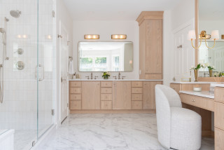
Seeking better function and a high-end look, the couple envisioned a more open, airy layout with ample storage and a spacious shower. Chumbley, who uses Houzz Pro software, delivered with a sleek, curbless shower free of glass or doors, a custom white oak double vanity with all-drawer storage and an elegant freestanding tub that enhances the sense of space. Soft neutral tiles and refined details complete the calm, luxurious retreat.
Before Photo
Durable marble-look porcelain tiles wrap the shower walls and enclosure, setting a luxe tone. The shower includes both a fixed head and a hand shower in satin brass. A long niche with matching satin brass Schluter trim keeps hair and body products organized, while a built-in bench offers a relaxing spot. Beige matte porcelain floor tiles slope gently toward a linear drain in front of the bench to keep water contained.
A new white oak double linen cabinet now stands where one of the old vanities sat, coordinating with the updated double vanity (see below). “It’s a 24-inch-deep cabinet that’s nice and spacious,” Chumbley says. “We put organizational racks on the inside of the doors too. It’s very functional in terms of zones for storing what you need.”
Wall tile: Golden Reverie, 12 by 24 inches, Daltile; floor tile: Reside USA in beige, Arizona Tile
See why you should hire a professional who uses Houzz Pro software
Find a home professional on Houzz
Before Photo
The white vanities, with white-framed mirrors and dated lights,
had limited storage. A double linen cabinet appears here to the right of the wife’s vanity. “Because the other vanity was going away, we wanted a larger scale for the double vanity on this wall,” Chumbley says. A door partially visible at right leads to the husband’s closet.
A Cristallo quartzite countertop and backsplash deliver durability and drama. The rare natural stone features a white base with bold gold veining, orange and gray flecks and subtle translucency. A mitered edge enhances the countertop’s hefty look.
Wall, ceiling and trim paint: Modern Gray, Sherwin-Williams
What to Consider When Choosing a Bathroom Vanity
Faucets: Skylar in satin brass, Newport Brass; sconces: Lanza in brushed bronze, Hinkley
The 10 Most Popular New Bathrooms Right Now
Medicine cabinets: Krugg Reflections
See the Bathroom Features Homeowners Want Most in 2025
New to home remodeling? Learn the basics
Before Photo
Before: The oval jetted tub sat in a tiled deck with sharp corners. “They just didn’t like the deck design and wanted a freestanding tub,” Chumbley says. A shallow arched niche above the tub was painted green.
Chumbley expanded and squared off the former niche to create an accent wall clad in 13-by-39-inch fluted ceramic tiles featuring a crisp white background with soft taupe and gray veining and touches of gold. “That particular tile is art to us,” Chumbley says. “We made the accent wall taller to separate it from the arched doorway next to it. Also, cutting those fluted tiles on a straight line is easier than a radius. It gives you a more successful and cleaner outcome.”
More on Houzz
Read more stories
Browse photos for ideas
Find a home professional
This article was originally published by a www.houzz.com . Read the Original article here. .


Bathroom at a Glance
Who lives here: A retired couple
Location: Keller, Texas
Size: 200 square feet (19 square meters)
Design-build pro: Chris Chumbley of USI Design & Remodeling
Before: The bathroom, with its tall cove ceiling, skylight, taupe walls and abundant light brown tile, felt dated and divided. Two separate single vanities with oval sinks — including the husband’s smaller one seen here — occupied opposite walls, while a corner shower beside the vanity felt squeezed in. “They wanted a walk-in shower with a wider entry,” Chumbley says. “They also didn’t want any glass in the shower, so we had to create a much larger footprint.”
An arched doorway by the shower led to the wife’s dressing room, home office and laundry area. Across from the shower, a tiled deck surrounded an oval tub, part of which is visible at right. The homeowners wanted to incorporate the water closet in the new design.