
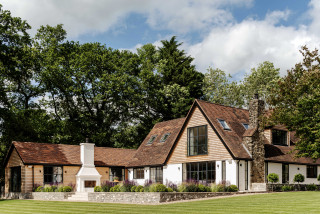
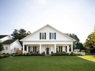
This is the project that grew and grew. What started out as a simple refurbishment of a rural cottage in West Sussex, England, became a comprehensive renovation, an addition and a landscaping job. “It was an absolute joy,” says Paul Duffy, the architect responsible for the transformation. “It evolved to become this genuinely amazing project.”
The property sits within the South Downs National Park, on a beautiful plot with long, unspoiled views. “I really enjoy it every time I go,” Duffy says. All the construction and design ideas he suggested had to respect this landscape and were subject to stringent planning constraints. Read on to see how the project evolved while staying in harmony with its special surroundings.
This article was originally published by a www.houzz.com . Read the Original article here. .


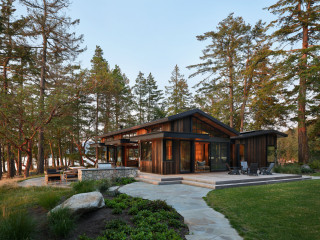


Creating the two asymmetrical forms broke up the scale of the house and gave it a San Juan Islands cabin feel. Butrim also looked to agricultural and maritime buildings, as well as Native American longhouses, for architectural inspiration. The materials, which include weathered cedar at random widths, tinted concrete and dark metal roofing, accomplish two goals. They nod to the history of cabins built on this island, and they help the building blend into the wooded site.
“Originally, the front entry led directly into the corridor,” Butrim says. “However, our clients thought that would feel too formal and they wanted this to be a more casual house. It also felt like an entrance you’d have if you’d driven from the road and down the driveway, which doesn’t happen here. Instead, we thought about them entering the house from the approach from the dock.” The front entry is located on the left side of the house. (The door is open in this photo.)