This article was originally published by a www.houzz.com . Read the Original article here. .
This article was originally published by a www.houzz.com . Read the Original article here. .
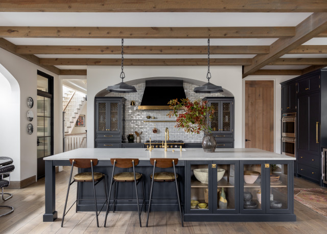
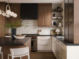
“The homeowner, seeing the partially installed backsplash, panicked. The designer suggested pausing the installation to reassess the tiles, proposing that they hand-sort the tiles to use the lighter gray ones on the main walls and reserve the darker ones for a smaller accent area, like above the range, to create a subtle contrast that could enhance the design. To address the grout issue, they switched to a thinner grout line with a custom-mixed light gray grout that blended better with the tiles, minimizing the uneven appearance, a technique the designer had seen in a recent Houzz article on working with handmade tiles. After a few extra days of work, the backsplash came together beautifully.”
Shop for your kitchen
This article was originally published by a www.houzz.com . Read the Original article here. .

Designer: Amanda Lantz Interiors
Location: Carmel, Indiana
Size: 300 square feet (28 square meters); 17 feet, 4 inches by 17 feet, 4 inches
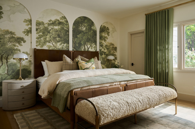
Homeowners’ request. “The homeowners envisioned a primary bedroom that felt restful, layered and exceptionally comfortable,” says designer Amanda Lantz. “Their primary concern was creating a space that would support quality sleep while still feeling warm and inviting. To achieve complete light control, we incorporated a Lutron drapery track with blackout-lined drapery across the window wall, along with Lutron shades flanking either side of the bed. Beyond functionality, the homeowners were drawn to a rich mix of textures and soft materials that would create a cozy retreat. Layered textiles, luxurious fabrics and plush rugs were thoughtfully incorporated throughout the room to add depth, warmth and a sense of everyday comfort.”
Moody details. “To create a moody and inviting atmosphere, we focused on layering rich materials, deep tones and tactile textures throughout the space,” Lantz says. “A dark wool-and-silk area rug serves as the foundation of the room, creating a striking contrast against the hardwood flooring while providing a dense, luxurious texture underfoot. Warm, rich wood tones in the furnishings add depth and character, balancing the darker palette with a sense of natural warmth. The drapery fabric was intentionally selected to draw from the tones within the rug and carry them vertically throughout the room, helping to envelop the space in deep, rich tones.”
Designer tip. “One design principle I frequently use is the thoughtful distribution of color throughout a space,” Lantz says. “Rather than introducing a color in only one place, I like to repeat it at least three times within a room to create a sense of balance and cohesion. In this bedroom, tones found in the area rug were carried into the drapery and accent pillows, helping the room feel layered, intentional and visually connected.”
More on Houzz
Read more stories
Browse photos for ideas
Find home professionals