Tag

Stylish

Browsing


Designer: Tara Lenney Design
Location: Plano, Texas
Size: 145 square feet (13 square meters)

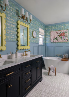
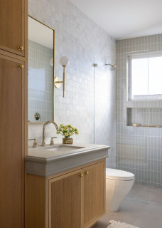
Homeowners’ request. “The clients wanted their 1990s bathroom to feel more luxurious and cohesive without a full layout reconfiguration, to help save on budget,” designer Tara Lenney says. “The homeowners requested a calming, elevated retreat with better lighting, more practical storage and updated finishes — something that felt special but still worked for real life. We agreed that the best way to achieve this was by refreshing within the existing footprint while maximizing style and function with modern materials and smart storage upgrades with better cabinetry.”

Bathtub setup. “Including a bathtub was a must-have for this homeowner,” Lenney says. “She uses it regularly and loves the statement it makes. We selected a clean-lined soaking tub that fit beautifully into the prior tub location. Its placement and shape make the space feel elevated without being fussy, and we paired it with modern fixtures, like the brass chandelier, to give it a luxury hotel vibe that feels both calming and just a bit dramatic.”

Lenney used Houzz Pro software on this project. “It’s our main platform for proposals and invoicing,” she says.

Other special features. Marble tile flooring in a herringbone pattern. Handmade-look wall tiles in a vertical stacked pattern that emphasizes the height of the room. “Normally we loathe glass block windows, but in this case the original window had a brass trim detail on it, which we actually liked, so we opted to keep this feature,” Lenney says. “The vanity cabinetry is custom in a warm stained white oak, which adds warmth to the otherwise white tonal room to give it some soul and keep it from feeling cold.”

Designer tip. “Get creative with cabinetry,” Lenney says. “We kept the layout of this bathroom the same but used tall towers to maximize storage and camouflage weird wall angles. We raised the height of the cabinets to match our tall homeowners. The cabinets were previously 32 inches and we lifted them up to 36 inches. We didn’t have a great spot for towel holders on the vanity wall, so we opted for large cabinet pulls that double as towel holders and are an unexpected large-scale touch.”

“Uh-oh” moment. “The biggest ‘uh-oh’ moment was early in the space-planning process when we realized we couldn’t shift the plumbing without a much more extensive renovation — and blowing our budget,” Lenney says. “That meant we had to make every bit of the existing layout work and reimagine the design within those constraints. It ended up being a blessing in disguise. The fixed layout pushed us to get more creative with material pairings, lighting and styling, and the final space feels thoughtful, cozy and elevated.”

Wall paint: Creamy, Sherwin-Williams


This article was originally published by a www.houzz.com . Read the Original article here. .


After raising their daughter, a California couple shifted focus to caring for the wife’s elderly mother in their late-1970s home. To make the space safer and more functional, they prioritized updating their outdated primary bathroom, which had a cramped vanity and a hazardous step-up shower and tub.

They turned to Sea Pointe Design & Remodel, where lead designer Janna Parr reimagined the bathroom as a spacious wet room with a built-in tub and open shower featuring both a multifunction shower head and a hand shower. A new cherry double vanity adds warmth and storage, while a mix of calming, textured tiles brings style and serenity to this now safe, modern retreat.

Before Photo

Sea Pointe Design & RemodelSave Photo

“After” photos by Leigh Ann Rowe

Bathroom at a Glance
Who lives here: A couple and the wife’s elderly mother
Location: Laguna Niguel, California
Size: 185 square feet (17 square meters)
Designer: Janna Parr of Sea Pointe Design & Remodel

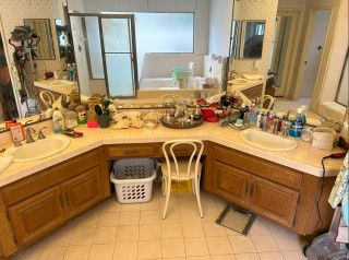
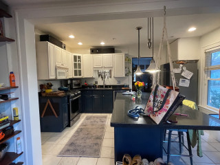
Before: The aging bathroom, with its peeling floral wallpaper, lacked both safety and style. A basic angled wood double vanity had large plain mirrors and a hard-to-clean tile countertop. The only drawer storage came from a small makeup station in the center, leaving hair and skincare products cluttering the surface. “We had a challenge with the angled wall and did not want to turn it into a structural project,” Parr says. “We couldn’t really move walls. There was also a peeling soffit above with a fluorescent light that we wanted to eliminate.”

Across from the vanity, the step-up tub and shower (visible here in the mirrors) raised safety concerns and felt outdated. The homeowners chose to keep the water closet as is. “We didn’t change anything in there,” Parr says.

Find a bathroom designer

Sea Pointe Design & RemodelSave Photo
After: Parr removed the tub, shower and double vanity to make way for a complete transformation, including updated plumbing and electrical systems.

An elegant semicustom cherry double vanity anchors the space. It offers a smart mix of shallow and deep soft-close drawers along with spacious cabinets for improved storage. A rich clove brown finish adds depth and warmth. “We wanted to make sure we had enough counter space and sink space,” Parr says. “We went with one long sink to achieve symmetry with the way we were planning to do the mirror and medicine cabinets above.”

The two frameless mirrored medicine cabinets flank a metal-framed mirror in an oil-rubbed bronze finish. Wall sconces with traditional torch-style silhouettes and brass accents sit on either side. “We fell in love with the detail on the top of the mirror,” Parr says. “It also bounces light around the bathroom, so it feels more open and airy.”

A soft, warm white now coats the walls and ceiling, while a bright white on the trim adds subtle contrast.

Paint colors: Shoji White (wall and ceiling) and Pure White (trim), Sherwin-Williams; sconces: Elton in Patina Brass, Troy Lighting; vanity hardware: Top Knobs; mirror: Colestin in oil-rubbed bronze, Rejuvenation

Shop for bathroom vanities on Houzz

Sea Pointe Design & RemodelSave Photo
The artisan-crafted 36-inch concrete trough sink gives the vanity a modern, organic feel. Its semivessel design adds visual depth, while two wall-mounted, single-handle faucets in a luxe gold finish bring a touch of sophistication. “We were looking at trough sinks in general because we wanted a long sink,” Parr says. “Color-wise it also tied into tiles we used in the shower. The semivessel sink design also offered some dimension and interest.”

Topping the vanity is a polished pure white quartz surface that’s resistant to scratches, stains, cracks and heat. “We had a lot of movement with the backsplash tile that was our feature and wanted something to complement but not compete,” Parr says. “It also ties into other white elements throughout the space.”

The backsplash consists of polished ivory onyx mosaic tiles in a scalloped design with tonal variation that adds texture and charm. “I think they add both luxury and whimsy,” Parr says. “They also add interest to an otherwise neutral palette. We also wanted to tie in some of the gold tones on this side of the bathroom with the gold tones seen around the tub.”

Sink: Native Trails; faucets: Litze in Brilliance Luxe Gold, Brizo; countertop: Pure White, Caesarstone; wall tile: Piano Onyx Ivory mosaic, Elysium

11 Ways to Age-Proof Your Bathroom

Sea Pointe Design & RemodelSave Photo
A new linen closet at the back left now coordinates seamlessly with the updated double vanity, replacing a pair of aging upper and lower cabinets that were falling apart. “It has a rollout hamper inside and extra shelving that gives them lots of storage,” Parr says.

To enhance the existing tray ceiling, faux architectural beams were added where fluorescent lights once sat, adding both character and warmth. “That was a last-minute decision from the homeowners,” Parr says. “That was a splurge, but we had dreamed of adding them into the design to give it an old-world feel.”

A towel bar and hook near the vanity complement the space’s other luxe gold accents.

See why you should hire a professional who uses Houzz Pro software

Before Photo

Sea Pointe Design & RemodelSave Photo

Before: Across from the vanity in the former bathroom, the hazardous step-up tub sat next to a dated stall shower with a low enclosure, which was also raised above the main floor level. “It was clumsy and slippery,” Parr says. “There was also a ‘fern trench’ from the 1970s there behind the tub and shower.” The trench area was meant to hold plants.

Before Photo

Sea Pointe Design & RemodelSave Photo

Before: Here’s a closer look at the old shower beside the tub. With no shower niche, bathing products cluttered the floor, and the step-up entry was a key feature the homeowners were eager to eliminate.

Sea Pointe Design & RemodelSave Photo
After: The new wet room seamlessly combines a modern built-in rectangular tub with an open-concept shower, creating a stylish, low-maintenance space with a low-curb entry for easier access. “It would have been cost-prohibitive to revise the foundation in order to garner a curbless entry,” Parr says. “But as a designer, I also liked the way we carried the tile across the curb and bench to elongate the space and create a modern organic look and Roman luxury influence.”

The operable window on the back wall was updated by the homeowners, while a textured microcement finish — an ancient European technique gaining popularity in the U.S. — was applied to the wall in thin layers for durability and waterproofing. “I just didn’t want it to feel busy, and wanted to eliminate more tile and more grout,” Parr says.

Is a Wet Room Right for You?

Sea Pointe Design & RemodelSave Photo
The modern 36-by-66-inch acrylic tub is surrounded by large-format (24-by-48-inch) polished marble-look porcelain tiles. These rectified tiles, made using advanced inkjet technology, offer a realistic appearance and are precisely cut for minimal grout lines, creating a sleek, seamless look.

A streamlined, wall-mounted tub filler in a gold finish with lever handles replaced the original fixture. “Keeping the plumbing in the same location allowed us to keep within our budget,” Parr says. The paneled door partially visible at left leads to the primary bedroom.

Tile surround: Origines Or glossy, 24 by 48 inches, Elysium; tub filler: Litze in Brilliance Luxe Gold, Brizo

New to home remodeling? Learn the basics

Sea Pointe Design & RemodelSave Photo
The wet room’s shower area features a multifunction, wall-mounted shower head and a separate hand shower with a slide bar for flexibility and ease of use. All the fixtures match those used at the tub and vanity for a cohesive, polished look. “We strategically placed the fixtures so the valves are off to the side, so they can’t get wet when turning them on,” Parr says. “We also designed the shower bench a bit shorter so a caregiver can help with bathing.”

The upper portion of the shower wall is clad in 3-by-12-inch ivory ceramic tiles with subtle tonal variation, soft texture and a gentle glaze. “We did a staggered vertical pattern to kind of mirror the backsplash at the vanity,” Parr says.

Below, 24-by-48-inch matte sand-colored porcelain tiles add visual depth and contrast. A quartz-topped shower shelf, matching the vanity countertop, offers a clean, dry space for hair and body products, keeping clutter off the wet-room floor.

Shower fixtures: Litze in Brilliance Luxe Gold, Brizo; shower wall tile (top): Flash in ivory, 3-by-12-inch, Arizona Tile; shower wall tile (bottom): Waystone Sand, 24-by-48-inch, Elysium

Sea Pointe Design & RemodelSave Photo
The wet-room floor features authentic limestone mosaics with an aged finish, arranged in a herringbone pattern with driftwood-hued grout. A linear drain is seamlessly integrated using the same tile for a clean, cohesive look. “The more natural materials I can incorporate into a space will make it feel timeless and luxurious,” Parr says. “They also can take on a lot of water and abuse.” A custom spot-resistant shower glass divider with brass clips and hinges adds to the open, airy feel.

The doors just outside the wet room lead to the water closet — located behind the shower fixtures — and a walk-in closet on the adjacent wall. “The thoughtful design and layout for functionality was a primary focus,” Parr says, “but the clients put full faith and trust in me to create a layered bathroom with multiple textures, sheens and touches of luxury.”

More on Houzz
Read more bathroom stories
Browse bathroom photos
Find a bathroom remodeler
Shop for your bathroom


This article was originally published by a
www.houzz.com . Read the Original article here. .


Before Photo

Cameron Getter DesignSave Photo

“After” photos by Kieran Reeves Photography

1. Warm and Organic Look With Enlarged Shower

Bathroom at a Glance
Who lives here: A couple with a toddler
Location: Austin, Texas
Size: 150 square feet (14 square meters)
Designer: Cameron Getter Design

Before: This former primary bathroom in Austin, Texas, had an aging white double vanity and beige tile flooring that gave the space a bland look. Black details called attention to outdated lighting and other elements. A large built-in tub sat beneath a frosted glass window, and the super small shower stall, seen in the mirror’s reflection, felt disjointed in the space. The angled door on the left connected to the couple’s primary closet.

The homeowners, parents of a toddler, knew just where to turn. Designer Cameron Getter had already helped them choose furniture for their main living areas and update their guest bathroom, so they tapped her to help them transform their basic primary bathroom into an organic, spa-like space with warmth.


This article was originally published by a
www.houzz.com . Read the Original article here. .


1. Fireside Chat

Designer: Alona Perov of Co Interiors
Contractor: Rafael Lopez of HomeBuild
Location: Raleigh, North Carolina
Size: 206 square feet (19 square meters); 13 feet, 6 inches by 15 feet, 3 inches

Homeowners’ request. “This room is located in a grand basement and sits directly in front of the staircase, making it the first space seen upon entry,” says contractor Rafael Lopez, whose clients found him on Houzz. “The homeowner wanted it to make an immediate impression while still feeling inviting and livable. A striking fireplace design was key to achieving that balance: dramatic enough to impress yet warm and approachable for casual TV watching and relaxation.”

Contemporary details. “The fireplace became the focal point and set the tone for a modern-contemporary aesthetic,” designer Alona Perov says. “A slim, horizontal insert was chosen for a sleek, modern profile. The fireplace surround features a mix of materials for visual impact. Black soapstone with soft white veining and subtle gold flecks, left unsealed for a natural matte finish. A floating plaster hearth mimics the look of concrete. It hovers just off the floor, maintaining a clean line and serving as a practical ledge. Walnut veneer paneling frames the TV. The paneling features vertical and horizontal grooves for added detail and depth. Together, these elements offer a tailored, high-end look while remaining rooted in contemporary simplicity.”

Other special features. “The fireplace structure protrudes 4 inches off the wall and ceiling, subtly accented with multicolor LED backlighting for a dramatic effect,” Lopez says. “Frameless drywall pot lights were selected for the ceiling to maintain a minimalist, uninterrupted ceiling plane.”

Designer tip. “With 12-foot ceilings, the room risked feeling cavernous and disconnected,” Perov says. “To visually anchor the space and create a more inviting atmosphere, the ceiling was painted a warm gray tint (Penthouse by Benjamin Moore) instead of a stark white, creating a ‘visual sandwich’ effect that balances the floor and ceiling and pulls the eye inward.”

“Uh-oh” moment. “Originally, the fireplace design featured a discreet top vent integrated within the millwork — a sleek, horizontal slot intended to maintain the clean profile,” Lopez says. “However, the installer refused to deviate from standard protocol and insisted on using a visible metal vent, despite no such restriction being mentioned in the product guide. Lesson learned. Always confirm that all contractors understand and agree with the design intent before installation begins. If someone isn’t comfortable executing the vision, it’s better to find an alternative early on because once you’re on-site and mid-installation, there’s little room for negotiation.”

Wall paint: Cloud Cover, Benjamin Moore


This article was originally published by a www.houzz.com . Read the Original article here. .


1. Polished and Practical

Designers: Naomi Dresser and Caitlin Carter of Fig St. Design
Location: Santa Cruz, California
Size: 55 square feet (5.1 square meters)

Homeowners’ request. “This space was designed to be a guest bathroom with serene beach vibes and maximize storage opportunities,” designer Naomi Dresser says. “This beach house is super tiny with very little closet space, so the bathroom needed to be able to accommodate space for extra linens, towels and cleaning supplies.”

Special features. “The color palette draws from the coast — muted ocean spray shower tile and warm wood tones with a splash of brass,” Dresser says. “To give the space an ultrasoft and custom vibe, we created custom countertop edges, fluted cabinet details and a full tile backsplash behind the vanity.”

Small-space strategies. The tiled backsplash extends from the vanity to the ceiling and into the shower, visually extending the space. Stacked rectangular tile in the shower emphasizes the height of the shower. Large-format floor tile runs into a curbless shower, lending a light and airy look and feel. “Custom cabinetry offered the opportunity to maximize storage and give added details like the fluting,” Dresser says. “We added a custom built-in full-height cabinet to the left of the vanity to capitalize on storage square footage.”

Dresser uses Houzz Pro software to manage projects, including for retainers, proposals, invoices and purchase orders. “Keeps us organized,” she says.

See why you should hire a professional who uses Houzz Pro software


This article was originally published by a www.houzz.com . Read the Original article here. .


3. Cottage Charm

Designers: Kakin Nichols and Lauren Taylor of Curated Studio
Location: Highlands, North Carolina
Size: 238 square feet (22 square meters)

Homeowners’ request. “The goal was to design a functional space for entertaining family and friends that flowed effortlessly from room to room, blending seamlessly with the natural surroundings while letting the mountain views take center stage,” designer Kakin Nichols says. “Prioritizing function, we ensured ample circulation, providing plenty of space for multiple cooks to work comfortably. The color palette was carefully selected to complement, rather than compete with, the landscape. Drawing inspiration from the area’s changing seasons, we incorporated various shades of greens, rich browns and deep terra cotta to evoke a sense of warmth and tranquillity.”

Nichols uses Houzz Pro software. “We use it to pin items for furniture documentation and proposals, as well as time tracking,” she says.

Country-style elements. “The interior style of the home captures the timeless charm of traditional cottage architecture, blending warmth and character with a welcoming, livable atmosphere,” Nichols says. “We combined artisanal materials with simple, clean surfaces, pairing salvaged post oak wood flooring in varying widths and reclaimed columns with tongue-and-groove paneling and elegant quartzite countertops. The Pratt + Larson Craftsman collection ceramic backsplash tile adds color and texture, while the tongue-and-groove walls, painted in Soft Chamois by Benjamin Moore, and perimeter cabinets, painted in Natural Cream by Benjamin Moore, enhance the home’s inviting and cohesive feel.”


This article was originally published by a www.houzz.com . Read the Original article here. .


4. Have a Seat

Designer: Gabrielle Bove of Opaline Interiors Studio
Location: Hopkinton, Massachusetts
Size: 105 square feet (9.8 square meters)

Homeowners’ request. “Our clients are a young, fun-loving family who were looking for a functional, durable space laced with color, warmth and functionality,” designer Gabrielle Bove says. “With two young children, they needed enclosed storage and easily accessible open storage space for items like their stroller and car seat. We layered hardy materials like nickel-gap paneling, a solid walnut bench seat, easy-clean fabric and a textured indoor-outdoor area rug that would stand the test of time and stand up to muddy feet.”

Mudroom storage features. “It was important to our clients that the mudroom be functional but not lack style and beauty,” Bove says. “We chose to design a custom bench with functional drawers for items like shoes and winter accessories. We topped this with a solid walnut bench seat for contrast and additional durability. We selected Benjamin Moore’s Sea Star paint for the millwork, a soothing but rich pop of color and a nod to our clients’ love of the Mediterranean.”

Other special features. “We layered classic patterns in youthful colors with a neutral backdrop and warm textures, all curated to merge our clients’ love of Mediterranean motifs with the New England landscape,” Bove says.

Designer tip. “Knowing this young family would eventually grow, it was important to think of the space’s flow and capacity in two to five years,” Bove says. “Making sure they had enough storage for additional shoes, winter gear and eventually backpacks was important.”

“Uh-oh” moment. “Due to the placement of existing doors and windows, there wasn’t originally an opportunity for closed, tall storage, which we felt this family needed,” Bove says. “We were able to locate a cavity in the floor plan adjacent to the mudroom, which was perfect for a functional closet. This space allowed us to keep circulation open between all doorways but gave our clients a place to hide coats and diaper bags when not in use.”

Contractor: Brenshaw; paint colors: Simply White (paneling), Classic Gray (walls), Sea Star (bench), Benjamin Moore

4 Designer Tips for a Fashionable Entry


This article was originally published by a www.houzz.com . Read the Original article here. .


Roth Design Co.Save Photo
6. Leap of Leopard

Designer: Dawn Rothenbacher of Roth Design
Location: Charlotte, North Carolina
Size: 42 square feet (3.9 square meters); 6 by 7 feet

Homeowners’ request. “The homeowner wanted more of an exciting experience when walking through her home, each space leaving a lasting impression,” designer Dawn Rothenbacher says. “She loves exotic animals and had an inspiration picture with these particular colors, so we started there. She didn’t want a boring beige box.”

Special features. “The Schumacher Iconic Leopard wallpaper is the showstopper for this space,” Rothenbacher says. “The fact that we applied it to her 10-foot ceiling as well made it even more of a wow factor. Light and plumbing fixtures were sourced in a lacquered brass to prevent tarnishing. The mirror was an antique the homeowner had in storage.” A leopard print trash bin complements the wallpaper.

Designer tip. “Never forget your ceiling,” Rothenbacher says. “People think about the walls and floors but never the untapped potential of changing the ceiling color or pattern. This is where the drama lives. A powder room has a short amount of time to make a lasting positive impression. I also recommend people starting with the powder room when renovating. It’s the quickest turnaround for seeing impactful results. This keeps you motivated to continue to do the next space.”

“Uh-oh” moment. “Most people get scared of wallpaper behind a toilet, sink or on a ceiling,” Rothenbacher says. “The best solution is to hire professional installers. When spending money on expensive designer wallpaper, you don’t want to waste your money with mistakes due to lack of experience.”

Paint color: Cloud White by Benjamin Moore

Check out our beginner’s guide to get started on your home project


This article was originally published by a
www.houzz.com . Read the Original article here. .


Photos by Peter Lyons Photography

2. 1920s Spanish Colonial Charm

Kitchen at a Glance
Who lives here: A woman and her dog
Location: Kensington, California
Size: 252 square feet (23 square meters)
Designer: Anne Norton of AND Interior Design Studio

Before: This 1920s Spanish Colonial home in Kensington, California, has a long history, including being the residence of J. Robert Oppenheimer during his time at the University of California, Berkeley. But the home’s funky kitchen with post-and-beam architecture, flat, low, wood-covered ceiling with dark stain, dark floor, dark-stained Douglas fir cabinetry and numerous windows and skylights didn’t share that history; it was added on to the back of the home in the 1970s.

While the layout was good, the kitchen lacked storage. The homeowner, who loves to cook, found designer Anne Norton on Houzz to help her create a kitchen that would flow with the rest of the home’s historic architecture, and would include upgraded cabinetry and a kitchen table where friends and family, especially her grandchildren, could gather around.


This article was originally published by a www.houzz.com . Read the Original article here. .


Schloegel Design RemodelSave Photo
5. Walnut With a Natural Stain

Designers: Lindsay Brungardt and Leslie Hatfield of Schloegel Design Remodel
Location: Kansas City, Missouri
Size: 73½ square feet (6.8 square meters)

Homeowners’ request. “Our clients had just one full bathroom in their home, and their dream was to transform their bedroom into a true primary suite by adding a full bathroom,” designer Lindsay Brungardt says. “They envisioned a space that was not only functional but also elegant, featuring a roomy layout, a vanity with ample storage and a design that honored the charm and character of their 1920s home.”

Vanity features. “The vanity, crafted in a furniture-style design, features rich walnut with a natural stain,” Brungardt says. “Its inset cabinetry beautifully reflects the era of the 1920s home, adding a timeless charm. To create cohesion, the species and style were chosen to match the kitchen island, which we remodeled simultaneously. Though compact, the vanity provides excellent storage with two functional drawer stacks and a central cabinet, maximizing organization. The furniture-style construction elevates the design, creating an open and airy feel that enhances the sense of space in the bathroom.”

Other special features. “The shower is a true centerpiece, showcasing antique blue tile walls paired with classic hexagonal floor tiles and a built-in bench for comfort,” Brungardt says. “Gold plumbing fixtures add a striking contrast, creating a touch of luxury that complements the blue tiles beautifully. A thoughtful design detail is the placement of the shower handle near the glass door, allowing the client to turn the water on and let it warm up without stepping inside — a small touch that adds big convenience.”

Designer tip. “The half wall paired with a glass panel next to the vanity creates a clever balance of openness and privacy,” Brungardt says. “This design not only makes the bathroom feel more spacious but also adds privacy in the shower. It’s an excellent solution for smaller bathrooms, maximizing light and flow while still providing subtle division.”


This article was originally published by a
www.houzz.com . Read the Original article here. .

Pin It