
![]()
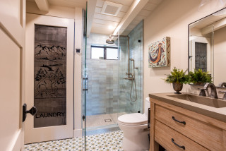
Location: Maple Grove, Minnesota
Size: 50 square feet (4.7 square meters)
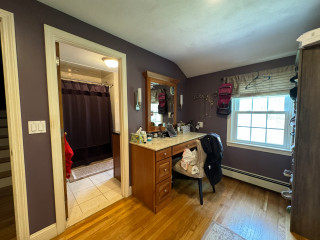
Homeowners’ request. “This bathroom is shared by three teenage girls,” says interior designer Victoria Johnson. “The parents reached out wanting to maximize storage and give the space a more elevated, timeless look.”
Shower-tub combo. “The homeowners chose to keep the shower-tub combo primarily for resale value, as families with young children often prefer having a tub,” Johnson says. “Plus, their teenage daughters still enjoy using it. To make the setup more functional, we designed a wall-to-wall niche large enough to hold all their hair products, soaps and razors neatly. We also added a hand shower, which serves both as a spa-like feature and a practical one — it’s perfect for washing their beloved dog.”
Other special features. “Everything in this bathroom was designed around the idea of three — one for each daughter,” Johnson says. “We installed a triple medicine cabinet, which we purchased on Houzz, so each girl has her own section. We also designed a custom recessed cabinet between the studs, again divided into three compartments for individual storage. The custom vanity features a single sink to maximize counter space, a decision that has proven incredibly functional for busy mornings.” The countertop is Taj Mahal quartzite.
Designer tip. “There are three features I absolutely love here,” Johnson says. “First, the wall-to-wall niche. It’s such a simple upgrade that dramatically improves usability, and I’ll likely do this in every project moving forward. Second, medicine cabinets. There are so many beautifully designed options now and the hidden storage they provide is invaluable. Third, when space is tight, adding recessed cabinets between studs is a clever way to gain storage without sacrificing floor space.”
Wall color: Pearly White, Sherwin-Williams
This article was originally published by a www.houzz.com . Read the Original article here. .


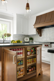

Kitchen at a Glance
Who lives here: A couple with a blended family that includes six young adult kids
Location: Shakopee, Minnesota
Size: 238 square feet (22 square meters)
Designers-builders: Steve McDonald and Angela Barnhart of White Birch Design
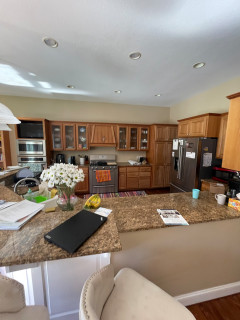
Before: The kitchen’s short cherry cabinets, beige walls and brown granite countertops made the space feel drab and dated. “They just wanted to add cabinets that go to the ceiling and add an island and paint everything, but that wasn’t solving problems for the kitchen itself,” Barnhart says.
The awkward angled peninsula with the sink cut the kitchen off from the family room. “You had to go all the way around the peninsula to get in and out of the kitchen,” Barnhart says. “When you entertain and have a bunch of people there, it becomes very difficult.”
A large stainless steel refrigerator jutted past the cabinetry, and a pair of wall ovens with a TV above them crowded the space even further. The homeowners liked the maple floor but not its dark stain, and they wanted to keep the charm of glass-front cabinets above the range wall in the updated design.