2. Curve Control
Designer: Maritza Capiro
Location: Coral Gables, Florida
Size: 189 square feet (18 square meters)
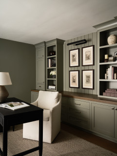
Homeowners’ request. “The homeowners wanted a functional yet stylish home office that could seamlessly blend into the overall design aesthetic of their home,” designer Maritza Capiro says. “The previous space lacked warmth, cohesion and efficient storage, which made it feel more utilitarian than inviting. They wanted a workspace that felt luxurious, inspiring and uncluttered — a place where they could focus while also enjoying the beauty of their surroundings. To address these needs, we focused on creating a layout that balanced functionality with visual interest. By adding custom built-ins, intentional lighting and an eye-catching desk, we transformed the space into a statement-making office that supports productivity and relaxation.”
Special features. “The sculptural, curved desk serves as a centerpiece, combining artistry with practicality,” Capiro says. “Its soft, neutral finish complements the room’s light, airy palette while standing out as a design focal point. The black built-in shelves provide ample storage for books and decorative objects, while the arched detail adds architectural interest. The matte black finish contrasts beautifully with the lighter elements in the room. The statement chandelier adds texture and sophistication to the space, while a picture light over the shelves enhances the display. The light wood flooring grounds the space and adds warmth, while layered textures such as the area rug, upholstered chair and patterned accent chair create a welcoming and polished look. The walls are painted in a soft, neutral tone (Extra White by Sherwin-Williams) that enhances the natural light and makes the room feel spacious.”
Cord and document control. “To keep the space visually clean and organized, we included hidden storage within the built-ins and desk,” Capiro says. “Cords are discreetly routed behind the furniture, while the desk drawers store necessary office supplies and documents. This strategy keeps everything functional but out of sight, maintaining the overall polished look.”
Designer tip. “Invest in a statement desk that doubles as both a functional piece and a design focal point,” Capiro says. “Pair it with custom built-ins to ensure all storage needs are met without cluttering the room. Additionally, layering textures through rugs, upholstery and accents can make any space feel more inviting and cohesive.”
Shop for home office furniture
This article was originally published by a www.houzz.com . Read the Original article here. .

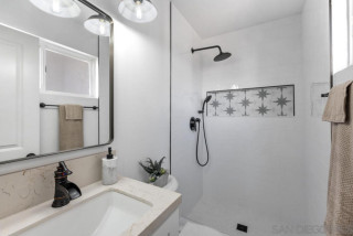

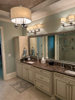


“I like to minimize overhead light in a bathroom,” Clark says. “You get better light from eye level when you’re putting on makeup. But the vanity was so long that it really needed something in the center, so I added the glass pendant light there.”
The mirrors hide medicine cabinets. “Some of my clients are reluctant about medicine cabinets at first because they tend to all look the same. But these arched mirrored medicine cabinets are really pretty,” Clark says. The frames are brass.