This article was originally published by a www.houzz.com . Read the Original article here. .

This article was originally published by a www.houzz.com . Read the Original article here. .

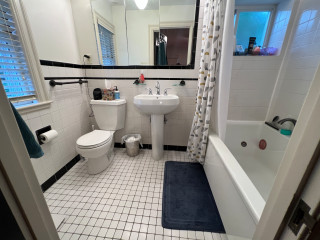
The small black-and-white en suite bathroom in this 1934 Colonial just outside Boston had vintage charm, but it fell short of the sophisticated retreat the new homeowners envisioned. The single pedestal sink offered no storage or counter space, and the aging shower-tub combo didn’t meet the couple’s needs. The nearby walk-in closet in the bedroom also lacked functional storage.
Looking to create a more spacious and practical layout, the couple hired design-build pros Jason and Megan Hoffman. Jason suggested pushing a wall shared by the bathroom and closet into the bedroom to gain valuable square footage. The reimagined bath now features a warm wood double vanity, a roomy low-curb shower with a built-in bench and a linen cabinet for added storage. A thoughtful mix of white, black and wood finishes with clean-lined midcentury touches brings modern style to this refreshed and highly functional space.
Before Photo
Bathroom at a Glance
Who lives here: A young couple
Location: Newton, Massachusetts
Size: 43 square feet (4 square meters)
Designers-builders: Jason and Megan Hoffman of J.P. Hoffman Design Build
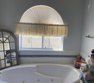
Before: The 40-square-foot bathroom had charm thanks to its pedestal sink and classic black-and-white tile, but it lacked the storage and counter space the young couple needed in their primary suite. The aging shower-tub combo added to the challenges. “They have a tub in another bathroom, so that satisfied the home’s need for a tub,” Jason says. “Having no tub here opened up the opportunity to maximize the layout.”
Two existing windows — one beside the toilet and another at the end of the shower-tub — were in good shape, so the homeowners opted to keep them.
Find a bathroom designer
A pony wall on the left adds a touch of privacy for the new two-piece white toilet. A decorative walnut shelf above the toilet offers a warm accent. “We moved the new toilet 6 inches so everything on that wall now fits,” Jason says.
Creamy white paint (White Dove by Benjamin Moore) covers the walls, ceiling and trim, creating a clean, warm backdrop. Matte black details throughout add striking contrast.
10 Aging-in-Place Features Pros Swear By
Bronze and brass two-light fixtures with clear glass globes add a touch of midcentury style that complements the vanity. The bathroom also has recessed LED ceiling lights and a new exhaust fan, both of which were digitally removed from these photos to better highlight the room’s key design features.
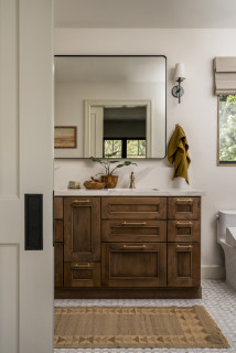
Double vanity: Serenity door style in natural walnut, Candlelight Cabinetry; towel ring: Purist in matte black, Kohler; vanity pulls: Morris, Top Knobs; vanity lights: Young House Love Clear Glass Bubble, Shades of Light
Shop for bathroom vanities on Houzz
Creamy white glossy ceramic tiles, measuring 2 by 6½ inches, cover the wall above the vanity in a vertical stack pattern; the grout is frosty white. The tile’s subtle surface movement adds depth and texture. “We used that tile on the shower walls too,” Jason says. “By bringing the tile all the way across that wall, you’re creating less transitions and making the room seem bigger.”
Faucets: Jason Wu collection, matte black, Brizo; wall tiles: Wellfleet in Coconut, 2 by 6½ inches, Best Tile
10 Smart Bathroom Storage Solutions
On the bathroom floor, 4-by-12-inch matte black porcelain tiles are laid in a herringbone pattern and paired with midnight black grout, adding depth and visual interest.
Floor tile: Topography porcelain in black, 4 by 12 inches, Best Tile
See why you should hire a professional who uses Houzz Pro software
On the shower floor, hexagonal tumbled Carrara marble mosaic tiles bring natural variation in veining and tone, set with frosty white grout for soft contrast. “The homeowners liked the way everything looked when all the details were put together,” Jason says.
Shower floor tile: Antique Carrara hexagon tumbled, 2 by 2 inches, Best Tile
A hardwired black towel warmer with a programmable timer, mounted to the side of the linen cabinet, adds both function and luxury to the space. “We were able to redesign and update this bathroom without changing the location of windows,” Jason says. “The creativity and the ability to see the solution was key here.” For added privacy, the windows were fitted with a translucent film.
New to home remodeling? Learn the basics
Before: A swing door on the left once connected the bedroom and bathroom. An imposing dark armoire stood against the wall space between the door to the bathroom and the primary closet to its right. The door on the far right leads to the second-floor landing and staircase to the main level. The exposed metal ductwork visible at the back left is from a prior HVAC upgrade.
A new pocket door now connects the bedroom and bathroom. “It was related to the size of the bathroom and the location of switches to optimize space,” Jason says. The previously exposed ductwork is also gone. “We were able to enclose the necessary ductwork behind a wall in the new bathroom and added the valuable linen cabinet,” Megan says.
More on Houzz
Read more bathroom stories
Browse bathroom photos
Find a bathroom remodeler
Shop for your bathroom
This article was originally published by a www.houzz.com . Read the Original article here. .

Bathroom at a Glance
Who lives here: A young family of three
Location: Long Beach, California
Size: 97 square feet (9 square meters)
Designer: Heather Knight-Willcock
Contractor: Bryan Luu of BLuu Construction
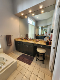
A large part of the project involved relocating the primary suite. Knight-Willcock found space for the primary bathroom by taking over a small existing hall bath, part of a hallway and space from two small closets. (See before-and-after floor plans below.) This allowed room for a double vanity, a generous shower stall and additional storage.
“Heather named this project ‘MCMR,’ which stands for Midcentury Modern Revival,” Luu says. Style-wise, this meant the design honors the home’s midcentury modern vintage while giving it modern conveniences and a warm organic feel.
This view from the bedroom shows a new paneled pocket door partially open on the left. “There is a small hallway to the left of this door. Using a pocket door optimized the space,” Luu says.
Find a local general contractor on Houzz
This article was originally published by a www.houzz.com . Read the Original article here. .

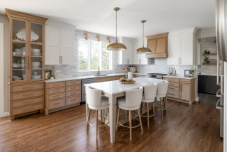
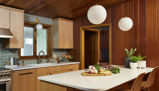
Morris pushed the kitchen into an unused den and stole space from a home office to expand the kitchen and create a spacious new butler’s pantry with a coffee station. A large island adds storage, prep space and seating for four. Multiple storage solutions, including drawers, cabinets, open shelves, a hutch and an appliance garage, ensure that everything has a place and the countertops stay free of clutter. Meanwhile, white and wood cabinets help create a warm and welcoming atmosphere that no guest would want to leave.
This article was originally published by a www.houzz.com . Read the Original article here. .
For the bathroom, Snow replaced the built-in tub with a smaller, sleeker freestanding model that adds breathing room. She ditched the glass block wall that divided the shower from the toilet area and added a wall that better separates the two spaces. The new private shower room has an arched doorway with glass door, walls with handmade Moroccan zellige tiles and a marble bench. A custom white oak double vanity improves storage, and its reeded front adds texture. Genuine limestone batons in a herringbone pattern for the flooring, along with plaster walls, provide more texture and interest.
This article was originally published by a www.houzz.com . Read the Original article here. .

LaBruna spoke with her clients about style and carefully observed the rest of their house. “When you walk through what appears to be the front door, you enter into a courtyard with a pool that has a lot of tropical plants. I also saw that they had a lot of colorful tropical artwork in their house,” she says. LaBruna determined that they liked midcentury style, lots of color and tropical flair. When she presented them with mood boards that incorporated midcentury and tropical style, they were fully on board.
This article was originally published by a www.houzz.com . Read the Original article here. .

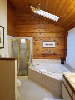
For help, she hired designer Kristine Tyler. Tyler eliminated the corner tub, making space for a large curbless shower. River rock tile spans the entire floor, playing off the knotty cedar ceiling and wall portions to create a rustic look. A custom alder floating vanity complements the knotty cedar and includes a handcrafted bronze sink with a layered design. Ribbed copper-tone tiles on the side walls add texture and warmth. And in a twist of fate, an inspirational tile design led the homeowner to reconnect with a high school boyfriend, who’s the brother of the owner of the tile company. The couple married soon after the bathroom project was completed.
This article was originally published by a www.houzz.com . Read the Original article here. .
![]()
Designer: Molly Robinson of Homoly Design + Build
Location: Westwood, Kansas
Homeowners’ request. “This room was thoughtfully designed with the homeowners’ two dogs and two cats in mind,” says designer Molly Robinson, who uses Houzz Pro software.
Special features. “A dedicated ‘cat condo’ includes a custom ramp, a designated litter box area and built-in ventilation to keep things fresh and functional,” Robinson says. “For the pups, there’s a cozy zone complete with a doggy door that provides easy access to the outdoors. The black-and-white checkered tile flooring, paired with bold wallpaper that extends across the walls and ceiling, injects a playful and whimsical energy into the space. The pattern creates visual interest and a sense of movement, making the room feel dynamic and full of personality.
“To ground the design and let those elements shine, we opted for neutral white cabinetry that adds a crisp, clean contrast without competing for attention. The result is a fun, stylish space that feels both fresh and thoughtfully balanced.”
Designer tip. “We designed the countertop to be slightly taller than standard height, which makes folding laundry more comfortable and ergonomic — no more hunching over,” Robinson says. “As a bonus, the added height also serves a practical purpose by keeping pet treats and other essentials out of reach of curious paws.”
“Uh-oh” moment. “One of the biggest ‘uh-oh’ moments came when we realized just how tricky it would be to incorporate all of the custom pet features and maintain a clean, functional layout for everyday use,” Robinson says. “Between the cat ramp, litter box ventilation, doggy access to the outdoors and still needing room for laundry tasks, it started to feel like we were designing three rooms in one. We reworked the cabinetry layout and decided to go fully custom, which gave us the flexibility to tuck away the pet zones in a way that felt intentional and integrated.”
New to home remodeling? Learn the basics
This article was originally published by a www.houzz.com . Read the Original article here. .

The kitchen, however, was not so fabulous. It was closed off from the rest of the house, making it feel dark. The appliances were old, and at some point someone had added red carpeting and a harvest gold range and countertops. While keeping the kitchen’s footprint intact, interior designer Colleen Slack was able to open up the room, provide adequate storage and countertop space, and create a look that jibes with the home’s classic midcentury style.
This article was originally published by a www.houzz.com . Read the Original article here. .

Removing the corner shower allowed Lundin to create a larger double vanity with wood-look laminate slab door and drawer fronts in a walnut finish. A roomier makeup area splits the vanities, adding symmetry. “It’s a floating vanity and we put LEDs under there that make it look attractive and serve as nightlights,” Lundin says.
The backsplash is composed of 12-by-24-inch porcelain tiles, cut to fit, in black, white and gold with a hand-painted look in a vertical pattern. “There are also some bluish-gray tones that pull from the wallcovering we used in the bathroom,” Lundin says.
Four damp-rated 25-inch black LED linear pendant lights hang in front of a custom mirror. “I’m increasingly using pendants in bathrooms to get better lighting on people’s faces,” Lundin says. Luxury vinyl plank wood-look flooring adds warmth and durability.
Pendant lights: Flare, WAC Lighting; tile: Setana, TileBar
Find general contractors, bathroom designers and other pros near you
This article was originally published by a www.houzz.com . Read the Original article here. .

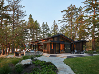
Creating the two asymmetrical forms broke up the scale of the house and gave it a San Juan Islands cabin feel. Butrim also looked to agricultural and maritime buildings, as well as Native American longhouses, for architectural inspiration. The materials, which include weathered cedar at random widths, tinted concrete and dark metal roofing, accomplish two goals. They nod to the history of cabins built on this island, and they help the building blend into the wooded site.
“Originally, the front entry led directly into the corridor,” Butrim says. “However, our clients thought that would feel too formal and they wanted this to be a more casual house. It also felt like an entrance you’d have if you’d driven from the road and down the driveway, which doesn’t happen here. Instead, we thought about them entering the house from the approach from the dock.” The front entry is located on the left side of the house. (The door is open in this photo.)