Before Photo
This article was originally published by a www.houzz.com . Read the Original article here. .
Before Photo
This article was originally published by a www.houzz.com . Read the Original article here. .

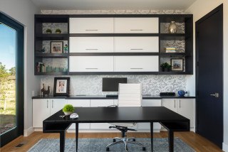
Homeowners’ request. “The homeowner wanted a home office that felt calm and highly functional,” says designer Melissa Powell. “The vision was to create a bright, tailored workspace that could support everyday productivity while still feeling connected to the overall design of the home. The room needed to feel polished enough to be seen and enjoyed but practical enough for daily use. To solve that we focused on a soft neutral palette, custom storage, warm white oak millwork, layered lighting and a clean furniture layout that allowed the desk to become the focal point without overwhelming the room.”
Special features. “This space features white oak cabinetry and flooring, integrated art lighting, double-stacked flat ceiling trim, honey bronze hardware and a brass-and-opal light fixture,” Powell says. “The built-ins provide both open display and closed storage, while the soft drapery, large window and light wood tones keep the room feeling warm, bright and inviting.”
Cord and document control. “The custom built-ins were key to keeping this office visually clean and functional,” Powell says. “Closed lower cabinets allow files, office supplies, paperwork and less decorative items to be tucked away, while the open shelves are reserved for art, books and styled accessories. Keeping the desk surface minimal also helps reduce visual clutter and allows the room to maintain a calm, polished feel.”
Designer tip. “In a home office, balance function with beauty by mixing closed storage with open display,” Powell says. “Closed cabinetry keeps everyday office items hidden, while open shelving gives you a place to add personality through art, books and decorative objects.”
Light: Bouldin salt-blasted glass chandelier, Crate and Barrel; upholstered desk chair: Four Hands; rug: Ernesta
This article was originally published by a www.houzz.com . Read the Original article here. .
![]()
House at a Glance
Who lives here: A retired couple
Location: Bronxville, New York
Size: 2,500 square feet (232 square meters); two bedrooms, 2½ bathrooms
Designer: Curated Nest
Contractor: DTF Rosemount
The homeowners were happy with the condo’s open floor plan after having lived with smaller, more compartmentalized rooms in their previous Tudor-style home.
Galvao and Coren identified the couple’s style by visiting their house during a thorough design phase. This included sharing inspiration images, discussing their vision, understanding how they live and reviewing their art collection.
“They have the kind of art collection where they had picked up pieces on their travels and every piece had a story behind it,” Galvao says. “We were able to discern a lot about their style from their art collection.”
The well-traveled couple spend extended periods abroad for the husband’s job. He’s English and their time living in England gave the wife, a jazz composer with an Italian background, a deep appreciation for afternoon tea. The entry, seen here from the living room, includes a tea nook, coat closet and powder room.
Find an interior designer on Houzz
This article was originally published by a www.houzz.com . Read the Original article here. .
Low-curb showers offer the safe, easy entry of a curbless shower while keeping water where it belongs, making them a practical choice for nearly any household. They can also open up a small bathroom visually and cost considerably less than going fully curbless. Browse this roundup for inspiration on built-in niches, bench configurations, tile choices and fixture finishes.
Design-build firm May Construction tripled the footprint of this low-curb shower in a San Jose, California, bathroom with a new, open layout. Clear tempered glass with satin brass hardware keeps the enclosure clean and modern, while 5-by-5-inch glossy ivory ceramic tiles with subtle tone variations wrap the walls and both sides of the pony wall. Brushed gold finishes unify the wall-mounted shower head and handheld fixture. Two niches — one tucked into the pony wall near the new smart bidet toilet, another inside the shower — add storage without disrupting the serene aesthetic.
Read more about this bathroom
Find a bathroom designer on Houzz
When a California couple found Blythe Interiors on Houzz, they asked designers Lynn Siemer and Dani Pestka to breathe new life into their 100-square-foot en suite primary bathroom. The low-curb shower is one of the standout transformations. The upgraded enclosure is taller and frameless, with a built-in bench and a 1-by-6-inch beige porcelain tile floor that provides a nonslip surface. The same glossy white tiles used on the shower walls carry through to the wall surrounding the new freestanding tub and the back of an arched niche behind the new makeup vanity. Beige-and-white checkerboard flooring ties the room together elegantly.
Read more about this bathroom
Design-build pro Jamaal Siddiqui, who uses Houzz Pro software, borrowed 20 square feet from the primary bedroom to carve out space for a double vanity and this low-curb shower in a Bedford, Massachusetts, home. A pony wall topped with a custom tempered glass panel separates the vanity from the shower while keeping the space feeling light and open. A ceiling-mounted shower head, wall-mounted shower head, three body sprayers and a pressure-balanced valve have a brushed nickel finish. Honed marble tiles in a 3-by-12-inch format cover the walls and back of a double niche, coordinating with the fan-shaped marble mosaic on both the shower and main bathroom floors.
Read more about this bathroom
See why you should hire a professional who uses Houzz Pro software
Vivid blue shower wall tiles in a staggered brick pattern deliver an energetic pop of color in this Eagleville, Pennsylvania, hall bathroom by Custom Craft. A double niche (not shown) and generous corner shelf keep bath products organized. The fixture lineup includes a rain shower head, wall-mounted shower head, handheld sprayer and matching grab bar. A sliding glass door completes the look while visually opening up the space.
Read more about this bathroom
An extensive renovation of this Long Beach, California, midcentury modern home by BLuu Construction included a primary bathroom with a roomy low-curb shower. Handmade zellige tiles laid in a vertical staggered pattern add movement and emphasize the room’s ceiling height. A new transom window brings in light while maintaining privacy. A quartz ledge runs the length of the back wall. The shower door swings out to the left by design, letting homeowners turn on the water without getting wet and reach towels on the warmer from inside the shower.
Read more about this bathroom
10 Tips for Designing the Perfect Shower
A pony wall, fixed frameless glass partition and frameless glass door strike the right balance between privacy and light in this new Huntersville, North Carolina, low-curb shower by CoCreative Interiors and Simple Solutions Home. Polished blue ceramic wall tiles create a serene backdrop that coordinates beautifully with the vibrant botanical wallpaper wrapping the room. Matte black hexagonal tiles in a 2-by-2-inch format on the shower floor add contrast and a nonslip surface.
Read more about this bathroom
Removing an oversize bench and eliminating soffits opened up this low-curb shower in a Charlotte, North Carolina, bathroom by ReVision Design + Build. A glass enclosure now extends higher for an airier look. Creamy white limestone-look porcelain tiles in a 12-by-24-inch format line the shower walls and main floor, creating a cohesive, calming backdrop. Pale green penny tiles on the shower floor and in a niche coordinate with the earthy sage green of Sherwin-Williams’ Evergreen Fog used on the vanity, ceiling and mirror frame. A shower door handle that doubles as a towel bar is a small but smart finishing touch.
Read more about this bathroom
8 Ways to Make Your Bathroom Feel Like a Spa
In this Fayette, Ohio, primary bathroom by Lange Custom Builders, a custom tempered glass enclosure keeps the expanded low-curb shower feeling light and airy despite its moody palette. Authentic zellige tiles — made from natural unrefined clay in a rich red-brown — line the shower walls, their tonal variation adding depth and texture. A fixed shower head and hand shower on a slide bar have a gold finish. Marble-look quartz unifies the custom niche, built-in bench and other shower details, tying in with the floating walnut vanity’s countertop for a cohesive look.
Read more about this bathroom
A smarter layout and the removal of an old built-in tub gave House of Norica room to add a larger low-curb shower and a freestanding tub in this London bathroom. Pipework behind the tub was boxed in to create a narrow shelf trimmed in brass, a detail that coordinates neatly with the trim on the shower’s glass enclosure. A painting above the tub inspired the pale blue zellige tile choice, which brings subtle texture and gentle color shifts to the space.
Read more about this bathroom
A reworked layout in this Portland, Oregon, retreat by Amy Pearson Design made room for an expansive low-curb shower that spans the full width of the room. Trapezoidal Carrara marble mosaic tiles cover the bathroom and shower floors and wrap the shower curb, drawing the eye in and creating a sense of more space. Graphite geometric tiles line the side walls, while the same pattern in clean white opens up the back wall visually. A fixed shower head paired with a hand shower offers flexible bathing options. An operable transom window inside the shower adds natural light and ventilation.
Read more about this bathroom
More on Houzz
Read more stories
Browse photos for ideas
Find home professionals
This article was originally published by a www.houzz.com . Read the Original article here. .

A pair of mirrored medicine cabinets adds storage above the vanity. A ledge running along this wall extends the wood upward, creates a natural stopping point for the backsplash and provides a spot for everyday items and display.
The wife fell in love with the alabaster wall sconce, which introduces a touch of brass. Its oval shape, along with the rounded black mirror frames, softens the room’s strong straight lines.
Wall color: Agreeable Gray, Sherwin-Williams
This article was originally published by a www.houzz.com . Read the Original article here. .

After: The remodeling team replaced the cramped original addition with a much larger, light-filled living room that includes a modern fire feature and a TV. Wrapped in expansive windows and offering direct access to two new decks, the space finally capitalizes on the home’s scenic setting. “All these spaces connect now,” Jants says. “The kitchen is now centered between two entertaining areas. You can host and have separate conversation areas yet you’re still in the same space.”
At the end of the island, the structural support posts sit atop acrylic globes. “They’re different and an uncommon decorative element,” Jants says. “They’re like salt. They season the design.”
This article was originally published by a www.houzz.com . Read the Original article here. .
![]()
Homeowners’ request. “The primary bedroom needed a refresh,” says designer Erica Lugbill. “What wasn’t working was a lack of architectural character and a sense that the room hadn’t quite been finished. The homeowners wanted something moodier and more layered, with real dimension on the walls and ceiling. The vision centered on bringing in darker accents, custom built-ins, thoughtful lighting and the kind of details — molding, paneling, upholstery — that make a bedroom provide a true sense of calm, rather than just a place to sleep.”
Layered details. “The layering in this room starts at the ceiling,” Lugbill says. “We introduced custom crown molding and painted the entire ceiling — molding included — in Sherwin-Williams Tricorn Black, a warm black that anchors the space and draws the eye upward in an unexpected way. A complementary color — Sherwin-Williams Iron Ore — carries into the TV built-in, giving the cabinetry a moody, furniture-like quality.
“On the bed wall, a custom upholstered headboard and footboard are paired with proposed 2-inch fluted wall panels that add tactile depth and a quiet sophistication. The height of the headboard adds a dramatic focal point. The window treatments are a ripplefold drapery in a soft, light-blocking panel on a track that moves beautifully and keeps the palette calm and cohesive. Underfoot, the bedroom is grounded by a plush wool rug.”
Other special features. “Opal bedside pendants replace traditional table lamps, freeing up surface space and adding a sculptural lighting element on either side of the bed,” Lugbill says. “The ceiling fan was chosen for its sleek profile — functional without sacrificing the room’s elevated aesthetic. A dark navy faux Belgian linen dresser, a bedside table in charcoal gray oak with Bianco Lilac marble and a round side table in white-and-gray bone round out the furniture, each chosen to layer material and finish without competing.”
Designer tip. “Paint your ceiling dark and don’t stop at the crown molding,” Lugbill says. “One of the most impactful moves we made in this primary bedroom was painting the ceiling black. Homeowners often treat the ceiling as an afterthought, defaulting to white. But a dark ceiling creates intimacy, adds architectural drama and makes every other element in the room feel more grounded. It’s a commitment, but it’s one of those decisions that immediately elevates a space from pretty to truly designed. If you’re nervous, start with a small room, but once you see it you won’t look back.”
This article was originally published by a www.houzz.com . Read the Original article here. .
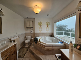
To the right of the tub, the water closet got an update with deep blue walls. The overall palette, a base of white with blue accents and the sauna’s light wood, creates a clean and airy look that’s just right for a relaxing retreat.
Tub: Brainpod 2.0, Polar Monkeys; tub filler: Purist, Kohler; chandelier: Terrell Swann, Stray Dog Designs; water closet paint: Bunglehouse Blue, Sherwin-Williams
Read more about this project
This article was originally published by a www.houzz.com . Read the Original article here. .

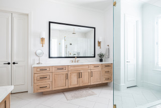
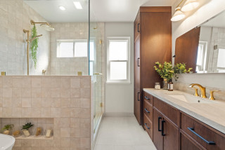
A new custom Eastern black walnut double vanity adds a generous dose of warmth in this updated California primary bathroom by designer Lori Wallick. The piece includes inset soft-close doors and drawers in two styles: Shaker for the doors and bottom two sets of drawers and flat-panel for the row of top drawers. The countertop and short backsplash are Taj Mahal quartzite, which complements the rest of the palette in the bathroom. Two earth-tone concrete sinks tie in with the concrete tub opposite the vanity. Sleek gold-finish widespread faucets join brushed pewter cabinet pulls and hand-hammered copper mirrors for a mixed-metals look.
Custom vanity: Oak Ridge Cabinets
Read more about this bathroom makeover
New to home remodeling? Learn the basics
This article was originally published by a www.houzz.com . Read the Original article here. .

Natural textures are key to this look. Wood, stone, jute, linen and wool will all provide a link to nature and work together to create a fuss-free scheme.
Go for clean-lined furniture shapes for a contemporary take. Choosing unpainted wood that allows the grain to show through and undyed fabrics in natural tones will help to create a tactile and earthy scheme that provides a link to the outdoors all year round.
Smaller elements, such as jute or seagrass baskets, can also help to introduce pleasing texture in a simple way.
This article was originally published by a www.houzz.com . Read the Original article here. .

Kitchen at a Glance
Who lives here: A couple and their two Dachshunds
Location: Jacksonville, Florida
Size: 200 square feet (19 square meters)
Designers: Allie Reed for Woodsman Kitchens and Floors and Jessica Woodward of Welcome Home Styling
Builder: Inga Home Renovations
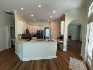
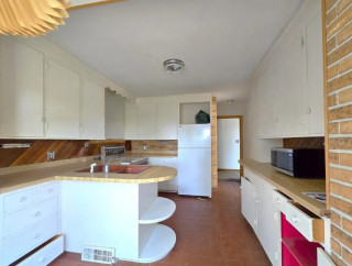
Before: The 170-square-foot kitchen was boxed in by the angled peninsula, which completely cut off the flow to the adjoining family room. The setup shoved the primary work zone into one tight corner. “It really felt like the sink, cooktop and refrigerator were all on top of each other,” Reed says. “There was no workspace around the cooktop and that was huge for them.”
While the couple wanted to keep the existing wood-look luxury vinyl plank flooring, they were ready to ditch the basic black appliances, short white cabinets and beige granite. They also wanted to address a cramped, angled desk area on the right next to the pantry closet. “That space over there was useless,” Reed says. “It ended up being a drop zone for everything.”
Traffic flow was another issue, with an arched doorway to a TV room on the right, another arched doorway to the dining room at the back and a hallway on the left leading to the bedrooms. “We had three entrances into the kitchen,” Reed says. “That’s why we wanted to close one of them up.”
Find home design and building pros on Houzz