![]()
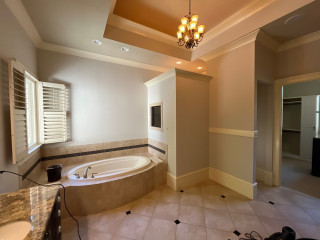
For this busy Minnesota couple with three teenage daughters, the original primary bathroom was cramped, dated and uninspiring. Designer Victoria Johnson transformed the space into a serene retreat with a freestanding soaking tub, a furniture-style white oak double vanity and a spa-worthy shower with integrated LED lighting. Soothing neutral tones, thoughtful storage and luxe finishes turned this once-boring bathroom into a peaceful, elevated haven perfect for recharging after a hectic day.
Before Photo
A tower cabinet with adjustable shelves provides storage for linens and essentials. Its metal-framed door with reeded glass lightens the vanity wall while hiding clutter. The large bottom drawer includes a built-in outlet and custom partition for hair tools.
The counter and backsplash are Fusion quartzite, a durable natural stone with dramatic patterning and swirling colors. “It’s stunning and definitely the wow factor of this bathroom,” Johnson says. Mitered edges give the countertop a substantial feel. Walls, ceiling and trim are painted a light greige (Gossamer Veil by Sherwin-Williams) with a limewash finish. “Limewash is good for spaces with moisture, and I also wanted to have texture but not do tile everywhere,” Johnson says. “I figured if we went with a finish that was good for a space with moisture we could solve that. It also adds texture to the space.”
The floor was upgraded to 12-by-24-inch large-format light gray matte porcelain tiles laid in a herringbone patter with matching grout for a clean, contemporary look.
Find a bathroom designer on Houzz
A bold, extra-large black LED zigzag sconce mounted vertically between the mirrors adds modern flair. “I don’t like sconces above mirrors,” Johnson says. “I think when you have them next to the mirror you get better lighting. In this space I didn’t have the room to add them on each side, so I put one in the middle. This one in particular is more like a decorative piece or statement.” New recessed LED ceiling lights on dimmers provide overall illumination. (They were digitally removed by the photographer to showcase other design details.)
Sconce: Zig Zag, Visual Comfort; medicine cabinets: Infinity in black, CB2
Before and After: 4 Elevated Bathrooms in 170 to 180 Square Feet
Faucet: Castia in brushed nickel, Kohler
See why you should hire a professional who uses Houzz Pro software
Before Photo
10 Bathroom Vanity Features Pros Always Recommend
A floor-mounted tub filler with hand shower head and diverter in vibrant brushed nickel matches the vanity faucets. Durable fabric drapes soften the existing windows and add warmth. Johnson mounted the drapery rod a few inches higher to visually lift the walls. She also removed the window trim and added a sheetrock detail for a cleaner, more modern look.
10 Ways to Control the Cost of Your Bathroom Remodel
Before Photo
The door next to the shower leads to the water closet, which the homeowners wanted to keep. “We changed the toilet, continued the tile into that space and painted the water closet,” Johnson says.
New to home remodeling? Learn the basics
The new setup includes a fixed shower head, an 8-inch contemporary rain can, a hand shower and a pressure-balanced valve with diverter, all in vibrant brushed nickel. A long niche keeps products organized and off the floor, while an integrated LED lighting strip adds a modern glow. “I love the overall look and feel,” Johnson says. “It’s definitely not a basic bathroom anymore. The improved storage we gave them is great too.”
More on Houzz
Read more stories
Browse photos for ideas
Find home professionals
This article was originally published by a www.houzz.com . Read the Original article here. .


Bathroom at a Glance
Who lives here: A couple — a CPA and an art teacher — with three teenage daughters
Location: Maple Grove, Minnesota
Size: 170 square feet (16 square meters)
Designer: M. Victoria Johnson Interiors
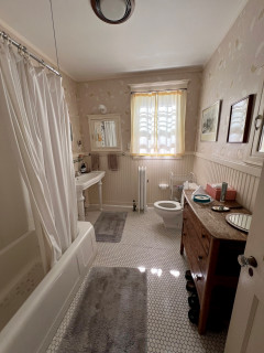
Before: The former bathroom, with powder blue walls and a basic beige tile floor, had an aging wood double vanity that offered little storage. “Storage was an issue for sure,” Johnson says. “Everything was just in need of an update and upgrade.”
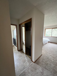
A solid-surface countertop and row of Hollywood-style vanity lights dated the space. Nearby, a corner tub with deck ate up valuable square footage. The door at right leads to the primary bedroom; the other door reflected in the mirror opens to the couple’s closet.