This article was originally published by a www.houzz.com . Read the Original article here. .

This article was originally published by a www.houzz.com . Read the Original article here. .
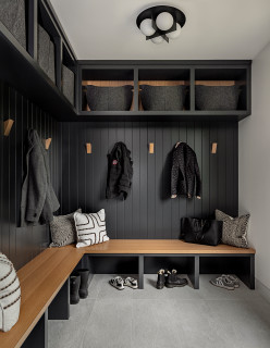
Homeowners’ request. “This space is located right off the front door and the garage door, so it gets used multiple times a day,” designer Harmony Young says. “The homeowner wanted a place for storage, along with somewhere to sit and put on shoes. Because it’s near the entry, they also wanted it to feel warm and inviting. Our goal was to make the space welcoming and cozy right as you walk in, while keeping it functional and organized so everything can be neatly tucked away.”
Mudroom storage features. “We created a bench with cubbies underneath for shoe storage, along with a shelf above for grab-and-go items,” Young says. “This also provided a place to accessorize and make the space feel warm, inviting and pulled together. Since there’s already a coat closet in the space, the homeowners didn’t feel they needed much enclosed storage. Instead, we focused on creating more of a furniture piece rather than a storage cabinet.”
Other special features. “We wanted to bring in some color, and green felt like the perfect complement to this mountain home,” Young says. “The color we chose is Sherwin-Williams Pewter Green. To add warmth, depth and dimension, we incorporated a beautiful white oak wood tone. We finished the look with brushed brass coat hooks and black rattan baskets for shoe storage. We love the harlequin black-and-tan rug. It’s the perfect complement to the space and is durable enough to withstand the Utah climate.”
Designer tip. “Don’t be afraid to mix materials,” Young says. “We incorporated both wood and paint, which I feel added an extra layer of detail and warmth. Even though the space is highly functional, we included decor pieces and artwork to add interest and make it feel more like an entryway than a mudroom.”
“Uh-oh” moment. “When the wood paneling first went in, I was a little unsure about the color we had chosen,” Young says. “But once we pulled everything together, I knew it was the perfect complement to the green paint.”
Project photography: Cristina Zolotaia
This article was originally published by a www.houzz.com . Read the Original article here. .


Clever changes, including opening up the stairwell, adding skylights in the bathrooms and installing more windows, had a huge impact. “It’s made it a house you want to be in as opposed to one that felt a bit dingy before,” Sarah says. Scroll down to see their inspiring renovation.
This article was originally published by a www.houzz.com . Read the Original article here. .

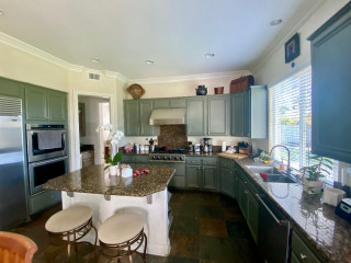
Kitchen at a Glance
Who lives here: A couple
Location: Duanesburg, New York
Size: 275 square feet (26 square meters)
Design-build pro: Marianne A. Clifford of Marianne Ashley Designs
Clifford removed the old appliances, cabinets, counters and floor, along with the two-level island, making way for a more than 12-foot-wide, one-level island with seating and storage. “It offers a lot more options on how the island can be used,” she says. The new layout improves sightlines and makes the kitchen feel open and inviting.
The island base and perimeter cabinets are semicustom cherry flat-panels with a natural finish and matte black ledge pulls. “A lot of the woodwork in their home was already cherry, so we wanted to create a unified look,” Clifford says.
The upgraded stainless steel refrigerator stayed in place, while an added open upper cabinet and tall pantry on the side expand storage. “There are hooks inside that pantry cabinet for hanging a step stool and broom,” Clifford says.
Modern counter stools with cognac leather upholstery and curved low backs sit at the island, while contemporary pendant lights with etched opal glass shades and matte black frames hang overhead. The ceiling has new LED recessed lights on dimmers. “This gives them full control,” Clifford says.
Pendant lights: Somerset, Hinkley Lighting; stools: Zion, Ballard Designs
Find kitchen remodelers near you
This article was originally published by a www.houzz.com . Read the Original article here. .

Pullouts flanking the range are just one of several custom storage options that Yolanda Badia of YB Interiors added to this Georgia kitchen for a family of four. The homeowners wanted a kitchen that would always look and feel organized, and they got exactly that with these pullouts, two appliance garages, a cabinet with a lift-up mechanism for an air fryer, pullouts for trash and recycling, and more. The storage is a mix of enclosed and glass-front cabinets and open shelving, but the generous use of white creates a unified look.
Cabinets: AB Furniture Refinishing
Read more about this kitchen
This article was originally published by a www.houzz.com . Read the Original article here. .

![]()
A custom-made bed is upholstered in a soft blue velvet. Berger bought a cost-friendly ottoman and covered it to complement the bed.
“For me, it’s important to be strategic about budget,” Berger says. “I want my clients to know they’re getting value for money, even when the budget is high. It’s better to spend money on certain good-quality pieces and thoughtful design.”
Wall paint: Skimming Stone, Farrow & Ball; bed: Loaf; lamps: Soho Home
This article was originally published by a www.houzz.com . Read the Original article here. .
![]()
Designer: Mark Ciano Home
Location: Westport, Connecticut
Homeowner’s request. “My client approached me with a vision to transform her third-floor storage and kids play space into a stunning but functional home office suite,” designer Mark Ciano says. “Her vision was a multipurpose space that not only represented her style and looked fantastic but also solved many of her home office needs, including a sitting area for informal meetings, a desk area with tons of storage and a window seat she could take calls on and look at the treetops.”
Built-in storage. “I designed a full wall of built-in cabinetry, including closed storage below for supplies and any other typical office items and open shelves above for decorative items and books and panels to hang art,” Ciano says. “The built-in unit was painted just the right tone of blue, Farrow and Ball De Nimes, a muted midtones blue that denotes tranquillity. Printer space is hidden inside the built-ins, and all computer laptop cords run through the top of the desk and are neatly tacked behind the leg of the desk.”
Other special features. The desk is walnut and marble. “The walls are wallpapered in Cowtan & Tout Tabor in a neutral weave to create a layered texture but not close in the space or hit you in the face with color,” Ciano says. “We commissioned two pieces of art that sit in the built-ins behind the desk area off to the sides. My client’s dear friend is an artist on the West Coast and I worked with her on the concept, color and execution of the pieces. The lighting details were quite important. Instead of a desk lamp or recessed spots, I opted for hanging pendants over the desk.
“To separate the space and create a divider between the sitting area and desk area, I designed open custom shelving units that followed the slope of the ceiling. It creates a separation but doesn’t close spaces in. The divider bookcases are in rift-cut oak and stained with a medium-toned walnut finish. A full coffee station with refrigeration was a must because of the time she spends working.”
Designer tip. “People spend so many hours at their desk these days, I wanted my client to have a cozy window seat with treetop views if she’s reviewing contracts or just needs to take a few minutes’ break between Zoom calls,” Ciano says.
Desk: Rove Concepts; commissioned art: Reggie Stone
Find a local interior designer on Houzz
This article was originally published by a www.houzz.com . Read the Original article here. .

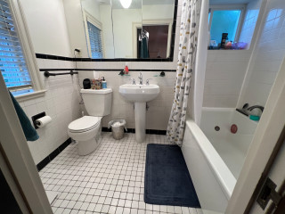
The small black-and-white en suite bathroom in this 1934 Colonial just outside Boston had vintage charm, but it fell short of the sophisticated retreat the new homeowners envisioned. The single pedestal sink offered no storage or counter space, and the aging shower-tub combo didn’t meet the couple’s needs. The nearby walk-in closet in the bedroom also lacked functional storage.
Looking to create a more spacious and practical layout, the couple hired design-build pros Jason and Megan Hoffman. Jason suggested pushing a wall shared by the bathroom and closet into the bedroom to gain valuable square footage. The reimagined bath now features a warm wood double vanity, a roomy low-curb shower with a built-in bench and a linen cabinet for added storage. A thoughtful mix of white, black and wood finishes with clean-lined midcentury touches brings modern style to this refreshed and highly functional space.
Before Photo
Bathroom at a Glance
Who lives here: A young couple
Location: Newton, Massachusetts
Size: 43 square feet (4 square meters)
Designers-builders: Jason and Megan Hoffman of J.P. Hoffman Design Build
Before: The 40-square-foot bathroom had charm thanks to its pedestal sink and classic black-and-white tile, but it lacked the storage and counter space the young couple needed in their primary suite. The aging shower-tub combo added to the challenges. “They have a tub in another bathroom, so that satisfied the home’s need for a tub,” Jason says. “Having no tub here opened up the opportunity to maximize the layout.”
Two existing windows — one beside the toilet and another at the end of the shower-tub — were in good shape, so the homeowners opted to keep them.
Find a bathroom designer
A pony wall on the left adds a touch of privacy for the new two-piece white toilet. A decorative walnut shelf above the toilet offers a warm accent. “We moved the new toilet 6 inches so everything on that wall now fits,” Jason says.
Creamy white paint (White Dove by Benjamin Moore) covers the walls, ceiling and trim, creating a clean, warm backdrop. Matte black details throughout add striking contrast.
10 Aging-in-Place Features Pros Swear By
Bronze and brass two-light fixtures with clear glass globes add a touch of midcentury style that complements the vanity. The bathroom also has recessed LED ceiling lights and a new exhaust fan, both of which were digitally removed from these photos to better highlight the room’s key design features.
Double vanity: Serenity door style in natural walnut, Candlelight Cabinetry; towel ring: Purist in matte black, Kohler; vanity pulls: Morris, Top Knobs; vanity lights: Young House Love Clear Glass Bubble, Shades of Light
Shop for bathroom vanities on Houzz
Creamy white glossy ceramic tiles, measuring 2 by 6½ inches, cover the wall above the vanity in a vertical stack pattern; the grout is frosty white. The tile’s subtle surface movement adds depth and texture. “We used that tile on the shower walls too,” Jason says. “By bringing the tile all the way across that wall, you’re creating less transitions and making the room seem bigger.”
Faucets: Jason Wu collection, matte black, Brizo; wall tiles: Wellfleet in Coconut, 2 by 6½ inches, Best Tile
10 Smart Bathroom Storage Solutions
On the bathroom floor, 4-by-12-inch matte black porcelain tiles are laid in a herringbone pattern and paired with midnight black grout, adding depth and visual interest.
Floor tile: Topography porcelain in black, 4 by 12 inches, Best Tile
See why you should hire a professional who uses Houzz Pro software
On the shower floor, hexagonal tumbled Carrara marble mosaic tiles bring natural variation in veining and tone, set with frosty white grout for soft contrast. “The homeowners liked the way everything looked when all the details were put together,” Jason says.
Shower floor tile: Antique Carrara hexagon tumbled, 2 by 2 inches, Best Tile
A hardwired black towel warmer with a programmable timer, mounted to the side of the linen cabinet, adds both function and luxury to the space. “We were able to redesign and update this bathroom without changing the location of windows,” Jason says. “The creativity and the ability to see the solution was key here.” For added privacy, the windows were fitted with a translucent film.
New to home remodeling? Learn the basics
Before: A swing door on the left once connected the bedroom and bathroom. An imposing dark armoire stood against the wall space between the door to the bathroom and the primary closet to its right. The door on the far right leads to the second-floor landing and staircase to the main level. The exposed metal ductwork visible at the back left is from a prior HVAC upgrade.
A new pocket door now connects the bedroom and bathroom. “It was related to the size of the bathroom and the location of switches to optimize space,” Jason says. The previously exposed ductwork is also gone. “We were able to enclose the necessary ductwork behind a wall in the new bathroom and added the valuable linen cabinet,” Megan says.
More on Houzz
Read more bathroom stories
Browse bathroom photos
Find a bathroom remodeler
Shop for your bathroom
This article was originally published by a www.houzz.com . Read the Original article here. .

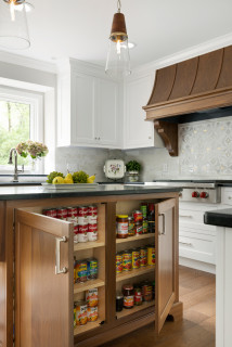
Pantries are the best way to store canned goods, jars and bottles, as they keep everything in one organized space, says Simon Lennox of Adornas Kitchens & Interiors.
Of course, not all of us have the luxury of being able to incorporate a huge pantry, but even a small one can be a real bonus. “A well-organized larder cupboard will add a lot of storage space to a kitchen without necessarily taking up [too much] space, as they can be made to any shape and size,” Odile Kipling of SoKipling says
Kipling has some advice on how to get the most out of your pantry. “Do an inventory of what you want to store … and measure the tallest, widest, smallest and heaviest items to make sure everything has a place and is easily accessible,” she says.
“Pullout shelves or shallow drawers are ideal at the lower levels, especially if the cupboard is deep, so you don’t have to kneel down and reach for the items at the back,” Kipling says.
She suggests that pantry pullouts above the countertop are less practical because you may not be able to see inside them. Here she recommends shallower shelves and a rack on the back of the door for condiments, spices or — if you have enough cupboard depth — larger items such as pasta boxes.
This article was originally published by a www.houzz.com . Read the Original article here. .
![]()
Designer: Molly Robinson of Homoly Design + Build
Location: Westwood, Kansas
Homeowners’ request. “This room was thoughtfully designed with the homeowners’ two dogs and two cats in mind,” says designer Molly Robinson, who uses Houzz Pro software.
Special features. “A dedicated ‘cat condo’ includes a custom ramp, a designated litter box area and built-in ventilation to keep things fresh and functional,” Robinson says. “For the pups, there’s a cozy zone complete with a doggy door that provides easy access to the outdoors. The black-and-white checkered tile flooring, paired with bold wallpaper that extends across the walls and ceiling, injects a playful and whimsical energy into the space. The pattern creates visual interest and a sense of movement, making the room feel dynamic and full of personality.
“To ground the design and let those elements shine, we opted for neutral white cabinetry that adds a crisp, clean contrast without competing for attention. The result is a fun, stylish space that feels both fresh and thoughtfully balanced.”
Designer tip. “We designed the countertop to be slightly taller than standard height, which makes folding laundry more comfortable and ergonomic — no more hunching over,” Robinson says. “As a bonus, the added height also serves a practical purpose by keeping pet treats and other essentials out of reach of curious paws.”
“Uh-oh” moment. “One of the biggest ‘uh-oh’ moments came when we realized just how tricky it would be to incorporate all of the custom pet features and maintain a clean, functional layout for everyday use,” Robinson says. “Between the cat ramp, litter box ventilation, doggy access to the outdoors and still needing room for laundry tasks, it started to feel like we were designing three rooms in one. We reworked the cabinetry layout and decided to go fully custom, which gave us the flexibility to tuck away the pet zones in a way that felt intentional and integrated.”
New to home remodeling? Learn the basics
This article was originally published by a www.houzz.com . Read the Original article here. .

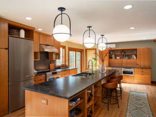
After: Now the kitchen has a streamlined look with dedicated storage and a refreshing cream-and-blue palette. Gone is the awkward butler’s pantry, replaced by glass-front cabinets for glassware and dishes. To the left of the new paneled fridge, an area that used to be a walk-in pantry now has cabinets for small appliances, bakeware, dry goods and a microwave.
To the right of the stove, a countertop cabinet hides a pullout shelf with a coffee bar and toaster, as well as stationary shelves for mugs and more. To the right of the sink, a cabinet with hammered glass doors keeps more dishware at hand.
Ramsay also removed a dining table and chairs (where the previous photo was taken from) and relocated a desk on the sink-side wall. This allowed for a more spacious island with seating for three, plus French doors that bathe the space in light. Wood-look luxury vinyl flooring grounds the space in beauty and practicality
Perimeter cabinet paint: Dumpling, Sherwin-Williams; island base paint: Hale Navy, Benjamin Moore
Read more about this project