Tag

Space

Browsing


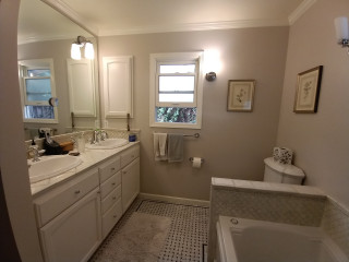
Once their kids had flown the nest, this Palo Alto, California, couple embarked on a multiphase remodel of their 1947 ranch home. One of their first priorities was an overhaul of the primary bathroom, which had a compact footprint, a cramped shower stall and dated finishes. Creating a space that would support aging in place was their top priority. They also wanted to add an exterior door opening to a patio with a hot tub.

They hired Harrell Design + Build to help them maximize every inch of the 127-square-foot room. By adopting a wet-room strategy for the tub and shower, the team was able to incorporate a larger vanity, carve out a semiprivate toilet area and find space for the new exterior door.


This article was originally published by a www.houzz.com . Read the Original article here. .


The owner of a 900-square-foot home in Davis, California, wanted to expand the living space on her modest lot. She turned to MAK Design + Build to create a versatile backyard accessory dwelling unit (ADU) that could host visiting family. As a medical professional, she also saw the potential to rent the space to medium-term tenants, such as traveling nurses, in the future.

Constraints such as the locations of the main house and garage on the property, along with setback requirements, helped shape the design. The homeowner also had two must-haves: a separate bedroom and privacy between the main house and the ADU. After exploring numerous layout options, she ultimately chose a one-level ADU tucked into a corner behind the garage. The finished space supports both her current lifestyle and possible future plans. In fact, once construction was complete, she liked the ADU so much that she told the designers she planned to move into it herself.


This article was originally published by a www.houzz.com . Read the Original article here. .


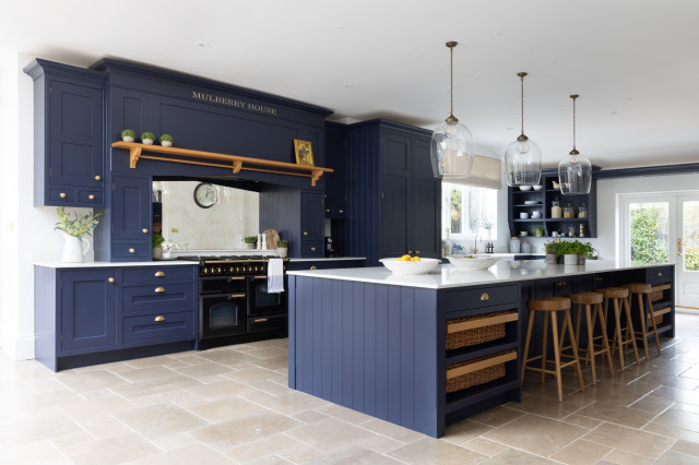
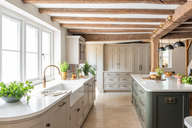
The owners of this beautiful storage-packed kitchen in a centuries-old detached home in Hampshire, England, had their grandchildren front of mind when planning their space. “They look after the grandkids a lot, and also entertain,” says Darren Taylor, managing director of Searle & Taylor, who the couple tasked with designing their new kitchen. “The children get involved in a lot of the baking so it had to be practical and safe.”

Taylor ensured there were plenty of features to fulfill this goal, all within a space that maintains a balance of both contemporary and traditional. The result is an elegant room that functions well and feels relaxed and comfortable to move around in.


This article was originally published by a www.houzz.com . Read the Original article here. .


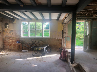
The low, beamed ceiling in this room in a centuries-old English house presented a challenge for kitchen specialist Chisholm Design. The firm had been tasked with creating a kitchen here where there once was none. In doing so, they needed to incorporate plentiful storage without the space feeling cramped. This was especially important because the front of the home dates from the 18th or early 19th century, with high ceilings and big windows, and the back of the house, where the kitchen is located, is 16th century, with low ceilings.

“There’s quite a mismatch in the feel of the house as you go through it, so it was important the spaces flowed together,” designer Joanna Chisholm says. She did this by keeping the kitchen light and open, so the low ceiling and reduced light is less apparent, and by building storage neatly into all the available space, including under the stairs and within the fireplace.


This article was originally published by a www.houzz.com . Read the Original article here. .


Bright Custom HomesSave Photo
Photos by KM Photography Interiors

Kitchen at a Glance
Who lives here: A couple and their child
Location: Calgary, Alberta
Size: 192 square feet (18 square meters); 12 by 16 feet
Designer: Megan Stimpson of Alykhan Velji Designs
Builder: Sukhman Mahal of Bright Custom Homes

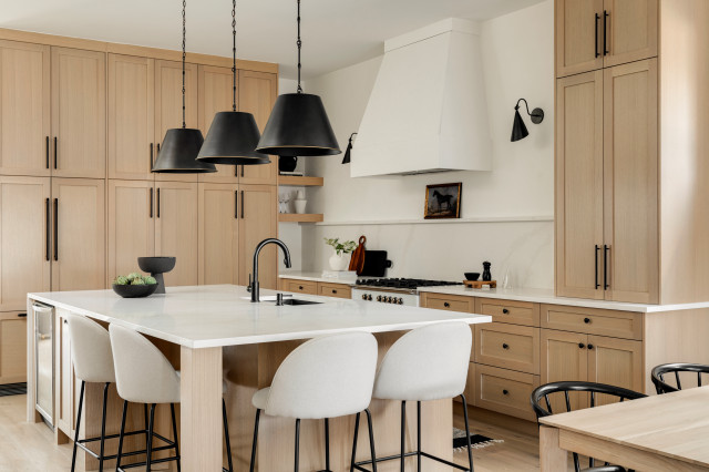
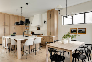
The design came together in a somewhat unconventional way. Sukhman Mahal, co-owner of Bright Custom Homes, began the build as a spec house. The design process with Stimpson was well underway before the family bought the home. “From the beginning, we wanted transitional style that would be timeless and have wide appeal,” Stimpson says. “The layout of the space is long and quite narrow. We used the same wood tones and wall paint within the open floor plan to keep things simple, bright, neutral and cohesive.”

Because construction was still in progress when the house sold, the new owners had the opportunity to tweak the finishes to suit their personalities. The room already had white oak cabinetry, off-white quartz countertops and antique oak engineered flooring. However, they were able to change the backsplash, lighting, faucet and cabinet hardware selections.

Wall color: White Dove, Benjamin Moore; flooring: 7½ -inch Wildwood Antique Oak planks in Istanbul, Magna Hardwood Floors

Find a builder on Houzz


This article was originally published by a
www.houzz.com . Read the Original article here. .


This article was originally published by a
www.houzz.com . Read the Original article here. .


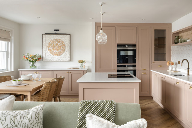
The new owners of this three-bedroom Regency-style apartment in Cheltenham, England, loved its location close to their daughter’s school, but its sleek, modern features not so much. “They prefer period style and classic looks,” says Angela Colley of GeorgieRose Interior Design.

One of the homeowners had contacted the designer as she liked the look of her previous projects, which blend soft, earthy colors and classic style. She asked Colley to design a kitchen, dining area and living space in the home’s one large public room. “There was a lot to fit in, so it was about keeping it light and bright so it didn’t overpower,” Colley says.

The starting point for the kitchen was a paint sample of a pinkish-brown shade. “I just took a shine to the color,” she says. “I wasn’t sure [the owner] would like my suggestion, but she absolutely loved it.”


This article was originally published by a www.houzz.com . Read the Original article here. .


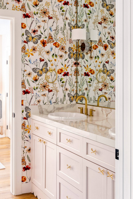
Designer Christy Mancera envisioned a fairy tale when pulling together the look for a Nevada bathroom shared by two young girls. “We wanted to make this bathroom a sweet dream space for these little girls,” she says. Butterfly wallpaper, a pale pink vanity, scallop motifs and bow-shaped drawer pulls are a few key pieces that pull together the delightful room.

“After” photos by Kristin Elizabeth Studio

Bathroom at a Glance
Who lives here: A family of six
Location: Henderson, Nevada
Size: 50 square feet (4.7 square meters)
Design-build firm: Cera Construction

Before: The existing bathroom was functional but the plain look was far from inspired.

Cera ConstructionSave Photo
After: The bathroom’s 5-by-10-foot footprint remained the same. The room has a door on either end of the vanity. Each door leads to one of the girls’ bedrooms.

One of the first ideas Mancera presented the girls’ mother with was a light pink double vanity with a scalloped edge along the bottom. This custom touch was a motif she carried through on other elements in the room.

Find a design-build firm on Houzz

Cera ConstructionSave Photo
“This was the first time I’d tried using a scalloped edge along a toekick,” Mancera says. “At first I designed a fuller scallop, but we wound up lifting it up a bit so that if something rolled underneath the sink, my clients would be able to retrieve it.”

Mancera and the rest of the design-build team used Houzz Pro software during the entire process, from the beginning of the design phase until construction was complete. “It helped us keep all the communication between the clients and all the team members organized and efficient,” Mancera says.

See why you should hire a professional who uses Houzz Pro software

Cera ConstructionSave Photo
Mancera searched high and low to find just the right sinks. These have edges with a scalloped look. “They are Victorian-style sinks,” she says. “They really helped to pull in the fairy-tale feel.”

The faucets and handles have simple silhouettes, which keeps them from distracting from the scalloped motif. The finish is brushed brass.

Browse bathroom faucets in the Houzz Shop

Cera ConstructionSave Photo
“The butterflies and flowers on the wallpaper make these such happy walls,” Mancera says. She plucked a pink hue from the pattern and had the vanity painted to match.

The mirror is a simple sheet mirror. However, Mancera elevated the look by creating a frame with brass Schluter strips, which are commonly used to edge tile.

Cera ConstructionSave Photo
Across from the vanity is a toilet on the left (not shown) and a tub-shower on the right. Mancera presented her clients with a scrumptious pink glazed ceramic wall tile. The subtle variation in pink tones works beautifully with the wallpaper, and the white grout picks up on the white background of the wallpaper. “We used a vertical grid composition to minimize the impact of the pattern,” the designer says.

The existing tub and window were in fine shape, so Mancera worked them into her design. Other ways she helped stay on budget were by using porcelain countertops instead of natural stone, using luxury vinyl tile flooring instead of hardwood and using a sheet mirror instead of two separate vanity mirrors. The latter move also meant the wall over the vanity didn’t need to be wallpapered.

More on Houzz
Read more bathroom stories
Browse bathroom photos
Find a bathroom remodeler
Shop for your bathroom


This article was originally published by a
www.houzz.com . Read the Original article here. .


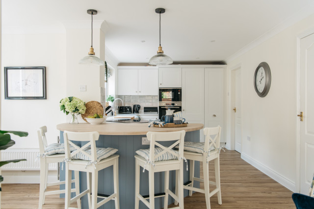
This home in Northampton, England, had a kitchen with an adjoining dining area and a living room in a conservatory, but it felt gloomy and cramped. The owner, who lives here with her two sons, found interior designer Eleni Fantis on Houzz and asked her to rethink the design. “[The owner] wanted a real family space, with defined areas, but where they could all gather, cook, entertain and enjoy being together,” Fantis says.

Before Photo

Sarah AlcroftSave Photo

Photos by Beth Saunders Photography

Kitchen at a Glance
Who lives here: A woman with two sons
Location: Northampton, England
Size: About 120 square feet (11 square meters); 12 by 10 feet
Designers: Eleni Fantis of Omorfia Interior Design (interior design) and Ezra Kerr of Jikoni Interiors (kitchen design)

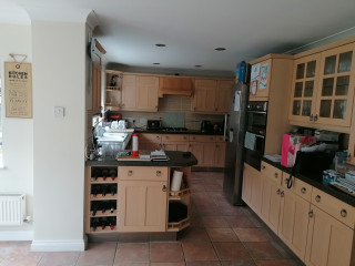
Before: The original kitchen was put in when the house was built. While there was plenty of storage, the arrangement made the area feel cramped.

Fantis wanted to use a kitchen company that would make the most of the space. Enter kitchen designer Ezra Kerr.

Jikoni InteriorsSave Photo
Fantis’ solution to the dark area was to create a flow of light and space, while Kerr cleverly turned the kitchen into a cozy but high-functioning room.

The kitchen is the heart of the space and it was important that this was somewhere the owner could feel relaxed and enjoy making food, entertaining and teaching her boys to cook.

Find an interior designer on Houzz

Jikoni InteriorsSave Photo
The new design removed the bank of cabinets on the right, widening the room, but this meant Kerr needed to find a way to fit plenty of storage into the new layout.

Luckily, there’s a utility room through the door opposite the sink, so he didn’t need to find space for laundry appliances.

He made more use of the short wall with a full-height pantry cabinet — one of the owner’s key requests — a refrigerator and cabinets above and below the combination and standard ovens.

Kerr stopped short of the ceiling for a maximum sense of space. “Having units to the ceiling makes a room look smaller — when you can’t see the wall above, it closes everything in — so we left a gap,” he says.

Shop for your kitchen

Jikoni InteriorsSave Photo
In the corner, Kerr retained the base and wall cabinet arrangement to add some extra countertop space — a spot that serves as a good breakfast station.

The white doors are vinyl-wrapped, making them robust, and the white countertop is durable quartz. Kerr went with a curved ceramic sink to add interest.

Fantis chose pretty pink and blue tiles for the backsplash. “[The owner] didn’t really have any pattern in her home, so I wanted to incorporate some delicate patterns so as not to overwhelm her,” she says.

Kitchen cabinet paint: Satin White and Richmond Denim, Jikoni Interiors

Find a kitchen designer

Jikoni InteriorsSave Photo
As there was now no room on the ovens wall for a cooktop, Kerr came up with a neat solution — an angled peninsula.

“Usually, the [cooktop] would go on the back wall, but because there was no space, that was the only way we could do it. You could have had a [standard] peninsula, but we tried to make it a bit more special. It makes the kitchen feel cozy and works really well in the space.”

New to home remodeling? Learn the basics

Jikoni InteriorsSave Photo
There was originally a wall cabinet in this corner to the right, but Kerr swapped it for open oak shelves. “We didn’t want to block out any light, so it’s better if the look feels open,” he says.

The wood-look luxury vinyl tile flooring pairs well with the oak shelves, and looks and feels warmer than the original tiles.

Jikoni InteriorsSave Photo
The other side of the peninsula is curved, which not only gives it a softer feel, it also adds countertop space and makes it more sociable.

“[The owner] wanted us to fit in as many seats as we could,” Kerr says. “We created the circular shape so you can have people sitting round being sociable without all sitting in a line.” This section of countertop is oak, giving it the feel of a table.

The induction cooktop has a downdraft ventilation system that vents out through the wall. “An extractor hanging from the ceiling would have blocked the room,” Kerr says.

See why you should hire a professional who uses Houzz Pro software

Jikoni InteriorsSave Photo

Kerr has tucked a wine fridge and another cabinet into the peninsula unit. Neither is obvious from the living area, but they help maximize the storage.

Jikoni InteriorsSave Photo

An upholstered bench offers an additional seating spot when guests are over.

Before Photo

Omorfia Interior Design LtdSave Photo

Before: Originally, the dining area was in the small room to the left and the living area was in a conservatory to the right.

Jikoni InteriorsSave Photo

After: Fantis had most of the wall between the two spaces removed. She sited the seating area near the French windows and moved the dining area into the conservatory.

Light can now circulate between the spaces, making them feel brighter and bigger.

Jikoni InteriorsSave Photo

The large armchair between the living room and kitchen is key to the color scheme. “The floral fabric was actually the beginning of the whole design, and is a printed velvet,” Fantis says. “[The owner] loved it so much, I persuaded the supplier to sell me additional [fabric], which we then used for some of the blinds.”

The original dark red curtains have been swapped for these pale blue ones, which fit with the fresh, light color scheme and are less dominating.

Before Photo

Sarah AlcroftSave Photo

The conservatory roof had been badly lined in the past, so Fantis had that replaced.


This article was originally published by a
www.houzz.com . Read the Original article here. .


When this Canadian family started to outgrow its home, the last thing it wanted to do was leave behind its beloved neighborhood in Victoria, British Columbia. “This is a fantastic neighborhood that’s walkable to shops, restaurants and the beach,” Robbyn McDonald of MAC Reno Design Build says. “We finished the attic to create space for a primary suite and living room. They’d never had an en suite bathroom before, so they were really excited.” The new, light-filled bathroom is a fresh take on midcentury modern style.

MAC Reno Design Build LTD ( MAC Renovations)Save Photo
Photos by Dasha Armstrong Photography

Bathroom at a Glance
Who lives here: A young family
Location: Victoria, British Columbia
Size: 118 square feet (11 square meters)
Designer-builder: MAC Reno Design Build

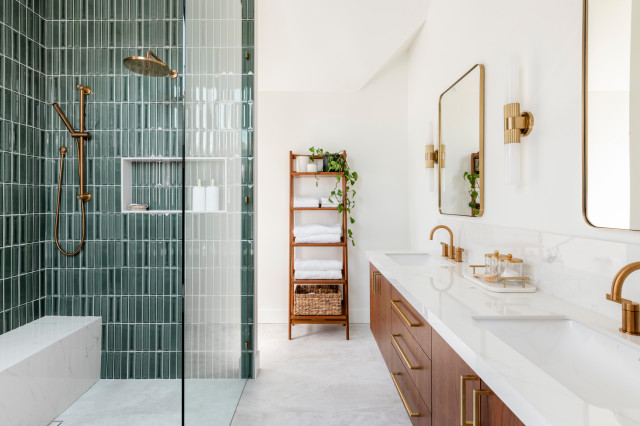
The new bathroom includes a double vanity, a generous shower stall, a freestanding bathtub and a private toilet alcove behind the plumbing wall in the shower. The shower has a long bench with a handheld shower wand above it. The shower stall is curbless, so the floor slopes imperceptibly to direct water to a linear drain next to the bench.

To increase the attic space, the firm removed the home’s existing hipped pyramid roof. It framed the walls a few feet higher, then added a new cross-gable roof.

Find a local design-build firm on Houzz

MAC Reno Design Build LTD ( MAC Renovations)Save Photo
“The jumping-off point for the room was the clients’ wooden towel stand,” McDonald says. “We echoed it in the vertical-grain walnut floating double vanity.” The vanity sets a midcentury-modern-inspired tone, emphasized by brushed gold fixtures.

Simple mirrors with rounded edges maintain the clean look. The room has a lot of straight lines, so the subtle curves of the mirror frames add softness.

MAC Reno Design Build LTD ( MAC Renovations)Save Photo
The vanity has three large drawers in the center for efficient storage. There’s motion-activated lighting under the vanity. This makes navigating to the toilet alcove easy at night without turning on a bright light.

The countertop is a porcelain slab that looks like marble. The designers used the same porcelain on the shower bench. The bench is heated and serves as a toasty seat in the shower.

Browse vanities in the Houzz Shop

MAC Reno Design Build LTD ( MAC Renovations)Save Photo

The flooring is also porcelain, composed of large-format tiles. The open door offers a glimpse into the primary bedroom. Heated floors keep the bathroom nice and warm.

The shower has a partial enclosure, which keeps the water inside. Tight insulation and energy-efficient glass on the windows and skylight help prevent drafts.

MAC Reno Design Build LTD ( MAC Renovations)Save Photo
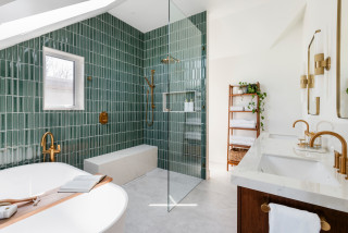
One of the challenges in an attic renovation is addressing lower ceilings. Placing the tub beneath the sloped ceiling and adding the skylight was a good layout strategy here. It’s easy to get in and out of the tub without hitting the ceiling.

“The vaulted ceiling added height and visual interest, creating a cozy and inviting tub area,” McDonald says. “Positioning the skylight above the tub brought natural light throughout the room, reducing reliance on artificial lighting.”

Shop for a bathtub

MAC Reno Design Build LTD ( MAC Renovations)Save Photo
Midcentury modern style also inspired the sumptuous green tiles in the shower. Their vertical composition nods to the era. The tiles are glossy, with 3D beveled edges — a fresh update on the style. Tiles from the era would have been flat, while these have a lot of dimensionality.

Shower tile: Flauti in Sage Gloss, Ceramic Tileworks

MAC Reno Design Build LTD ( MAC Renovations)Save Photo
The tucked-away toilet area behind the shower wall has privacy and light from a window. The green tiles and brushed gold accessories keep the space cohesive with the rest of the bathroom.

“High-quality materials and precise construction techniques ensured the bathroom met industry best practices for sustainability, water conservation and performance,” McDonald says. These include:

Updated plumbing and mechanical systemsWater-conserving shower fixtures Low-E energy-efficient windows that create a tight envelopeHeated flooring that provides even, energy-efficient heatLED lightingPlenty of natural light to reduce use of artificial lighting

MAC Reno Design Build LTD ( MAC Renovations)Save Photo


This article was originally published by a
www.houzz.com . Read the Original article here. .
Pin It