Before Photo
This article was originally published by a www.houzz.com . Read the Original article here. .
Before Photo
This article was originally published by a www.houzz.com . Read the Original article here. .
Designer: Erica Peale Design
Location: Arlington, Virginia
Size: 108 square feet (10 square meters); 9 by 12 feet
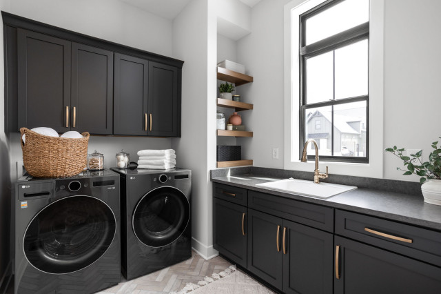
Homeowner’s request. “The homeowner wanted a more functional, well-organized space with dedicated storage for laundry and cleaning supplies,” says designer Erica Peale. “Previously, the room lacked proper laundry hampers, causing baskets to pile up on the floor, and there was no storage for linens or cleaning supplies, leaving the space cluttered. Painted a jarring orange, the room felt anything but inviting.”
Peale uses Houzz Pro software to help run her business. “We use Houzz for website hosting, 3D floor planning, project library and client reviews,” she says. “Houzz is an invaluable tool to help with our projects.”
Storage strategies. “Thoughtful design transformed this laundry room into a highly functional and organized space,” Peale says. “Open cubbies were created to house rolling laundry hampers, keeping them accessible yet neatly tucked away. Pullout drying racks add convenience for air-drying garments, while custom cabinetry provides ample storage for cleaning supplies, detergents and household linens. Additional features such as adjustable shelving, a built-in ironing board, concealed waste bins and dedicated folding surfaces ensure everything has a place, making daily laundry tasks more efficient and enjoyable.”
Other special features. “The custom cabinetry was painted in a soft, soothing spa-like blue, (Sherwin-Williams’ Stardew), bringing a calm and refined feel to the space,” Peale says. “Large-format 12-by-18-inch travertine floor tiles ground the room with warmth and texture, while a polished marble 1-inch hexagon backsplash adds a timeless, elevated touch. Floating shelves with brass ceiling-mounted brackets introduce both style and function, complemented by brass cabinet hardware that adds warmth and subtle contrast. A full-size utility sink enhances everyday usability, while Steele Canvas laundry baskets provide an efficient system for separating whites, darks and dry cleaning.”
Designer tip. “A key design approach we recommend is choosing a softer, more restful color palette and prioritizing closed storage to minimize visual clutter,” Peale says. “Layering a mix of textures and varying sheens not only reflects light throughout the space but also creates depth and visual interest, transforming a functional room into one that feels calm, polished and intentional.”
General contractor: Connor Bentley; wall paint: White Dove, Benjamin Moore
25 Home Design Trends Defining How We’ll Live in 2026
This article was originally published by a www.houzz.com . Read the Original article here. .
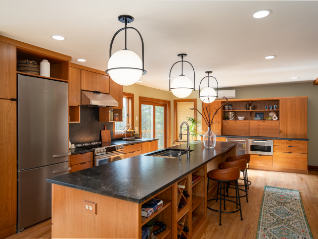
Kitchen at a Glance
Who lives here: A couple
Location: Duanesburg, New York
Size: 275 square feet (26 square meters)
Design-build pro: Marianne A. Clifford of Marianne Ashley Designs
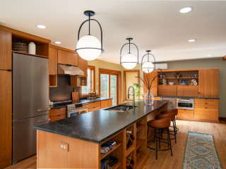
Clifford removed the old appliances, cabinets, counters and floor, along with the two-level island, making way for a more than 12-foot-wide, one-level island with seating and storage. “It offers a lot more options on how the island can be used,” she says. The new layout improves sightlines and makes the kitchen feel open and inviting.
The island base and perimeter cabinets are semicustom cherry flat-panels with a natural finish and matte black ledge pulls. “A lot of the woodwork in their home was already cherry, so we wanted to create a unified look,” Clifford says.
The upgraded stainless steel refrigerator stayed in place, while an added open upper cabinet and tall pantry on the side expand storage. “There are hooks inside that pantry cabinet for hanging a step stool and broom,” Clifford says.
Modern counter stools with cognac leather upholstery and curved low backs sit at the island, while contemporary pendant lights with etched opal glass shades and matte black frames hang overhead. The ceiling has new LED recessed lights on dimmers. “This gives them full control,” Clifford says.
Pendant lights: Somerset, Hinkley Lighting; stools: Zion, Ballard Designs
Find kitchen remodelers near you
This article was originally published by a www.houzz.com . Read the Original article here. .

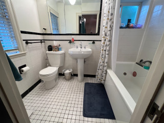
The small black-and-white en suite bathroom in this 1934 Colonial just outside Boston had vintage charm, but it fell short of the sophisticated retreat the new homeowners envisioned. The single pedestal sink offered no storage or counter space, and the aging shower-tub combo didn’t meet the couple’s needs. The nearby walk-in closet in the bedroom also lacked functional storage.
Looking to create a more spacious and practical layout, the couple hired design-build pros Jason and Megan Hoffman. Jason suggested pushing a wall shared by the bathroom and closet into the bedroom to gain valuable square footage. The reimagined bath now features a warm wood double vanity, a roomy low-curb shower with a built-in bench and a linen cabinet for added storage. A thoughtful mix of white, black and wood finishes with clean-lined midcentury touches brings modern style to this refreshed and highly functional space.
Before Photo
Bathroom at a Glance
Who lives here: A young couple
Location: Newton, Massachusetts
Size: 43 square feet (4 square meters)
Designers-builders: Jason and Megan Hoffman of J.P. Hoffman Design Build
Before: The 40-square-foot bathroom had charm thanks to its pedestal sink and classic black-and-white tile, but it lacked the storage and counter space the young couple needed in their primary suite. The aging shower-tub combo added to the challenges. “They have a tub in another bathroom, so that satisfied the home’s need for a tub,” Jason says. “Having no tub here opened up the opportunity to maximize the layout.”
Two existing windows — one beside the toilet and another at the end of the shower-tub — were in good shape, so the homeowners opted to keep them.
Find a bathroom designer
A pony wall on the left adds a touch of privacy for the new two-piece white toilet. A decorative walnut shelf above the toilet offers a warm accent. “We moved the new toilet 6 inches so everything on that wall now fits,” Jason says.
Creamy white paint (White Dove by Benjamin Moore) covers the walls, ceiling and trim, creating a clean, warm backdrop. Matte black details throughout add striking contrast.
10 Aging-in-Place Features Pros Swear By
Bronze and brass two-light fixtures with clear glass globes add a touch of midcentury style that complements the vanity. The bathroom also has recessed LED ceiling lights and a new exhaust fan, both of which were digitally removed from these photos to better highlight the room’s key design features.
Double vanity: Serenity door style in natural walnut, Candlelight Cabinetry; towel ring: Purist in matte black, Kohler; vanity pulls: Morris, Top Knobs; vanity lights: Young House Love Clear Glass Bubble, Shades of Light
Shop for bathroom vanities on Houzz
Creamy white glossy ceramic tiles, measuring 2 by 6½ inches, cover the wall above the vanity in a vertical stack pattern; the grout is frosty white. The tile’s subtle surface movement adds depth and texture. “We used that tile on the shower walls too,” Jason says. “By bringing the tile all the way across that wall, you’re creating less transitions and making the room seem bigger.”
Faucets: Jason Wu collection, matte black, Brizo; wall tiles: Wellfleet in Coconut, 2 by 6½ inches, Best Tile
10 Smart Bathroom Storage Solutions
On the bathroom floor, 4-by-12-inch matte black porcelain tiles are laid in a herringbone pattern and paired with midnight black grout, adding depth and visual interest.
Floor tile: Topography porcelain in black, 4 by 12 inches, Best Tile
See why you should hire a professional who uses Houzz Pro software
On the shower floor, hexagonal tumbled Carrara marble mosaic tiles bring natural variation in veining and tone, set with frosty white grout for soft contrast. “The homeowners liked the way everything looked when all the details were put together,” Jason says.
Shower floor tile: Antique Carrara hexagon tumbled, 2 by 2 inches, Best Tile
A hardwired black towel warmer with a programmable timer, mounted to the side of the linen cabinet, adds both function and luxury to the space. “We were able to redesign and update this bathroom without changing the location of windows,” Jason says. “The creativity and the ability to see the solution was key here.” For added privacy, the windows were fitted with a translucent film.
New to home remodeling? Learn the basics
Before: A swing door on the left once connected the bedroom and bathroom. An imposing dark armoire stood against the wall space between the door to the bathroom and the primary closet to its right. The door on the far right leads to the second-floor landing and staircase to the main level. The exposed metal ductwork visible at the back left is from a prior HVAC upgrade.
A new pocket door now connects the bedroom and bathroom. “It was related to the size of the bathroom and the location of switches to optimize space,” Jason says. The previously exposed ductwork is also gone. “We were able to enclose the necessary ductwork behind a wall in the new bathroom and added the valuable linen cabinet,” Megan says.
More on Houzz
Read more bathroom stories
Browse bathroom photos
Find a bathroom remodeler
Shop for your bathroom
This article was originally published by a www.houzz.com . Read the Original article here. .

Kitchen at a Glance
Who lives here: A family
Location: Vienna, Virginia
Size: 256 square feet (24 square meters)
Designer-builder: Winn Design + Build
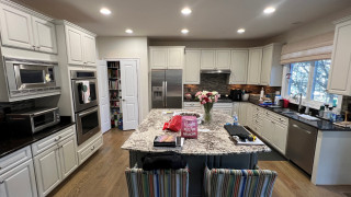
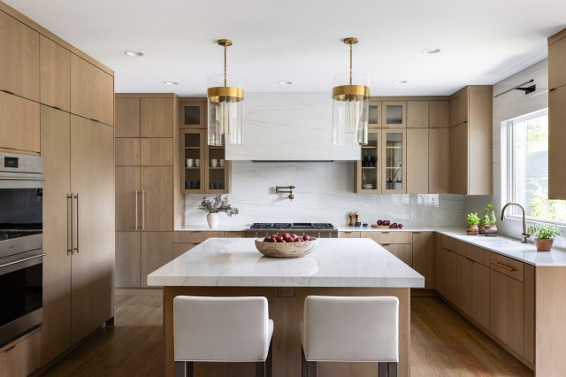
Before: Heavy traditional-style white cabinets stopped short of the ceiling and didn’t provide the storage the family needed. An abundance of stainless steel appliances overwhelmed the room, while a dated, busy tile backsplash created visual clutter. Dark granite countertops along the perimeter and a lighter granite on the island also felt out of step with the homeowners’ goals. They did want to keep the white oak flooring and have it refinished. “It continues into adjacent rooms,” says design-build pro Michael Winn.
The sink on the right and the rangetop on the back wall worked well but the left wall felt disjointed. A cramped grouping of wall ovens, a hulking microwave and a toaster oven sitting on the countertop crowded an awkward run of cabinetry. “They also had a workstation there that ends up for most people being a gathering space for papers,” Winn says. “We did away with that and cleaned things up.”
The large stainless steel refrigerator also made the cooking area feel tight. “To the left of that was the pantry closet,” Winn says. “It was a step-in pantry that simply consisted of deep shelves, so things would get lost in the back.”