Tag

Rooms

Browsing


As holiday hosting ramps up, so does the value of a dedicated dining room. Beyond providing seating for a meal, a dining room sets the tone, gives hosts room to spread out and draws people together. For inspiration, explore these five refreshed spaces featuring bold wallpaper, layered textures and stylish architectural updates.

Sarah Montgomery InteriorsSave Photo
1. Historic Warmth

Designer: Sarah Montgomery Interiors
Location: Chicago
Size: 255 square feet (24 square meters)

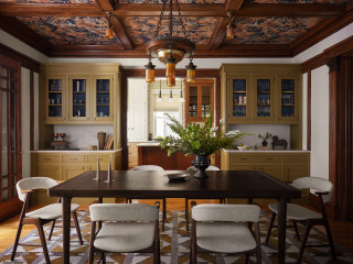
Homeowners’ request. “Set on a historic street in Logan Square, this brick Foursquare home had been carefully restored — lots of woodwork, stained glass and even its century-old dining room light fixture,” says designer Sarah Montgomery. “Our clients wanted to bring that same richness into their furnishings, creating a design-forward family space that incorporated some modern elements and could also stand up against two young boys and a pooch.”

Special features. Wallpapered ceiling in botanical paper. Built-ins painted in Olivetone by Benjamin Moore. Upper cabinets backed in geometric wallpaper. Vintage dining chairs reupholstered in family-friendly fabric. The light fixtures are antique and original to the home. The millwork is also original.

Designer tip. “Always consider the ceiling as a design element and don’t be afraid of painting built-ins a fun color,” Montgomery says.

“Uh-oh” moment. “There were several design schemes for the dining room that we presented, and to better help the client visualize them, we created 3D renderings,” Montgomery says. “We don’t always do this, but in order to help them select the perfect main feature — the wallpaper — it was necessary. The dining room had so many original features that we were working with that the new elements had to complement those in just the right way.”

Montgomery says she uses Houzz Pro software for project management. “We use the Selections boards to upload our items and send them to our client for an easy approval process and so they have access to all the necessary details,” she says. “We use Houzz Pro for sending proposals. We share their client dashboard so they have easy reference for their boards and documents at all times. We also log out time through Houzz so that our client gets clear invoices breaking down the time spent month-over-month.”

Ceiling wallpaper: Pierre Frey; built-in cabinet wallpaper: Fayce; rug: Oscar Isberian; wall paint: Swiss Coffee, Benjamin Moore; project photography: Dustin Halleck; styling: Sami Wiley

See why you should hire a professional who uses Houzz Pro software

Camden Grace LLCSave Photo
2. Elevated Farmhouse

Designer: Jeanne Barber of Camden Grace
Location: Berwyn, Pennsylvania
Size: About 200 square feet (19 square meters)

Homeowners’ request. “The dining room opens to the home’s foyer and living room, all with tall ceilings and substantial millwork, making it feel slightly formal,” says designer Jeanne Barber, who uses Houzz Pro software. “We connected the dining room to the living room and entry color palettes by going a little lighter and brighter. The surrounding neighborhood is diverse, with historical stone homes of modest size built by farmers when they cleared land and grander Victorians built by robber barons.”

Special features. “The chair shape was an ode to the farmhouse style, but we wanted it to look more elevated so we found chairs with a pop of blue and faux leather for the seats,” Barber says. “A standout wallpaper was a must, beautifully tying all the hues and textures together. A long dining table was essential because our client’s extended family surrounds her on neighboring streets and they often host family gatherings.” The rug is hand-woven jute in a harlequin pattern.

Designer tip. “Get wallpaper,” Barber says. “It always makes a huge impact in a space and beautifully ties everything together.”

Wallpaper: Coppice in Navy/Lagoon/Gold, Harlequin; dining table: Spencer, Woodbridge Furniture; chairs: Nantucket in Blueberry and Tusk, Redford House; rug: Harwich hand-woven jute, Annie Selke

Find an interior designer on Houzz

Gramophone Design BuildSave Photo
3. Modern Geometry

Designer: Ashley Frush of Gramophone Design Build
Location: Hunt Valley, Maryland
Size: About 290 square feet (27 square meters); 14 feet, 11 inches by 19 feet, 5 inches

Homeowners’ request. “The clients wanted their dining space to feel connected to the rest of the remodel without exceeding the budget,” says designer Ashley Frush.

Special features. “We chose to highlight the existing octagon tray ceiling — once a design element the homeowners didn’t love — by adding LED tape lighting to modernize and emphasize its geometry,” Frush says. “Below the chair rail, we continued this updated aesthetic by replacing traditional picture frame molding with fluted paneling, achieving texture and interest while avoiding drywall repairs. To tie in the home’s architectural details, we echoed the arch top windows by reshaping the butler’s pantry entries into archways. Finally, we split the existing ceiling rough-ins to accommodate two oversized woven black rattan pendants, adding drama and warmth to the dining area without making the space feel overly formal.”

Designer tip. “Bring balance to a space,” Frush says. “To do that here, we used oversized pendants that visually connect the painted upper walls with the textured fluted paneling below. The archways establish a rhythm of soft repeating forms, while the LED-lit tray ceiling captures attention, turning an awkward shape into an intentional, eye-catching feature.”

Console, table and chairs: Four Hands; rug: Amber Lewis x Loloi; paint color: Pure White, Sherwin-Williams

10 Easy Ways to Refresh Your Guest Room

Duet Design GroupSave Photo
4. Timeless Elegance

Designer: Devon Tobin of Duet Design Group
Location: Denver
Size: 215 square feet (20 square meters); 14 feet, 1 inch by 15 feet, 3 inches

Homeowners’ request. “The homeowners wanted a dining room that felt both elegant and approachable — a place for hosting family dinners that didn’t feel overly formal,” says designer Devon Tobin. “The space was dated and lacked warmth. We refreshed the palette, added architectural texture and layered in natural materials to create a setting that felt timeless but livable.”

Special features. “The white plaster fireplace surround brings architectural balance and light to the room, while the exposed beams add warmth and structure,” Tobin says. “The vintage-inspired rug grounds the space with a pattern and a sense of age, complementing the dark-stained chairs and brass chandelier. The wall color is Sherwin-Williams Cotton, a soft neutral that changes beautifully with light throughout the day.”

Designer tip. “When working with traditional architecture, contrast is a key element,” Tobin says. “Pair crisp, pale walls with dark, silhouetted furniture and soft organic textures. It keeps a classic room from feeling predictable.”

“Uh-oh” moment. “The original ceiling height and window placement limited lighting and furniture options,” Tobin says. “Introducing the beams provided a strong horizontal line, giving the chandelier proper scale and transforming a flat ceiling into a design feature.”

Dining table and chairs: Hooker Furniture; chandelier: Visual Comfort

New to home remodeling? Learn the basics

5. Moody Drama

Designer: Lori Withey of Bellisa Design
Location: Dallas
Size: 165 square feet (15 square meters); 11 by 15 feet

Homeowners’ request. “The existing light gray walls and unremarkable window shades called for bold intervention,” says designer Lori Withey. “But what began as a colors and furniture update morphed into a full-on construction project and the selection of standout design features.”

Special features. “A cerused oak dining table with a distinct textured grain is complemented by dark chocolate velvet dining chairs, which have a luxurious sheen and dense soft pile, reflecting light in all directions,” Withey says. “A wallcovering with gold marigolds over a blue-green background offers an enchanting design that injects a vibrant energy into the space. A luminous 12-light chandelier finished in gold leaf features an explosion of quartz crystals that cast shadow patterns across the dark painted ceiling and the patterned wallpaper, creating an additional feature to be enjoyed.”

Designer tip. “Painting or papering a ceiling in a darker color similar to the wall color or wallpaper is a highly effective way to establish a dramatic, moody atmosphere in any space,” Withey says. “Darker ceilings visually envelop a room, amplifying the feeling of intimacy and coziness. This design move blurs the edges between walls and ceiling, making the space feel cohesive.”

Cabinet: West cane cabinet in charcoal brown, Crate and Barrel; chandelier: John-Richard

More on Houzz
Read more stories
Browse photos for ideas
Find home professionals


This article was originally published by a
www.houzz.com . Read the Original article here. .


Designers: Jessica Warren and Amanda Tarango of Baker Design Group
Location: Spring, Texas
Size: 47 square feet (4.4 square meters)

Homeowners’ request. “The clients’ needs, wants and goals were to modernize the space; create a luxurious, dramatic feel; and honor original architectural details,” designer Jessica Warren says.

Special features. “A handcrafted wallpaper with a large-scale, textural pattern works beautifully within the room’s small footprint and tall ceilings, adding visual depth without overwhelming the space,” Warren says. “The metallic finish introduces a dramatic, luxurious quality. To maintain a cohesive, monochromatic palette, the trim and ceiling were painted in a coordinating hue (Peppercorn by Sherwin-Williams).”

The vanity is a custom ebony-stained cabinet with a quartz countertop and a round beige opaque glass sink.

Designer tip. “We leaned into this powder bath’s challenges — tall ceilings and tricky angles — by embracing a darker, monochromatic palette,” Warren says. “The deep tones grounded the room and minimized awkward proportions. To elevate the space and keep it from feeling heavy, we layered in pops of gold. That subtle shimmer catches the light, creating a dramatic yet elegant atmosphere — perfect for homeowners wanting both boldness and sophistication in a smaller space.”

“Uh-oh” moment. “Midway through installation, our wallpaper installer informed us that we didn’t have enough paper to complete the project,” Warren says. “Since the wallpaper was handcrafted and would take six to eight weeks to remake, waiting wasn’t an option. As a quick solution, we sourced a stunning glass tile for the vanity wall — and in the end, we think it turned out even better that way.”

Wallpaper: Ginza in Granite, MDC; backsplash tile: Brook in Stacked Twilight, Soho Studio; sink: Whist opaque glass in Doe, Kohler; sconces: Copenhagen in vintage brass, Corbett collection, Hudson Valley Lighting; mirror: Vault, Uttermost; hardware: Dayton in champagne bronze, Miseno


This article was originally published by a www.houzz.com . Read the Original article here. .


4. Purple Reign

Eschewing a light and airy color palette in favor of deep purple cabinets, walls and millwork, April Gahagan of FS Design Group gave this laundry area a rich, layered look. Because the space, brought to life by Judd Builders in North Carolina, also serves as a side foyer, mudroom and pantry — a high-traffic area, in other words — the designer carefully balanced aesthetics with practicality. For instance, dragonfly wallpaper has been placed higher up, above sturdier wainscoting, to keep it out of harm’s way. And the flooring is durable brick, given an elevated look thanks to varying shades and a herringbone pattern.

Purple paint: Brinjal, Farrow & Ball


This article was originally published by a www.houzz.com . Read the Original article here. .


Chelsea Ayres InteriorsSave Photo
4. Blue Chairs, Cognac Sofa

Designer: Chelsea Ayres Interiors
Location: Athens, New York
Size: 464 square feet (43 square meters); 16 by 29 feet

Homeowners’ request. “This home is perched right on the lake, and my clients wanted this lower-level living area to feel like a true extension of the water, a place where family and friends could gather year-round to relax, play games and soak up that serene lakeside vibe,” designer Chelsea Ayres says. “Our goal was to layer warmth and personality while staying true to the home’s natural setting. By introducing texture, color and thoughtful seating arrangements, we were able to transform it into a welcoming hub that feels distinctly ‘them.’”

Special features. “With such a long and narrow space, the layout called for a few separate seating areas, which we unified by wrapping the walls as well as the ceiling in Benjamin Moore Collingwood (a warm gray), creating a cohesive cozy space that disguises the low basement ceilings,” Ayres says. “Keeping things warm and cozy was also attained by careful selection of materials for furnishings. Leaning into sumptuous velvet in a rich, deep lagoon color for the accent chairs, along with a substantial wood coffee table to ground the space and ottomans made from wool to mimic lakeside stones, we struck a balance of both nature-inspired pieces that were also inviting and warm.”

A rich cognac leather sofa brings warmth to the space, while a wet bar and additional seating area anchor the opposite side of the room.

Designer tip. “Don’t be afraid to segment your seating areas in large or oddly shaped spaces,” Ayres says. “Allowing for smaller seating arrangements offers a more intimate vibe in what can otherwise feel like an overwhelming space. If you are trying to create a room where people will truly connect, you need to keep the seating arrangements smaller and clustered around tables, especially around round tables if you can. It allows for much better conversation and inclusion.”

New to home remodeling? Learn the basics


This article was originally published by a
www.houzz.com . Read the Original article here. .


Stained glass windows, made from colored glass joined by lead strips, or cames, became popular in homes in the mid-19th century. Decorative colored glass, however, dates back to ancient Egypt and Rome. Today, colorful, artistic windows are making a comeback, with homeowners embracing both antique and modern designs. Here are standout examples from Houzz’s photo feed to inspire your project.

1. Stunning Sidelights

In a 1904 Dutch Colonial in Seattle, Miriam Larson of Story created these pictorial stained glass windows to capture the feeling of tree, sand and sky for her California-loving clients. They purchased rights to the design, and Larson devised the layout and had the panels custom-fabricated.

Click the image to see more of each project.

Find an interior designer near you

Nicole Forina HomeSave Photo
2. Old Meets New

This arched stained glass window is one of a matching pair flanking a fireplace in a 100-year-old Colonial home designed by Nicole Forina Home in Summit, New Jersey. The windows’ traditional style feels cohesive with the room’s contemporary furnishings in part because of their shared color scheme.

J Reiko Design + Co.Save Photo
3. Pieces of History

The stained glass panel in this photo is one of several in the entryway to a beautifully remodeled Denver home. J Reiko Design + Co. preserved multiple examples of original stained glass and mosaic flooring throughout the property, which is located in a historic district.

Browse home decor on Houzz

Studio ZimmermannSave Photo
4. Bathed in Color

Sybille Zimmermann of Studio Zimmermann installed this modern stained glass window in her own primary bathroom in Los Angeles after admiring a similar design in what she describes as a “hippie truck” on the Malibu Pier. The round soaking tub echoes the window’s shape.

Tour this home’s landscape

EMR ArchitectureSave Photo
foster design farmSave Photo
6. Garland Glow

Part of a primary suite addition to a historic corner row house in Philadelphia (a collaboration between Foster Design Farm and Swiatocha Architecture + Design), this stained glass window provides both privacy and period character. It hangs in front of an existing window in place of a curtain — an easy idea to borrow.

Seldin Design StudiosSave Photo
7. Pink Peekaboo

In the primary bathroom of a Victorian home in San Francisco, Seldin Design Studios repurposed an original stained glass window from elsewhere in the house in the large walk-in shower, surrounding it in blush, rose and peach tile. A new, complementary stained glass window was installed above the toilet.

Drawn Interior DesignSave Photo
EMR ArchitectureSave Photo
9. Well-Rounded

During the medieval period, windows were often made using small round discs of glass called rondels. EMR Architecture installed a modern take on one such window — designed by the homeowner — in a bathroom door while remodeling a Victorian townhouse in West London.

Sey Interiors, LLCSave Photo
10. Privacy, Please

Vintage stained glass panels that look as though they may be mounted like shutters provide privacy while gently filtering light in this Dallas bathroom by Sey Interiors. Floral wallpaper above the wainscoting picks up the red, yellow and blue glass.

11. Arts and Crafts Elegance

Board & Vellum artfully restored a 1912 Craftsman home in Seattle’s historic Mount Baker neighborhood, preserving original stained glass windows — including this stunning floral design in the dining room and another in the kitchen. Both the blooms and the symmetry in the stained glass echo the surrounding wallpaper.

Charlotte Bucciero InteriorsSave Photo
12. Here Comes the Sun

Hertfordshire, England-based Charlotte Bucciero Interiors designed stained glass panels to allow more sunlight and whimsy into this entry area of an Arts and Crafts home. Custom paneling and woodblock wallpaper based on a 1918 watercolor by C.F.A. Voysey complete the playful composition.

Seldin Design StudiosSave Photo
13. Verdant View

Another classic Victorian home in San Francisco remodeled by Seldin Design Studios has a custom stained glass window with a wreath design, inspired by the home’s history, hanging above a pale turquoise claw-foot bathtub. The layout of the floor’s turquoise, black and white hexagonal tile was customized for the space too.

Anne Chemineau – Decor InterieurSave Photo
14. Deco Paris

In a Parisian apartment designed by Anne Chemineau and Franck Voyer of Decor Intérieur, a courtyard-facing opening was fitted with a custom six-panel stained glass window that reflects the project’s color palette and adds Art Deco flair. The piece was created in collaboration with renowned stained glass artists Studio Vitrail Bianconi.

Agnieszka Jakubowicz PHOTOGRAPHYSave Photo
16. Color Bands

While stained glass traditionally is considered to be decorative arrangements of colored glass pieces held together by cames, one could argue that any colored glass technically qualifies. In this Canadian home designed by Ottowa-based architects Linebox Studio, the dining area windows create a vibrant multicolor experience for both the family inside and passersby outside.

17. Raise a Glass

In this midcentury California home, Orange County-based PVK Studio preserved original features while introducing a contemporary coastal vibe. In the bar area, two groovy stained glass windows feature wine bottles and martini glasses.

25 Awesome Home Bars

AB Design Elements, LLCSave Photo
18. Calm Composition

An oversize stained glass window hangs above a soaking tub in this bathroom by Scottsdale, Arizona-based AB Design Elements. The window’s abstract design is bold and dynamic, but the green-and-blue color palette is soft and calming.

foster design farmSave Photo
19. Sacred Salvage

Salvaged from an 1887 West Philadelphia church, this half-moon stained glass window was refinished by a Pennsylvania couple and installed in their guest bedroom — part of a former Catholic church renovated by architect Carrie Foster of Foster Design Farm.

Read more about this house

San Diego Master CraftsmenSave Photo
20. Stained Cabinets

In this historic Craftsman residence remodeled by San Diego Master Craftsmen, stained glass panels in cabinet fronts bring period charm and artistic detail to the kitchen.

Nicky Percival LimitedSave Photo
21. Petaled Panes

Farrow & Ball’s Dix Blue paint draws out the color in the original stained glass windows in this living room, which is part of a Victorian coach house conversion in Kent, England, by Nicky Percival. Zoom in to see that each flower in these windows — and in similar ones in the dining area and kitchen — represents a different species.

TEA2 ArchitectsSave Photo
22. Out of Sight

On one end of a new Shingle-style home on White Bear Lake in Minnesota, TEA2 Architects added grids of stained glass to obscure views of the neighbors and wash the pantry in colorful light.

23. Captured Memories

In a Tudor-style Nashville, Tennessee, house built by Castle Homes, custom stained glass doors at the billiards room entrance feature memories of the owner’s children and family travels.

24. Antique Allure

Remodeled by Tusk Builders and designed by Yond Interiors, this kitchen in a Victorian in Minneapolis features marble countertops, an antique-style brass bridge faucet and a plate rail. Together, they enhance the romantic design of the original stained glass window above the sink.

Arndt Design StudioSave Photo
25. Springtime Shine

Dragonflies flit across a stained glass window in this Los Angeles kitchen by Arndt Design Studio. The cabinetry’s soft, springlike green echoes the leaves in the glass.

FRAHER ArchitectsSave Photo
26. Bull’s-Eyed Beauty

The entryway to a late Victorian house in London, remodeled by
Fraher Architects with interiors by Lizzie Green, features seven spectacular panels of multicolored, textured stained glass. A closer look at the red circles, or rondels, reveals that they thicken toward a central point — a result of the production process that earned them the nickname “bull’s-eye glass.”

Meridith Baer HomeSave Photo
27. Textured Light

In a 1930s Tudor Revival home in Los Angeles, uploaded by Meridith Baer Home, glass panels set in steel window frames add organic color and earthy texture to the neutral decor.

28. Checkerboard Charm

Outside Philadelphia, the entry area in an 1870 Victorian updated by SG23 Design boasts an original stained glass window surrounded by new chinoiserie wallpaper. The colorful checkerboard glass panes frame a clear section — a design typical of the Queen Anne style popular in the late 19th century.

Chelsea Design CompanySave Photo
29. Pictorial Perfect

A historic Missouri farmhouse, revamped by architect Tim Hollerbach Designs and
Chelsea Design, features stained glass windows flanking an original stone fireplace. Designed by Chelsea Smith and crafted by Cosby Art Glass Co., the design depicts flowers and birds native to the property, along with the facade of the remodeled farmhouse itself.

Tim Barber ArchitectsSave Photo


This article was originally published by a
www.houzz.com . Read the Original article here. .


Even the most utilitarian rooms deserve a little design love. These five new laundry spaces prove that function and style can happily coexist. Here, design and construction pros share details on how they leaned on bold color, clever layouts and hardworking details to turn wash-and-fold zones into inviting spaces that elevate laundry day.

Savvy InteriorsSave Photo
1. Sunny Retro Vibe

Designer: Susan Wintersteen of Savvy Interiors
Location: San Diego
Size: 70 square feet (6.5 square meters); 7 by 10 feet

Homeowners’ request. “They wanted a hardworking laundry that felt cheerful and a little retro, with better storage, a landing zone for folding and a place for the dog gear by the yard door,” designer Susan Wintersteen says. “The original room was dark, cramped and had zero counter space. Our goal: brighten it up, make it multipurpose and lean into a ’70s vibe without feeling theme-y.”

Wintersteen uses

Houzz Pro to manage her design-build projects. “We use Houzz Pro for Mood Boards, proposals and product tracking with our procurement team,” she says. “The visual boards help clients make faster decisions because they can see the palette and proportions together, and the integrated proposals keep selections and pricing clear.”

Special features. Custom-painted cabinetry in a saturated mustard yellow paired with olive accents. “We chose this palette to nod to the home’s 1970s bones and make chore time feel less like a chore,” Wintersteen says.

A stacked washer and dryer free up space. “This unlocked a continuous counter for folding and sorting,” Wintersteen says. The dark, low-maintenance quartz countertop has subtle movement and was chosen to help hide lint and wear. A rollout hamper on casters sits below.

See why you should hire a professional who uses Houzz Pro software

Savvy InteriorsSave Photo
Opposite the appliances is this built-in nook with storage for leashes, cleaners and a step stool. The flooring is small-format porcelain mosaic tile. The wallpaper depicts dogs in colorful sweaters.

Designer tip. “Put counters at the right working length — even in a small room,” Wintersteen says. “Gaining a continuous counter made this space feel twice as useful as adding another tall cabinet would have. In laundries, a linear counter beats vertical storage nine times out of 10.”

Wallpaper: Harbour Dogs in Creme, Joules

Find an interior designer on Houzz

2. Jewel Tone Elegance

Designer: April Gahagan of FS Design Group
Builder: Judd Builders
Location: Asheville, North Carolina
Size: 166 square feet (15 square meters); 12 feet, 2 inches by 13 feet, 8 inches

Homeowners’ request. “The homeowner envisioned a space infused with rich jewel tones and timeless, traditional elegance,” builder John Judd Jr. says. “Serving as a side foyer, laundry, mudroom and pantry, the room needed to balance beauty with everyday functionality. Working closely with the designer, she emphasized that this multifunctional area should feel intentional and inviting, not an afterthought. Every design detail was given the same level of care typically reserved for kitchens and primary bathrooms. The bold choice of a deep, saturated color brings warmth while also standing up beautifully to the demands of a high-traffic space.”

Special features. The cabinet, millwork and wall color is a rich, deep purple (Brinjal by Farrow & Ball). The flooring is brick tile set in a herringbone pattern. The stairway is lined with dragonfly wallpaper. “Because the mudroom and laundry serve as one of the home’s busiest passageways, the design needed to balance efficiency with warmth,” Judd says. “Playful wallpaper, wainscoting, rich paint tones, archways and brass cabinet hardware transform it from a workspace into one that feels elevated and inviting. Details like hooks, a built-in bench and counter space ensure the room is functional.”

Designer tip. “Even in high-traffic, functional spaces like mudrooms and laundry areas, personal touches make all the difference,” designer April Gahagan says. “Artwork, family photos and meaningful accent pieces bring warmth and personality to a space.”

5 Trends in Laundry Appliances for 2025

House of MaevieSave Photo
3. Earthy and Organized

Designer: Susanne Ordonez of House of Maevie
Location: Raleigh, North Carolina
Size: 75 square feet (7 square meters); 8 feet, 5 inches by 8 feet, 11 inches

Homeowners’ request. “Our clients wanted their laundry room to feel fresh, functional and in line with the home’s earthy, masculine design vision,” says designer Susanne Ordonez, whose clients found her on Houzz. “The old space felt dated and cluttered and lacked storage, making it more of a catchall than a purposeful room. We solved this by adding custom cabinetry for clean, hidden storage and a built-in laundry hamper for convenience.”

Special features. Green-gray cabinets (Evergreen Fog by Sherwin-Williams). Quartz countertops. Beadboard paneling. Off-white walls (Greek Villa by Sherwin-Williams). Black slate tile flooring. White oak floating shelves. “The shelves bring warmth and encourage styling so the room feels designed, not just utilitarian,” Ordonez says. “A new countertop provides plenty of space for folding, while the muted green cabinetry ties everything together into a timeless, organized and elevated space.”

Designer tip. “We always recommend investing in elevated lighting and hardware to instantly make a space feel more polished and high-end,” Ordonez says. “To balance the budget in this laundry room, we paired statement hardware and lighting with an affordable slate tile. Thanks to its natural texture, the slate delivers a timeless, luxurious look without the cost.”

How to Design a Laundry Area That’s Easy to Keep Organized

Surrina Plemons Interiors, IncSave Photo
4. Playful and Travel-Inspired

Designers: Surrina Plemons Interiors and Laurel McAteer of Studio Haven Interiors
Location: Burlingame, California
Size: 90 square feet (8.4 square meters)

Homeowners’ request. “We believe that laundry rooms should be fun first and foremost,” designer Surrina Plemons says. “This is the workhorse area for this family of five. What you don’t see pictured here is a full-size refrigerator and freezer to the left of the sink. We needed to get creative in how to functionally provide enough space for the fridge, freezer, full-size sink, wine fridge, hamper storage, washer and dryer and a laundry chute. Because this was a new-construction build, we were able to get the space that we needed in the basement to provide for all of these needs.”

Special features. “They are a family that loves to travel and we were able to source the perfect wallpaper to capture many of the places that they have already been to,” Plemons says. Blue-gray cabinets complement tones in the wallpaper. The countertop is concrete-look quartz. The flooring is hexagonal porcelain tile.

Plemons uses Houzz Pro software, especially for invoicing.

Designer tip. “A laundry room is a space where chores get done — don’t be afraid to have a little fun,” Plemons says. “You can achieve so much visual interest with a patterned tile, colorful cabinets and wallpaper. I think laundry rooms and powder rooms are the spots to be a little playful and creative.”

“Uh-oh” moment. “Our biggest challenge was working out the details for the laundry chute, which is located in the tall cabinets on the right side,” Plemons says. “We needed to make sure it aligned with the third floor, where the bedrooms are. We have a great upstairs hall built-in that has a pullout for the laundry chute, which feeds the clothes down to the basement level. The angles had to be just right to keep the clothes flowing down and not getting stuck in the shaft.”

Wallpaper: City Maps in Blue & Red, York Wallcoverings; cabinets: custom color, Wolverine Cabinet

10 Enduring Pieces of Decorating Advice

MDH Design & BuildSave Photo
5. Farmhouse Chic Meets Function

Designer: Megan Bolz of MB Designs
Builder: MDH Design & Build
Location: Dawsonville, Georgia
Size: 72 square feet (6.7 square meters); 8 by 9 feetHomeowners’ request. “The homeowners wanted a laundry room that was both functional and beautiful, not overly large, but designed to maximize every inch of space for daily use,” designer Megan Bolz says. “Their request was for cabinetry that could house a stackable washer and dryer, with drawers alongside to keep essentials organized. A tall cabinet with an outlet was incorporated to neatly store and charge cleaning appliances. From a style perspective, the homeowners envisioned a farmhouse/cottage chic look with a modern twist — cozy yet clean and crisp.”

Special features. Creamy white custom cabinets (Natural Cream by Benjamin Moore). Black quartz countertops. Rolling hamper storage. Farmhouse utility sink. Decorative tile flooring. Open shelves.

The builder, MDH Design & Build, uses Houzz Pro to manage its business. “We use the software for estimates and Mood Boards and 3D drawings,” says Heather Buchs, the firm’s owner.

Wall paint: China White, Benjamin Moore

More on Houzz
Read more laundry room stories
Browse laundry room photos
Find a design professional
Shop for laundry room products


This article was originally published by a
www.houzz.com . Read the Original article here. .


1. Fireside Chat

Designer: Alona Perov of Co Interiors
Contractor: Rafael Lopez of HomeBuild
Location: Raleigh, North Carolina
Size: 206 square feet (19 square meters); 13 feet, 6 inches by 15 feet, 3 inches

Homeowners’ request. “This room is located in a grand basement and sits directly in front of the staircase, making it the first space seen upon entry,” says contractor Rafael Lopez, whose clients found him on Houzz. “The homeowner wanted it to make an immediate impression while still feeling inviting and livable. A striking fireplace design was key to achieving that balance: dramatic enough to impress yet warm and approachable for casual TV watching and relaxation.”

Contemporary details. “The fireplace became the focal point and set the tone for a modern-contemporary aesthetic,” designer Alona Perov says. “A slim, horizontal insert was chosen for a sleek, modern profile. The fireplace surround features a mix of materials for visual impact. Black soapstone with soft white veining and subtle gold flecks, left unsealed for a natural matte finish. A floating plaster hearth mimics the look of concrete. It hovers just off the floor, maintaining a clean line and serving as a practical ledge. Walnut veneer paneling frames the TV. The paneling features vertical and horizontal grooves for added detail and depth. Together, these elements offer a tailored, high-end look while remaining rooted in contemporary simplicity.”

Other special features. “The fireplace structure protrudes 4 inches off the wall and ceiling, subtly accented with multicolor LED backlighting for a dramatic effect,” Lopez says. “Frameless drywall pot lights were selected for the ceiling to maintain a minimalist, uninterrupted ceiling plane.”

Designer tip. “With 12-foot ceilings, the room risked feeling cavernous and disconnected,” Perov says. “To visually anchor the space and create a more inviting atmosphere, the ceiling was painted a warm gray tint (Penthouse by Benjamin Moore) instead of a stark white, creating a ‘visual sandwich’ effect that balances the floor and ceiling and pulls the eye inward.”

“Uh-oh” moment. “Originally, the fireplace design featured a discreet top vent integrated within the millwork — a sleek, horizontal slot intended to maintain the clean profile,” Lopez says. “However, the installer refused to deviate from standard protocol and insisted on using a visible metal vent, despite no such restriction being mentioned in the product guide. Lesson learned. Always confirm that all contractors understand and agree with the design intent before installation begins. If someone isn’t comfortable executing the vision, it’s better to find an alternative early on because once you’re on-site and mid-installation, there’s little room for negotiation.”

Wall paint: Cloud Cover, Benjamin Moore


This article was originally published by a www.houzz.com . Read the Original article here. .


Homoly Design + BuildSave Photo
5. Pretty and Pet-Friendly

Designer: Molly Robinson of Homoly Design + Build
Location: Westwood, Kansas

Homeowners’ request. “This room was thoughtfully designed with the homeowners’ two dogs and two cats in mind,” says designer Molly Robinson, who uses Houzz Pro software.

Special features. “A dedicated ‘cat condo’ includes a custom ramp, a designated litter box area and built-in ventilation to keep things fresh and functional,” Robinson says. “For the pups, there’s a cozy zone complete with a doggy door that provides easy access to the outdoors. The black-and-white checkered tile flooring, paired with bold wallpaper that extends across the walls and ceiling, injects a playful and whimsical energy into the space. The pattern creates visual interest and a sense of movement, making the room feel dynamic and full of personality.

“To ground the design and let those elements shine, we opted for neutral white cabinetry that adds a crisp, clean contrast without competing for attention. The result is a fun, stylish space that feels both fresh and thoughtfully balanced.”

Designer tip. “We designed the countertop to be slightly taller than standard height, which makes folding laundry more comfortable and ergonomic — no more hunching over,” Robinson says. “As a bonus, the added height also serves a practical purpose by keeping pet treats and other essentials out of reach of curious paws.”

“Uh-oh” moment. “One of the biggest ‘uh-oh’ moments came when we realized just how tricky it would be to incorporate all of the custom pet features and maintain a clean, functional layout for everyday use,” Robinson says. “Between the cat ramp, litter box ventilation, doggy access to the outdoors and still needing room for laundry tasks, it started to feel like we were designing three rooms in one. We reworked the cabinetry layout and decided to go fully custom, which gave us the flexibility to tuck away the pet zones in a way that felt intentional and integrated.”

New to home remodeling? Learn the basics


This article was originally published by a
www.houzz.com . Read the Original article here. .


This Trending Now story features the most-saved powder room photos uploaded to Houzz between Dec. 15, 2024, and March 15, 2025.

We all know that because they’re small and tucked away, powder rooms offer the chance to play outside the rest of the home’s design comfort zone. Vivid colors? Go ahead. Dramatic prints? Be our guest. But a powder room also can be the picture of serenity, drawing from nature to infuse us with calm as soon as we close the door. You’ll find plenty of ideas for any design approach in this countdown of the most-saved new powder room photos uploaded to Houzz so far this year.


This article was originally published by a www.houzz.com . Read the Original article here. .


2. Midcentury Meets Contemporary

Designer: Iconic by Kaitlyn Wolfe
Location: Phoenix
Size: 450 square feet (42 square meters)

Homeowners’ request. “We were hired to update this 1969 ranch-style midcentury modern home, which had undergone previous remodels and additions,” designer Kaitlyn Wolfe says. “While those changes served their purpose at the time, they no longer reflected the home’s original architectural integrity. The homeowners wanted a modern, functional space that honored the home’s history. The lava rock fireplace was a defining feature, and we immediately saw its potential as a focal point. We also embraced the existing slump block walls, which added texture and authenticity. However, the room’s long, narrow layout made furniture placement tricky. Our client was unsure how to make the space feel inviting while maintaining flow and functionality.

“Our solution was to streamline the design, introduce a more intentional layout and thoughtfully integrate vintage and modern elements to create a space that felt layered, lived-in and effortlessly stylish.”

Special features. “A key feature is the custom-built TV console from our Ground Floor furniture collection,” Wolfe says. “We designed it with teak wood veneer and incorporated angled, three-dimensional door fronts to add movement and depth. The warmth of the wood contrasts beautifully with the cool tones of the lava rock fireplace, creating balance without competition.

“We also sourced vintage furniture and decor from Shop My Warehouse, mixing materials and textures to reflect the midcentury modern aesthetic. These curated pieces bring warmth, personality and a collected feel to the space. By seamlessly blending contemporary and vintage, we ensured the living room feels both fresh and deeply connected to its roots.”

Designer tip. “We embraced the long and narrow shape of the living room by designing it like a hotel lobby, creating two distinct seating areas that could function separately or merge when entertaining,” Wolfe says. “This approach maximized both comfort and flexibility, ensuring the space could adapt to different needs. If you’re working with a challenging layout, consider breaking the space into zones rather than forcing a conventional setup.”

“Uh-oh” moment. “One unexpected challenge was working with the existing block walls, which made it difficult to run electrical,” Wolfe says. “Since we planned to install a built-in media unit, we needed to discreetly integrate power to the TV while maintaining a seamless transition from rough, uneven block to a smooth cabinetry surface. Through careful planning and craftsmanship, our installers ensured the transition looked flawless, and our electrician found creative ways to hide wiring without disrupting the aesthetic.”

Shop for living room furniture on Houzz


This article was originally published by a www.houzz.com . Read the Original article here. .

Pin It