Tag

Room

Browsing


Holiday and party guests may never see your bedroom or home office, but they’ll likely make a stop in the powder room. With a little extra care, you can make this small but hardworking space welcoming, whether for a special occasion or drop-in visitors. Here are 10 touches to help dress up your powder room for company.

Rebecca Driggs InteriorsSave Photo
1. Orchids

Longer lasting than a bouquet of flowers and undeniably elegant, orchids make a smart choice for the powder room.

While rare varieties of orchids can be expensive, you can often find budget-friendly potted orchids right in your local grocery store.

Orchids like bright indirect light, so a sink by a shaded window would be ideal.

Find a designer to help you make over your powder room

Elle Cherie | Inspired InteriorsSave Photo
2. Scent Diffuser

You may not feel comfortable leaving a lit candle in the powder room during a party, especially if children are present. But having a pleasing scent in the space is a gracious detail.

Choose a scent diffuser in a subtle fragrance and set it on the sink or a nearby shelf. You’ll get the good vibes without the flame. Choose the right size diffuser for the space and consider one made with pure essential oils.

Waterstone City Homes, Inc.Save Photo
3. Nice Soap and Hand Lotion

Swap out your usual no-frills hand soap for a pretty matching set of liquid soap and lotion. It’s such a simple thing, but guests really appreciate it.

Bonus points if you pick a seasonally inspired scent like apple cider or pumpkin spice in fall and peppermint or pine in winter.

STEPHANIE BRADSHAWSave Photo
4. Vase of Flowers

In the powder room (already a small space), a mini bouquet can make a big impression. Place a bud vase or other small vessel (cream pitchers and julep cups work well) on the sink and fill it with a few stems of freshly cut flowers. And if you have a bouquet in another room already, just pull out a few stems for the powder room — no need to buy anything extra.

Simply Home DecoratingSave Photo
5. Pretty Little Tray

Corralling things on trays is a staple decorator trick. If you don’t already have a small tray you could use, keep an eye out at flea markets for vintage trays. Setting your soap and bud vase on a pretty little ceramic or silver tray will make your powder room setup look intentionally designed.

Casa Vilora InteriorsSave Photo
6. Statement-Making Mirror

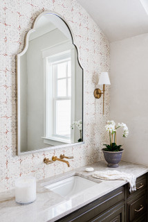
If your powder room has an easily removable mirror, swapping it for something with more personality can be a great way to refresh the space.

Generally speaking, opting for a mirror the same size or larger than the old one makes for the easiest (that is, fewest holes to fill) swap.

C.R. Interior DesignsSave Photo
7. Posh Wastebasket

Is it silly that something as small as a wastebasket can make an impression? Maybe so, but upgrading this detail can boost your powder room’s stylishness just the same.

Look for one made from a material with a bit of shine like brass, copper, wire or ceramic.

Kerrie Kelly Design LabSave Photo
8. Seasonal Wreath

Around the holidays, including a wreath in the powder room can make the space feel really festive. Pick up a wreath of fresh greenery, preserved olive branches, magnolia leaves or winter berries and hang it right over the mirror.

William Guidero Planning and DesignSave Photo
9. Monogrammed Linens

Setting out fresh cloth hand towels with your monogram is a welcoming personal touch. For a budget-friendly option, go for a single-letter monogram. Triple-letter monograms are elegant but tend to cost more since they are made to order.

KGA Studio Architects, PCSave Photo
10. New Paint Color

Have a free weekend in your future and want to give your powder room a whole new look? A new wall color can offer the biggest impact. Don’t be afraid to go bold: Navy, charcoal and even black look elegant in a bite-size space.

Huffard House Interior DesignSave Photo

Your turn: How do you dress up your powder room? Share a photo in the Comments!


This article was originally published by a
www.houzz.com . Read the Original article here. .


Clarke-Bishop InteriorsSave Photo
After: The large skylight brings a better quality of light into the room. Doing away with the slanted glazing has also freed up more wall space for a bigger cabinet.

While Clarke-Bishop has reduced the amount of black in the room, she’s also banished most of the white to make the kitchen feel warmer and more inviting.

“At first we were trying to do a pink kitchen, but we couldn’t find a shade that would work in this light — everything either looked too sugary or too dirty,” she says. They settled on a very pale but warm gray.

The walls, meanwhile, are a subtle pinkish-white. “It brings warmth into the room without being an overt color,” Clarke-Bishop says.

The client loves black, so Clarke-Bishop has retained some, designing a black island that echoes the existing range. The island is on legs. “It not being solid allows more light to come through and gives it a bit more airiness,” she says.

The island isn’t huge — 64½ inches long by 35½ inches wide by 32 inches deep — but it’s perfect for the homeowners. “They really didn’t want any appliances in the island. They wanted it to be a standalone” countertop, Clarke-Bishop says. “It’s become a real focal point of the kitchen — everyone stands around it chatting.”

The legs are a modern take on a Victorian turned leg. “I researched lots of Victorian table legs to find a good combination of the detail they needed to add a bit of something to the space without it being overly ornate, because everything’s quite simple and calm in the room,” Clarke-Bishop says.

The countertop is Arabescato marble, which has a hint of pink in it. The remaining countertops are a simple, lightly marbled quartz, “just to allow the island to have a shining moment.”

The refrigerator sits behind the far-left door, with a pantry in the right-hand tall cabinet.

Cabinet paint: Strong White; island paint: Pitch Black, both Farrow & Ball; wall paint: Rose Tinted White, Edward Bulmer


This article was originally published by a
www.houzz.com . Read the Original article here. .


Spend on: Quality Sofas

For most of us, a sofa is our key living room purchase and not worth scrimping on, the experts say.

“A sturdy, well-made sofa will last you years and, when you do get bored of it, you can always re-cover it,” says Natasha Burton of NB Interiors. “Cheap furniture is a false economy as you’ll be replacing it before you know it.”

And don’t forget your sofa’s main purpose. “Most importantly, you want your sofa to be comfortable,” says Caroline Nicholls of Slightly Quirky. “Plus, you want it to be hardwearing and easy to clean, especially if you have kids and/or pets.”

More expensive sofas often have jointed hardwood frames, built to withstand heavy loads. Cheaper sofas may have plastic or softer pine frames. Pricier sofas will also have coil springs or serpentine (zig-zag) springs, for that “sitting on air” feeling.

It really isn’t worth saving money if a too small, too big or awkwardly shaped sofa ruins those cozy evenings spent curled up.

How to Buy a Quality Sofa That Will Last


This article was originally published by a www.houzz.com . Read the Original article here. .


In 2024, most new single-family homes included laundry connections on the first floor (70%), according to the Census Bureau’s Survey of Construction. The first floor is also where most customers prefer to have the laundry, as shown in Chapter 2 of What Home Buyers Really Want.     

The second floor was the next most common location, accounting for 28% of new single-family homes, while laundry areas in the basement accounted for just 2%. The share of new homes with laundry in any other location was negligible. 

Across all Census Divisions, the first floor remains the most common location for laundry, even in regions where two-story homes are more prevalent. Nevertheless, some regional differences exist. In the West South Central division, 91% of homes had a laundry area on the first floor, compared to just 51% in the Pacific division. Meanwhile, a second-floor laundry was most popular in the Pacific division at 46%, and least common in the West South Central at 8%. 

Not surprisingly, laundry connections in basements are more common in areas of the country where basements themselves are more common: primarily in the northern regions. The West North Central division led with 14% of homes featuring a basement laundry, followed by New England at 9%. These two divisions are also among the few where most new homes include a full or partial basement.  

Among age-restricted homes, where accessibility and main-level living are key design priorities, 93% featured laundry on the first floor. 

Multifamily Laundry Trends

For multifamily units completed in 2024, 88% of apartments included an individual laundry, while 12% offered shared or no laundry facilities. This share has remained relatively stable since 2015, reflecting continued renter demand for in-unit laundry. 

Regionally, the Northeast has the highest shared or no laundry facilities percentage at 33%. In contrast, shared or no laundry facilities remained far less common elsewhere: 3% in the Midwest, 4% in the South, and 9% in the West. 

The pattern extends to the built-for-rent (BFR) segment, where 88% of units had an individual laundry, unchanged from the prior two years. In contrast, built-for-sale multifamily units saw a decrease—from 92% with individual laundry in 2023 to 81% in 2024—suggesting a possible shift toward more affordable condo projects, which are more likely to include shared facilities. 

Discover more from Eye On Housing

Subscribe to get the latest posts sent to your email.


This article was originally published by a eyeonhousing.org . Read the Original article here. .


After raising their daughter, a California couple shifted focus to caring for the wife’s elderly mother in their late-1970s home. To make the space safer and more functional, they prioritized updating their outdated primary bathroom, which had a cramped vanity and a hazardous step-up shower and tub.

They turned to Sea Pointe Design & Remodel, where lead designer Janna Parr reimagined the bathroom as a spacious wet room with a built-in tub and open shower featuring both a multifunction shower head and a hand shower. A new cherry double vanity adds warmth and storage, while a mix of calming, textured tiles brings style and serenity to this now safe, modern retreat.

Before Photo

Sea Pointe Design & RemodelSave Photo

“After” photos by Leigh Ann Rowe

Bathroom at a Glance
Who lives here: A couple and the wife’s elderly mother
Location: Laguna Niguel, California
Size: 185 square feet (17 square meters)
Designer: Janna Parr of Sea Pointe Design & Remodel

Before: The aging bathroom, with its peeling floral wallpaper, lacked both safety and style. A basic angled wood double vanity had large plain mirrors and a hard-to-clean tile countertop. The only drawer storage came from a small makeup station in the center, leaving hair and skincare products cluttering the surface. “We had a challenge with the angled wall and did not want to turn it into a structural project,” Parr says. “We couldn’t really move walls. There was also a peeling soffit above with a fluorescent light that we wanted to eliminate.”

Across from the vanity, the step-up tub and shower (visible here in the mirrors) raised safety concerns and felt outdated. The homeowners chose to keep the water closet as is. “We didn’t change anything in there,” Parr says.

Find a bathroom designer

Sea Pointe Design & RemodelSave Photo
After: Parr removed the tub, shower and double vanity to make way for a complete transformation, including updated plumbing and electrical systems.

An elegant semicustom cherry double vanity anchors the space. It offers a smart mix of shallow and deep soft-close drawers along with spacious cabinets for improved storage. A rich clove brown finish adds depth and warmth. “We wanted to make sure we had enough counter space and sink space,” Parr says. “We went with one long sink to achieve symmetry with the way we were planning to do the mirror and medicine cabinets above.”

The two frameless mirrored medicine cabinets flank a metal-framed mirror in an oil-rubbed bronze finish. Wall sconces with traditional torch-style silhouettes and brass accents sit on either side. “We fell in love with the detail on the top of the mirror,” Parr says. “It also bounces light around the bathroom, so it feels more open and airy.”

A soft, warm white now coats the walls and ceiling, while a bright white on the trim adds subtle contrast.

Paint colors: Shoji White (wall and ceiling) and Pure White (trim), Sherwin-Williams; sconces: Elton in Patina Brass, Troy Lighting; vanity hardware: Top Knobs; mirror: Colestin in oil-rubbed bronze, Rejuvenation

Shop for bathroom vanities on Houzz

Sea Pointe Design & RemodelSave Photo
The artisan-crafted 36-inch concrete trough sink gives the vanity a modern, organic feel. Its semivessel design adds visual depth, while two wall-mounted, single-handle faucets in a luxe gold finish bring a touch of sophistication. “We were looking at trough sinks in general because we wanted a long sink,” Parr says. “Color-wise it also tied into tiles we used in the shower. The semivessel sink design also offered some dimension and interest.”

Topping the vanity is a polished pure white quartz surface that’s resistant to scratches, stains, cracks and heat. “We had a lot of movement with the backsplash tile that was our feature and wanted something to complement but not compete,” Parr says. “It also ties into other white elements throughout the space.”

The backsplash consists of polished ivory onyx mosaic tiles in a scalloped design with tonal variation that adds texture and charm. “I think they add both luxury and whimsy,” Parr says. “They also add interest to an otherwise neutral palette. We also wanted to tie in some of the gold tones on this side of the bathroom with the gold tones seen around the tub.”

Sink: Native Trails; faucets: Litze in Brilliance Luxe Gold, Brizo; countertop: Pure White, Caesarstone; wall tile: Piano Onyx Ivory mosaic, Elysium

11 Ways to Age-Proof Your Bathroom

Sea Pointe Design & RemodelSave Photo
A new linen closet at the back left now coordinates seamlessly with the updated double vanity, replacing a pair of aging upper and lower cabinets that were falling apart. “It has a rollout hamper inside and extra shelving that gives them lots of storage,” Parr says.

To enhance the existing tray ceiling, faux architectural beams were added where fluorescent lights once sat, adding both character and warmth. “That was a last-minute decision from the homeowners,” Parr says. “That was a splurge, but we had dreamed of adding them into the design to give it an old-world feel.”

A towel bar and hook near the vanity complement the space’s other luxe gold accents.

See why you should hire a professional who uses Houzz Pro software

Before Photo

Sea Pointe Design & RemodelSave Photo

Before: Across from the vanity in the former bathroom, the hazardous step-up tub sat next to a dated stall shower with a low enclosure, which was also raised above the main floor level. “It was clumsy and slippery,” Parr says. “There was also a ‘fern trench’ from the 1970s there behind the tub and shower.” The trench area was meant to hold plants.

Before Photo

Sea Pointe Design & RemodelSave Photo

Before: Here’s a closer look at the old shower beside the tub. With no shower niche, bathing products cluttered the floor, and the step-up entry was a key feature the homeowners were eager to eliminate.

Sea Pointe Design & RemodelSave Photo
After: The new wet room seamlessly combines a modern built-in rectangular tub with an open-concept shower, creating a stylish, low-maintenance space with a low-curb entry for easier access. “It would have been cost-prohibitive to revise the foundation in order to garner a curbless entry,” Parr says. “But as a designer, I also liked the way we carried the tile across the curb and bench to elongate the space and create a modern organic look and Roman luxury influence.”

The operable window on the back wall was updated by the homeowners, while a textured microcement finish — an ancient European technique gaining popularity in the U.S. — was applied to the wall in thin layers for durability and waterproofing. “I just didn’t want it to feel busy, and wanted to eliminate more tile and more grout,” Parr says.

Is a Wet Room Right for You?

Sea Pointe Design & RemodelSave Photo
The modern 36-by-66-inch acrylic tub is surrounded by large-format (24-by-48-inch) polished marble-look porcelain tiles. These rectified tiles, made using advanced inkjet technology, offer a realistic appearance and are precisely cut for minimal grout lines, creating a sleek, seamless look.

A streamlined, wall-mounted tub filler in a gold finish with lever handles replaced the original fixture. “Keeping the plumbing in the same location allowed us to keep within our budget,” Parr says. The paneled door partially visible at left leads to the primary bedroom.

Tile surround: Origines Or glossy, 24 by 48 inches, Elysium; tub filler: Litze in Brilliance Luxe Gold, Brizo

New to home remodeling? Learn the basics

Sea Pointe Design & RemodelSave Photo
The wet room’s shower area features a multifunction, wall-mounted shower head and a separate hand shower with a slide bar for flexibility and ease of use. All the fixtures match those used at the tub and vanity for a cohesive, polished look. “We strategically placed the fixtures so the valves are off to the side, so they can’t get wet when turning them on,” Parr says. “We also designed the shower bench a bit shorter so a caregiver can help with bathing.”

The upper portion of the shower wall is clad in 3-by-12-inch ivory ceramic tiles with subtle tonal variation, soft texture and a gentle glaze. “We did a staggered vertical pattern to kind of mirror the backsplash at the vanity,” Parr says.

Below, 24-by-48-inch matte sand-colored porcelain tiles add visual depth and contrast. A quartz-topped shower shelf, matching the vanity countertop, offers a clean, dry space for hair and body products, keeping clutter off the wet-room floor.

Shower fixtures: Litze in Brilliance Luxe Gold, Brizo; shower wall tile (top): Flash in ivory, 3-by-12-inch, Arizona Tile; shower wall tile (bottom): Waystone Sand, 24-by-48-inch, Elysium

Sea Pointe Design & RemodelSave Photo
The wet-room floor features authentic limestone mosaics with an aged finish, arranged in a herringbone pattern with driftwood-hued grout. A linear drain is seamlessly integrated using the same tile for a clean, cohesive look. “The more natural materials I can incorporate into a space will make it feel timeless and luxurious,” Parr says. “They also can take on a lot of water and abuse.” A custom spot-resistant shower glass divider with brass clips and hinges adds to the open, airy feel.

The doors just outside the wet room lead to the water closet — located behind the shower fixtures — and a walk-in closet on the adjacent wall. “The thoughtful design and layout for functionality was a primary focus,” Parr says, “but the clients put full faith and trust in me to create a layered bathroom with multiple textures, sheens and touches of luxury.”

More on Houzz
Read more bathroom stories
Browse bathroom photos
Find a bathroom remodeler
Shop for your bathroom


This article was originally published by a
www.houzz.com . Read the Original article here. .


This young couple’s appreciation for historic design and love of cooking didn’t jibe with the finishes in their 1990s Colonial-style home or the small work area in their kitchen. They hired Lynda and Jessica Caccamo, a mother-daughter interior design team, to help them achieve a highly functional kitchen with a historic look.

The designers opened up the kitchen to the dining room, then swapped them, putting the new kitchen in the original dining room space and vice versa. The resulting design has a traditional historic style, featuring soft green kitchen cabinetry, a large island, a dining room wet bar, ample storage and plenty of room for the couple to prepare dinner together.


This article was originally published by a www.houzz.com . Read the Original article here. .


For these homeowners, a built-in jetted tub, glass block shower divider and funky layout weren’t giving them the style and function they wanted in their primary bathroom. Seeking a modern organic style with European flair, they hired designer Joey Snow to bring the entire California ranch home in line with their vision. Snow uses Houzz Pro software to manage her design business.

For the bathroom, Snow replaced the built-in tub with a smaller, sleeker freestanding model that adds breathing room. She ditched the glass block wall that divided the shower from the toilet area and added a wall that better separates the two spaces. The new private shower room has an arched doorway with glass door, walls with handmade Moroccan zellige tiles and a marble bench. A custom white oak double vanity improves storage, and its reeded front adds texture. Genuine limestone batons in a herringbone pattern for the flooring, along with plaster walls, provide more texture and interest.


This article was originally published by a www.houzz.com . Read the Original article here. .


This retired couple bought a Colonial-style home in Sterling, Massachusetts, on 4 acres to be closer to their growing family and granddaughter. While they loved the classic architecture, they wanted to update the home’s neutral interiors. A big focus was revamping the kitchen and its basic honey oak cabinets, angled two-tier peninsula, standard white appliances and laminate countertops. The husband, a trained chef and former restaurant owner, wanted ample room for prepping and serving. The wife was looking for some color for the cabinets and wanted an elegant look and feel. For help they hired designer Ruth Bergstrom.

Bergstrom replaced the angled two-tier peninsula with a spacious L-shaped peninsula that adds work surface and seating. Updated appliances in a more user-friendly layout enhance function, while a polished marble-look quartz for the countertops and backsplash adds elegance and durability. Gray cabinets with subtle green and blue undertones bring a soft and soothing feel.


This article was originally published by a www.houzz.com . Read the Original article here. .

Pin It