This article was originally published by a www.houzz.com . Read the Original article here. .
This article was originally published by a www.houzz.com . Read the Original article here. .
A few themes stand out in their advice: Umbrellas are hard to beat for instant shade and flexibility, pergolas and other structures deliver the most reliable coverage for outdoor living, and planting a shade tree is the best investment for natural shade.
This article was originally published by a www.houzz.com . Read the Original article here. .
![]()
A lawn and garden care service can take care of mowing, to be sure, but even if you prefer to cut your own grass, there may be some tasks worth hiring a pro to take care of. A gardener can help set up and maintain a drip irrigation and sprinkler system, trim hedges, prune rosebushes, and even handle seasonal leaf and snow removal. Or you may want to look for a gardener who designs gardens from scratch or has a specialty, like creating drought-tolerant landscapes or edible gardens.
Not sure where to start on your home project? Learn the basics
This article was originally published by a www.houzz.com . Read the Original article here. .

Be prepared to let go of hands-on tasks. “For me, the hardest part [of moving into management] was stepping away from designing floor plans,” he says. “I loved doing them. But by offloading that task, I freed myself to focus on what the firm needed, which was strategic leadership and growth.”
Invest in solid processes while staying nimble. “It’s crucial to build and refine systems and processes for consistency of quality as your business grows,” Sakai says. “But they must be flexible to adapt to industry trends and new challenges. We’ve spent a lot of time developing quality-control processes and checklists. But we evolve them constantly to stay relevant — otherwise, you risk become outdated.”
Get comfortable being uncomfortable. “If you’re comfortable, you’re not growing,” Sakai says. “Growth comes with discomfort. It’s important to allow yourself and your team to step back sometimes, but also to push forward when the time is right.”
Be transparent. “We’re transparent with everything — our financials, goals and client fees,” he says. “Transparency builds trust internally and with clients, fostering a culture of collaboration.”
Think long-term. “When you’re managing a project, you’re thinking about the next hour, the next day,” Sakai says. “As CEO, I’ve learned to think in 10-year chunks and frame day-to-day problems within the broader context of the firm’s reputation and goals.”
Empower others. “Always train your replacement,” Sakai says. “When someone can replace you in your current role, you can evolve into something new. Growth isn’t about holding back — it’s about building others up.”
34 Home Design Trends That Will Define 2025
This article was originally published by a www.houzz.com . Read the Original article here. .

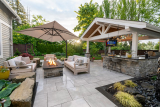
Przygoda-Montgomery, who designed the shaded patio in Oro Valley, Arizona, seen here, says that a way to assess whether your yard is guest-ready is to actually host something. “If people are left standing awkwardly or are unsure where to gather, it’s a sign that the space needs better flow and a better furniture arrangement,” she says.
How to Create an Inviting Outdoor Seating Area
This article was originally published by a www.houzz.com . Read the Original article here. .
“Using templates is one of the best time-saving techniques I’ve used in my various businesses over the years,” says contractor Travis Logan of Handyman Rescue Team in Seattle.
“I first started using templates, or scripts, in my early sales career after college,” he says. “By using proven sales scripts and rebuttals, I could quickly and easily replicate the success of those who came before me, since they were fine-tuned and honed over the years through actual customer interactions.
“Now, having templates ready to go eliminates the need to type out individual responses, since we have established wording and scripts for new-customer replies, existing-customer follow-ups and post-project review requests,” Logan says.
“This frees up time to spend on other critical administrative, operational or managerial tasks.”
This article was originally published by a www.houzz.com . Read the Original article here. .
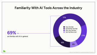
Industry Overview
Awareness of AI already is widespread across the construction and design industry, with nearly 7 in 10 professionals (69%) reporting familiarity with the technology. Just 23% say they’re not very familiar, and only 8% have had no exposure at all, underscoring AI’s rapid emergence as a topic most pros are actively tracking.
The industry overview section of the report combines data from firms offering residential services, commercial services or both in construction and design. These include remodelers, builders, interior designers, architects, design-build professionals, and specialty contractors and trades such as electricians, plumbers and roofers.
This article was originally published by a www.houzz.com . Read the Original article here. .

![]()
Focus on natives. Some of Deborah Gliksman’s favorite shrubs from California are the tall ‘Dark Star’ ceanothus (Ceanothus ‘Dark Star’, zones 8 to 10) and the smaller ‘Valley Violet’ ceanothus (Ceanothus maritimus ‘Valley Violet’, zones 8 to 10). Gliksman also recommends ‘Aromas’ sage (Salvia ‘Aromas’, zones 8 to 10), bush anemone (Carpenteria californica, Zone 9), ‘De La Mina’ Cedros Island verbena (Verbena lilacina ‘De La Mina’, zones 8 to 10), globe mallow (Sphaeralcea ambigua, zones 6 to 9) and St. Catherine’s lace (Eriogonum giganteum, zones 9 to 11). “They’re all stunning shrubs,” she says.
For perennials, Gliksman often uses yarrow (Achillea millefolium, zones 3 to 9), monkeyflower (Mimulus spp.), penstemons and Douglas iris (Iris douglasiana, zones 6 to 10). For ground covers, she loves ‘Silver Carpet’ aster (Corethrogyne filaginifolia ‘Silver Carpet’, zones 8 to 10), ground currant (Ribes spp.) and seaside daisy (Erigeron glaucus, zones 8 to 10).
What not to plant. Gliksman advises against using invasive plants. Besides possibly taking over your garden and even your neighborhood, she says, they can compete with native species and threaten biodiversity.
Your turn: What are your favorite low-maintenance plants to grow in your garden? Tell us in the Comments.
More on Houzz
Read more gardening guides
Get landscape design ideas
Find a landscape designer
Shop for gardening tools
This article was originally published by a www.houzz.com . Read the Original article here. .
“We also look for people that want to learn and grow and who will thrive within a team environment,” he says. “If a team member is a professional communicator and understands that serving each other is how we best serve our clients, they are Hursthouse material.”
Some skills are harder to find than others, True says. “One is a work ethic of truly caring about the desired result. The balance between an extremely high level of creativity, a terrific communicator and a focused determination to excel at the highest level of client service is a rare find.
“On one hand, I feel it’s getting harder to find special people, as there [seem to] be less people entering the industry,” he says. “On the other hand, people are changing companies more often, so [in some ways] it might be a bit easier. If a company doesn’t take good care of its people, they will have a revolving door — and that’s an opportunity for Hursthouse.
“Our average seniority for team members at Hursthouse is now 13 years, with many over 20, 25 and 30 years,” True says. “We try to have our team sing about how great it is to work at Hursthouse.”
This article was originally published by a www.houzz.com . Read the Original article here. .
Designer Tammy Battistessa of Ellaire Kitchen & Bath Design agrees. “Whenever possible, I include aging-in-place and universal design features in every project, as I believe many of these features benefit clients of all ages and abilities, in addition to allowing a client to safely remain in their home for a longer period of time,” she says.
Creating a home that can adapt also makes it more sustainable. “Aging in place is a key element to making legacy homes that can evolve over time,” architect Tim Barber says. With all that in mind, we asked more than 50 home design and construction professionals to share the aging-in-place features they always recommend. Here are the 10 that came up again and again.
This article was originally published by a www.houzz.com . Read the Original article here. .

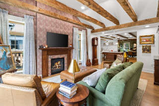
Curves are making a strong comeback, whether in furniture, cabinetry, tile or mirrors. Fluted finishes, curved sofas and bubble silhouettes soften hard angles, add sculptural interest and create a sense of calm. These rounded forms also bring visual flow and comfort.
“Furniture and decor are taking on more sculptural shapes,” designer Whitney Ray of Wyeth Ray Interiors says. “From curved sofas to asymmetrical mirrors and stone tables with softened edges, these forms add visual interest while evoking a sense of calm and connection to nature. This trend bridges art and function, often blurring the line between furniture and sculpture.”
In this Los Angeles living room by Mark Design, curvy furniture, organic-shaped mirrors, a ribbed coffee table and arched console accessories highlight the trend. The shapes, palette and boucle sofa fabric also contribute to the room’s organic modern style.