
This article was originally published by a www.houzz.com . Read the Original article here. .

This article was originally published by a www.houzz.com . Read the Original article here. .

One of the homeowners loves to cook and bake. The other’s interest in the culinary arts lies primarily in enjoying food. “The cook had a lot of specialty tools and gadgets he wanted to use,” Rachaman says. “He cooks Asian food a lot and wanted specific places to put things like the small bowls he likes to serve it in.” The designers planned storage to house items like this, as well as spices, mixing bowls, baking sheets and cutting boards. The homeowner also has a large cookbook collection, and the designers tailored the island to house them.
One quirky part of the renovation involved one of the homeowners’ cold morning swims in Lake Washington. “He hangs his wetsuit to dry in the coat closet,” Emhoff says. “He wanted the fridge to back up to this closet so the heat coming off it would help dry the wetsuit.” There’s a vented wall between the back of the fridge and the coat closet.
Cabinetry: Bellmont Cabinet; cabinet paint: Olympic Range, Sherwin-Williams; wall paint: Pink Ground, Farrow & Ball
Browse kitchen and dining furniture in the Houzz Shop
This article was originally published by a www.houzz.com . Read the Original article here. .

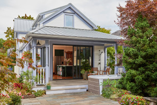
The house had already been extended at the back to create a kitchen, but this was quite narrow. A wall between two public rooms had been knocked down, creating a dark and underused living space in the center of the house. The owners wanted these structural issues resolved and an old cellar dug out to create a usable basement. They also needed more storage, particularly for coats and shoes — they have three children — and a downstairs bathroom.
“The brief was for a modern, cozy and homey scheme, harmonious with the original Victorian architecture,” Lywood says. “They were not afraid of color or pattern so we had a lot of fun creating this design.” Read on to see the beautiful results of this year-long project.
This article was originally published by a www.houzz.com . Read the Original article here. .
Dupes also preserved and replicated some of the original millwork and added more personality with details such as an ogee edge on the island’s marble-look quartz countertop. The kitchen gained some space as well, after a full bathroom behind the wall on the left became a powder room.
Perimeter cabinetry and pantry paint: Pure White, Sherwin-Williams; island base paint: Mt. Rainier Gray, Benjamin Moore; tile: Eveningstar mosaic (accent), Seaport in Arctic White (field) and Thassos marble pencil liner in white (trim), TileBar
Read more about this project
This article was originally published by a www.houzz.com . Read the Original article here. .

While Clarke-Bishop has reduced the amount of black in the room, she’s also banished most of the white to make the kitchen feel warmer and more inviting.
“At first we were trying to do a pink kitchen, but we couldn’t find a shade that would work in this light — everything either looked too sugary or too dirty,” she says. They settled on a very pale but warm gray.
The walls, meanwhile, are a subtle pinkish-white. “It brings warmth into the room without being an overt color,” Clarke-Bishop says.
The client loves black, so Clarke-Bishop has retained some, designing a black island that echoes the existing range. The island is on legs. “It not being solid allows more light to come through and gives it a bit more airiness,” she says.
The island isn’t huge — 64½ inches long by 35½ inches wide by 32 inches deep — but it’s perfect for the homeowners. “They really didn’t want any appliances in the island. They wanted it to be a standalone” countertop, Clarke-Bishop says. “It’s become a real focal point of the kitchen — everyone stands around it chatting.”
The legs are a modern take on a Victorian turned leg. “I researched lots of Victorian table legs to find a good combination of the detail they needed to add a bit of something to the space without it being overly ornate, because everything’s quite simple and calm in the room,” Clarke-Bishop says.
The countertop is Arabescato marble, which has a hint of pink in it. The remaining countertops are a simple, lightly marbled quartz, “just to allow the island to have a shining moment.”
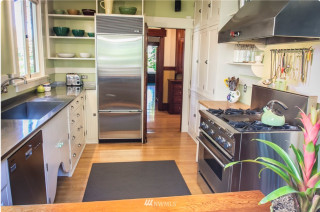
The refrigerator sits behind the far-left door, with a pantry in the right-hand tall cabinet.
Cabinet paint: Strong White; island paint: Pitch Black, both Farrow & Ball; wall paint: Rose Tinted White, Edward Bulmer