These Austin, Texas, homeowners love to entertain, but their closed-off kitchen wasn’t supporting the casual gatherings they enjoy hosting. They hired Etch Design Studio, which uses Houzz Pro, and Skelly Build to open the kitchen to the adjacent sunroom and create a layout better suited to the way they cook, eat, gather and entertain.
Interior designer Zoie Young led the project, beginning the design process by asking the owners to share inspiration photos. “They had selected photos that were mostly contemporary and transitional with a little bit of farmhouse thrown in,” she says. “That let me know they would want a touch of classic Texas traditional in there.”
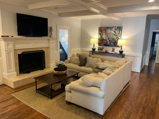
This article was originally published by a www.houzz.com . Read the Original article here. .


Kitchen at a Glance
Who lives here: A couple
Location: Lumberton, New Jersey
Size: 204 square feet (19 square meters)
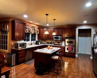
Design-build team: Anne van de Rijn (designer) and Nick Zizzamia (project manager) of Cipriani Remodeling Solutions
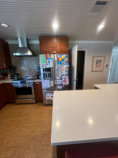
Before: The former kitchen felt stuck in time. Short, dark wood cabinets — none reaching the ceiling — made the space feel low and cave-like, and creamy beige solid-surface counters did little to lift things. Storage was a constant frustration. “The kitchen was beautiful in its day,” designer Anne van de Rijn says. “I knew it was a quality kitchen when they originally did it, but it needed to be brightened up.”
The island was a particular pain point — slender, matching the dark perimeter cabinetry, with seating for just two and storage on only one side. A pair of small pendants hung too low overhead. The sink location worked, but across from it a refrigerator shared a wall with a built-in desk that had long since stopped functioning as one. “The desk was the first thing you hit when you came in from the garage, so it became a landing space for clutter,” van de Rijn says.
The cooking wall was equally cramped: Two wall ovens squeezed in on either side of a gas cooktop left almost no counter workspace, and a microwave mounted above the cooktop couldn’t properly ventilate the space. “And it just wasn’t pretty,” van de Rijn says. One bright spot the homeowners wanted to keep: the red oak floor, which they knew would bring warmth to whatever came next.