
The number of open positions in the construction sector edged higher in March, per the Bureau of Labor Statistics Job Openings and Labor Turnover Survey (JOLTS). The current level of open jobs is down measurably from three years ago due to declines in construction activity, particularly in housing. However, recent gains for nonresidential construction have not fully offset soft conditions for housing with respect to the demand for construction labor.
The number of open jobs for the overall economy declined, falling from 6.92 million in February to 6.87 million in March. The March reading was down from a year ago (6.95 million) due to a cooling labor market.
Previous NAHB analysis indicated that this number had to fall below eight million on a sustained basis for the Federal Reserve to move forward on interest rate reductions. With estimates remaining below eight million for national job openings, the Fed, in theory, should be able to cut further. However, this is situation is complicated by rising energy costs due to the Iran war.
The number of open construction sector jobs increased for the month, rising slightly from 201,000 in February to 224,000 in March. This total was down compared to a year ago (278,000). The chart below notes the declining trend that has been in place for unfilled construction jobs since the Fed raised the federal funds rate and home building weakened. While home building employment was declining during the second half of 2025, other subsectors of the construction industry have expanded (e.g. data centers). This has produced volatility within a reduced range in the job openings series since 2024.
The construction job openings rate increased to 2.6% in March, down from the 3.3% rate estimated a year ago.
The layoff rate in construction declined slightly to 1.7% in March. The quits rate increased to 1.7% for the month.
This article was originally published by a eyeonhousing.org . Read the Original article here. .


Kitchen at a Glance
Who lives here: A couple with two kids — one in college and one still at home — and a labradoodle
Location: Richardson, Texas
Size: 430 square feet (40 square meters)
Designer: Tara Lenney Design
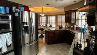
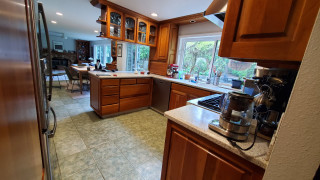
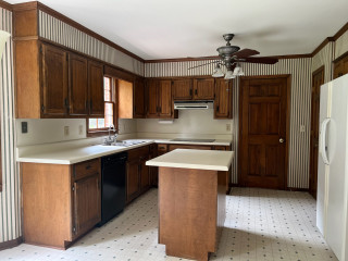
Before: The dreary, chopped-up, 310-square-foot kitchen had dark oak-stained cabinetry, granite countertops in brown, tan and black, and a beige ceramic tile floor. It also had what Lenney describes as “the world’s weirdest shape.” A black electric cooktop sat on an angled wall to the right, while a stainless steel double-bowl sink was positioned beneath two windows. (Take note of the window near the sink to help orient the view in the following “after” photo.)
A large stainless steel refrigerator protruded past surrounding cabinetry along a wall backed by a centrally located laundry room (see the before-and-after floor plans below) and was squeezed next to a pair of wall ovens. The laundry room further divided the kitchen from the closed-off dining room and sunken living room.
In the background, a short peninsula cut the kitchen off from the breakfast area and a den. “It was very uninviting,” Lenney says. “Everything was spread out in weird locations. It was also like a hallway. You’re trying to get your cooking done and there are literally people walking through your cooking area. If you were in the kitchen, you couldn’t be where anyone else was because of the layout.”
Find a kitchen designer on Houzz