
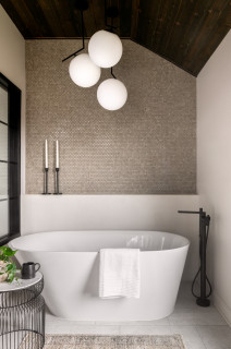
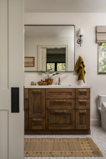
This primary bathroom was part of the remodel of a family home in Chadds Ford, Pennsylvania, that also included the kitchen and mudroom. A referral from another client led the homeowners to Black Forest Design and Build, which handled the redesign and construction work. The primary suite changes benefited from the designers’ focus on style and functionality, with warm wood tones, black matte fixtures and contrasting white features creating a modern farmhouse feel. “The homeowners wanted a larger shower with two shower heads, a freestanding bath, double vanity and an enclosed toilet area,” says designer Beth Schulz.
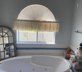
Before: The old bathroom had a narrow shower stall crammed between the built-in tub and the vanity. The layout didn’t quite work and the owners wanted a bigger space, specifically a larger shower. A multipaned window provided plenty of natural light and the team decided to keep it.
For a rustic touch, the team used dark-stained cedar planks for the ceiling, which added texture and contrast. “We leaned into some modern farmhouse elements but gave it our own twist by layering natural elements and textures to keep the space feeling warm and inviting,” Schulz says.
See why you should hire a professional who uses Houzz Pro software
Before: Here’s the layout of the primary suite prior to the remodel, which included a linen closet and a large closet that separated the bedroom from the bathroom. Both closets were taken out to make room for the enlarged bathroom. The areas in pink indicate what was demolished.
Before: This is the view from the former primary bath into the bedroom. There are closets in the hall, which were demolished to make room for the bigger bathroom.
After: Black Forest gained space in the new bathroom (right side of diagram) by eliminating the closets. The previous shower stall was demolished to make way for a larger wet-room-style shower. The toilet area was enclosed and a freestanding tub replaced the built-in one.
Before: The previous shower was uncomfortably narrow, the tile was dated, and there was nowhere to store bath products.
New to home remodeling? Learn the basics
Here’s a view that shows the new wall with window that separates the shower area from the vanity. Schulz says the owners specifically requested a double vanity, and the pros delivered with custom white oak and a honed quartzite top. She used the same large-format floor tile that’s in the shower.
This article was originally published by a www.houzz.com . Read the Original article here. .


Bathroom at a Glance
Who lives here: A couple and their two dogs
Location: Chadds Ford, Pennsylvania
Size: 230 square feet (21 square meters)
Design-build firm: Black Forest Design and Build
A natural color palette with soft earth tones now defines the bath, with a new walk-in wet-room-style shower as the focus feature. “The homeowners wanted the bathroom to feel like an extension of the rest of their home. While function was paramount, we also customized the space for them,” Schulz says.
The new freestanding tub and matte black fixtures sit under a three-globe light, next to an accent wall of earth-colored penny tiles.
Tub and fixtures: Kohler; penny tile: Bedrosians
Find a design-build firm on Houzz