This article was originally published by a www.houzz.com . Read the Original article here. .

This article was originally published by a www.houzz.com . Read the Original article here. .
Once you’ve selected and purchased a paint color, it’s time to commit. Paint will look quite different during the painting process, and it is very important not to judge the color until it has been properly applied in the necessary number of coats — at least two, but often three or more, depending on the product and shade.
It’s truly wisest not to judge the color at all until at least the next day, and to give yourself some time to adjust to the change in your space before jumping to any conclusions.
This is especially true with darker shades, which will visually shrink the space in a way you will need a little time to get used to.
This article was originally published by a www.houzz.com . Read the Original article here. .

Terra cotta, sage, olive green, dusty blue, muted pastels, creamy beiges, browns, taupes and buttery yellows are taking over interiors. “The reign of all-white interiors and icy gray palettes has definitely come to an end,” says color specialist Jennifer Ott. “Homeowners are now craving warmth, richness and depth in their spaces. For those who still prefer lighter palettes, stark whites are giving way to warmer neutrals that are sun-warmed and tactile — think canvas, parchment or soft stone gray. These hues add subtle depth while maintaining a sense of calm and brightness.”
Kitchens feature terra-cotta-colored tile backsplashes and sage cabinetry, while living rooms lean into buttery yellows, warm taupes and olive accents layered with natural textures like linen, wool and rattan. Bedrooms and bathrooms are embracing muted blues and greens for a soothing, restorative feel, and even entryways and home offices are benefiting from warmer palettes that create inviting spaces rather than stark or clinical ones. “Clients have been increasingly drawn to warm, nature-inspired tones in their kitchen designs, particularly incorporating earthy hues like terra cotta, soft beige and sage green,” says designer Donna Rose. “This trend aligns with the broader shift toward biophilic, nature-inspired design.”
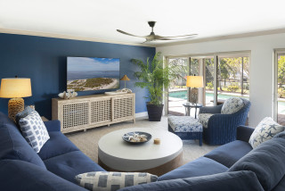
This New Jersey living room by Forina Design showcases the warmth of woodsy tones. Like many of the pros featured in this story, Forina Design subscribes to Houzz Pro. Moody green sofas, deep beige wallpaper, wood accents and touches of yellow, gold and blue create a layered, inviting space that feels both organic and vibrant.
9 Paint Colors Poised to Dominate in 2026