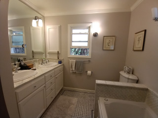
Before Photo
This article was originally published by a www.houzz.com . Read the Original article here. .

Before Photo
This article was originally published by a www.houzz.com . Read the Original article here. .

They hired Harrell Design + Build to help them maximize every inch of the 127-square-foot room. By adopting a wet-room strategy for the tub and shower, the team was able to incorporate a larger vanity, carve out a semiprivate toilet area and find space for the new exterior door.
This article was originally published by a www.houzz.com . Read the Original article here. .

The small black-and-white en suite bathroom in this 1934 Colonial just outside Boston had vintage charm, but it fell short of the sophisticated retreat the new homeowners envisioned. The single pedestal sink offered no storage or counter space, and the aging shower-tub combo didn’t meet the couple’s needs. The nearby walk-in closet in the bedroom also lacked functional storage.
Looking to create a more spacious and practical layout, the couple hired design-build pros Jason and Megan Hoffman. Jason suggested pushing a wall shared by the bathroom and closet into the bedroom to gain valuable square footage. The reimagined bath now features a warm wood double vanity, a roomy low-curb shower with a built-in bench and a linen cabinet for added storage. A thoughtful mix of white, black and wood finishes with clean-lined midcentury touches brings modern style to this refreshed and highly functional space.
Before Photo
Bathroom at a Glance
Who lives here: A young couple
Location: Newton, Massachusetts
Size: 43 square feet (4 square meters)
Designers-builders: Jason and Megan Hoffman of J.P. Hoffman Design Build
Before: The 40-square-foot bathroom had charm thanks to its pedestal sink and classic black-and-white tile, but it lacked the storage and counter space the young couple needed in their primary suite. The aging shower-tub combo added to the challenges. “They have a tub in another bathroom, so that satisfied the home’s need for a tub,” Jason says. “Having no tub here opened up the opportunity to maximize the layout.”
Two existing windows — one beside the toilet and another at the end of the shower-tub — were in good shape, so the homeowners opted to keep them.
Find a bathroom designer
A pony wall on the left adds a touch of privacy for the new two-piece white toilet. A decorative walnut shelf above the toilet offers a warm accent. “We moved the new toilet 6 inches so everything on that wall now fits,” Jason says.
Creamy white paint (White Dove by Benjamin Moore) covers the walls, ceiling and trim, creating a clean, warm backdrop. Matte black details throughout add striking contrast.
10 Aging-in-Place Features Pros Swear By
Bronze and brass two-light fixtures with clear glass globes add a touch of midcentury style that complements the vanity. The bathroom also has recessed LED ceiling lights and a new exhaust fan, both of which were digitally removed from these photos to better highlight the room’s key design features.
Double vanity: Serenity door style in natural walnut, Candlelight Cabinetry; towel ring: Purist in matte black, Kohler; vanity pulls: Morris, Top Knobs; vanity lights: Young House Love Clear Glass Bubble, Shades of Light
Shop for bathroom vanities on Houzz
Creamy white glossy ceramic tiles, measuring 2 by 6½ inches, cover the wall above the vanity in a vertical stack pattern; the grout is frosty white. The tile’s subtle surface movement adds depth and texture. “We used that tile on the shower walls too,” Jason says. “By bringing the tile all the way across that wall, you’re creating less transitions and making the room seem bigger.”
Faucets: Jason Wu collection, matte black, Brizo; wall tiles: Wellfleet in Coconut, 2 by 6½ inches, Best Tile
10 Smart Bathroom Storage Solutions
On the bathroom floor, 4-by-12-inch matte black porcelain tiles are laid in a herringbone pattern and paired with midnight black grout, adding depth and visual interest.
Floor tile: Topography porcelain in black, 4 by 12 inches, Best Tile
See why you should hire a professional who uses Houzz Pro software
On the shower floor, hexagonal tumbled Carrara marble mosaic tiles bring natural variation in veining and tone, set with frosty white grout for soft contrast. “The homeowners liked the way everything looked when all the details were put together,” Jason says.
Shower floor tile: Antique Carrara hexagon tumbled, 2 by 2 inches, Best Tile
A hardwired black towel warmer with a programmable timer, mounted to the side of the linen cabinet, adds both function and luxury to the space. “We were able to redesign and update this bathroom without changing the location of windows,” Jason says. “The creativity and the ability to see the solution was key here.” For added privacy, the windows were fitted with a translucent film.
New to home remodeling? Learn the basics
Before: A swing door on the left once connected the bedroom and bathroom. An imposing dark armoire stood against the wall space between the door to the bathroom and the primary closet to its right. The door on the far right leads to the second-floor landing and staircase to the main level. The exposed metal ductwork visible at the back left is from a prior HVAC upgrade.
A new pocket door now connects the bedroom and bathroom. “It was related to the size of the bathroom and the location of switches to optimize space,” Jason says. The previously exposed ductwork is also gone. “We were able to enclose the necessary ductwork behind a wall in the new bathroom and added the valuable linen cabinet,” Megan says.
More on Houzz
Read more bathroom stories
Browse bathroom photos
Find a bathroom remodeler
Shop for your bathroom
This article was originally published by a www.houzz.com . Read the Original article here. .

When planning your remodel, make sure you put your kitchen’s busiest areas — the sink, stove and fridge — in practical locations that are relevant to one another while allowing enough space for people to use and access them comfortably, Findlay says.
When choosing cabinetry, make sure the doors won’t block your workflow when they’re open, she says. “The last thing you want is your fridge and cupboard doors banging into each other every time you open them!”
Solution: Plan your kitchen layout as far in advance as possible, and choose your appliances before you start looking at cabinetry, Findlay says. “This will allow you to fit your units around your appliances, rather than the other way around, giving you a seamless look that’s both smart and space-efficient.”
Tip: Think about how many people live in your home and will be using the kitchen at one time, she says. If it’s going to get crowded, you may have crammed too many elements into the kitchen layout and may want to consider scaling back.
This article was originally published by a www.houzz.com . Read the Original article here. .

“We wanted to elevate the space as much as possible with elements like a freestanding bathtub and a large vanity,” Fishman says. Looking into the shower, a striking marble-covered wall steals the spotlight. The marble also provides an elegant backdrop when the homeowners are looking in the vanity mirror across the room.
“We used this plaster on the walls throughout the house,” Fishman says. “They provided a jumping-off point for the bathroom’s palette.” The plaster honors the Spanish Revival architecture and adds texture, depth and an organic feel to the room. “In the shower, there’s a layer of waterproofing under the cement, then the plaster, then a sealer,” Fishman says. This product is similar to tadelakt, a waterproof Moroccan treatment.
Browse bathtubs in the Houzz Shop
Marble: Stoneland USA; plaster: Tonachino Firenze by Meoded Paint & Plaster
This article was originally published by a www.houzz.com . Read the Original article here. .

The window was installed two months before the cabinetry went in. That made it challenging to set the handmade cast-iron, wall-mounted sink, one of the key elements of the vision for an old English working kitchen.
“It is not flat; it is not plumb. There are no 90-degree angles. It’s very imperfect, which is part of the beauty,” says Laura Marshall, Refined Renovations’ director of marketing.
To get the sink centered and with an even reveal, and at the same time have its wall-mounted faucet perfectly line up with the plumbing, there was no room for error. Luckily, with a lot of coordination between the design and production teams, the installation went flawlessly, Marshall says.
Faucet: Country Kitchen bridge in satin nickel, Rohl
This article was originally published by a www.houzz.com . Read the Original article here. .

The area with the X shape is a double shower area, with the shower heads marked at the top and bottom of the plan. The shower area is about 3 feet wide, but because of the wet-room layout, it feels larger. “With the tub height, it’s not like they will bump their elbows on a wall when they are washing their hair,” Gilmour says. The freestanding tub occupies the area under the window. The shower floor slopes slightly toward the drain, represented by the square in the middle of the X shape on the plan.
The toilet wasn’t photographed, but it’s at the bottom left corner, with the entry from the bedroom to its right. The double vanity runs across the top of the plan.
This article was originally published by a www.houzz.com . Read the Original article here. .

A backsplash featuring matte white scallop-shaped ceramic tiles brightens the room and adds visual movement. An upgraded 30-inch induction range sits below a hood with wood trim that coordinates with the other wood details in the room. A stainless steel 36-inch counter-depth 4-door smart refrigerator (partially visible) is to the left of the sink.
A pair of modern pendant lights over the island coordinate with other black and brass finishes used in the room. (The kitchen also has recessed LED ceiling lights, which were digitally removed by the photographer to highlight other design details.)
Backsplash: Prado in Andalucia, Mirazur collection, Sonoma Tilemakers; pendant lights: Blaine 16-inch, Rejuvenation; paint colors: Wind’s Breath (walls) and Super White (trim), Benjamin Moore
Shop for your kitchen
This article was originally published by a www.houzz.com . Read the Original article here. .
Kitchen at a Glance
Who lives here: A couple with two kids — one in college and one still at home — and a labradoodle
Location: Richardson, Texas
Size: 430 square feet (40 square meters)
Designer: Tara Lenney Design
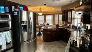
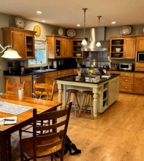
Before: The dreary, chopped-up, 310-square-foot kitchen had dark oak-stained cabinetry, granite countertops in brown, tan and black, and a beige ceramic tile floor. It also had what Lenney describes as “the world’s weirdest shape.” A black electric cooktop sat on an angled wall to the right, while a stainless steel double-bowl sink was positioned beneath two windows. (Take note of the window near the sink to help orient the view in the following “after” photo.)
A large stainless steel refrigerator protruded past surrounding cabinetry along a wall backed by a centrally located laundry room (see the before-and-after floor plans below) and was squeezed next to a pair of wall ovens. The laundry room further divided the kitchen from the closed-off dining room and sunken living room.
In the background, a short peninsula cut the kitchen off from the breakfast area and a den. “It was very uninviting,” Lenney says. “Everything was spread out in weird locations. It was also like a hallway. You’re trying to get your cooking done and there are literally people walking through your cooking area. If you were in the kitchen, you couldn’t be where anyone else was because of the layout.”
Find a kitchen designer on Houzz