Tag

Layout

Browsing


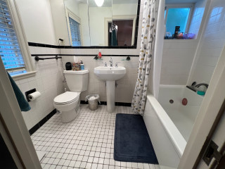
The small black-and-white en suite bathroom in this 1934 Colonial just outside Boston had vintage charm, but it fell short of the sophisticated retreat the new homeowners envisioned. The single pedestal sink offered no storage or counter space, and the aging shower-tub combo didn’t meet the couple’s needs. The nearby walk-in closet in the bedroom also lacked functional storage.

Looking to create a more spacious and practical layout, the couple hired design-build pros Jason and Megan Hoffman. Jason suggested pushing a wall shared by the bathroom and closet into the bedroom to gain valuable square footage. The reimagined bath now features a warm wood double vanity, a roomy low-curb shower with a built-in bench and a linen cabinet for added storage. A thoughtful mix of white, black and wood finishes with clean-lined midcentury touches brings modern style to this refreshed and highly functional space.
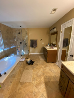
Before Photo

J.P. Hoffman Design BuildSave Photo

“After” photos by Lara Kimmerer

Bathroom at a Glance
Who lives here: A young couple
Location: Newton, Massachusetts
Size: 43 square feet (4 square meters)
Designers-builders: Jason and Megan Hoffman of J.P. Hoffman Design Build

Before: The 40-square-foot bathroom had charm thanks to its pedestal sink and classic black-and-white tile, but it lacked the storage and counter space the young couple needed in their primary suite. The aging shower-tub combo added to the challenges. “They have a tub in another bathroom, so that satisfied the home’s need for a tub,” Jason says. “Having no tub here opened up the opportunity to maximize the layout.”

Two existing windows — one beside the toilet and another at the end of the shower-tub — were in good shape, so the homeowners opted to keep them.

Find a bathroom designer

J.P. Hoffman Design BuildSave Photo
After: Jason’s idea to shift the wall into the bedroom added just 3 square feet, but the modest gain made a meaningful difference. Relocating the new double vanity to the former shower-tub wall on the right and placing a spacious low-curb shower on the former sink wall gave the couple the larger vanity and shower they were hoping for.

A pony wall on the left adds a touch of privacy for the new two-piece white toilet. A decorative walnut shelf above the toilet offers a warm accent. “We moved the new toilet 6 inches so everything on that wall now fits,” Jason says.

Creamy white paint (White Dove by Benjamin Moore) covers the walls, ceiling and trim, creating a clean, warm backdrop. Matte black details throughout add striking contrast.

10 Aging-in-Place Features Pros Swear By

J.P. Hoffman Design BuildSave Photo
The natural walnut double vanity has full-overlay doors and drawers with modern matte black pulls in horizontal and vertical orientations. A coordinating matte black towel ring on the right ties in with the vanity hardware and other black accents. “The walnut vanity and linen cabinet really gave them the dark wood tone they were looking for and all the storage they wanted,” Jason says.

Bronze and brass two-light fixtures with clear glass globes add a touch of midcentury style that complements the vanity. The bathroom also has recessed LED ceiling lights and a new exhaust fan, both of which were digitally removed from these photos to better highlight the room’s key design features.

Double vanity: Serenity door style in natural walnut, Candlelight Cabinetry; towel ring: Purist in matte black, Kohler; vanity pulls: Morris, Top Knobs; vanity lights: Young House Love Clear Glass Bubble, Shades of Light

Shop for bathroom vanities on Houzz

J.P. Hoffman Design BuildSave Photo
The double vanity is topped with a durable white engineered quartz that mimics marble with soft gold and gray veining. Two rectangular undermount white porcelain sinks are paired with matte black widespread faucets, each with modern low-profile lever handles.

Creamy white glossy ceramic tiles, measuring 2 by 6½ inches, cover the wall above the vanity in a vertical stack pattern; the grout is frosty white. The tile’s subtle surface movement adds depth and texture. “We used that tile on the shower walls too,” Jason says. “By bringing the tile all the way across that wall, you’re creating less transitions and making the room seem bigger.”

Faucets: Jason Wu collection, matte black, Brizo; wall tiles: Wellfleet in Coconut, 2 by 6½ inches, Best Tile

J.P. Hoffman Design BuildSave Photo
Two recessed mirrored medicine cabinets with brass frames hang above the vanity, offering sleek storage with adjustable tempered glass shelves inside. “They wanted those recessed cabinets, so we had to get the manufacturer specs for the cabinets, the faucets and the lights and do 3D renderings to make sure everything would fit before they made the purchases,” Jason says.

10 Smart Bathroom Storage Solutions

J.P. Hoffman Design BuildSave Photo
The spacious low-curb shower features a custom glass enclosure and a coordinated suite of matte black fixtures, including a rain shower head, hand shower on a slide bar and a thermostatic valve, all from the same collection as the vanity faucets for a cohesive look.

On the bathroom floor, 4-by-12-inch matte black porcelain tiles are laid in a herringbone pattern and paired with midnight black grout, adding depth and visual interest.

Floor tile: Topography porcelain in black, 4 by 12 inches, Best Tile

See why you should hire a professional who uses Houzz Pro software

J.P. Hoffman Design BuildSave Photo
The shower includes a built-in tiled bench beneath the hand shower for convenience. The bench is topped with the same quartz used on the vanity.

On the shower floor, hexagonal tumbled Carrara marble mosaic tiles bring natural variation in veining and tone, set with frosty white grout for soft contrast. “The homeowners liked the way everything looked when all the details were put together,” Jason says.

Shower floor tile: Antique Carrara hexagon tumbled, 2 by 2 inches, Best Tile

J.P. Hoffman Design BuildSave Photo
The shower side of the pony wall next to the toilet includes a built-in niche for bathing products. A custom walnut linen cabinet with adjustable shelves on the left adds valuable storage. The cabinet has the same matte black pulls as the vanity, tying the elements together.

A hardwired black towel warmer with a programmable timer, mounted to the side of the linen cabinet, adds both function and luxury to the space. “We were able to redesign and update this bathroom without changing the location of windows,” Jason says. “The creativity and the ability to see the solution was key here.” For added privacy, the windows were fitted with a translucent film.

New to home remodeling? Learn the basics

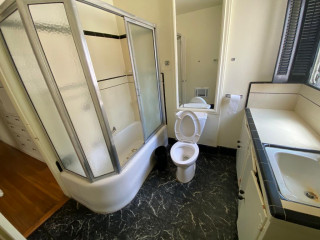
Before: A swing door on the left once connected the bedroom and bathroom. An imposing dark armoire stood against the wall space between the door to the bathroom and the primary closet to its right. The door on the far right leads to the second-floor landing and staircase to the main level. The exposed metal ductwork visible at the back left is from a prior HVAC upgrade.

J.P. Hoffman Design BuildSave Photo
After: Pushing the wall into the bedroom allowed for a modest expansion of the bathroom. “Our clients were willing to sacrifice some bedroom square footage to achieve their goal of a more generous bathroom and closet,” Megan says. “Although the new closet is narrow, our team incorporated custom shelving to maximize storage and create an organized, functional space.”

A new pocket door now connects the bedroom and bathroom. “It was related to the size of the bathroom and the location of switches to optimize space,” Jason says. The previously exposed ductwork is also gone. “We were able to enclose the necessary ductwork behind a wall in the new bathroom and added the valuable linen cabinet,” Megan says.

More on Houzz
Read more bathroom stories
Browse bathroom photos
Find a bathroom remodeler
Shop for your bathroom


This article was originally published by a
www.houzz.com . Read the Original article here. .


Hollyman DesignSave Photo
5. Forgetting About Function

When planning your remodel, make sure you put your kitchen’s busiest areas — the sink, stove and fridge — in practical locations that are relevant to one another while allowing enough space for people to use and access them comfortably, Findlay says.

When choosing cabinetry, make sure the doors won’t block your workflow when they’re open, she says. “The last thing you want is your fridge and cupboard doors banging into each other every time you open them!”

Solution: Plan your kitchen layout as far in advance as possible, and choose your appliances before you start looking at cabinetry, Findlay says. “This will allow you to fit your units around your appliances, rather than the other way around, giving you a seamless look that’s both smart and space-efficient.”

Tip: Think about how many people live in your home and will be using the kitchen at one time, she says. If it’s going to get crowded, you may have crammed too many elements into the kitchen layout and may want to consider scaling back.


This article was originally published by a
www.houzz.com . Read the Original article here. .


Oro Coast BuildersSave Photo
After: To make the most of the space, the firm used a partial wet-room layout. This meant placing both the shower and tub within an enclosure. The enclosure has two glass panels with a door in the center. This allows the entire bathroom to enjoy the natural light from the wet room’s window.

“We wanted to elevate the space as much as possible with elements like a freestanding bathtub and a large vanity,” Fishman says. Looking into the shower, a striking marble-covered wall steals the spotlight. The marble also provides an elegant backdrop when the homeowners are looking in the vanity mirror across the room.

“We used this plaster on the walls throughout the house,” Fishman says. “They provided a jumping-off point for the bathroom’s palette.” The plaster honors the Spanish Revival architecture and adds texture, depth and an organic feel to the room. “In the shower, there’s a layer of waterproofing under the cement, then the plaster, then a sealer,” Fishman says. This product is similar to tadelakt, a waterproof Moroccan treatment.

Browse bathtubs in the Houzz Shop

Marble: Stoneland USA; plaster: Tonachino Firenze by Meoded Paint & Plaster


This article was originally published by a
www.houzz.com . Read the Original article here. .


Refined RenovationsSave Photo
After: A tall bank of windows measuring just over 6 feet wide now lets in abundant sunshine. Refined Renovations’ in-house interior design service, Refined Interiors, custom-made the relaxed Roman shades, which have a traditional botanical pattern.

The window was installed two months before the cabinetry went in. That made it challenging to set the handmade cast-iron, wall-mounted sink, one of the key elements of the vision for an old English working kitchen.

“It is not flat; it is not plumb. There are no 90-degree angles. It’s very imperfect, which is part of the beauty,” says Laura Marshall, Refined Renovations’ director of marketing.

To get the sink centered and with an even reveal, and at the same time have its wall-mounted faucet perfectly line up with the plumbing, there was no room for error. Luckily, with a lot of coordination between the design and production teams, the installation went flawlessly, Marshall says.

Faucet: Country Kitchen bridge in satin nickel, Rohl


This article was originally published by a
www.houzz.com . Read the Original article here. .


Floor plan: To get a better understanding of the wet-room layout, let’s jump into the floor plan. A wet-room strategy can save space when both a generous shower stall and bathtub are desired. Gilmour enclosed the wet area on the right side of the bathroom with two hinged glass shower doors.

The area with the X shape is a double shower area, with the shower heads marked at the top and bottom of the plan. The shower area is about 3 feet wide, but because of the wet-room layout, it feels larger. “With the tub height, it’s not like they will bump their elbows on a wall when they are washing their hair,” Gilmour says. The freestanding tub occupies the area under the window. The shower floor slopes slightly toward the drain, represented by the square in the middle of the X shape on the plan.

The toilet wasn’t photographed, but it’s at the bottom left corner, with the entry from the bedroom to its right. The double vanity runs across the top of the plan.


This article was originally published by a www.houzz.com . Read the Original article here. .


Kindred Designs LLCSave Photo
The island has an oil-based stain that enhances the wood grain. Black metal swivel stools help make the island a gathering spot. The countertops are marble-look quartz. The island slab creates a continuous, expansive prep space. “I feel quartz is an economical and durable choice for families,” Reesey says.

A backsplash featuring matte white scallop-shaped ceramic tiles brightens the room and adds visual movement. An upgraded 30-inch induction range sits below a hood with wood trim that coordinates with the other wood details in the room. A stainless steel 36-inch counter-depth 4-door smart refrigerator (partially visible) is to the left of the sink.

A pair of modern pendant lights over the island coordinate with other black and brass finishes used in the room. (The kitchen also has recessed LED ceiling lights, which were digitally removed by the photographer to highlight other design details.)

Backsplash: Prado in Andalucia, Mirazur collection, Sonoma Tilemakers; pendant lights: Blaine 16-inch, Rejuvenation; paint colors: Wind’s Breath (walls) and Super White (trim), Benjamin Moore

Shop for your kitchen


This article was originally published by a
www.houzz.com . Read the Original article here. .


An overabundance of tan and brown finishes and a large built-in tub made for a drab and heavy look in Michael and Yoshie Davison’s primary bathroom. Yearning for a light and airy feel with a fresh style, they turned to designer Shelley Vilov and project manager David Jordan, both of whom had helped the couple update another bathroom in their home.

The remodeling team replaced the built-in tub with a freestanding model that helped loosen up the layout and allow for a bigger shower. White marble-look porcelain tiles cover the floor and the walls wrapping the shower and tub area, creating a brighter look. Pale gray walls also brighten the space, while midtone gray vanities and chrome fixtures and details add touches of fresh, modern style.


This article was originally published by a www.houzz.com . Read the Original article here. .

Pin It