This article was originally published by a www.houzz.com . Read the Original article here. .

3. Brighter Style With Family-Friendly Function
Kitchen at a Glance
Who lives here: A family of six
Location: Henderson, Nevada
Size: 342 square feet (32 square meters)
Design-build firm: Cera Construction
Before: When a couple with four young children purchased this home in Nevada, they knew the kitchen would need a major update to better support busy family life. Although the space had a functional work triangle and large island, it lacked personality, offered inefficient storage and felt disconnected from the rest of the home because of a partial wall on the right.
The homeowners wanted a brighter, more open kitchen with improved flow and family-friendly function, so they hired designer Christy Mancera of Cera Construction. Using Houzz Pro software, Mancera reworked the floor plan to create a more connected and efficient gathering space tailored to the family’s lifestyle.
See why you should hire a professional who uses Houzz Pro software
This article was originally published by a www.houzz.com . Read the Original article here. .
![]()
Designer: Heather Safferstone of Safferstone Interiors
Location: Merion Station, Pennsylvania
Size: 252 square feet (23 square meters); 10½ by 24 feet
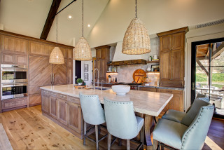
Homeowners’ request. “The client purchased a historic home with beautiful architectural bones, but the existing kitchen was tucked into an oddly angled room at the side of the house,” says designer Heather Safferstone. “It felt disconnected from the way the family actually lived, cooked, gathered and hosted. As part of a large-scale, two-story renovation, the homeowners added a generous new kitchen adjacent to a large family room, along with a breakfast room, full bath, home office and a new primary suite above. The goal was to create a kitchen that felt deeply connected to the home’s traditional character while supporting the rhythm of modern family life.”
Green cabinets. Pewter Green by Sherwin-Williams. “The client and I loved the idea of a green kitchen from the beginning, but her husband was initially a bit hesitant,” Safferstone says. “Like many homeowners, they had that familiar ‘What is best for resale?’ moment, so we originally considered a more classic off-white kitchen. The turning point came from the adjacent family room. We selected a dark green velvet for two sofas, and once they were delivered, the clients saw how beautifully that depth of color grounded the space. It gave them the confidence to carry green into the kitchen in a much more committed way. Rather than limiting the color to the island, we used Pewter Green on the perimeter cabinetry and introduced a walnut island at the center of the room. The walnut adds warmth and keeps the kitchen feeling collected rather than overly matched.”
Other special features. Mont Blanc quartzite perimeter countertops and backsplash. Soapstone island countertop. Warm brass details. “Because the clients keep a kosher kitchen and frequently host large Shabbat dinners and holiday celebrations for family and community, function was essential,” Safferstone says. “They needed ample prep space, thoughtful storage, durable materials and a layout that could support serious cooking and entertaining with ease. A large island became one of the key solutions, providing generous prep space, additional storage, two dishwashers and two trash pullouts flanking the sink for convenience during cooking and cleanup.”
Designer tip. “Worry less about resale and be willing to design for yourself,” Safferstone says. “Find your design muse within the project and run with it. Maybe it’s an architectural element within the home you want to tie into or, in this case, the color of the sofa in the next room.”
Stools: Poly & Bark; pendant lights: Hendricks small, Ralph Lauren, Visual Comfort; project photography: Rebecca McAlpin; styling: Gabrielle Langdon
Find an interior designer on Houzz
This article was originally published by a www.houzz.com . Read the Original article here. .

Before Photo
4. Warm Wood and Blue Accents
Kitchen at a Glance
Who lives here: A recently retired couple
Location: Kingston, Washington
Size: 280 square feet (26 square meters), including a breakfast area
Designer: Molly Erin McCabe of McCabe by Design
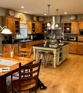
Before: This recently retired couple in Kingston, Washington, found their dark, dated kitchen’s open layout adequate, but short maple cabinets without knobs or pulls offered little in the way of storage or style. Granite tile countertops and a black tile backsplash, paired with a mix of black and stainless steel appliances, felt tired, while a bulky two-tier island cramped circulation.
A breakfast area with a wood table and sliding glass door connected the kitchen to the living room, but the space lacked cohesion. Hoping for a brighter, smarter and more functional kitchen, the homeowners turned to designer Molly Erin McCabe for guidance and a fresh approach.
New to home remodeling? Learn the basics
This article was originally published by a www.houzz.com . Read the Original article here. .

Beautiful materials take the spotlight in these five kitchens, where designers layered natural stone, warm wood cabinetry, handcrafted tile and refined finishes to elevate everyday function. Thoughtful layouts, carefully edited palettes and a mix of modern, classic and artisanal details allow standout features to shine, creating spaces that feel welcoming, cohesive and timeless. Here, the pros share how they brought it all together.
Designer: Michelle and Jeff Price of 805 Interiors
Location: Westlake Village, California
Homeowners’ request. “The original kitchen was a dated faux Tuscan style with brown-on-brown finishes and a maze of ’90s soffits that made the ceilings feel oppressively low and forced a cramped, inflexible layout,” says designer Michelle Price. “Our goal was a transitional Mediterranean Revival, replacing those dated features with a blend of artisanal textures and modern restraint, while bringing real architectural integrity back to the space. We stripped the soffits away and introduced architectural beams to reclaim the volume of the room, adding authentic Mediterranean character in the process. This completely opened up the space and allowed us to maximize the stunning lake and mountain views.”
Price uses
Houzz Pro to manage her projects. “We love the Clipper and use it for all of our sourcing, as well as the Room Board features,” she says. “This was a whole-home project, so the Room Boards were invaluable for organizing. We use all the ordering and tracking features as well as proposal and invoice creation, so our client benefited from us having information and answers quickly at our fingertips.”
Luxurious materials and features. “We knew the range and hood would be the focal point of the kitchen, so we designed an arched niche finished in Venetian plaster and set it off with hand-painted Portuguese tile for a truly bespoke moment,” Price says. “To let that anchor breathe, we intentionally kept the rest of the space quiet: custom white oak cabinets stained in a warm, medium tone and neutral zellige tile for the remaining backsplash to bring an organic, old-world feel. The countertops are leathered Taj Mahal quartzite, chosen for its soft texture and natural variation. The sink wall has a large window framing stunning views. Unlacquered brass fixtures feel both refined and timeless.” The flooring is smoked white oak.
Designer tip. “I always tell my clients that every space should have only one or two ‘stars’ and that everything else needs to play a supporting role so those stars can truly shine,” Price says. “Homeowners often make selections in isolation, feeling that each element needs to be special or exciting on its own. The result is usually a space that feels disjointed or overly busy. Giving your stars room to have their moment is what allows a design to feel cohesive and intentional.”
Paint colors: Cloud White (walls) and Ballet White (island), Benjamin Moore
See why you should hire a professional who uses Houzz Pro software
Designer: Debra Geller Interior Design
Construction: Phil Kouffman Builder
Location: Montauk, New York
Homeowners’ request. “The homeowner envisioned a drop-dead stunning kitchen — artistic, modern, layered and luxurious — yet warm enough to support everyday family life,” says designer Debra Geller. “As an entertainer she required a space that could function effortlessly during large gatherings while maintaining a refined, elevated aesthetic. As part of a full-home renovation, we doubled the size of the kitchen, removed walls, reworked structural elements and installed oversized picture windows to frame uninterrupted views of the Atlantic.”
Geller uses Houzz Pro to manage her business. “We utilize Houzz Pro for client leads and for its visual planning tools, including the 3D scanning feature,” she says. “This tool allows us to scan a room onsite and convert it into a 2D plan directly from our phones, enabling us to quickly test layouts and place furnishings without opening CAD programs. It streamlines onsite meetings and allows our team to make informed layout decisions efficiently prior to implementation.”
Luxurious materials and features. “Luxury in this kitchen is expressed through scale, natural stone, customization and craftsmanship,” Geller says. “The 14-foot island is topped in Invisible Blue marble, showcasing fluid movement and subtle veining reminiscent of the ocean beyond. The perimeter countertops, full-height backsplash and custom 60-inch hood are also clad in Invisible Blue marble, creating continuity and a dramatic sculptural focal point. The island seating countertop section is Black Absolute leathered granite, selected for its depth, durability and rich tactile quality. The cabinetry is painted in Benjamin Moore Chantilly Lace, enhancing brightness and architectural contrast. The island and refrigerator wall are constructed in white oak with a custom stained whitewash finish, introducing warmth and organic texture.”
Other special features. A 48-inch double workstation sink with integrated cutting and straining accessories. Toe-kick lighting for a soft ambient evening glow. Walk-in butler’s pantry with secondary refrigerator, filtered water station and curated coffee center. Custom bar stools upholstered in vegan leather.
Designer tip. “In larger kitchens, mixing painted cabinetry with natural wood adds warmth and visual depth,” Geller says. “Keeping the perimeter light while introducing wood on the island or feature wall grounds the space and prevents it from feeling sterile.”
Cabinetry: Ciuffo Cabinetry; island light: Gabriel Scott
Find a kitchen designer on Houzz
Designer: Natalia Avalos Interiors
Location: Alamo, California
Homeowners’ request. “Their goal was to create a home that felt elevated yet livable — moody but inviting, refined yet comfortable,” says designer Natalia Avalos, whose clients found her on Houzz. “They wanted richer materials, more intentional detailing and a sense of flow from room to room.”
Luxurious materials and features. “This kitchen is elevated through a thoughtful combination of polished marble countertops and backsplash, a sculptural plaster hood, rich natural walnut cabinetry and warm brass fixtures,” Avalos says. “Each material was intentionally selected to create depth, warmth and a refined sense of contrast.
“The polished marble brings timeless elegance and light reflection, enhancing the overall brightness of the space. The plaster hood introduces an artisanal, sculptural quality that softens the architecture and adds visual interest beyond standard cabinetry. Natural walnut cabinetry was chosen for its richness and warmth, balancing the coolness of the stone while adding organic texture. The detailed end of the island was designed to be both practical and visually striking, breaking away from the enclosed, boxy feel that kitchens often have.” The cabinets are painted in Feather Down by Benjamin Moore.
Designer tip. “Be intentional about how you use your countertops,” Avalos says. “Identify which areas will serve primarily as functional prep zones and which can be styled more decoratively. Incorporate everyday objects — beautiful cutting boards, ceramic vessels, curated oils or frequently used cookware — and treat them as part of the design. When thoughtfully selected, these functional pieces become both practical and visually pleasing, making the kitchen feel lived-in yet elevated.”
Wall paint: Sea Salt, Benjamin Moore; project photography: Jessica Brydson Photography
5 Trends in Countertops and Other Surfaces Shaping 2026
Designers: Mia Rao and Robyn Swanson of Mia Rao Design
Builder: Dave Knecht
Location: La Grange, Illinois
Homeowners’ request. “This 1870s Second Empire Italianate home is rich with history,” says designer Robyn Swanson. “The home once belonged to Civil War Capt. George Pratt and his family after the war. Also, it was the boyhood home of 1990s heartthrob David Hasselhoff. Now it’s the home base for a retired couple with three grown children, and the goal was to restore and modernize this Victorian beauty and create a family retreat to hang out and entertain for generations to come. With an addition to the back of the home, the kitchen was enlarged into the bright, airy space it is today.”
Mia Rao Design uses Houzz Pro software to manage its business. “We currently use Houzz Pro for Selection Boards, Mood Boards, orders and tracking and find it to be a great platform,” Swanson says.
Luxurious materials and features. Custom cabinetry painted in Benjamin Moore White Dove and Stained Glass (bar). White oak island with deep espresso stain. Marble-look porcelain countertops. Subtle coffered ceiling. Polished nickel faucet and island pendant lights. “These items were chosen for their classic style and quality,” Swanson says. “The porcelain counters are beautiful and durable. The stool fabric is rated for outdoor and resiliency. The idea is for this bright space to be used with love by the family and continue to look spectacular. The view from the pass-through above the sink is to the back gardens. The bright white and sea glass cabinets come alive in the natural sunlight.”
Designer tip. “Design for what you love, not for trends,” Swanson says. “The bright sea glass blue is a statement but the homeowners love it. It reflects their vibrant personalities.”
“Uh-oh” moment. “Making the kitchen larger and more open was a must-have,” Swanson says. “The original kitchen had a lower ceiling. During demo it was discovered that the ceiling was concealing a very deep load-bearing beam. The architect and the builder put their heads together and devised a plan to raise the beam into the floor joists above to create the ceiling height desired for the space.”
Range wall tile: Embossed in white, 6 by 6 inches, Pratt + Larson; bar backsplash tile: Clover Leaf in West Point Blue, 6 by 6 inches, Quemere Designs; pendant lights: Chapman & Myers Prestwick in polished nickel and clear glass, Visual Comfort
New to home remodeling? Learn the basics
Designer: Whitney Gelinas of Wit Interiors
Location: Berkeley, California
Homeowners’ request. “In this extensive renovation of a 20th-century Tudor, we thoughtfully restored and reimagined the home to support a lively family of six,” says designer Whitney Gelinas. “Obviously, one of the most important rooms was the kitchen. Our clients wanted a big, open space in their kitchen and dining area, as that’s where everyone naturally gathers. They also wanted extra stools at the countertop so their kids could easily spend time with their cousins. Now seven stools fit comfortably. We opened up the room and fully modernized it to improve storage, flow and durability.”
Luxurious materials and features. “This light-filled kitchen has white oak floating shelves and white custom cabinetry,” Gelinas says. “We paired a marble arabesque mosaic backsplash tile with Taj Mahal quartzite countertops for a timeless and sophisticated feel. And the emerald Zellige tile range backsplash truly steals the spotlight. We installed it in a unique pattern that brings a touch of our clients’ vibrant personality and love of color to the kitchen.” The custom cabinetry is painted in Chantilly Lace by Benjamin Moore.
Other special features. “We’re really happy with how the arched wall between the dining room and kitchen and the curved hood turned out, both thoughtfully designed to echo the doorways found throughout the home,” Gelinas says. “We also love the balance of hues in the details, including a matte black Bertazzoni induction range, warm brass hardware and plumbing fixtures and smoky glass pendant lights, which help make a space filled with mostly hard finishes feel layered with character and texture.”
Designer tip. “Don’t be afraid to mix backsplashes and play with unique tile layouts,” Gelinas says. “Layering different materials, like pairing a marble mosaic with handcrafted tile, adds depth and personality. Varying the scale, shape or pattern keeps the eye moving and makes the space feel custom rather than cookie-cutter. It’s a simple way to elevate your kitchen and create a look that feels thoughtfully designed and completely your own.”
More on Houzz
Read more stories
Browse photos for ideas
Find home professionals
This article was originally published by a www.houzz.com . Read the Original article here. .

After: While project lead Morgan Taugher drew inspiration from historic English kitchens and sculleries, all the design elements are new and meet modern-day needs. Layout changes included scooting the sink to the right and placing a new paneled fridge to its left (not seen), while the old fridge spot now has a full-height pantry.
Bright white and soft blue-gray cabinets create a cheerful backdrop for a stained-oak island, which has spindle legs, vintage-style hardware and even faux keyholes. Other period-appropriate details include handmade backsplash tile installed without grout, a Roman shade in a traditional botanical pattern, a handmade cast-iron sink and fluted opal glass pendant lights. The lower cabinets and island are topped with marble-like Matarazzo quartzite.
Cabinets and island: custom, Refined Renovations; cabinet paint: White Dove, Benjamin Moore (uppers) and Silver Lake, Sherwin-Williams (lowers); backsplash: handmade zellige tile, Clé; Roman shade: custom, Refined Interiors
Read more about this project
This article was originally published by a www.houzz.com . Read the Original article here. .
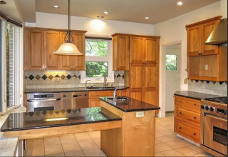
The new island sits within the work triangle and offers plenty of room for preparing meals. It also has seating for three, storage on both sides and a dishwasher on the far side. The top is Caesarstone with subtle purplish-black veining, and the base cabinets are clad in black laminate by Greenlam. Above, three substantial pendant lights fit the island’s scale and add touches of warm brass.
Read more about this kitchen
This article was originally published by a www.houzz.com . Read the Original article here. .

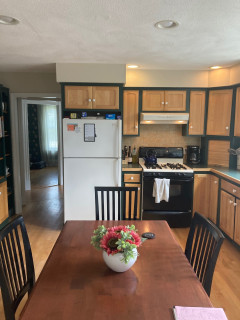
After: Now the kitchen has a streamlined look with dedicated storage and a refreshing cream-and-blue palette. Gone is the awkward butler’s pantry, replaced by glass-front cabinets for glassware and dishes. To the left of the new paneled fridge, an area that used to be a walk-in pantry now has cabinets for small appliances, bakeware, dry goods and a microwave.
To the right of the stove, a countertop cabinet hides a pullout shelf with a coffee bar and toaster, as well as stationary shelves for mugs and more. To the right of the sink, a cabinet with hammered glass doors keeps more dishware at hand.
Ramsay also removed a dining table and chairs (where the previous photo was taken from) and relocated a desk on the sink-side wall. This allowed for a more spacious island with seating for three, plus French doors that bathe the space in light. Wood-look luxury vinyl flooring grounds the space in beauty and practicality
Perimeter cabinet paint: Dumpling, Sherwin-Williams; island base paint: Hale Navy, Benjamin Moore
Read more about this project
This article was originally published by a www.houzz.com . Read the Original article here. .

Rustic style brings a relaxed, real-world edge to a kitchen. Rough-hewn wood, natural stone and handcrafted details add texture and toughness — a welcome balance in a space made for hard work and happy messes. Even a few rugged touches can give a kitchen that lived-in, collected-over-time charm. See how these new kitchens mix raw materials and refined design, creating inviting, hardworking spaces full of character.
Designer: Lauri Johnson of Swan Home Design
Builder: B&B Builders
Location: Swan Valley, Idaho
Size: 322 square feet (30 square meters); 13 feet, 10 inches by 23 feet, 3 inches
Homeowners’ request. “The owner wanted their kitchen to be spacious, functional and warm and inviting,” says designer Lauri Johnson. “They love to entertain and wanted to be able to have multiple people in the kitchen at a time, so we gave them plenty of room to maneuver between the island and the stovetop and fridge.”
Rustic details. Reclaimed-timber range hood detail. Rift-sawn white oak cabinets in a custom stain. Stone zellige tile backsplash. Wide-plank knotty wood flooring. Taj Mahal quartzite island countertop. Allure quartzite perimeter countertop. “We chose different quartzite countertops in order to create more interest and texture,” Johnson says.
Other special features. “The seating arrangement still allows for plenty of storage for a busy kitchen and to be able to sit together and enjoy a family-style meal,” Johnson says.
Paint colors: Alabaster (walls) and Shoji White (trim), Sherwin-Williams
Find a home professional on Houzz
Designers: David and Agi Losonczi of Revival Contractors
Location: Newport Beach, California
Size: 280 square feet (26 square meters)
Homeowners’ request. “The homeowners wanted a bright, timeless coastal kitchen that still felt warm and lived-in,” says designer Agi Losonczi. “Their old layout was dark, dated and lacked functional storage. They dreamed of a light, open space that reflected the relaxed elegance of Newport Beach — something classic yet current. We focused on improving natural light flow, creating hidden storage and integrating warm textures so the space would feel both inviting and refined.”
Rustic details. “To bring a soft coastal-rustic charm, we used wide-plank European oak flooring and a handcrafted natural stone tile backsplash in mixed beige and ivory tones,” Losonczi says. “The marble-look quartz countertops add luxury while being easy to maintain. Natural white oak accents on the range hood trim and island bring warmth and texture. These materials were chosen for their organic character — subtle imperfections, matte finishes and soft colors that give the room a sense of authenticity and calm.”
Other special features. Custom Shaker cabinets in White Dove by Benjamin Moore. Brushed brass pulls.
Designer tip. “When we’re designing a bright kitchen, we mix different warm materials like natural wood, soft white paint and unlacquered brass to keep it from feeling sterile,” Losonczi says. “We also use hidden outlets under cabinets and lighting with warm color temperature to maintain a cozy glow day and night.”
Backsplash: Zellige in Natural White, 4 by 4 inches, Cle Tile; stools: Balboa, Serena & Lily; wall paint: Swiss Coffee, Benjamin Moore
See why you should hire a professional who uses Houzz Pro software
Design team: Greg Howe and Pam Lamaster-Millett (designers) and Dana Burgess (project manager) of Searl Lamaster Howe Architects
Location: Harbert, Michigan
Size: 306 square feet (28 square meters); 9 by 34 feet
Homeowners’ request. “For this multigenerational retreat, our client wanted a kitchen with ample space for everyone,” says project designer Dana Burgess. “The final plan design is composed of several prep and cooking zones connected by the large central island. The result is a welcoming setting ideal for hosting large gatherings — casual, comfortable and naturally inspired.”
Rustic details. “We wanted the cabinet design to give a nod to more traditional framed cupboards but without applied hardware,” says designer Pam Lamaster-Millett. “The horizontal band serves as integrated pulls and lets the plain-sawn white ash be the focus. Additionally, keeping the background elements such as the wall and flooring tones neutral allowed for the millwork to be the standout feature within the kitchen.”
Other special features. “The kitchen’s location within the house is strategic,” says designer Greg Howe. “It’s tucked just steps away from the front entry yet screened from view by a partial-height wall. A shallow shelf serves as a perch not just for everyday glasses and tableware but select pieces of art and family mementos. The pine-stained wood ceiling from the dining room and foyer beyond extends into the space, connecting the spaces and enhancing the sense of openness. Open views from the adjacent living room called for a less cluttered aesthetic.”
The countertops and backsplash are quartz. The flooring is porcelain tile. The range and cooking zone are just out of view on the left, directly across from the island end. “It’s set slightly apart for two reasons,” Howe says. “First, it reduces congestion in the kitchen, which is a good thing given it is often used by several people during food prep. Second, it removes the range and exhaust hood from a direct line of sight from the living room the kitchen opens onto.”
Designer tip. “Opting for a shallow shelf instead of upper cabinets in the work zone really opens the area for better light,” Lamaster-Millett says.
“Uh-oh” moment. “The original cabinet stain was envisioned in a soft green — a deliberate contrast from the natural wood tones of the wood framing and pine ceiling above,” Burgess says. “The final deep brown was a safer pivot made during shop drawings.”
How to Design a Kitchen That Brings People Together
General contractor: Ashley Wainscott of Simply Home
Location: Austin, Texas
Size: 250 square feet (23 square meters)
Homeowners’ request. “The homeowners wanted an updated space with a nod to modern design while honoring the rustic roots of their home and location,” says general contractor Ashley Wainscott. “They wanted their countertops and cabinets to be the center of attention and to carry those countertops throughout the downstairs of the home.”
Rustic details. Knotty pine cabinets and beams. Black Galaxy granite perimeter countertop. Light granite island countertop. Large-format stone tile flooring.
Other special features. “Refinished ceilings and updated wall colors brighten the space and enhance its architectural details,” Wainscott says. “Multiple coats of high-quality paint and precise prep work created a polished, durable finish. The standard horizontal brick lay kept the backsplash light and airy, keeping your eyes on other parts of the kitchen.”
More on Houzz
Read more stories
Browse photos for ideas
Find home professionals
This article was originally published by a www.houzz.com . Read the Original article here. .

4. Seamless Flow for an Open-Plan Main Level
Kitchen at a Glance
Who lives here: An empty-nest couple
Location: Bloomington, Minnesota
Size: 170 square feet (16 square meters)
Designers: Amy Jants, Alisa Dragt-Hoffman and Katie Slick of McDonald Remodeling
Before: When a design-loving empty-nest couple purchased this 1942 Bloomington, Minnesota, home, they were immediately drawn to its sweeping Minnesota River Valley views. The kitchen was a different story. A closed-off layout, a wall separating it from the living room, a short peninsula, worn cabinetry and a cramped footprint were at odds with the airy, entertaining hub the couple envisioned.
To create a more open main level, designers Amy Jants, Alisa Dragt-Hoffman and Katie Slick of McDonald Remodeling reimagined the entire space, reworking the kitchen and its relationship to the surrounding living areas.