This article was originally published by a www.houzz.com . Read the Original article here. .

This article was originally published by a www.houzz.com . Read the Original article here. .

Rustic style brings a relaxed, real-world edge to a kitchen. Rough-hewn wood, natural stone and handcrafted details add texture and toughness — a welcome balance in a space made for hard work and happy messes. Even a few rugged touches can give a kitchen that lived-in, collected-over-time charm. See how these new kitchens mix raw materials and refined design, creating inviting, hardworking spaces full of character.
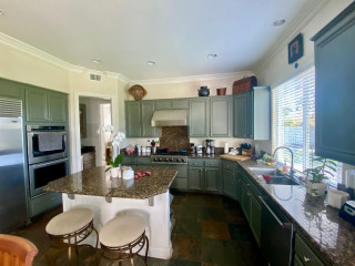
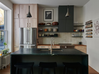
Designer: Lauri Johnson of Swan Home Design
Builder: B&B Builders
Location: Swan Valley, Idaho
Size: 322 square feet (30 square meters); 13 feet, 10 inches by 23 feet, 3 inches
Homeowners’ request. “The owner wanted their kitchen to be spacious, functional and warm and inviting,” says designer Lauri Johnson. “They love to entertain and wanted to be able to have multiple people in the kitchen at a time, so we gave them plenty of room to maneuver between the island and the stovetop and fridge.”
Rustic details. Reclaimed-timber range hood detail. Rift-sawn white oak cabinets in a custom stain. Stone zellige tile backsplash. Wide-plank knotty wood flooring. Taj Mahal quartzite island countertop. Allure quartzite perimeter countertop. “We chose different quartzite countertops in order to create more interest and texture,” Johnson says.
Other special features. “The seating arrangement still allows for plenty of storage for a busy kitchen and to be able to sit together and enjoy a family-style meal,” Johnson says.
Paint colors: Alabaster (walls) and Shoji White (trim), Sherwin-Williams
Find a home professional on Houzz
Designers: David and Agi Losonczi of Revival Contractors
Location: Newport Beach, California
Size: 280 square feet (26 square meters)
Homeowners’ request. “The homeowners wanted a bright, timeless coastal kitchen that still felt warm and lived-in,” says designer Agi Losonczi. “Their old layout was dark, dated and lacked functional storage. They dreamed of a light, open space that reflected the relaxed elegance of Newport Beach — something classic yet current. We focused on improving natural light flow, creating hidden storage and integrating warm textures so the space would feel both inviting and refined.”
Rustic details. “To bring a soft coastal-rustic charm, we used wide-plank European oak flooring and a handcrafted natural stone tile backsplash in mixed beige and ivory tones,” Losonczi says. “The marble-look quartz countertops add luxury while being easy to maintain. Natural white oak accents on the range hood trim and island bring warmth and texture. These materials were chosen for their organic character — subtle imperfections, matte finishes and soft colors that give the room a sense of authenticity and calm.”
Other special features. Custom Shaker cabinets in White Dove by Benjamin Moore. Brushed brass pulls.
Designer tip. “When we’re designing a bright kitchen, we mix different warm materials like natural wood, soft white paint and unlacquered brass to keep it from feeling sterile,” Losonczi says. “We also use hidden outlets under cabinets and lighting with warm color temperature to maintain a cozy glow day and night.”
Backsplash: Zellige in Natural White, 4 by 4 inches, Cle Tile; stools: Balboa, Serena & Lily; wall paint: Swiss Coffee, Benjamin Moore
See why you should hire a professional who uses Houzz Pro software
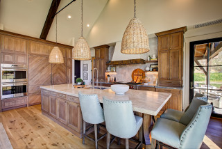
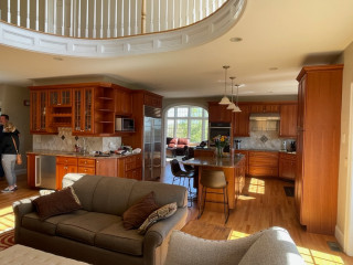
Design team: Greg Howe and Pam Lamaster-Millett (designers) and Dana Burgess (project manager) of Searl Lamaster Howe Architects
Location: Harbert, Michigan
Size: 306 square feet (28 square meters); 9 by 34 feet
Homeowners’ request. “For this multigenerational retreat, our client wanted a kitchen with ample space for everyone,” says project designer Dana Burgess. “The final plan design is composed of several prep and cooking zones connected by the large central island. The result is a welcoming setting ideal for hosting large gatherings — casual, comfortable and naturally inspired.”
Rustic details. “We wanted the cabinet design to give a nod to more traditional framed cupboards but without applied hardware,” says designer Pam Lamaster-Millett. “The horizontal band serves as integrated pulls and lets the plain-sawn white ash be the focus. Additionally, keeping the background elements such as the wall and flooring tones neutral allowed for the millwork to be the standout feature within the kitchen.”
Other special features. “The kitchen’s location within the house is strategic,” says designer Greg Howe. “It’s tucked just steps away from the front entry yet screened from view by a partial-height wall. A shallow shelf serves as a perch not just for everyday glasses and tableware but select pieces of art and family mementos. The pine-stained wood ceiling from the dining room and foyer beyond extends into the space, connecting the spaces and enhancing the sense of openness. Open views from the adjacent living room called for a less cluttered aesthetic.”
The countertops and backsplash are quartz. The flooring is porcelain tile. The range and cooking zone are just out of view on the left, directly across from the island end. “It’s set slightly apart for two reasons,” Howe says. “First, it reduces congestion in the kitchen, which is a good thing given it is often used by several people during food prep. Second, it removes the range and exhaust hood from a direct line of sight from the living room the kitchen opens onto.”
Designer tip. “Opting for a shallow shelf instead of upper cabinets in the work zone really opens the area for better light,” Lamaster-Millett says.
“Uh-oh” moment. “The original cabinet stain was envisioned in a soft green — a deliberate contrast from the natural wood tones of the wood framing and pine ceiling above,” Burgess says. “The final deep brown was a safer pivot made during shop drawings.”
How to Design a Kitchen That Brings People Together
General contractor: Ashley Wainscott of Simply Home
Location: Austin, Texas
Size: 250 square feet (23 square meters)
Homeowners’ request. “The homeowners wanted an updated space with a nod to modern design while honoring the rustic roots of their home and location,” says general contractor Ashley Wainscott. “They wanted their countertops and cabinets to be the center of attention and to carry those countertops throughout the downstairs of the home.”
Rustic details. Knotty pine cabinets and beams. Black Galaxy granite perimeter countertop. Light granite island countertop. Large-format stone tile flooring.
Other special features. “Refinished ceilings and updated wall colors brighten the space and enhance its architectural details,” Wainscott says. “Multiple coats of high-quality paint and precise prep work created a polished, durable finish. The standard horizontal brick lay kept the backsplash light and airy, keeping your eyes on other parts of the kitchen.”
More on Houzz
Read more stories
Browse photos for ideas
Find home professionals
This article was originally published by a www.houzz.com . Read the Original article here. .

After: Reesey removed the fridge wall and flipped the locations of the kitchen and dining area, adding a 5-foot bump-out along the way. (For orientation, check out the white door in both photos; it leads to an outdoor walkway and stayed in the same place.) These moves more than doubled the size of the kitchen, to 313 square feet, and allowed for expansive storage, better flow and a pleasing openness.
Three kinds of wood bring warmth without feeling one-note: milled pine on the ceiling beams, maple on the island base and oak for the flooring. The dining furniture and a band on the range hood complement the other wood elements, while green cabinets (painted in Dried Thyme by Sherwin-Williams) and white walls, countertops and backsplash tile balance the color palette. Texture and movement come from the wood graining and the backsplash tiles’ scallop shapes.
Paint colors: Dried Thyme, Sherwin-Williams (cabinets); Wind’s Breath, Benjamin Moore (walls); Super White, Benjamin Moore (trim)
Read more about this project
This article was originally published by a www.houzz.com . Read the Original article here. .

Warm contemporary style strikes a nice balance in a kitchen. It offers the clean lines and easy function of modern design but with natural materials and soft tones that make a kitchen feel welcoming. In the following seven spaces, designers used wood, texture, streamlined storage and abundant light to create kitchens that feel calm, connected and comfortable.
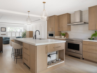
Designers: Lauren Magee, Maria Williams and Michael Winn of Winn Design + Build
Location: Alexandria, Virginia
Size: 252 square feet (23 square meters); 14 by 18 feet
Homeowners’ request. “The homeowners envisioned a clean, modern kitchen with better functionality and stronger visual connection to the rest of the home and the outdoors,” says designer Michael Winn. “The original kitchen was small, dark and closed off from both the dining area and backyard. They wanted a space that would feel open, bright and streamlined yet warm and would support everything from casual breakfasts to entertaining guests. Expanding the footprint and rethinking flow were key to solving their challenges.”
Winn’s firm uses
Houzz Pro software for things like lead generation, Mood Boards and client communication.
Contemporary elements. “Contemporary style was a natural fit for the homeowners, who gravitate toward minimalism, natural light and a sense of calm,” Winn says. “To achieve this, we used flat-panel cabinetry in maple veneer, integrated appliances, sleek, black fixtures and clean-lined lighting. The waterfall-edge island in a muted quartz, along with white oak floors and a slab-style backsplash, contributes to the clean yet inviting palette. A folding glass wall (not shown) at the rear of the new addition off the kitchen blurs the boundary between inside and out — a modern hallmark that reinforces openness and connections.”
Other special features. Mixed metals. Integrated dog food station with dedicated pot filler. Warm ambient lighting with undercabinet LED strip lighting and integrated cabinet lights.
Designer tip. “If you’re going for a minimalist aesthetic, continuity is key — especially across surfaces and materials,” Winn says. “Matching the countertop and backsplash helps streamline the look while also reducing visual clutter.”
Wall and ceiling paint: Chantilly Lace, Benjamin Moore
See why you should hire a professional who uses Houzz Pro software
Designers: Mary Englert and Kate Adams of Case Architects & Remodelers
Location: Potomac, Maryland
Size: 430 square feet (40 square meters)
Homeowners’ request. “The owners had previously renovated the kitchen but, after a decade of use, were unhappy with how the space functioned for them,” says designer Kate Adams. “Their goal was to remove a wall between the kitchen and formal dining room to create a more open space. Their biggest requirement was more light, more storage, wider aisles and an earthy, clean, contemporary look. We actually flipped the kitchen and dining room in order to gain more light in both spaces. This also allowed us to create a large walk-in pantry, something they were lacking before.” The homeowners found the remodeling firm on Houzz.
Contemporary elements. Alder cabinets in light and dark stains. Painted white MDF cabinets. “The clients desired an ‘earthy-zen’ space with a focus on natural materials and colors,” Adams says. “One major goal was to bring more light into the space and open up views to the wooded backyard. We decided that a more modern look with clean lines would better allow for this. The simple details on the cabinets allow the various wood tones and Taj Mahal quartzite countertops to speak for themselves, and carry more visual weight. Slab doors were debated but we chose a thin-stile Shaker cabinet door to add more depth and dimension to the large kitchen. We find this door style to be a perfect option for clients looking for a more modern look but still wanting to remain slightly transitional without making the jump to a more contemporary slab door style.
“We used three different cabinet colors, in a color block arrangement to keep your eyes moving and create interest. The two wood tones help to warm up the large space. Paneled built-in appliances add to the modern look, limiting the visual clutter that large appliances can sometimes add. The dark green tiled backsplash adds depth and dimension with its fluted pattern and pulls the greens of the backyard in through the new windows.”
Other special features. “At the main sink, we replaced the existing windows with a large bay window, raising the head height to meet the ceiling, which maximizes natural light and the visual connection to the outdoors,” designer Mary Englert says. “We wrapped the windowsill with countertop material for a durable and seamless plant ledge. A dedicated coffee bar near the dining area is both practical and functional. It features its own sink with a reverse-osmosis filtration system and faucet, as well as a fully integrated undercounter beverage fridge. Reeded glass pocket doors and glass-front cabinetry echo the fluted backsplash tile, creating a subtle design detail.”
Designer tip. “Make sure everything has a home — thoughtful storage solutions are a must,” Englert says. “With minimal wall cabinets, we added peg organizers in deep drawers for dishes. A pullout next to the range provides storage for cooking utensils and knives to keep the countertops free from clutter. For added convenience, a docking outlet was added inside a drawer to create a hidden charging station. Even the family dog was considered. An open base cabinet allows for food and water bowls to be kept accessible yet discreetly out of the way.”
Flooring: Red oak
Find a home professional on Houzz
Designers: Cameron Cruse, Rick Berry, Brian Campbell and Ryan Yoshida of Scott Edwards Architecture
Location: White Salmon, Washington
Size: 256 square feet (24 square meters)
Homeowners’ request. “When envisioning daily life in their new home, the clients spoke of sharing a cup of coffee at the island while looking at the tranquil view,”
says designer Cameron Cruse. “The layout of the kitchen provides an intimate and well-organized experience particular to the clients’ lifestyle. Each cabinet is meticulously designed and placed in alignment with how the clients use the space, with the spice drawer next to the cooktop and dish storage directly behind the dishwasher in the island. Display areas for treasures, art and cookbooks are woven throughout.”
Contemporary elements. “The home’s restrained design and the timeless materiality of the contemporary style deliberately integrate with the surrounding natural environment, and the interiors are quiet and refined — a comfortable and well-considered setting for daily life,” Cruse says. “The kitchen is light and airy, and the design is characterized by organic textures and materials balanced with modern lines.”
Other special features. “Caesarstone quartz in the color Cloudburst Concrete gives a seamless, light clay-like backsplash,” Cruse says. “Using walnut on the island and open shelves provides warmth.” The hood is lime plaster.
Designer tip. “Detailing cabinet drawers and doors with integrated eased-edge finger pulls contributes to the clean lines and serenity of the space,” Cruse says. “Reducing the pulls, knobs and hardware throughout simplifies the palette and calms your eyes.”
“Uh-oh” moment. “The client requested no sink or stove on the kitchen island, which can be a difficult ask because it challenges the design tool of creating the refrigerator-sink-stove triangle,” Cruse says. “After conducting several space studies, we found a solution that worked for the client.” They located the paneled fridge, sink and induction cooktop around one side of the island.
“In the end, it’s a lovely experience to sit at the furniture-styled island with no threat of water or heat nearby.”
Know the 3 Zones of Kitchen Storage
Architect: Norman Sanchez Architecture
Location: Oakland, California
Size: 300 square feet (28 square meters)
Homeowners’ request. “The goal was to modernize the kitchen and the appliances in a way that felt at home with the original midcentury architecture,” says architect Norman Sanchez. “Our client wanted ample storage in order to keep the countertops clean and free of appliances. In addition, we sought to make visual and physical connections to the adjacent spaces more direct in order to improve flow and sightlines.”
Contemporary elements. “The contemporary style was chosen for its clean lines and simple elegance, which both work well to complement the midcentury aesthetic,” Sanchez says. “Flush dark gray panels for the millwork, minimalist pulls and appliances with cabinet panels are all elements of the contemporary kitchen. The walnut island and side panels add warmth to the otherwise cool palette and help to make the sleek lines of the kitchen feel at home in this midcentury gem.”
Other special features. Quartersawn white oak flooring. Black faucet, hardware and range hood vent.
Designer tip. “The use of a lighting control system allowed us to reduce the amount of visible switches throughout the kitchen,” Sanchez says. “It also allowed us to control the various types of lighting via preprogrammed scenes, making it easier to set the mood for a gathering or turning on all the lights needed for preparing dinner with the touch of a single button.”
The 10 Most Popular New Kitchens Right Now
Designer: Maggie Lunetta
Contractor: PorchLight Homes
Architect: Lake Country Builders
Location: Minnetonka, Minnesota
Size: 345 square feet (32 square meters); 15 by 23 feet
Homeowners’ request. “The homeowners loved their home, but it wasn’t working for their growing family,” says designer Maggie Lunetta. “The kitchen had limited storage, an undersized island and appliances that were dated and starting to fail. They also had two dining areas, but the formal dining room was rarely used. We decided to tap into that underutilized space to expand the kitchen footprint, making room for a large island with seating, a walk-in pantry and more efficient — and hidden — storage throughout. The goal was to create a kitchen that felt open, functional and family-friendly while still maintaining a clean, elevated aesthetic.”
Contemporary elements. “A contemporary direction felt right for this family — clean lines, subtle contrast and a calm, livable sophistication,” Lunetta says. “Flat-panel cabinetry in a mix of white oak and painted finishes adds warmth and balance, while Taj Mahal quartzite countertops that continue up the backsplash create a seamless, elevated look. Integrated, panel-ready appliances keep everything streamlined. The large island anchors the space with generous storage and seating, and the walk-in pantry — wrapped in patterned wallpaper on the walls and ceiling — adds just the right touch of drama and personality.”
Other special features. Rift-sawn white oak flooring. Dark green island (Greenblack by Sherwin-Williams). “Storage was carefully planned, with custom drawer organization throughout, including spice drawers, pullout racks for knives and utensils and dedicated compartments for cutting boards and dishware,” Lunetta says.
Designer tip. “I always start by asking how my clients want the space to feel and function — before we ever talk about finishes or layout,” Lunetta says.
“Uh-oh” moment. “During installation, we discovered that the pendants we selected were heavier than anticipated and required additional stabilization,” Lunetta says. “Of course, the ceiling and drywall were already complete when this came up, so it took a bit of coordination to make it work. With some creative problem-solving and teamwork, we were able to fit the fix into the schedule, and the pendants became one of the standout features of the space. It was a good reminder that sometimes it’s worth proactively adding extra support for lighting early on, especially when you’re working with larger or more substantial fixtures.”
Island lights: Elliot Grande pendant, Visual Comfort; project photos: Alyssa Lee Photography; wall paint: Drift of Mist, Sherwin-Williams
How to Design a Kitchen That Brings People Together
Designer: Leslie Teague of Kenorah Design + Build
Location: Port Moody, British Columbia
Size: 160 square feet (15 square meters); 10 by 16 feet
Homeowners’ request. “They wanted a modern design with warmth and texture,” says designer Leslie Teague. “The floor plan remained fairly similar to the original, but they had an old, dated, angled walk-in pantry that was taking up too much space and would not allow for a bigger island. So we modernized the space with a cabinet pantry and we were able to increase the island size.”
Contemporary elements. “In order to give a contemporary feel, we went with slab cabinets and a quartz counter and backsplash, but warmth and texture in the design were also important,” Teague says. “So we went with a warm wood tone on the cabinets and added texture on the back of the island with a fluted back panel and a plaster finish on the hood.”
Designer tip. “Balance is important,” Teague says. “The black handles and black stainless steel appliances are spread throughout as an accent and don’t overpower anything.”
“Uh-oh” moment. “The clients had originally wanted wood cabinet doors, but that was pushing the budget so we were able to find a beautiful wood laminate look for the doors and still achieve the quality and look they wanted,” Teague says.
New to home remodeling? Learn the basics
Designer: Jacob Kindler of Urban Homes
Location: Englewood, New Jersey
Size: 352 square feet (33 square meters); 16 by 22 feet
Homeowners’ request. “The homeowners requested a warm yet contemporary kitchen with dramatic natural stone, abundant light and seamless indoor-outdoor flow,” says designer Jacob Kindler. “They wanted functional elegance — ample storage, professional appliances and sculptural lighting blending sophistication with comfort.”
Contemporary elements. Flat-panel cabinets. Stained wood island and other details. Dramatic marble countertops and backsplash.
Other special features. Dual sinks with black fixtures. Integrated open shelving. Built-in bookcase in the island.
Designer tip. “Balance bold materials with simplicity,” Kindler says. “When using a dramatic stone like this marble, keep cabinetry and fixtures understated — matte finishes, clean lines and neutral tones allow the natural stone to shine while maintaining harmony and sophistication.”
“Uh-oh” moment. “I remember standing with the homeowners as the marble island was being uncrated,” Kindler says. “We all held our breath — the veining was far bolder than it looked on paper. For a moment, we wondered if it might overwhelm the space. But once the slab was set in place, the entire kitchen came alive. The natural movement of the stone anchored everything — cabinetry, light, even the view beyond the windows. That was the moment we all knew: This kitchen had found its soul.”
More on Houzz
Read more stories
Browse photos for ideas
Find home professionals
This article was originally published by a www.houzz.com . Read the Original article here. .
Every great kitchen starts with a solid plan, but it’s the custom details that bring it to life. A sculptural island, a statement range hood or hidden storage tucked behind sliding marble backsplash panels — these are the touches that elevate a space. In the following five kitchens, designers blend craftsmanship, creativity and personality to create rooms that feel as individual as the people who cook and unwind in them.
Designer: Richard Somerby Design
Location: Brooklyn, New York
Size: 110 square feet (10 square meters)
Homeowners’ request. “This renovation involved converting a multifamily building into a single-family home for a pair of professionals” in Brooklyn’s Park Slope neighborhood, designer Richard Somerby says. “Our clients wanted a kitchen that was functional and durable, with honest materials and a calm, modern attitude. We replanned the working wall and gave the waterfall stone island depth to allow for cooking without crowding. A key request was open display and wall space to exhibit the family’s ceramics, glassware, art and keepsakes, leading to the floating shelves flanking the range area.”
Tailored details. “The light natural wood base and ‘pantry’ cabinetry was chosen for its organic materiality, contrasting the almost metallic deep green-gray lacquer upper cabinet block, hidden range hood and floating shelves,” Somerby says. “The backsplash is a soft, hand-glazed zellige tile with subtle variations and slight lippage that reads as warm rather than glossy. The perimeter counters are an oiled wood, which keeps the working wall light and tactile. The island is honed soapstone with integrated drain grooves. The range hood is concealed within an upper cabinet block to maintain a clean composition that is echoed in the cast-concrete pendants that give just enough focus to the island without drawing the eye away from the centerpieces of the clients’ art and ceramics.”
Designer tip. “Our designs often center around contrast, specifically between light and dark,” Somerby says. “Here we made the island the dark, sculptural element and kept the working wall light and tactile. The contrast is also functional: mess, prep and cleaning happen where the stone is, while the wood perimeter is more suited to everyday use.”
Pendant lights: Aplomb, Foscarini; wall and ceiling paint: Capitol White, Benjamin Moore
Find a kitchen designer on Houzz
Designers: Katharine Hatcher (design-build consultant) and James Inmon (drafting and renderings) of Bailey Design + Build and Katrina Moffett (interior design) of KHM Interiors
Location: Louisville, Kentucky
Size: 299 square feet (28 square meters); 13 by 23 feet
Homeowners’ request. “The client envisioned a sanctuary haven where they could unwind and host laid-back gatherings,” designer Katharine Hatcher says. “They desired low-maintenance and easy-care materials and wanted a functional home that would support their family through all seasons of life. Our mission was to create a space that not only met their practical needs but also embraced the warmth and comfort of home.”
Tailored details. “The Dried Thyme (Sherwin-Williams) green-painted cabinets provide a soothing, organic natural anchor and complement the white oak stained cabinets so well,” Hatcher says. “The Nuage quartzite island countertop provides interest yet allows the Lotus pattern accent tile to be the star of the show. The main backsplash tile has a handmade look but is very simple and tailored with the classic brick-laid pattern. The teardrop-shaped pendants have soft curves, which suit our organic motif but feature brass bands and decorative fasteners that provide structure and a tailored look. The woven bar stools add texture but have a classic tailored shape. Dual Monogram built-in refrigerator-freezers with integrated panels look like furniture and offer great storage.”
Designer tip. “We designed the kitchen with two dishwashers,” Hatcher says. “This is such a practical feature for people who love to cook and bake and host gatherings. It helps keep the kitchen organized and limits dirty dishes being staged on the counter or in the sink, which is especially nice when the sink is located in the island in the middle of the kitchen. This is also really nice when you’re entertaining. You can start a load of dishes used to prep before guests arrive and still have an empty dishwasher ready to fill with dinner plates as you finish the meal. A lot of people don’t love taking time away from their party to unload clean dishes; at the same time, a lot of people tell us they don’t love their guests looking at a sink full of dirty dishes, so it’s a win-win.”
The 10 Most Popular New Kitchens Right Now
Designer: Katelyn Irizarry of PRD Custom Homes & Interiors
Location: Kiawah Island, South Carolina
Size: 308 square feet (29 square meters); 14 by 22 feet
Homeowners’ request. “Our clients purchased this house as their home away from home where they would spend the majority of their summers and holidays with their family,” designer Katelyn Irizarry says. “They wanted it to feel upscale and polished but still cozy and reflective of Kiawah Island.”
Tailored details. “We combined a mix of materials, colors and textures to give the kitchen warmth, while the intricate trim and cabinetry details gave the space a feeling of upscale luxury,” Irizarry says. “We took the marble countertops up the backsplash to keep everything smooth and not distract the eye. The range hood was custom-built to mimic the interior door styles and stained to pull rich wood tones from both the refinished floors and exposed beams. Between the rich wood tones and deep blue-green cabinet finishes, the kitchen needed a star of the show, so we chose unlacquered brass plumbing fixtures, along with a custom black, brass and stainless La Cornue range. To carry the weight of the metal accents throughout — without pulling your eye from the bright brass accents — we chose bronze cabinet hardware and island tubing.”
Other special features. “We had a local furniture maker customize an octagonal table, inlaid with oak and walnut, which can easily seat four on a regular basis but can be expanded to seat up to 10, taking over the entire reading nook,” Irizarry says. “The reading nook is lined with neutral-on-neutral palm-printed grasscloth and upholstered to accommodate cozy rainy days of lounging and board game playing.”
Designer tip. “Always mix it up,” Irizarry says. “Colored cabinetry with stained wood tones. Mix your metals. Go with bright polished brass accents to stand out against soft honed countertops. Never match wood tones in the room.”
See why you should hire a professional who uses Houzz Pro software
Designers: Eleanor Halff of E.H. & Co. and Kristie Rosado of Buckminster Green
Location: Philadelphia
Size: 208 square feet (19 square meters); 13 by 16 feet
Homeowners’ request. “This kitchen was a part of a whole-home remodel,” says Kenny Grono, founder of remodeling firm Buckminster Green. “The previous kitchen was over 40 years old, so it was time for a refresh. The homeowner wanted a contemporary kitchen with elements that worked with the overall design scheme for the adjacent dining and living rooms. The overall size was working in the previous kitchen, but the homeowner wanted to make use of extra depth along the range wall.”
Tailored details. “The counter and backsplash stone are Viola Monet marble,” Grono says. “Additionally, there is a walnut counter at the end of the island. This was fabricated by the custom cabinetmaker. The walnut cabinetry coordinates with wood elements in the adjacent spaces, while the painted cabinets keep the space light and cheerful. Some of the cabinets are push-to-open for a seamless look on cabinets that are not opened as often.”
Other special features. “The Viola Monet panels slide to reveal walnut spice shelving in the space behind the backsplash,” Grono says.
Designer tip. “Consider the space as a whole before making final selections for the kitchen,” Grono says. “This way the spaces that flow into the kitchen will feel like a cohesive whole.”
Pendant lights: McCarren, Visual Comfort
New to home remodeling? Learn the basics
Designers: Architect Stephania Terrazas and interior designer Melissa Sakell of Anthony Wilder
Location: Washington, D.C.
Size: 345 square feet (32 square meters)
Homeowners’ request. “The existing kitchen was quite small and separated from the breakfast area by a wall, making the space feel closed off,” architect Stephania Terrazas says. “With three young children, the homeowners wanted a kitchen that allowed them to prep food while staying connected as a family during meals. A stronger connection to the backyard was also high on their list. Summer days called for easy access to popsicles and fresh fruit passed straight outside.”
Tailored details. “For the countertops and backsplash, we selected Arabescato Vagli, an Italian natural marble, carried full-height for a bold and timeless statement,” Terrazas says. “This marble’s elegant veining works beautifully in a modern-transitional kitchen, striking the right balance between sophistication and warmth. To soften the look and ground the space, we designed the island with a stained wood base, bringing in natural texture and warmth.
“The island quickly became the heart of the kitchen, serving as the main gathering spot. To accentuate it, we introduced a striking linear double-arm pendant that adds both function and personality. For the walls, we proposed Simply White by Benjamin Moore, a clean and versatile shade that unifies the entire space and lets the textures and finishes shine.”
Other special features. “We added a generous 8-foot-wide window to create a seamless visual and functional connection with the backyard,” Terrazas says. “We even went a step further, suggesting a covered patio and an extended countertop that doubles as an outdoor bar.”
Designer tip. “Kitchens inevitably get messy, so we always recommend adding a tall cabinet with a hidden outlet inside,” Terrazas says. “It’s the perfect home for a portable vacuum and other cleaning supplies — functional, discreet and a total game changer for keeping things tidy.”
Cabinetry: Jack Rosen Custom Kitchens
More on Houzz
Read more stories
Browse photos for ideas
Find a home professional
This article was originally published by a www.houzz.com . Read the Original article here. .
![]()
Homeowners’ request. “The homeowners envisioned a timeless, tailored kitchen with a sense of warmth, texture and craftsmanship that would serve as the heart of the home,” Younger Homes owner Danielle Younger says. “Having traveled and lived in many places throughout the world, they wanted this kitchen to evoke an old-world feel so that their collection of antiques and treasures gathered during their travels would seamlessly integrate into their new home. They also wanted an open, airy space that would feel equally appropriate for family cooking and large gatherings. Functionally, they needed generous prep space, integrated storage and a layout that allows multiple people to cook or entertain without crowding.”
Tailored details. “The backsplash wall is veneer Ocean Blue fieldstone laid in an irregular pattern that climbs from the countertops all the way up the vaulted ceiling and wraps the custom plaster range hood, giving the kitchen an old-world texture and grounding the space,” Younger says. “The countertops are Dekton, with subtle gray veining and an off-white base that provides an elegant, classic contrast to the rustic stone and warm wood. The island top is carefully pieced together to give the appearance of a seamless single slab.
“Rift-cut white oak cabinetry has inset doors and drawers on the island. Perimeter cabinetry, walls and trim are all painted Sherwin-Williams Snowbound to contrast perfectly with the wood tones and let the stone wall take center stage. These tailored details balance rugged Hill Country materials with refined European styling. Brass hardware and lighting add a tailored, jewel-like accent.”
Other special features. Custom plaster range hood with an elegant curve. Globe pendant lights with brass bands for a sculptural statement. White oak flooring. “This home was built with high-quality finishes to protect the owners’ health and the surrounding environment, achieving EPA Indoor AirPlus certification — assuring optimal indoor air quality — as well as Energy Star certification — ensuring the home uses less energy and is built to a high standard for both efficiency and health,” Younger says.
Designer tip. “Mix contrasting textures — stone, plaster, wood, marble and brass — to create depth and interest while keeping the palette neutral,” Younger says. “We also recommend running the stone backsplash full height for a dramatic yet cohesive look; it eliminates upper visual breaks and highlights a vaulted ceiling beautifully.”
Pendant lights: Broomley, Corbett Lighting
This article was originally published by a www.houzz.com . Read the Original article here. .

After: The design team stripped the kitchen down to just two keepers: the red oak flooring and the beverage fridge. It replaced everything else with custom perimeter cabinets in a soft blue-gray specially matched to Benjamin Moore’s Boothbay Gray, a nod to the wife’s Maine roots. Depending on the light, the cabinets can read more blue or more gray, giving the space subtle, shifting depth.
A new paneled refrigerator flanked by pantry storage and matching cabinets creates a seamless, symmetrical wall that’s both beautiful and practical. The wet bar got its own spotlight, ideal for entertaining.
This article was originally published by a www.houzz.com . Read the Original article here. .
![]()
Before Photo
1. Thoughtful Layout With Green Cabinets
Kitchen at a Glance
Who lives here: A family of five
Location: Wakefield, Massachusetts
Size: 159 square feet (15 square meters), plus a mudroom and bar area of 231 square feet (21 square meters)
Designer: Amanda Colosi Johnson of McGuire + Co. Kitchen & Bath
Before: This Wakefield, Massachusetts, family of five had grown weary of its U-shaped kitchen and its dark brown and cottage green cabinetry, vinyl tile flooring and standard appliances. A large refrigerator jutted awkwardly from the cabinetry, while a peninsula with two backless stools and hard-to-reach drawers separated the kitchen from the adjoining bar and mudroom.
Having previously collaborated with McGuire + Co. Kitchen & Bath on a full bathroom remodel, the homeowners returned to the team for their kitchen. Rather than moving walls, lead designer Amanda Colosi Johnson focused on maximizing the existing footprint while giving the space a stylish, functional upgrade.
This article was originally published by a www.houzz.com . Read the Original article here. .

Pullouts flanking the range are just one of several custom storage options that Yolanda Badia of YB Interiors added to this Georgia kitchen for a family of four. The homeowners wanted a kitchen that would always look and feel organized, and they got exactly that with these pullouts, two appliance garages, a cabinet with a lift-up mechanism for an air fryer, pullouts for trash and recycling, and more. The storage is a mix of enclosed and glass-front cabinets and open shelving, but the generous use of white creates a unified look.
Cabinets: AB Furniture Refinishing
Read more about this kitchen
This article was originally published by a www.houzz.com . Read the Original article here. .

A daring cabinet color can bring personality, style and charm to a kitchen. For inspiration on venturing beyond safe neutrals, see how designers used mauve, green, sapphire, teal and bright blue to create inviting, one-of-a-kind kitchens.
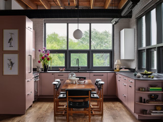
Designer: Sarah Montgomery Interiors
Location: Chicago
Size: 169 square feet (16 square meters); 13 by 13 feet
Homeowners’ request. “The homeowner loved to bake, host and gather friends and the kitchen was one of the most important spaces in their home to them,” designer Sarah Montgomery says. “The original kitchen was the same layout but the cabinets were in bad shape. Our client’s goal was a kitchen that got them excited to be in each day, something unexpected and that spoke to their artistic eye. The client didn’t want a typical island. Instead they wanted a moveable extension table at the center, great for pulling out during dinner parties or using as a workstation.”
Cabinet color. Pale purple (Muskoka Dusk by Benjamin Moore). “Since the kitchen is part of an open concept, the design needed to be just as strong as the functionality,” Montgomery says. “As a color lover, our client loved the idea of colored cabinets and we landed on this shade of mauve. The industrial bones of the space are softened by the color, providing just the right amount of contrast. One final detail was the curved open shelving on the edge of the cabinets, softening the edge and transitioning into the living space.”
Other special features. Black ultracompact countertops (Dekton). Oil-rubbed bronze hardware. Vintage dining chairs.
Designer tip. “Completely paneling the fridge and dishwasher in the small, open space made it feel less utilitarian by softening the look of appliances,” Montgomery says.
Montgomery uses Houzz Pro software. “We use Houzz Pro for project management,” she says. “We use the Selections boards to upload our items and send them to our client for an easy approval process and so they have access to all the necessary details. We use Houzz Pro also for sending proposals. We share the client dashboard so they have easy reference for their boards and documents at all times. Lastly, we log our time through Houzz so that our client gets clear invoices breaking down the time spent month over month.”
See why you should hire a professional who uses Houzz Pro software
Designer: Rochelle Grass of Dwelling Place Interiors
Location: Greenville, South Carolina
Size: 392 square feet (36 square meters); 14 by 28 feet
Homeowners’ request. “After living in their idyllic neighborhood for 20 years, this couple chose to renovate their dated home’s entire first floor rather than leave their dear friends,” designer Rochelle Grass says. “They host up to 75 people at a time and are the hub of their neighborhood. We drafted an entirely new floor plan, moved the kitchen to the opposite side of the home, created open flow throughout the common areas, added a bathroom, furnished the home and much more. It’s now a place where they love to relax and enjoy good company.”
Cabinet color. “My client loves green, so I knew that Sherwin-Williams Oakmoss was a winner for some of the cabinetry,” Grass says. “I balanced this vivid color with neutral stone and warm woods in the other cabinets and floors.”
Other special features. “We built the room around a custom range alcove that centers the kitchen,” Grass says. “This is a beautiful architectural feature as well as a practical space that keeps all of your spices and oils handy when cooking.”
Designer tip. “Always have three words to describe how you want your space to feel,” Grass says. “These clients wanted classic, comfortable and spacious.”
Grass started using Houzz Pro after this project was completed. “I wish I had known about Houzz Pro for this project,” she says. “Having the 3D floor planner would have been ideal to share the new floor plan with these clients. We removed a second staircase to create a home office, turned a sunroom into living space and reoriented all the rooms. The scanner would have saved hours of work.”Find a kitchen designer on Houzz
Designer: Jasmin Lee of The Design Intention
Architect: Jason LaGorga of DesignCrossover
Location: Brookline, Massachusetts
Size: 193 square feet (18 square meters); 10 feet, 6 inches by 18 feet, 4 inches
Homeowners’ request. “The existing kitchen was a classic white Shaker style — clean but no longer aligned with the homeowners’ personal taste or lifestyle,” designer Jasmin Lee says. “They wanted something more modern, with a fresh look that felt warm and inviting while still being highly functional. By reimagining the layout and incorporating smart storage solutions, we maximized functionality. Warm colors and natural materials replaced the stark white, bringing depth and personality to the kitchen.”
Cabinet color. Jewel-tone blue (Hidden Sapphire by Benjamin Moore), paired with rich walnut. “The painted cabinets bring a bold, modern personality to the space, while the walnut adds warmth and grounding natural texture,” Lee says. “The upper walnut cabinets feature ribbed glass fronts, which add interest, allow glimpses of dishware and keep the look lighter than all-solid doors. The cabinetry is accented with brushed brass hardware, which ties everything together with a touch of luxury and warmth, balancing both the bold color and the dark wood.”
Other special features. Soft gray stone countertops and backsplash. “The tone is cool and elegant, providing a calm surface that balances the richness of the cabinetry,” Lee says. “The stone’s subtle pattern adds depth without competing with the bolder cabinet colors.”
Designer tip. “My favorite design technique is to begin with zones — defining how each part of the kitchen will be used — and then creating specific storage and functionality within those areas,” Lee says. “For example, if a client loves to bake, we determine the best place for the mixer and all the coordinating ingredients so everything is within reach. By starting with zones, we uncover where storage is truly needed, how the kitchen will function day to day and how to eliminate the frustrations of the old layout.”
9 Ways to Save on Your Kitchen Remodel
Designer: Kelly Vickers of Zimmer Design
Location: Minneapolis
Size: 98 square feet (9.1 square meters)
Homeowners’ request. “The kitchen was too closed off and small,” designer Kelly Vickers says. “There was no storage. Cabinetry didn’t match and had been pieced together over the years. They originally wanted to add on to the back of their home. We presented two designs, one staying in the footprint and one with an addition. The homeowner chose to stay in the footprint based on the design that was provided, as it allowed for an open kitchen with more storage and better flow without needing more space or costs.”
Cabinet color. Aegean Teal by Benjamin Moore. “This vibrant teal was selected to match the homeowner’s upbeat personality and love of color,” Vickers says. “We wanted a unique look specific to her bungalow-style home. Brass hardware and lighting fixtures pop on these colorful cabinets.”
Vickers says she uses Houzz Pro software for all her projects. “I use it as a platform for sourcing, proposals, project management, sourcing tracking and scheduling.”
Other special features. Ultracompact stone-look countertops (Awake by Dekton). “The undulating cream subway tile backsplash brings an organic texture to the space, uniting the countertops with the upper cabinets,” Vickers says. “Stacking it in a vertical offset creates a contemporary look while still feeling traditional to the home. Blending in the original buffet built in at the peninsula creates warmth and allows both spaces a sense of belonging. We also added oak flooring.”
New to home remodeling? Learn the basics
Designer: Adair Witmer of Ambiance by Adair
Location: Lancaster, Pennsylvania
Size: 160 square feet (15 square meters); 10 feet, 6 inches by 15 feet, 3 inches
Homeowner’s request. “The client, a bachelor, loves to cook but had a very old and inefficient kitchen that was made up of too few cabinets, a huge radiator taking up a corner, an old range, a sink cabinet that covered part of a window and many obstacles,” designer Adair Witmer says. “He wanted to update the room to have a Mediterranean feel with ample storage and display spaces for his cooking collectibles.”
Cabinet color. “I chose to have two contrasting colors of cabinetry because I wanted the cabinets to go to the ceiling and to have all one color would look monotonous,” Witmer says. “I found a simple Shaker-style cabinet with thin rails and stiles in a beautiful blue for the base cabinets and wood for the tall cabinets. To break up the run of cabinets, I designed some to stack 36 inches with a 12-inch square glass cabinet above. I added floating shelves to provide interest to the space and give the client lots of places to display his collectibles.”
Other special features. “Granite counters and backsplash were used to bridge the blue and wood and provide a showstopper the moment you walk into the kitchen,” Witmer says. “Simple LVT (luxury vinyl tile) was used on the floor that complemented the space without drawing attention.”
Designer tip. “I believe in breaking up runs of cabinets with floating shelves and glass cabinets and making a statement with the backsplash,” Witmer says. “I always have lights on dimmers and insist on under- and in-cabinet lighting to create the ultimate in ambiance.”
More on Houzz
Read more stories
Browse photos for ideas
Find a home professional
This article was originally published by a www.houzz.com . Read the Original article here. .

After: Now the kitchen has a streamlined look with dedicated storage and a refreshing cream-and-blue palette. Gone is the awkward butler’s pantry, replaced by glass-front cabinets for glassware and dishes. To the left of the new paneled fridge, an area that used to be a walk-in pantry now has cabinets for small appliances, bakeware, dry goods and a microwave.
To the right of the stove, a countertop cabinet hides a pullout shelf with a coffee bar and toaster, as well as stationary shelves for mugs and more. To the right of the sink, a cabinet with hammered glass doors keeps more dishware at hand.
Ramsay also removed a dining table and chairs (where the previous photo was taken from) and relocated a desk on the sink-side wall. This allowed for a more spacious island with seating for three, plus French doors that bathe the space in light. Wood-look luxury vinyl flooring grounds the space in beauty and practicality
Perimeter cabinet paint: Dumpling, Sherwin-Williams; island base paint: Hale Navy, Benjamin Moore
Read more about this project