This article was originally published by a www.houzz.com . Read the Original article here. .


This home in Northampton, England, had a kitchen with an adjoining dining area and a living room in a conservatory, but it felt gloomy and cramped. The owner, who lives here with her two sons, found interior designer Eleni Fantis on Houzz and asked her to rethink the design. “[The owner] wanted a real family space, with defined areas, but where they could all gather, cook, entertain and enjoy being together,” Fantis says.
Before Photo
Kitchen at a Glance
Who lives here: A woman with two sons
Location: Northampton, England
Size: About 120 square feet (11 square meters); 12 by 10 feet
Designers: Eleni Fantis of Omorfia Interior Design (interior design) and Ezra Kerr of Jikoni Interiors (kitchen design)
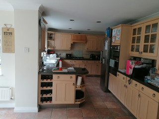
Before: The original kitchen was put in when the house was built. While there was plenty of storage, the arrangement made the area feel cramped.
Fantis wanted to use a kitchen company that would make the most of the space. Enter kitchen designer Ezra Kerr.
The kitchen is the heart of the space and it was important that this was somewhere the owner could feel relaxed and enjoy making food, entertaining and teaching her boys to cook.
Find an interior designer on Houzz
Luckily, there’s a utility room through the door opposite the sink, so he didn’t need to find space for laundry appliances.
He made more use of the short wall with a full-height pantry cabinet — one of the owner’s key requests — a refrigerator and cabinets above and below the combination and standard ovens.
Kerr stopped short of the ceiling for a maximum sense of space. “Having units to the ceiling makes a room look smaller — when you can’t see the wall above, it closes everything in — so we left a gap,” he says.
Shop for your kitchen
The white doors are vinyl-wrapped, making them robust, and the white countertop is durable quartz. Kerr went with a curved ceramic sink to add interest.
Fantis chose pretty pink and blue tiles for the backsplash. “[The owner] didn’t really have any pattern in her home, so I wanted to incorporate some delicate patterns so as not to overwhelm her,” she says.
Kitchen cabinet paint: Satin White and Richmond Denim, Jikoni Interiors
Find a kitchen designer
“Usually, the [cooktop] would go on the back wall, but because there was no space, that was the only way we could do it. You could have had a [standard] peninsula, but we tried to make it a bit more special. It makes the kitchen feel cozy and works really well in the space.”
New to home remodeling? Learn the basics
The wood-look luxury vinyl tile flooring pairs well with the oak shelves, and looks and feels warmer than the original tiles.
“[The owner] wanted us to fit in as many seats as we could,” Kerr says. “We created the circular shape so you can have people sitting round being sociable without all sitting in a line.” This section of countertop is oak, giving it the feel of a table.
The induction cooktop has a downdraft ventilation system that vents out through the wall. “An extractor hanging from the ceiling would have blocked the room,” Kerr says.
See why you should hire a professional who uses Houzz Pro software
Kerr has tucked a wine fridge and another cabinet into the peninsula unit. Neither is obvious from the living area, but they help maximize the storage.
An upholstered bench offers an additional seating spot when guests are over.
Before Photo
Before: Originally, the dining area was in the small room to the left and the living area was in a conservatory to the right.
After: Fantis had most of the wall between the two spaces removed. She sited the seating area near the French windows and moved the dining area into the conservatory.
Light can now circulate between the spaces, making them feel brighter and bigger.
The large armchair between the living room and kitchen is key to the color scheme. “The floral fabric was actually the beginning of the whole design, and is a printed velvet,” Fantis says. “[The owner] loved it so much, I persuaded the supplier to sell me additional [fabric], which we then used for some of the blinds.”
The original dark red curtains have been swapped for these pale blue ones, which fit with the fresh, light color scheme and are less dominating.
Before Photo
The conservatory roof had been badly lined in the past, so Fantis had that replaced.
This article was originally published by a www.houzz.com . Read the Original article here. .


7. Invisible Induction Cooktops
SKS — formerly known as Signature Kitchen Suite — made a splash at KBIS with this kitchen island with a hidden induction cooktop and pop-up downdraft ventilation system. When not in use, the vent is flush with the countertop and the cooktop blends in with the counter’s wood grain finish, leaving a nearly seamless expanse of functional prep space.
This island is still in development, but invisible induction technology is already available to consumers. For example, the already-available outdoor Cosmopolitan kitchen from Danver, which was also on display at KBIS, is prepped to fit Invisacook induction burners.
While invisible induction admittedly is more niche and high-tech than some of the simple features mentioned previously, as it becomes more widespread, it could be a game changer — particularly in compact kitchens, since it effectively reclaims a cooktop’s width of countertop.
More on Houzz
Read more home design stories
Browse thousands of home design photos
Find a home professional
Shop for your home
This article was originally published by a www.houzz.com . Read the Original article here. .

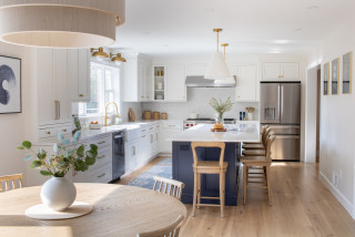
They hired designer Sarah West to help them create a timeless look and feel with cleaner lines and an organic modern style. West responded by pairing custom rift-cut white oak cabinets and several greige upper cabinets with creamy white walls for a warm atmosphere that complements the earthy tones in the stone flooring and new zellige backsplash tile. A furniture-style island has seating on three sides for face-to-face conversation. A large plaster range hood offers clean lines, softened by an elegantly arched window.
This article was originally published by a www.houzz.com . Read the Original article here. .

From outdated building codes to unusual historic design elements, updating an older house is a challenge that requires a special touch. An experienced kitchen designer can help you navigate this tricky process smoothly.
When kitchen designer Sarah Robertson of Studio Dearborn remodeled this historic Scarsdale, New York, Colonial kitchen, she had to balance design elements from the earliest portion of the home — dating back to the early 19th century — with an addition completed in the 1920s. The finished space nods to the home’s rich history while incorporating fresh, modern touches.
The Hidden Problems in Old Houses
This article was originally published by a www.houzz.com . Read the Original article here. .
The Ryders expanded the home into what was once a deck to create a new living room. That allowed them to knock down walls and open up the kitchen footprint into the former living room to create an open-plan concept that breezily connects the new kitchen, dining and living spaces. It also freed up room for a large kitchen island that seats six. A mix of soft white and light gray cabinets and marble-look quartz countertops establishes a fresh and clean look. Wood flooring and hand-hewn wood ceiling beams add warmth. And a built-in coffee station ensures that the homeowners are well-caffeinated to manage the lively household.
This article was originally published by a www.houzz.com . Read the Original article here. .

Before Photo
Kitchen at a Glance
Who lives here: A family of four
Location: Mendham Township, New Jersey
Size: 336 square feet (31 square meters)
Designer: Alison Griffin of Griffin Designs
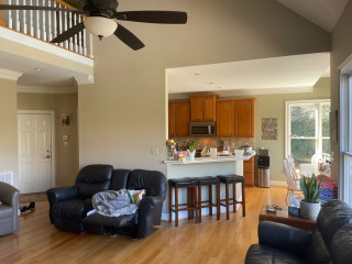
Before: The house is set perpendicular to a fairly busy road. The home’s front entrance, pictured here to the right of the windows, opens to a side yard.
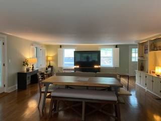
The room — which previously contained only living and dining spaces and now also houses the kitchen — extends from this side of the house to the other in one open space. This photo looks toward the dining and family room areas. The other end of the room, which was not photographed before the remodel, contained a rarely used sitting area with expansive views of a dense forest preserve.
The room’s ceilings were just 7⅓ feet, which made the space dark. “This is such a large, long space, which made the ceilings seem even lower,” Griffin says.
The original kitchen was on the other side of the house, in a back corner. “That kitchen was small and cramped,” Griffin says. The homeowners wanted to move the kitchen to this side of the house.
This dining table, with its wood top and metal legs, was a good fit for the new city loft look and was kept.
Find a local interior designer on Houzz
This article was originally published by a www.houzz.com . Read the Original article here. .

![]()
I recommend reviewing all of the food prep and other kitchen tools you currently own. This might be a good time to pare down items that are unnecessary, impractical or rarely used.
When planning your new kitchen, make sure there’s enough storage for all the kitchenware you plan to keep. Measure the dimensions of bulky items such as pressure cookers, stockpots, large serving trays and platters, tall drink dispensers and party-size serving bowls to make sure your new cabinets can accommodate them. If possible, designate a permanent home for all of your kitchen supplies before your plans are completed.
Find a pro near you on Houzz
This article was originally published by a www.houzz.com . Read the Original article here. .
![]()
Meanwhile, LaFreniere tackled the countertop clutter from the inside out.
“When I do kitchens, I focus on what’s inside of the cabinet,” she says. “I go through the homeowners’ small appliances, every pot, every utensil, spices [and] Tupperware and really make sure that there’s a place for everything.”
On one side of the range is a utensil pullout with a knife block and towel storage, and on the other side is a spice pullout. LaFreniere eliminated the lazy Susan. “I don’t do corner cabinets,” she says. “I find them to be completely useless, no matter whether a lazy Susan or the kidney pullouts. I just leave them empty.”
This article was originally published by a www.houzz.com . Read the Original article here. .

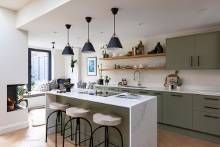
Parents of three now-grown sons, the couple were finally ready to make serious changes. They hired designer Jodi Swartz to help improve both function and style. While the overall layout stayed mostly the same, two-tone custom cabinets in a classic white for the perimeter and a robin’s-egg blue for the expansive island give the kitchen a fresh look. A dual-fuel range in a soft shade of blue and blue backsplash tiles complement the island. Touches of black add dramatic contrast. Elegant marble countertops, warm oak flooring and a cozy seating area near a fireplace elevate the kitchen with timeless appeal.
This article was originally published by a www.houzz.com . Read the Original article here. .

The cushions and artwork, in shades of blue, green and orange, bring dynamic color to the space, adding personality.
Sustainability is always a key consideration in Llogarajah’s projects. “Several existing elements were carefully integrated into the new design,” she says. Along with all the kitchen appliances and the sink, her design also incorporated the owner’s existing dining table and chairs to minimize waste.
“The design is tailored to seamlessly incorporate [all] these pieces, meaning the reused items feel intentional, as though they were always part of the overall scheme,” she says.