This article was originally published by a www.houzz.com . Read the Original article here. .

This article was originally published by a www.houzz.com . Read the Original article here. .
![]()
Kitchen at a Glance
Who lives here: A couple
Location: South Minneapolis, Minnesota
Size: 225 square feet (21 square meters)
Design-build firm: Bluestem Remodeling
The kitchen features custom Shaker-style cabinets in a mix of black and wood units. Polished gold-tone knobs and pulls add refined accents. “The clients were really interested in not having a monolithic look with their cabinetry,” says Mark Ferraro-Hauck, director of design at Bluestem Remodeling. “I love the repeated black throughout the room, but it’s not a black kitchen.”
Wide-plank white oak flooring has a special sealer that preserves its natural, unfinished appearance. “It integrates really well with the rest of the house, giving it a consistent flow,” Ferraro-Hauck says. “We didn’t want the kitchen to feel completely separate from the rest of the house.”
A large sliding glass door opens the kitchen to the patio and backyard. “Their backyard is their summer living room,” Ferraro-Hauck says. A double-hung window on the same wall adds another source of daylight and fresh air.
Custom cabinetry: Sean’s Cabinetry
Find kitchen remodelers on Houzz
This article was originally published by a www.houzz.com . Read the Original article here. .

The owners brought in trusted designer Laura O’Brien of O’Brien Harris, who had designed two other kitchens for them in the past. The first kitchen she designed for them was classic white, while the second featured dramatic black. “This time they were ready for something entirely different — a moody, colorful space that embraces color in a way that feels timeless and unexpected,” O’Brien says. The new kitchen nods to the building’s industrial history and its elegant facade.
This article was originally published by a www.houzz.com . Read the Original article here. .

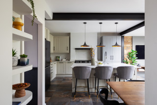
These Bellevue, Washington, homeowners wanted a kitchen as fun and relaxed as they are — full of color, pattern and personality. For 18 years, they lived with a small, dark, U-shaped kitchen with aging honey oak cabinets and no island, hardly a source of joy in their 1979 transitional-style home. The eating area had great light but was cut off by a peninsula. With one son in college and another in high school, the couple were ready for something brighter, more open and designed for gathering, complete with a spacious island, ample storage and a few surprises.
To help bring their vision to life — and to rethink the unused formal dining room off the kitchen — they turned to designer Erin Etchemendy of 31E Designs and to Houzz photos for inspiration. Removing the peninsula and dining room wall expanded the footprint by 121 square feet, making room for a long, custom island detailed with colorful patterned porcelain tiles. A walnut-and-quartzite top adds a unique twist to the light blue island base, while engineered wood flooring and flat-panel white oak cabinetry warm the space. Horizontally stacked rectangular tiles lend texture and movement, completing the bright kitchen brimming with character.
Before Photo
Kitchen at a Glance
Who lives here: A couple with a son in college and another in high school
Location: Bellevue, Washington
Size: 231 square feet (21 square meters)
Designer: Erin Etchemendy of 31E Designs
Before: This photo, taken from the doorway of the unused dining room, shows the dated 110-square-foot kitchen with its honey oak cabinets, no hardware, granite counters and cold tile floor. “They definitely wanted to get rid of that,” Etchemendy says. “They wanted to warm up the space for sure.”
Upper cabinets over the peninsula cut the kitchen off from the eating area and family room, making the already tight space feel even smaller and darker. The range wall separated the kitchen from the dining room, while the stainless steel refrigerator across from the sink jutted out awkwardly. “It felt cramped, and the organization — or lack thereof — was a problem,” Etchemendy says.
One bright spot: a large fixed window over the sink. The homeowners loved the natural light and wanted to make it a bigger feature in the new design.
The spacious island measures 3 feet, 2 inches wide by 14 feet, 6 inches long and features light blue flat-panel cabinets and drawers — including a charging drawer — plus open shelves for cookbooks. The top combines sealed walnut and Blue Lava quartzite, the latter a stunning stone with a cool blue background and dark blue and orange veining. “They wanted to incorporate the wood, but I didn’t think it would be a good idea to make the entire island top walnut,” Etchemendy says. “This way they have somewhere to put hot pots or other items and not worry about it. It’s also just a cool feature. They just wanted to do something that was different and unique.”
The light blue of the island contrasts with the perimeter flat-panel white oak cabinetry in a honey pecan finish. Engineered oak flooring with 7½-inch brushed and smoked planks adds more warmth. “They didn’t want to go sterile and do white or be overwhelming with a bunch of color,” Etchemendy says. “Adding the wood gives a warm backdrop to the pops of color.”
The newly open kitchen flows into an updated dining area with a new built-in bar, as well as a refreshed family room with a new fireplace surround and built-ins. LED recessed ceiling lights provide flexible illumination. The homeowners skipped island pendant lights to keep the focus on the backsplash. “They were worried the pendants would get in the way of that,” Etchemendy says. “But it’s wired in case they want to add pendants in the future.”
Find kitchen remodelers near you
Tiles: Tangier Decos, Surface Art
Before and After: 4 Revamped Kitchens in 150 to 250 Square Feet
Paint colors: Egret White (walls and ceiling) and Pure White (trim), Sherwin-Williams
See why you should hire a professional who uses Houzz Pro software
The upgraded double-basin stainless steel sink is paired with a touchless pull-down faucet, flanked by a dishwasher to the right and a trash-and-recycling pullout to the left. The backsplash, made of 2-by-10-inch gray-tone horizontal field tiles with a glossy finish, adds subtle texture and visual height. “They really liked the idea of having a bit of physical texture to the tile but not have it be overwhelming,” Etchemendy says. “We found a suite of tile with a flat glossy finish and a stacked stair pattern that just adds more character to a long, continuous wall.”
An interior corner to the right of the sink has floating wood shelves for decorative items, with a toaster oven tucked away off the main counter. “It was going to be interesting trying to figure out how to put a cabinet there with the window so close by,” Etchemendy says. “This creates a unique feature with the open shelving.”
Backsplash tile: Lighthouse in Mist, United Tile
9 Ways to Save on Your Kitchen Remodel
Flat black hardware in various shapes and sizes adds flair to the pantry, refrigerator wall and the rest of the cabinetry. “These clients are all about the unique and different,” Etchemendy says. “A pantry wall can be very overwhelming, but bringing in different accents helped break it up.”
25 Genius Kitchen Storage Ideas
Before Photo
New to home remodeling? Learn the basics
More on Houzz
Read more kitchen stories
Browse kitchen photos
Hire a kitchen remodeler
This article was originally published by a www.houzz.com . Read the Original article here. .

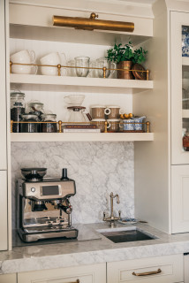
If your kitchen feels cramped, removing all or some of your upper cabinets might be the best option for you. This is a sure way to open up the visual space around the room, making the kitchen appear much larger than it is.
Plenty of light is important in a small space, and upper cabinets can sometimes cast a shadow over the countertops, making the workspace feel darker than necessary. So skipping those uppers can really open a space up. Running tile on the backsplash to the ceiling can also help visually heighten the look of the room.
If you’re worried about losing the storage from ditching upper cabinets, consider a hardworking island, if you have the space, or consult with a design pro to really maximize your lower cabinet storage with pullouts, drawers and other high-functioning components.
This article was originally published by a www.houzz.com . Read the Original article here. .
![]()
“The [owner] has a very good sense of style and knows what she wants, but we had to interpret that and work with the property and the space we were given,” he says.
The team crafted a beautiful modern-rustic kitchen with an elegant, elevated island and, hidden behind cabinet doors, a warm yellow pantry with masses of storage.
This article was originally published by a www.houzz.com . Read the Original article here. .

Kitchen at a Glance
Who lives here: A couple
Location: Duanesburg, New York
Size: 275 square feet (26 square meters)
Design-build pro: Marianne A. Clifford of Marianne Ashley Designs
Clifford removed the old appliances, cabinets, counters and floor, along with the two-level island, making way for a more than 12-foot-wide, one-level island with seating and storage. “It offers a lot more options on how the island can be used,” she says. The new layout improves sightlines and makes the kitchen feel open and inviting.
The island base and perimeter cabinets are semicustom cherry flat-panels with a natural finish and matte black ledge pulls. “A lot of the woodwork in their home was already cherry, so we wanted to create a unified look,” Clifford says.
The upgraded stainless steel refrigerator stayed in place, while an added open upper cabinet and tall pantry on the side expand storage. “There are hooks inside that pantry cabinet for hanging a step stool and broom,” Clifford says.
Modern counter stools with cognac leather upholstery and curved low backs sit at the island, while contemporary pendant lights with etched opal glass shades and matte black frames hang overhead. The ceiling has new LED recessed lights on dimmers. “This gives them full control,” Clifford says.
Pendant lights: Somerset, Hinkley Lighting; stools: Zion, Ballard Designs
Find kitchen remodelers near you
This article was originally published by a www.houzz.com . Read the Original article here. .
The inspiration came from one of Klosterman’s recent projects the couple admired. “I suggested a clean, traditional style with a lighter palette of creams, ivories, taupes and off-black accents,” she says. In the kitchen, the designer replaced the hodgepodge of styles and novelty appliances with streamlined, well-proportioned elements and a refined material palette. The result is a functional, elegant space with a clean-lined look.
This article was originally published by a www.houzz.com . Read the Original article here. .

Llogarajah, using Houzz Pro, addressed the look of the space and tweaked the layout to create a more family-friendly environment. And thanks to some thoughtful and sustainably minded choices, it was all done on a tight budget. Check out the before-and-after photos below.
This article was originally published by a www.houzz.com . Read the Original article here. .

![]()
If you like entertaining or eating everyday meals at a breakfast bar, then an island with more overhanging area and less cabinetry or storage underneath might be for you.
Think about how you imagine using the bar both every day and on special occasions. We’re realistic with many clients who have families in pointing out that children will often sit there and talk with parents, complete homework, use devices and eat (sometimes all at the same time) — I call this the “mission control” island breakfast bar.
Think about whether the sitting area needs to be closer to the fridge and pantry. This is another way of managing who is walking in and out of the kitchen, and who can be kept on the outside edges of the island — for safety as well as to avoid overcrowding in the kitchen.
Some people like to drop down part of the island to table height (around 29 inches) rather than the standard 36-inch-high countertop. This can work really well in some kitchens, but do be careful that you don’t inadvertently limit your storage and appliance options by having a really large table section on the island.
This article was originally published by a www.houzz.com . Read the Original article here. .

As long as you’re satisfied with your kitchen’s layout and your cabinets are sturdy and in good shape, having your cabinets professionally repainted or restained is a great way to update the look of the entire space. But if you’re not a fan of the cabinet style — for example, if you like Shaker but you currently have slab — paint can only go so far.
Having your cabinets refaced rather than replaced, as was the case in the kitchen pictured here, can help you achieve a new style for a fraction of the cost. Refacing experts remove doors and drawer fronts, add veneer to the boxes and sides of the cabinets and then replace the old doors and fronts with new ones. Hinges and hardware can be updated at the same time.
Refacing usually can’t change a partial-overlay cabinet door — in which the cabinet frame peeks out — into an inset cabinet or full-overlay style. But it might be able to create a more modern, upscale-looking partial overlay, with thinner reveals and sleeker doors.