Tag

Functional

Browsing


This retired couple in Washington state were ready to trade the cramped, dated kitchen in their 1990s split-level home for something brighter, smarter and more functional. Basic maple cabinets fell short on storage, and a bulky two-tier island made walkways uncomfortably tight. While skylights and a nearby sliding door offered some natural light, the lack of a window left the space feeling dark.

Designer Molly Erin McCabe guided the couple beyond their initial idea of a light refresh to a full remodel that reconfigured appliances, opened up circulation and brought in a garden view. Warm cherry cabinetry now stretches to the ceiling, maximizing storage and beautifully complementing a soft blue backsplash. A sleek single-level island creates better flow, while a new bar area with a beverage fridge improves entertaining.

Before Photo

McCabe By Design LLCSave Photo

“After” photos by Iklil Gregg Photography

Kitchen at a Glance
Who lives here: A recently retired couple
Location: Kingston, Washington
Size: 280 square feet (26 square meters), including a breakfast area
Designer: Molly Erin McCabe of McCabe by Design

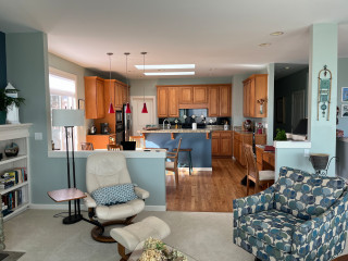
Before: This view from the living room shows the former kitchen in the background. While the size of the open layout was adequate, short basic maple cabinets without knobs or pulls offered little storage or style. Granite tile counters and a black tile backsplash paired with a mix of black and stainless steel appliances felt dated. The bulky two-tier island cramped circulation. “It was probably the first thing out of my mouth,” McCabe says. “They didn’t have sufficient aisleways.” A breakfast area with a wood table and chairs and a sliding glass door to a deck connected the kitchen and living room.

McCabe By Design LLCSave Photo
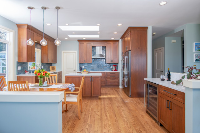
After: McCabe removed the dated cabinets, counters, backsplash and most of the appliances, along with the bulky two-tier island. In their place, she added a streamlined single-level island that includes storage and a trash and recycling pullout. “Without the bulk of the larger island, the entire kitchen is safer and more spacious, visually and functionally,” McCabe says.

Frameless cherry cabinets with a warm brown stain extend to the ceiling, maximizing storage. “It was configured for how the clients live and how they cook,” McCabe says. “My objective was to create storage that was inside the kitchen, to minimize trips into the pantry. The cherry also has a richer tone.”

The cabinetry pairs with the existing red oak floor, which was patched with new boards where the island was moved and then refinished with a matte urethane coat. “Because we moved the island, we had to weave in new boards,” McCabe says. “We kept the project cost down by only having to refinish the floor in the kitchen.”

Cabinetry: Bria cabinet line in door style Carson in cherry with Toast stain, Dura Supreme Cabinetry; wall paint: Comfort Gray, Sherwin-Williams

Find kitchen remodelers near you

Before Photo

McCabe By Design LLCSave Photo

Before: The blue-and-wood two-tier island with overhang and stools crowded the adjoining breakfast area. The black tile backsplash paired with a black propane cooktop and inefficient downdraft vent made that side of the kitchen feel especially dark. The two fixed skylights were incorporated into the new design.

McCabe By Design LLCSave Photo
After: The new island provides a large, uninterrupted surface for meal prep or serving a buffet. Its polished quartz top, also used on the perimeter counters, resists scratches, stains and chips and features a light marbled background with gray swells and charcoal accents. “The light-colored countertops lighten and brighten the kitchen,” McCabe says. The top drawer has a power strip inside. Ash gray knurled bar pulls add a subtle finishing detail to the cabinetry.

A 30-inch built-in induction cooktop in black glass replaces the former propane unit in roughly the same location. It’s paired with a wall-mounted stainless steel hood that improves air quality and helps keep surfaces clean.

For the backsplash, McCabe used handcrafted glazed ceramic blue picket tiles with tonal variation and light gray grout. “The blue tile in the backsplash ties in the blue hue that flows through the home, and the scale of the tile adds interest without creating visual clutter,” she says. A paneled door on the left leads to an existing walk-in pantry.

Backsplash tile: Watercolors picket in Whitney, Lunada Bay Tile; counters: Swanbridge, Cambria; hardware: Amwell in Ash Gray, Top Knobs

Before and After: 4 Appealing Kitchens in 300 Square Feet

Before Photo

McCabe By Design LLCSave Photo

Before: This view shows the interior side of the former island, which held a white double-bowl sink, sink cabinet and dishwasher. “There was no space to the right of the sink, which created a hazard,” McCabe says.

A black wall oven and a small black microwave sat next to the refrigerator alongside a short run of cabinetry and counter that ended just before the sliding glass door. “There was about 11 inches or so between the casing of the door and the cabinetry,” McCabe says.

McCabe By Design LLCSave Photo
After: McCabe moved the upgraded wall ovens and new refrigerator across the kitchen (see below), which freed up space to relocate the sink and add a vinyl casement window that fills the room with natural light. “This also gives them a direct view of the garden from the sink,” McCabe says.

The new undermount workstation sink in brushed stainless steel features a motion-activated smart pull-down faucet with a spot-resistant finish. “The plumbing from the island was rerouted through the floor joists to that wall,” McCabe says. “There’s a whole floor of the home below. Running the plumbing through the floor joists was instrumental to keep the costs down. The workstation sink effectively creates more counter space and makes food prep a breeze with multiple accessories.”

The couple’s existing top-control stainless steel dishwasher was reinstalled to the right of the sink. A valance above integrates LED pods for task lighting, and the updated plan also includes new ceiling LEDs and glass bulb pendant lights over the breakfast table.

See why you should hire a professional who uses Houzz Pro software

Before Photo

McCabe By Design LLCSave Photo

Before: Across from where the refrigerator and wall ovens were, a short run of cabinetry and counter went largely unused. “The cabinets there were only 21 inches deep instead of 24,” McCabe says. Nearby, a desk area by the dining table often became a dumping ground. “They wanted a beverage center,” McCabe says.

McCabe By Design LLCSave Photo
After: McCabe extended the wall behind the refrigerator by 7 inches to group the refrigerator and ovens together. The counter-depth four-door stainless steel fridge, which has a convertible lower right section that can switch between refrigerator and freezer, occupies the space of the former short cabinetry. A stainless steel combination convection microwave and wall oven is adjacent. “The stainless steel finishes on the appliances reflect light and contribute to the lighter, fresher feel of the space,” McCabe says.

The former desk area became a bar, featuring an undercounter beverage refrigerator and cabinets for storing spirits and entertaining supplies. “The beverage fridge and countertop help keep guests close by when entertaining, without making them feel like they are in the way,” McCabe says.

New to home remodeling? Learn the basics

Before Photo

McCabe By Design LLCSave Photo

Before: The former kitchen felt smaller than its actual size due to the shape and placement of the two-tier island (center), which made walkways tight, especially between the island and dining table (bottom right).

The refrigerator and wall ovens (bottom left) were positioned along the exterior wall, while the desk (top right) and a short run of cabinetry and counter (top left) sat across the room. The cooktop was on the left, opposite the island sink.

McCabe By Design LLCSave Photo
After: Removing the two-tier island and installing a single-level island improved circulation in the kitchen. Relocating the refrigerator and new wall ovens (top left) and adding a bar area with a beverage refrigerator (top right) made the space more functional. “It’s optimized for entertaining, has better work flow and allows two people to work together safely,” McCabe says.

More on Houzz
Read more kitchen stories
Browse kitchen photos
Hire a kitchen remodeler


This article was originally published by a
www.houzz.com . Read the Original article here. .


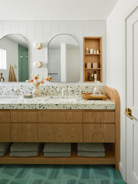
Linette Dai DesignSave Photo
The curved vanity edges were part of a careful balance. “I think carefully about balance in every design — shapes, temperature and color,” Dai says. “In here, it was a balance of straight lines and curves, a balance of cold terrazzo and warm wood and a balance of a soft concrete floor tile and glossy glass wall tiles.”

The globe sconces also add round shapes to this wall, playing off the strong rectilinear grid of glass tiles behind them. Instead of using mirrored medicine cabinets, Dai designed recessed oak shelving for storage. “This comes back to balance,” she says. “The wood adds warmth to balance out the coolness of the glass tiles.”

The balance also lets certain elements play leading roles while others are supporting players. Here, the terrazzo countertop and patterned floor are the stars. “I went with matte white faucets because I thought a metal finish would be a distraction,” Dai says. “These are quiet and they add a very cute pop of modern-day design.”

Shop for a bathroom mirror


This article was originally published by a
www.houzz.com . Read the Original article here. .


NV Kitchen and BathSave Photo
9. Attractive and Accessible

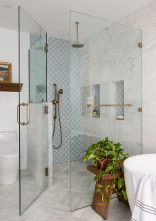
NV Kitchen and Bath included a large curbless shower in this Warrenton, Virginia, en suite bathroom for a homeowner with a walker. The 84-inch-wide shower has a built-in bench, grab bars and a 42-inch-wide opening, as well as a linear drain between the main bathroom floor and shower floor to keep the water contained. A custom tempered glass enclosure also prevents water from splashing into the rest of the bathroom. A rear shower wall has 12-by-24-inch slate-colored porcelain tiles, while the shower floor features 2-by-2-inch slate-colored mosaic tiles that create a nonslip surface. The bathroom floor and the two shower side walls are the same size porcelain tile in a nonslip finish with brown and black veining on a white background.

Read more about this bathroom


This article was originally published by a
www.houzz.com . Read the Original article here. .


KASA Interior DesignSave Photo
3. Moody and Modern

Designer: Bonnie Kespohl of Kasa Interior Design
Location: Edina, Minnesota
Size: 204 square feet (19 square meters); 12 by 17 feet

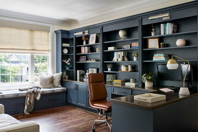
Homeowners’ request. “This is my personal home and this is my husband’s office space,” designer Bonnie Kespohl says. “While the existing dark oak wainscoting was in mint condition, the overall space felt heavy and dated.”

Special features. “He wanted to lighten up the space, which was accomplished through adding another window, adding recessed lights overhead [digitally removed by the photographer], replacing the existing built-in with an updated built-in painted in Benjamin Moore’s Blue Note, and lightening up the carpet,” Kespohl says. “We also refinished his existing maple desk and added new white powder-coated legs for a fresh look.

“We removed a portion of the existing wood wainscot in the window bump-out to the left of the desk and instead treated the opening with flat paneling enameled in Benjamin Moore’s Blue Note to match the new built-in. This helped to mix in a modern nod to go with the rest of the renovated home but still played nicely with the existing wainscoting.”

Cord and document control. “We have one visible cord from the monitor [not shown] to the wall, as a floor outlet wasn’t viable for this renovation,” Kespohl says. “We have a grommet on the built-in credenza so charging cords can plug in behind the file drawers below. The base of the credenza is fitted with three shallow top drawers for office supplies and personal effects, while the three deeper base drawers are sized appropriately for filing documents. The space also has a closet so residual items can be stored away out of sight.”

Designer tip. “Try to reimagine existing elements with just slight changes and add-ins,” Kespohl says. “Originally we had discussed removing the existing wood wainscoting. However, I loved it and it was in excellent condition, so we had to try to save it. It’s a beautiful feature of the original home, and we were able to modernize the office space and lighten it up, all while keeping the wood in play.”

Sconce: Lani in aged brass, Mitzi; carpet: Traverse in Chambray, Nourison

Trending Now: 10 Popular New Home Offices


This article was originally published by a
www.houzz.com . Read the Original article here. .
Pin It