![]()
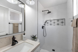
Designer: Jenny Murphy of J Reiko Design + Co.
Location: Denver
Size: 50 square feet (4.7 square meters); 5¾ by 8⅔ feet
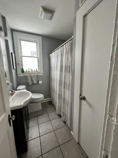
Homeowners’ request. “Set within the storied envelope of a historic home, this second-level bathroom serves all of the main bedrooms — an essential, high-traffic space tasked with meeting the demands of daily life for this young family,” says designer Jenny Murphy. “Following a comprehensive remodel of the main level, the directive here was one of continuity — extending a refined material palette and a restrained, modern sensibility while remaining attuned to the home’s architectural heritage. With the arrival of the homeowners’ first child, the program took on added urgency: The space needed to accommodate both the practicalities of family life and moments of quiet retreat.”
Murphy’s firm uses Houzz Pro software to help manage its business. “We use it mostly for project management, lead tracking, time tracking, invoicing and then logging specifications and creating a product selection sheet,” she says.
Special features. Black vanity. Creamy off-white and greige checkerboard shower tile. Marble tile flooring. Creamy wall paint (Swiss Coffee by Benjamin Moore). Full-height white oak linen cabinet. Curved mirrored medicine cabinet. “A combined tub and shower remained essential, accommodating both the practicalities of bathing a child and the more indulgent ritual of an evening bath for the adults,” Murphy says.
“To elevate this dual function, a deeper tub was specified — generous enough to comfortably serve an adult, ensuring the fixture felt intentional rather than purely utilitarian,” Murphy says. “In place of the expected glass enclosure, a custom linen pinch-pleat shower curtain softens the composition, introducing texture, movement and a hint of informality, aligning with the home’s Craftsman-bungalow-meets-English-cottage sensibility.”
Designer tip. “We were mindful of the budget on this project, so we leaned into simple, well-made pieces like a prefabricated vanity and linen cabinetry,” Murphy says. “From there it was all about how we layered in detail. We chose an affordable tile and elevated it by installing it in a classic checkerboard pattern, adding just the right amount of interest to make the space feel thoughtful and custom without stretching the budget.”
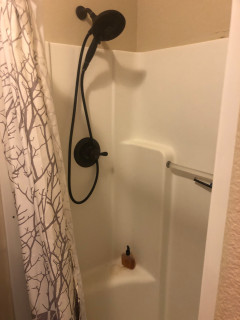
“Uh-oh” moment. “The existing wall length created a small but meaningful opportunity — measuring 69 inches against a standard 60-inch tub-shower insert,” Murphy says. “Rather than forcing a fit we chose to work with it. We introduced a custom-framed bench ledge at the end of the tub, clad in the same checkerboard tile to maintain continuity and intention. This solution does more than resolve a dimensional gap. It adds a place for bath essentials, a landing for toys while bathing a child and an integrated detail that supports the way the space is actually used.”
Vanity: Brittany in Black Onyx, James Martin Vanities; shower tile: Color Wheel Classic in Biscuit and Urban Putty, 4 by 4 inches, DalTile; floor tile: Ocean White honed, 18 by 18 inches, Floor & Decor; faucet: Cassidy in champagne bronze, Delta; medicine cabinet: Grae, Rejuvenation; linen cabinet: Billy/Oxberg in oak effect, Ikea
See why you should hire a professional who uses Houzz Pro software
This article was originally published by a www.houzz.com . Read the Original article here. .


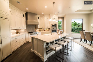


Kitchen at a Glance
Who lives here: An empty-nest couple
Location: Martindale, Texas
Size: 250 square feet (23 square meters)
Designer: Amanda Buckley of Bauley Interiors
Cabinetmaker: Kleighton Westphall of Monarch Woodworks of Austin
Builder: Blanco River Construction
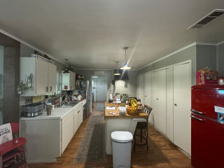
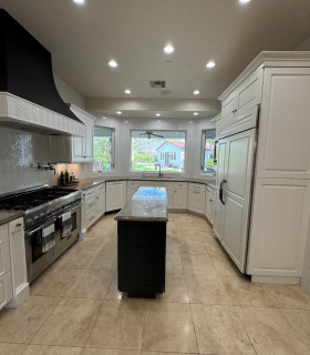
Before: Gray walls, short white cabinets and laminate counters gave the former kitchen a flat, utilitarian feel. Shallow upper cabinets flanking the sink window on the left offered little storage and blocked natural light. Ceilings in the small house were less than 8 feet high, Buckley says. “The window wasn’t that big and there wasn’t enough lighting overall. They also had a vinyl-style tile above the sink but that was their only backsplash.”
A long, narrow island with stools felt especially tight, squeezed by reach-in closets along the right wall. “That essentially was their pantry,” Buckley says. “Their small appliances and pots and pans were stacked up on each other in there.” A retro-style red refrigerator sat out in the open with no clear role, while the primary stainless steel refrigerator was tucked into the far back left corner. “The red refrigerator was sort of just there,” Buckley says. “They liked the look of it but didn’t use it much.”