Tag

Fresh

Browsing


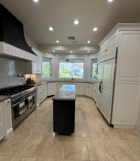
Homeowners’ request. “The homeowners envisioned a timeless, tailored kitchen with a sense of warmth, texture and craftsmanship that would serve as the heart of the home,” Younger Homes owner Danielle Younger says. “Having traveled and lived in many places throughout the world, they wanted this kitchen to evoke an old-world feel so that their collection of antiques and treasures gathered during their travels would seamlessly integrate into their new home. They also wanted an open, airy space that would feel equally appropriate for family cooking and large gatherings. Functionally, they needed generous prep space, integrated storage and a layout that allows multiple people to cook or entertain without crowding.”

Tailored details. “The backsplash wall is veneer Ocean Blue fieldstone laid in an irregular pattern that climbs from the countertops all the way up the vaulted ceiling and wraps the custom plaster range hood, giving the kitchen an old-world texture and grounding the space,” Younger says. “The countertops are Dekton, with subtle gray veining and an off-white base that provides an elegant, classic contrast to the rustic stone and warm wood. The island top is carefully pieced together to give the appearance of a seamless single slab.

“Rift-cut white oak cabinetry has inset doors and drawers on the island. Perimeter cabinetry, walls and trim are all painted Sherwin-Williams Snowbound to contrast perfectly with the wood tones and let the stone wall take center stage. These tailored details balance rugged Hill Country materials with refined European styling. Brass hardware and lighting add a tailored, jewel-like accent.”

Other special features. Custom plaster range hood with an elegant curve. Globe pendant lights with brass bands for a sculptural statement. White oak flooring. “This home was built with high-quality finishes to protect the owners’ health and the surrounding environment, achieving EPA Indoor AirPlus certification — assuring optimal indoor air quality — as well as Energy Star certification — ensuring the home uses less energy and is built to a high standard for both efficiency and health,” Younger says.

Designer tip. “Mix contrasting textures — stone, plaster, wood, marble and brass — to create depth and interest while keeping the palette neutral,” Younger says. “We also recommend running the stone backsplash full height for a dramatic yet cohesive look; it eliminates upper visual breaks and highlights a vaulted ceiling beautifully.”

Pendant lights: Broomley, Corbett Lighting


This article was originally published by a www.houzz.com . Read the Original article here. .


Running bond is a classic choice for traditional and farmhouse-style kitchens and baths. Depending on the tile size and finish, as well as the grout color and width, this layout can complement Craftsman, contemporary, Victorian, midcentury modern, industrial and cottage-style homes as well.

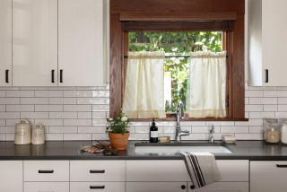
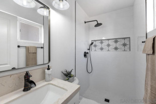
Used on a wall, the horizontal design can subtly widen the appearance of a room, making it a particularly good choice for narrow spaces. Running bond is also forgiving, requiring few complicated cuts and allowing for slight tile variations and imperfect alignment.

Although there’s a lot of movement in the pattern, because this tile layout is so common, it doesn’t call attention to itself — which can be an asset or a drawback, depending on the effect you’re trying to achieve.


This article was originally published by a www.houzz.com . Read the Original article here. .


Dave Fox Design Build RemodelersSave Photo
After: Broadstone addressed the boxed-in feeling by removing the closet. That allowed her to put a washlet toilet where the closet once stood, facing the vanity wall — a much more discreet location. (The seat is visible at bottom right.)

She removed the existing shower-tub combo and, at the end of the room, installed a deeper, double-insulated acrylic tub with handheld and fixed shower heads and a single fixed-glass panel. She also replaced the window and moved it higher on the wall in order to enhance privacy and draw the eye up — a trick to make the room look taller and airier.

A heated fan in the ceiling keeps the homeowners and guests warm both inside the partially open shower and when stepping out of it.

Tub: Double-insulated acrylic, 32 by 60 by 19 inches, MTI; walls, trim and ceiling paint: Cheviot, Sherwin-Williams; toilet: Vespin II Washlet+, Toto


This article was originally published by a
www.houzz.com . Read the Original article here. .


“After” photos by Mark Verschelden

2. Sunny and Bright

Bathroom at a Glance
Who lives here: A family of five
Location: Modesto, California
Size: 120 square feet (11 square meters)
Designers: Wendy Glaister and Stephanie Poulsen of Wendy Glaister Interiors

Before: Even with a skylight, this Modesto, California, en suite primary bathroom felt dark and depressing. The giant tub with a shower wand was impractical. A tight double vanity had two vessel sinks that hogged counter space. Interior designers Wendy Glaister and Stephanie Poulsen set out to create a more playful and happy bathroom using a color palette of sunny yellow, white and gray.


This article was originally published by a www.houzz.com . Read the Original article here. .


This article was originally published by a
www.houzz.com . Read the Original article here. .


KNC Design GroupSave Photo
The vanity is white oak with thin rail profiles. “We played around with putting a makeup station with a stool in the center, but ultimately my clients decided having hampers in here was more important to them,” Clark says. The two cabinets in the center are hamper pullouts.

“I like to minimize overhead light in a bathroom,” Clark says. “You get better light from eye level when you’re putting on makeup. But the vanity was so long that it really needed something in the center, so I added the glass pendant light there.”

The mirrors hide medicine cabinets. “Some of my clients are reluctant about medicine cabinets at first because they tend to all look the same. But these arched mirrored medicine cabinets are really pretty,” Clark says. The frames are brass.


This article was originally published by a
www.houzz.com . Read the Original article here. .


When this family of four relocated from Florida to Tempe, Arizona, it loved the natural setting of its equestrian community. But the home it moved into, custom-built in 2008, contained some oddities. The kitchen was the main concern. The location didn’t make sense within the overall layout of the home. And a massive, angled, two-tiered island broke up the floor plan in an unusual way and impeded traffic flow. Meanwhile, large beige floor tiles and basic granite countertops made the style look dated.

Wanting a more open and streamlined layout for entertaining guests, as well as a style that looked fresh and better suited to the Southwest, the homeowners hired designer Kimberley Worswick to spearhead a major overhaul. Worswick rethought the layout, moving the location of the kitchen to the dining room. She ditched the angled peninsula in favor of a large open-base island that can seat 10 people. Another, more standard island now sits in the main kitchen area and has additional seating, storage and the main sink, which creates an efficient work triangle. White-and-wood cabinets, zellige-look ceramic backsplash tile and Mediterranean-style pendant lights deliver an airy and welcoming style that nods to the home’s surroundings.


This article was originally published by a www.houzz.com . Read the Original article here. .


A Washington, D.C., family of four asked designer Sara Swabb of Storie Collective to update its 1936 Tudor-style home in a way that honored the home’s roots while bringing it into the modern era. In the entry, Swabb, who uses Houzz Pro business software, opened things up by widening doorways to keep sightlines clear to the kitchen and dining areas and allow natural light to be shared between the rooms.

In the kitchen, a warm green cabinet color, an arched range alcove and handmade terra-cotta tile flooring in a herringbone pattern create a fresh style that nods to the home’s past. A zellige tile accent wall spans the room, helping visually connect the main cooking area to a nearby zone containing a paneled fridge, a secondary sink and a built-in coffee machine. Textured wallpaper and patterned draperies energize the dining room, and midcentury modern furnishings perk up the living room.

Read more and save photos


This article was originally published by a www.houzz.com . Read the Original article here. .


Kindred Designs LLCSave Photo
The island has an oil-based stain that enhances the wood grain. Black metal swivel stools help make the island a gathering spot. The countertops are marble-look quartz. The island slab creates a continuous, expansive prep space. “I feel quartz is an economical and durable choice for families,” Reesey says.

A backsplash featuring matte white scallop-shaped ceramic tiles brightens the room and adds visual movement. An upgraded 30-inch induction range sits below a hood with wood trim that coordinates with the other wood details in the room. A stainless steel 36-inch counter-depth 4-door smart refrigerator (partially visible) is to the left of the sink.

A pair of modern pendant lights over the island coordinate with other black and brass finishes used in the room. (The kitchen also has recessed LED ceiling lights, which were digitally removed by the photographer to highlight other design details.)

Backsplash: Prado in Andalucia, Mirazur collection, Sonoma Tilemakers; pendant lights: Blaine 16-inch, Rejuvenation; paint colors: Wind’s Breath (walls) and Super White (trim), Benjamin Moore

Shop for your kitchen


This article was originally published by a
www.houzz.com . Read the Original article here. .


These homeowners disliked the mostly brown and tan finishes and bulky features in their primary bathroom. The couple’s designer, Chad Esslinger, describes the space a bit more bluntly. “Outdated and dismal,” he says.

To freshen up the look and feel, the couple created an ideabook on Houzz, with inspiration photos they shared with Esslinger. He worked within the same basic footprint but ditched all the former materials and components. Lots of light and bright finishes brighten the space. Esslinger used the same marble tile in various areas, but to create visual interest and texture he played with pattern and shape — hexagons behind the tub, herringbone on the floor, large-format rectangles in the shower. Deep blue vanities and brass details elevate the style.


This article was originally published by a www.houzz.com . Read the Original article here. .

Pin It