Before Photo
This article was originally published by a www.houzz.com . Read the Original article here. .

Before Photo
This article was originally published by a www.houzz.com . Read the Original article here. .
With three kids and busy careers, this young Bedford, Massachusetts, couple needed a space to unwind. Their dated primary bathroom — cramped with a single vanity and an old shower-tub combo — wasn’t cutting it.
Enter design-build pro Jamaal Siddiqui, who uses Houzz Pro software. By borrowing 20 square feet from the bedroom, he carved out space for a spacious double vanity with a dark driftwood finish and a relaxing low-curb shower. Layers of honed marble tile in varying patterns bring subtle elegance, while a soothing neutral palette transforms the room into a calm retreat where the couple can finally exhale.
Before Photo
Bathroom at a Glance
Who lives here: A young couple with three kids
Location: Bedford, Massachusetts
Size: 78 square feet (7.3 square meters)
Design-build pro: Jamaal Siddiqui of Yusra Design + Build
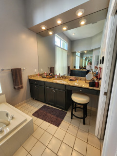
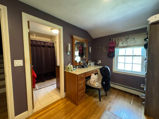
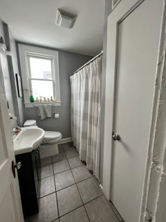
Before: Here’s a peek into the original 58-square-foot primary bathroom from the bedroom. A single-sink vanity hugged the wall behind the bedroom’s desk and makeup station. (See before-and-after floor plans below.) “This wasn’t just a primary bathroom renovation, this was a reconfiguration of the primary suite,” Siddiqui says. “The bathroom was a dark and small space, and one of the solutions was expanding into the bedroom to utilize underused square footage.”
Before Photo
Across from the vanity, a shower-tub combo with a fabric curtain filled the space, while a toilet was tucked into a niche by the bathroom’s only window. “By keeping the toilet in the same location, we were not only able to save costs but keep the privacy for the toilet as you walk into the bathroom,” Siddiqui says.
Siddiqui uses Houzz Pro software to keep projects on track, from selections to scheduling. “We also create ideabooks for all our projects,” he says. “This allows our clients to upload their likes and dislikes. It’s a starting point.”
See why you should hire a professional who uses Houzz Pro software
A neutral palette sets a soothing tone with greige walls (Accessible Beige by Sherwin-Williams), a crisp white ceiling and white trim with a satin finish. Marble mosaic tiles in a fan pattern, honed and with soft white grout, cover the floor. “The homeowner was inspired by a friend’s bathroom we had done in the past,” Siddiqui says. “Marble can sometimes come off as cold. Introducing softer geometry with the fan pattern helped to balance the feel of the space.” The floor is framed in 12-by-24-inch marble tiles, cut to size, for a polished finish.
The existing window keeps the space bright and airy, while a new low-profile, energy-efficient exhaust fan improves ventilation. Four-inch LED recessed lights in the ceiling provide clean, even illumination throughout.
Floor tile: Dolomite Iceberg Blended Fan marble mosaic, Maravilla, Floor & Decor
Find a home professional on Houzz
Before Photo
Before: A blank wall once sat to the right of the bathroom door. “The reconfiguration of the bathroom was really determined by the rest of the suite as well,” Siddiqui says. “We wanted to have the bathroom door and closet door in the bedroom opposite each other. Relocating the sink from that wall allowed us to move the bathroom door.”
Above, a pair of 18-by-30-inch mirrors have handcrafted beveled frames with champagne-colored beading, adding visual interest and depth. A towel ring between the mirrors keeps hand towels off the counter. Two ceiling-mounted dome pendant lights with opal etched glass and a brushed nickel finish illuminate the vanity. “One of the things we really gave a lot of thought about was how much space would be on the wall itself,” Siddiqui says. “The size of the mirrors didn’t allow us for a lot of wall space. By changing it up and installing ceiling-mounted pendant lights, it made it unique and also gave the homeowners the artificial light they need at the vanity.”
Pendant lights: Maybery in brushed nickel and opal etched glass, Birch Lane
Before and After: 4 Brilliant Bathrooms Under 60 Square Feet
The shower itself is designed for luxury, with a 12-inch ceiling-mounted shower head, wall-mounted shower head, three body sprays and a pressure-balanced valve, all in brushed nickel.
New to home remodeling? Learn the basics
Originally, a single-sink vanity hugged the wall by the bathroom door, with a shower-tub combo across from it, next to the toilet.
In the updated plan, the bathroom footprint was pushed into the primary bedroom, making room for a low-curb shower and a spacious double vanity relocated to a new wall. “By reconfiguring the space, we were able to optimize storage,” Siddiqui says. “It doesn’t always have to be an addition or something extreme. Rethinking the space can allow you to come up with a solution.”
More on Houzz
Read more stories
Browse photos for ideas
Find a home professional
This article was originally published by a www.houzz.com . Read the Original article here. .

After: The bathroom’s 5-by-10-foot footprint stayed the same, with a door at each end of the vanity leading to the girls’ bedrooms. A light pink double vanity, painted to echo the whimsical butterfly-and-flower wallpaper, brings a pop of color and pattern to the space. Mancera added scalloped edges to the vanity bottom, a motif she carried through the sinks, which feature subtly scalloped rims, and the sconces, with scalloped patinaed brass backplates and acrylic mounts. Brushed brass faucets and handles keep the look simple so the scalloped details shine, while bow-shaped brass cabinet pulls add a sweet, playful finishing touch that reinforces the room’s fairy-tale charm.
This article was originally published by a www.houzz.com . Read the Original article here. .
![]()
Before Photo
1. Thoughtful Layout With Green Cabinets
Kitchen at a Glance
Who lives here: A family of five
Location: Wakefield, Massachusetts
Size: 159 square feet (15 square meters), plus a mudroom and bar area of 231 square feet (21 square meters)
Designer: Amanda Colosi Johnson of McGuire + Co. Kitchen & Bath
Before: This Wakefield, Massachusetts, family of five had grown weary of its U-shaped kitchen and its dark brown and cottage green cabinetry, vinyl tile flooring and standard appliances. A large refrigerator jutted awkwardly from the cabinetry, while a peninsula with two backless stools and hard-to-reach drawers separated the kitchen from the adjoining bar and mudroom.
Having previously collaborated with McGuire + Co. Kitchen & Bath on a full bathroom remodel, the homeowners returned to the team for their kitchen. Rather than moving walls, lead designer Amanda Colosi Johnson focused on maximizing the existing footprint while giving the space a stylish, functional upgrade.
This article was originally published by a www.houzz.com . Read the Original article here. .

After: The remodel team cleared out the old appliances, cabinets, countertops, flooring and peninsula, upgraded the electrical and plumbing, and replaced the bulky staircase with a compact spiral design set deeper into the house. This opened up 141 square feet, making room for a new island with added storage, seating, a beverage fridge and pullout liquor shelves.
The island’s cool blue-green hue (Composed by Sherwin-Williams) pays tribute to the lake outside, while clean white perimeter cabinets with a touch of gray complement the painted greige wall panels (Grége Avenue by Benjamin Moore). A refinished pine ceiling and new rustic pine flooring in a natural finish add warmth and balance to the space.
This article was originally published by a www.houzz.com . Read the Original article here. .

She removed the existing shower-tub combo and, at the end of the room, installed a deeper, double-insulated acrylic tub with handheld and fixed shower heads and a single fixed-glass panel. She also replaced the window and moved it higher on the wall in order to enhance privacy and draw the eye up — a trick to make the room look taller and airier.
A heated fan in the ceiling keeps the homeowners and guests warm both inside the partially open shower and when stepping out of it.
Tub: Double-insulated acrylic, 32 by 60 by 19 inches, MTI; walls, trim and ceiling paint: Cheviot, Sherwin-Williams; toilet: Vespin II Washlet+, Toto
This article was originally published by a www.houzz.com . Read the Original article here. .

Before Photo
1. Warm and Organic Look With Enlarged Shower
Bathroom at a Glance
Who lives here: A couple with a toddler
Location: Austin, Texas
Size: 150 square feet (14 square meters)
Designer: Cameron Getter Design
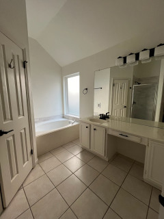
Before: This former primary bathroom in Austin, Texas, had an aging white double vanity and beige tile flooring that gave the space a bland look. Black details called attention to outdated lighting and other elements. A large built-in tub sat beneath a frosted glass window, and the super small shower stall, seen in the mirror’s reflection, felt disjointed in the space. The angled door on the left connected to the couple’s primary closet.
The homeowners, parents of a toddler, knew just where to turn. Designer Cameron Getter had already helped them choose furniture for their main living areas and update their guest bathroom, so they tapped her to help them transform their basic primary bathroom into an organic, spa-like space with warmth.
This article was originally published by a www.houzz.com . Read the Original article here. .
Siemer and Pestka brought in dark-stained wood vanities that improve storage and add rich warmth. A new makeup area sits in a stylish arched niche. A freestanding tub creates more breathing room. A luxurious new shower with a frameless glass enclosure improves the showering experience. And beige-and-white checkerboard flooring adds an elegant touch.
This article was originally published by a www.houzz.com . Read the Original article here. .

2. Sunny and Bright
Bathroom at a Glance
Who lives here: A family of five
Location: Modesto, California
Size: 120 square feet (11 square meters)
Designers: Wendy Glaister and Stephanie Poulsen of Wendy Glaister Interiors
Before: Even with a skylight, this Modesto, California, en suite primary bathroom felt dark and depressing. The giant tub with a shower wand was impractical. A tight double vanity had two vessel sinks that hogged counter space. Interior designers Wendy Glaister and Stephanie Poulsen set out to create a more playful and happy bathroom using a color palette of sunny yellow, white and gray.
This article was originally published by a www.houzz.com . Read the Original article here. .

1. Charming and Cheerful
Kitchen at a Glance
Who lives here: A couple with grown children and two dogs
Location: Delafield, Wisconsin
Size: 320 square feet (30 square meters); 20 by 16 feet
Designer: Morgan Taugher (lead) of Refined Renovations
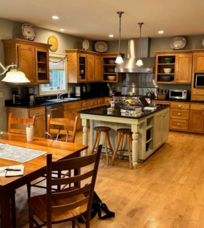
Before: This aging Delafield, Wisconsin, kitchen had dark cabinetry and countertops that gave it a heavy, shadowy look. An off-center stainless steel range, backsplash and hood dominated a back wall. The refrigerator stood on a wall to the right of the range, out of view, across from the sink and separated from it by the island, creating an inefficient workflow. The only pantry was located down the hall, accessed through a mudroom.
The homeowners, a couple with grown children and two dogs, wanted a kitchen with improved storage, a more efficient layout and a fresh look with an antique English sensibility. For help, they hired design-build firm Refined Renovations.
This article was originally published by a www.houzz.com . Read the Original article here. .

4. Elevated Classic
Bathroom at a Glance
Location: Franklin, Tennessee
Size: 180 square feet (17 square meters)
Design-build firm: Sebring Design Build
Before: These Franklin, Tennessee, homeowners turned to Sebring Design Build to update their primary bathroom. Although spacious and featuring two vanities, the layout felt chopped up and cramped. A toilet room sat to the right of one vanity, while a shower stall and second vanity flanked the opposite end of the bathtub.
The couple didn’t want a bathtub and asked for a layout based on universal design principles, including a wheelchair turning radius. They also envisioned a clean, elevated traditional style with a spa-like, airy feel.
New to home remodeling? Learn the basics